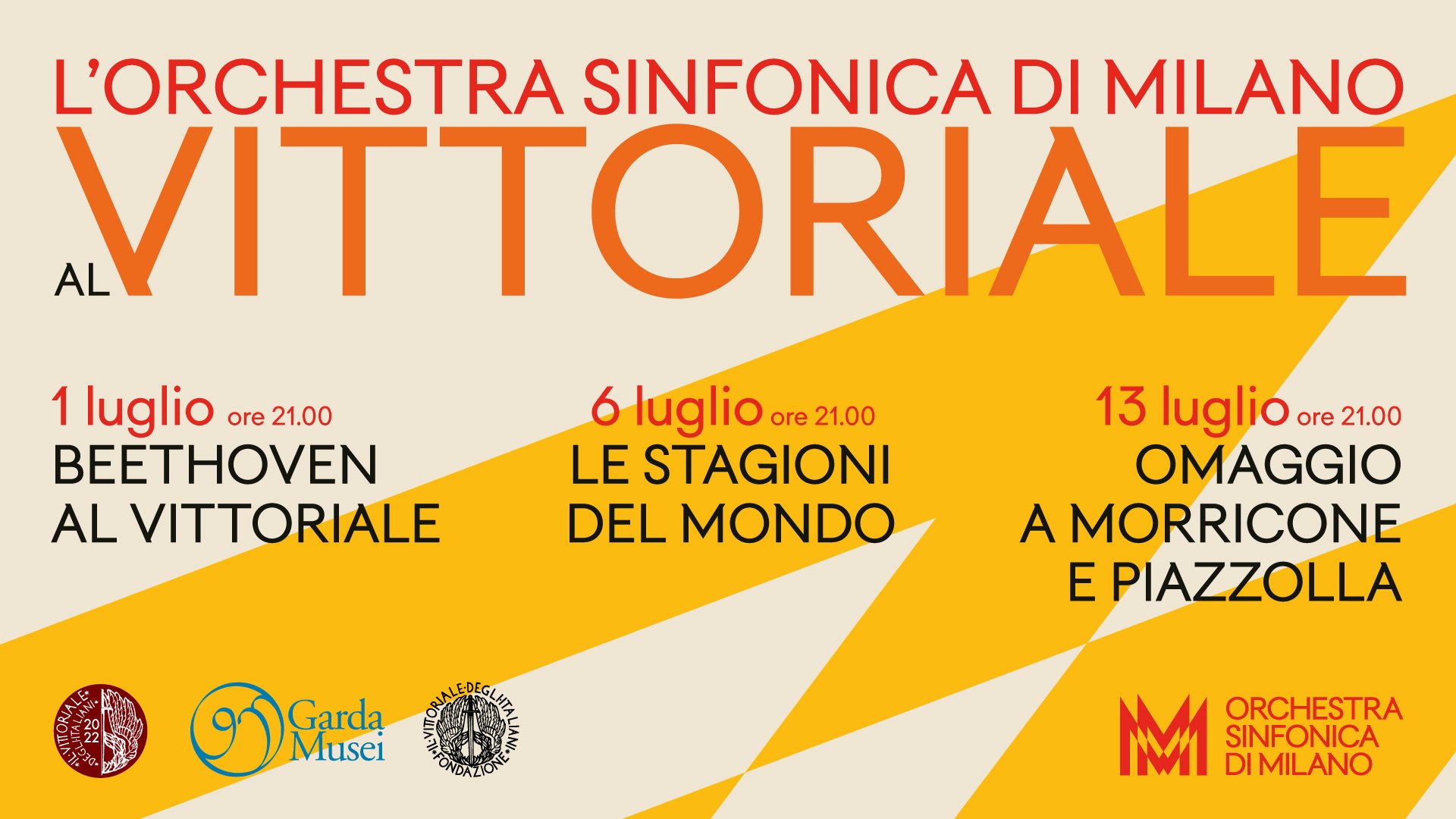
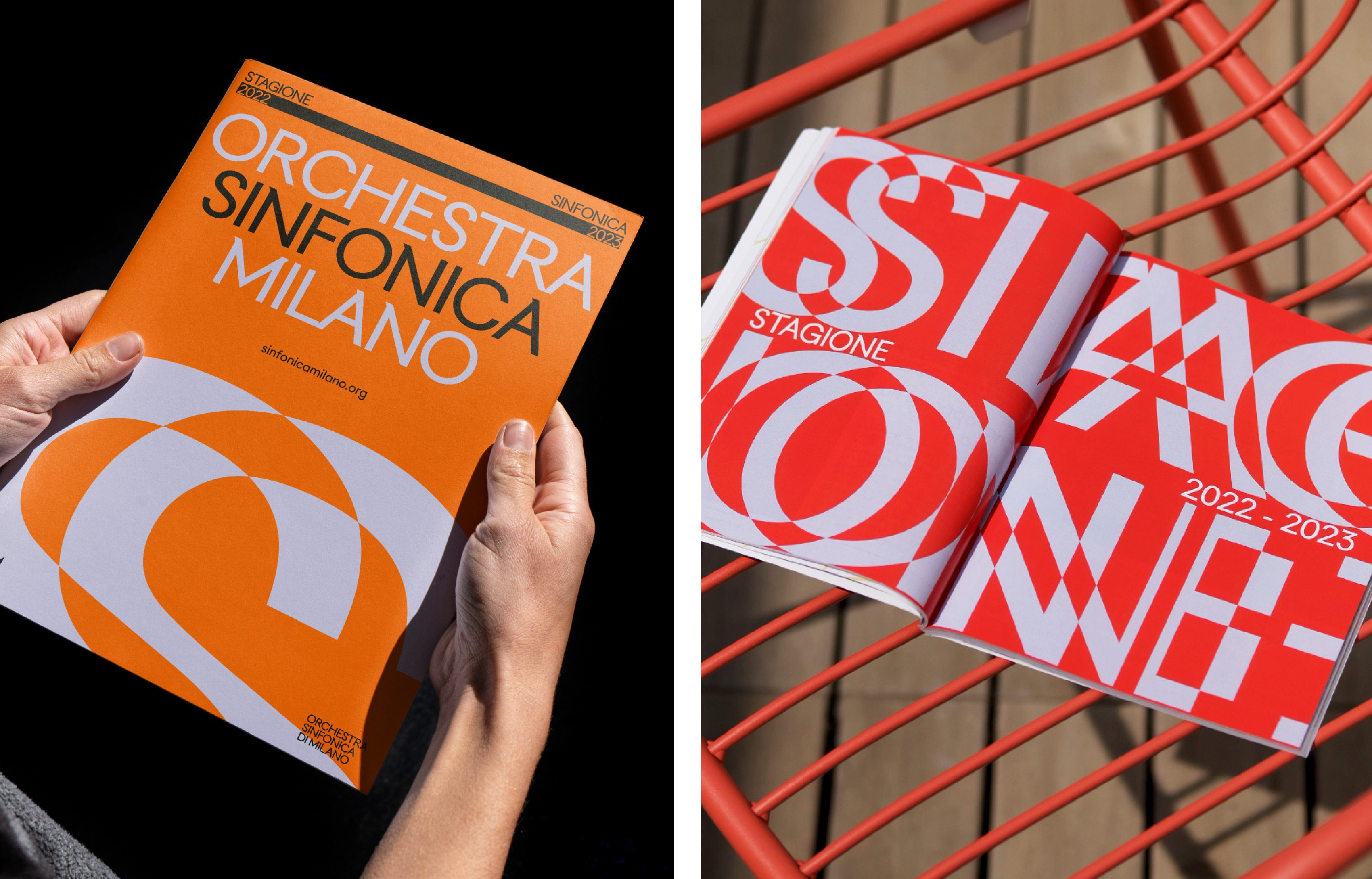
Orchestra Sinfonica di Milano by Landor & Fitch
Opinion by Thomas Barnett Posted 2 November 2023
In the words of synesthete Johann Wolfgang von Goethe, ‘music is liquid architecture; architecture is frozen music’. Unlike 19th-century architecture, contemporary graphic design is afforded no such static reprieve – it faces the challenge of animating the ‘universal language’. Whereas once the plastic arts could content themselves with merely freezing music, any contemporary attempt to visually translate music must now aim for warm, beating, liquid life.
The question of how to capture sound in visual form is an endlessly thrilling brief for designers. So it is with considerable envy, as well as admiration, that I examine Landor & Fitch’s recent brand identity for the Milano Orchestra Sinfonica.
All orchestra brand identities must live or die in the shadow of Studio Dumbar’s collaboration with Amsterdam Sinfonietta, a formidably impressive project that began in 2006 but reached its peak in 2018 with the launch of a new identity. Studio Dumbar generated some of the most truly beautiful poster designs of the century so far (for which it was rightfully awarded a D&AD yellow pencil in 2014).
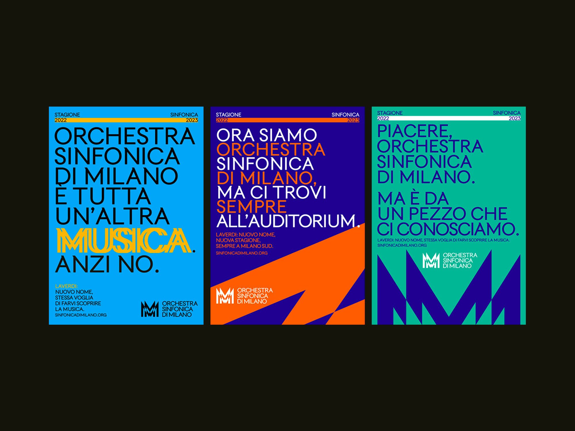
Landor & Fitch’s work bears striking similarity – and not just because it also managed to bag a coveted yellow pencil. The typographic artwork, sharply angled intersecting shapes coloured in vivid contrasting palettes all speak of a visual debt to Studio Dumbar’s work. So what distinguishes Landor & Fitch’s project beyond being more of a good thing? It’s a tricky question that casts a faint shadow over my (very great) enjoyment of the identity. Perhaps it can be best answered by observing that where Studio Dumbar’s concept revolves around those stellar posters, Landor & Fitch brings a digital-first focus to make the work a fully-fleshed out identity, full of surprising, evocative and precisely-crafted movement. While comparing pencils is as facile as it euphemistically sounds, it is nevertheless telling that Dumbar won its yellow pencil in the poster design category, while Landor & Fitch won its for branding.

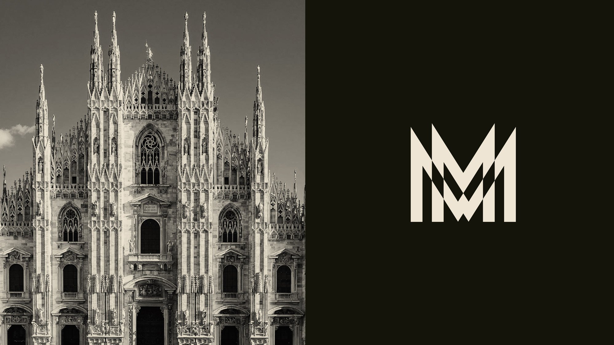
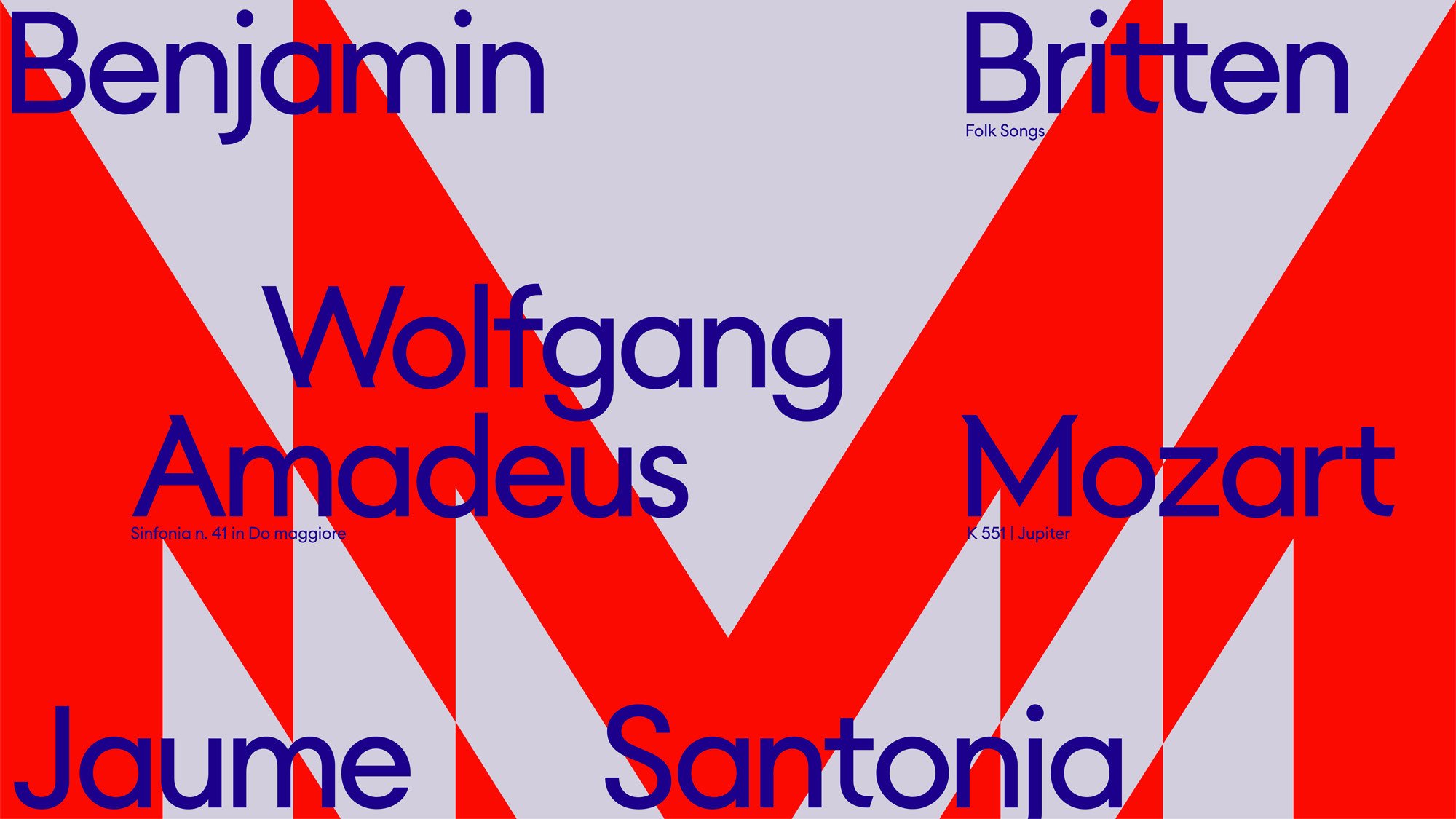
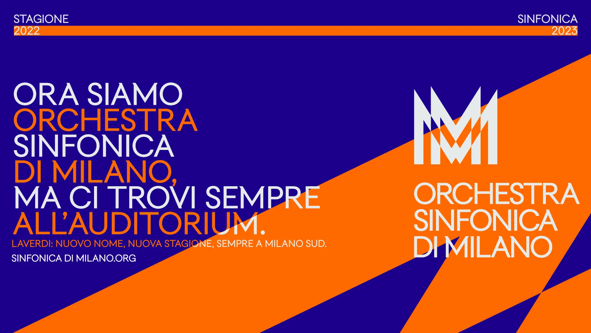
The primary asset is a versatile logomark in the form of two overlapping and intersecting ‘M’s, forming a spiky four-pronged crown that echoes the angular architecture of Milan cathedral. This visual linkage to a specific sense of place reflects a key tenet of the project, which also included changing the name of the orchestra from LaVerdi (a canny move, as was the decision to entirely abandon the shockingly uninspired accompanying branding).
The logo is enriched with well-considered animation that expresses visual reactions to sound (the range of motion is broken down into ‘circular’, ‘reaction’, ‘diffusion’ and ‘amplitude’, though the range of expression is potentially limitless). Other typographic elements are similarly allowed to flex, vibrate and quiver to whatever piece of music is played. The motion is mostly restricted to playful demonstrations of how the quality of single notes from individual instruments could be captured. It will be interesting to see if this typographic framework is also up to capturing the majesty of complicated multi-instrument movements, the current bar for which is set by the stunningly complex animations created for the London Symphony Orchestra by Superunion in collaboration with digital artist Tobias Gremmler, based on motion-data captured from conductor Sir Simon Rattle’s movements.
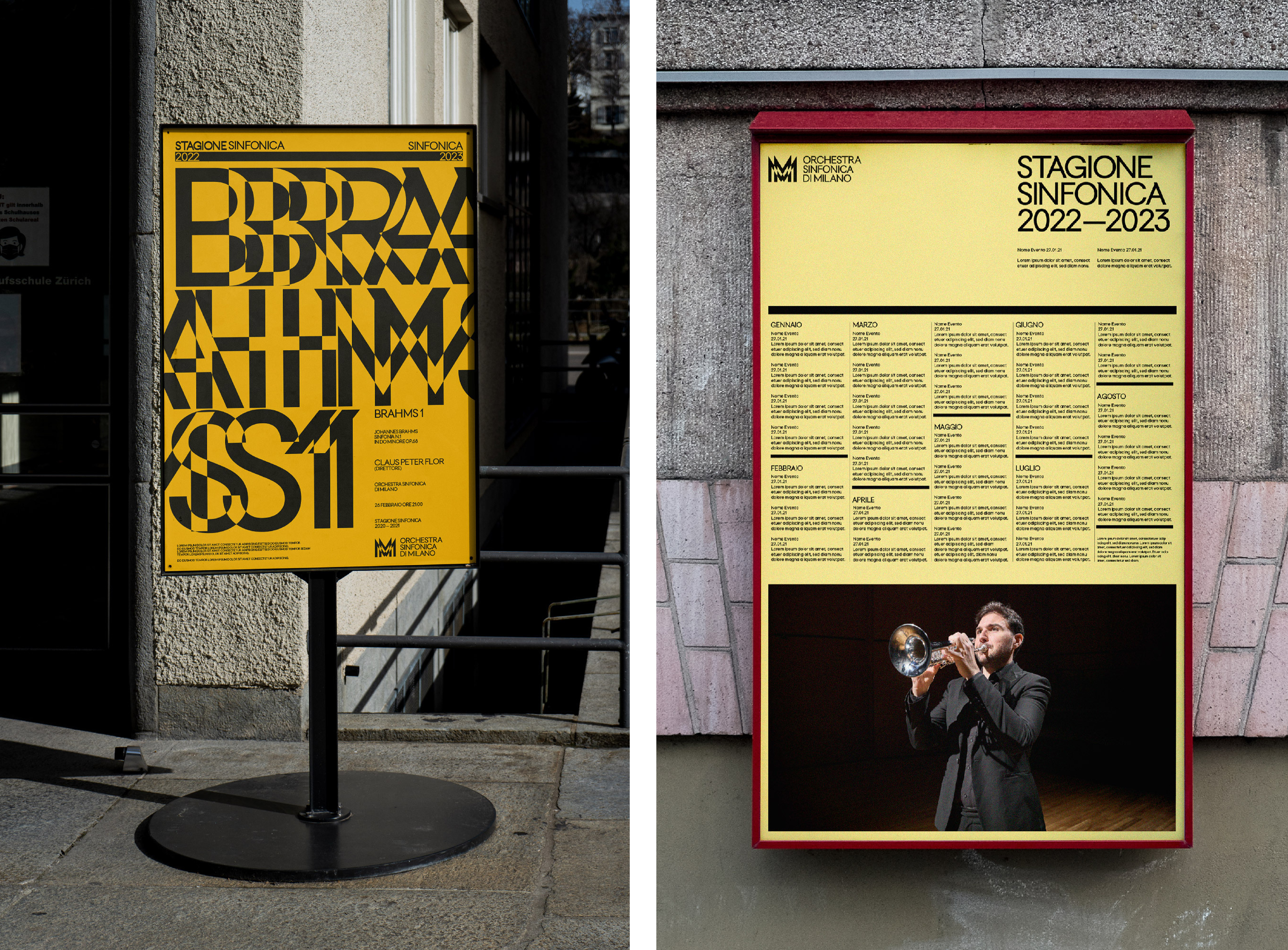
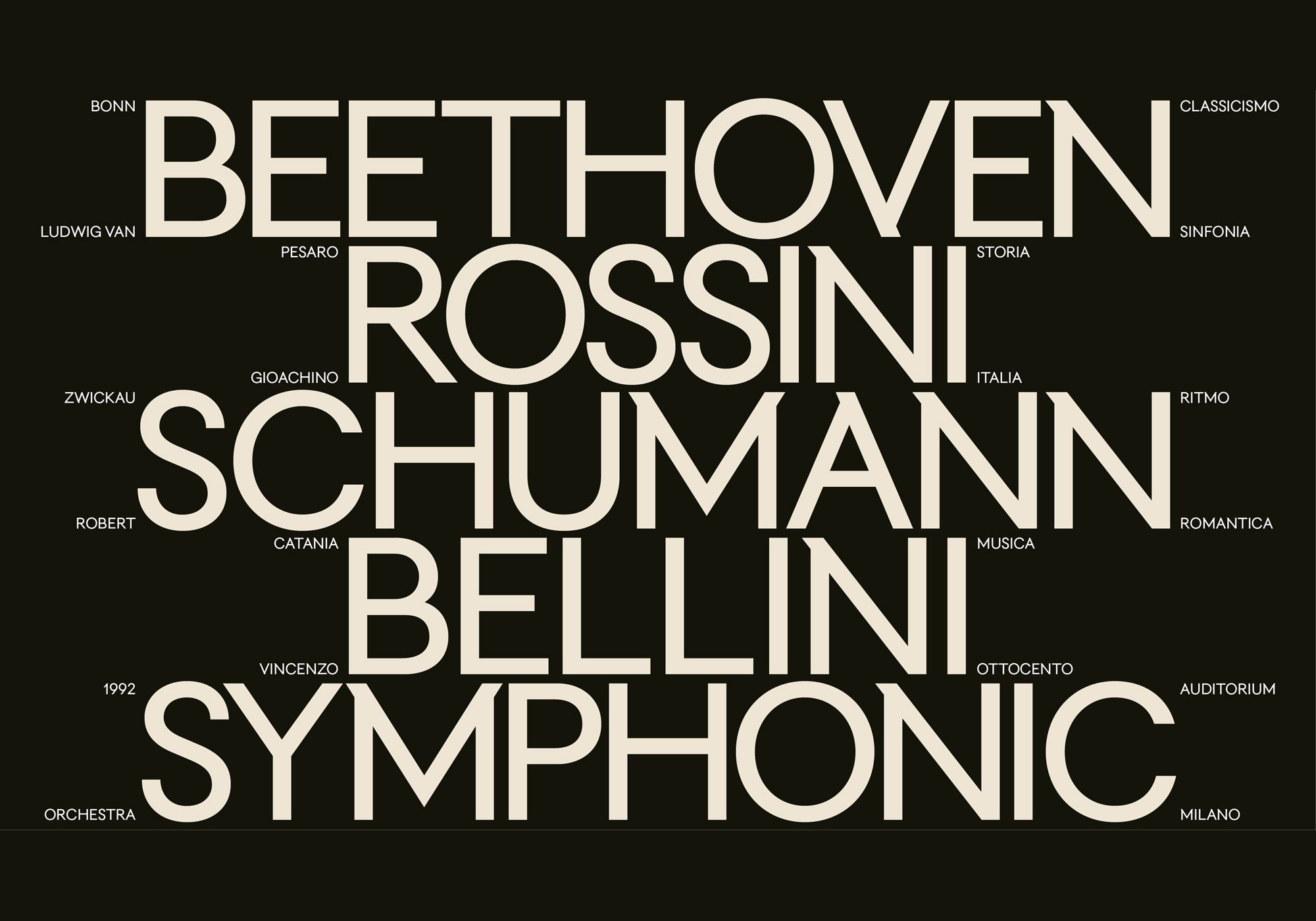
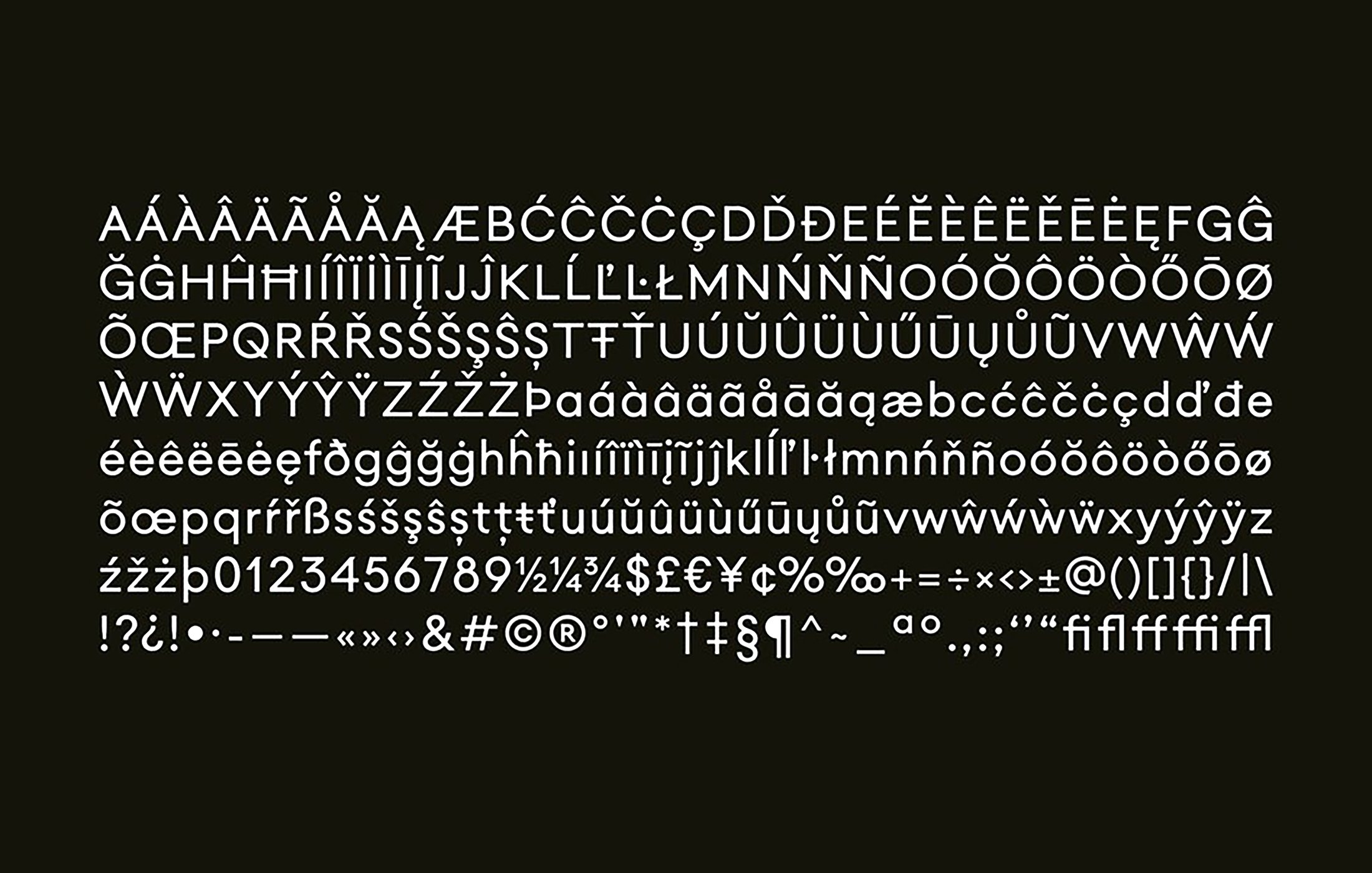
When not in glorious motion, the logomark is locked up with a logotype set in the custom created brand font ‘TUMB TUMB’. TUMB TUMB is an interesting semi-serif, with select upper-case characters featuring diagonals (A, N, M, V and W) being picked out with subtle modernist serifs. Landor & Fitch offers that ‘the small serifs are inspired…by the juxtaposition [with Milano Cathedral] of the facades of the buildings from the early 1900s’, as well as the historical design of Futura, which is (apparently) closely linked to the city, despite being designed in Frankfurt. The design is subtle and provides a pleasingly disrupted visual rhythm that is nonetheless subtle enough to preserve legibility, passing unnoticed until you take a second look.
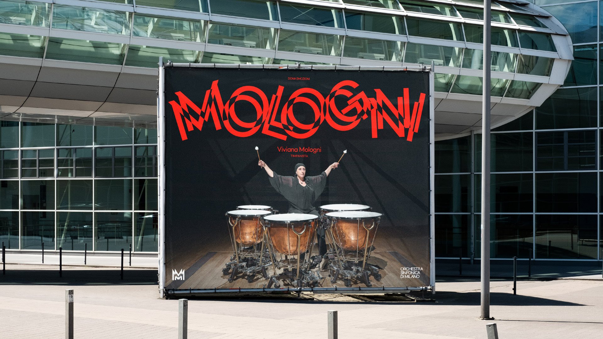
The name of the font and more broadly the onomatopoeic typographic illustrations are lifted directly from the work of Filippo Tommaso Marinetti, the leading figure of the Italo-centric international futurist avant-garde that burned brightly in the early 20th century but was all but swallowed up by the First World War (for an interesting discussion of how Italian Futurism’s uncompromising iconoclasm prefigured and paved the way for fascism, read this article). Particularly explicit reference is made to his illustrated work Zang Tumb Tuuum: Adrianopoli Ottobre 1912: Parole in Libertà (1914).

Futurism is not a ghost to invoke lightly. After scrolling through a few pages of this radically, dazzlingly, violently progressive artistic movement, flicking back to Landor & Fitch’s work feels slightly tame. Of course, stopping short of a visual style so furious that it segued neatly into the fireball of global war and prefigured the rise of nationalist fascism is probably a wise move in corporate branding, but one still longs for a little more of that sense of teetering-on-the-brink-of-ecstatic-chaos that is the province of much great classical music…and of Studio Dumbar’s work for Amsterdam Sinfonietta.
But then perhaps that is the genius of Landor & Fitch’s work – that it flirts with the blistering complexity of Beethoven and Stravinsky, yet manages to synthesise it into what is obviously an extremely usable identity. There is plenty of room for expressive flourishes, but it is nonetheless governed by the clear rules and restraint prerequisite to operating successfully and accessibly in the unforgiving world of modern UX and web environments (a potential weakness of Studio Dumbar’s work for Amsterdam Sinfonietta, but you certainly didn’t hear it from me!). Milano Orchestra’s website has evidently only been lightly reskinned so far with the new logo and fonts, but it is clear that Landor & Fitch’s work will effortlessly translate to gorgeous web design. This rebrand is a quintessentially Milanese melody of avant-garde ebullience that has been carefully bottled, but is still potently effervescent.
