Tigre by Triboro
Opinion by Emily Gosling Posted 22 August 2024
LES Tigre – not to be confused with seminal electroclash/riot grrrl combo Le Tigre – is a cocktail lounge in Manhattan’s Lower East Side area, which opened at the end of last year and apparently combines ‘sophistication and refinement in drink, sound and ambiance’ with an entrance that boasts ‘an original graffiti-worn door’. So far, so hip, amirite?
It all certainly seems incredibly swanky – despite that edgy door – and as such, it needed an identity and designs to match. Brooklyn-based design studio Triboro stepped up to the plate on that front, and there’s no doubt that its branding for the site reflects what the bar itself describes as Tigre’s ‘encapsulation of the duality of the Lower East Side, with one foot in the past, and another in the future, all underscored by a studied understanding of contemporary style’.
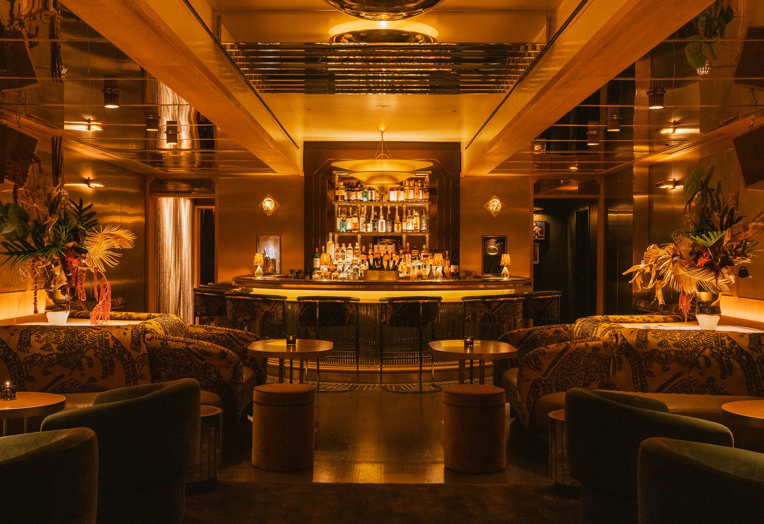
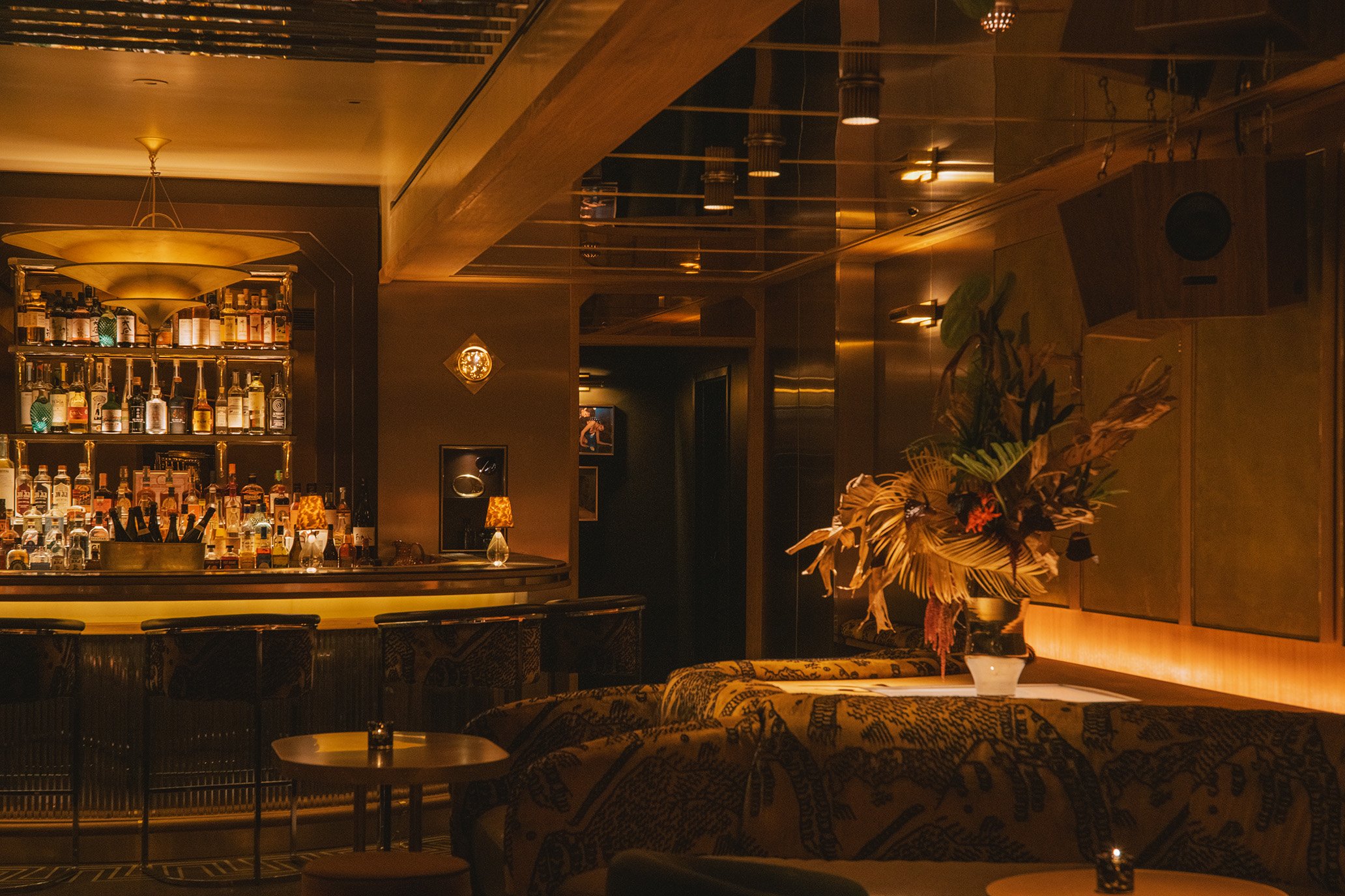
Triboro was brought onto project having worked with Tigre’s founders on designs for restaurants including The Golden Hour and Sauvage; and it says that on the Tigre work, the bar’s interior designs by New York-based practise Studio Tre heavily informed the look and feel of the branding.
The designs, which are used across menus, matchboxes, the Tigre website, business cards and other stationery, and more look to channel Studio 54 era glitz through touches like lush fabrics, mirrors and other reflective surfaces. ‘I think someone described it to us as a glittery jewel box in an early meeting, which sounded quite evocative and stuck in our mind’, says Triboro.
While the studio wouldn’t usually take a site’s interior designs as a direct influence on its graphics – instead often taking a ‘counter statement’ approach, it says – with Tigre, Triboro felt that the decor and spirit of the place, with its subtle references to the gritty former Lower East Side and its music scene, were perfect for the graphics concept.
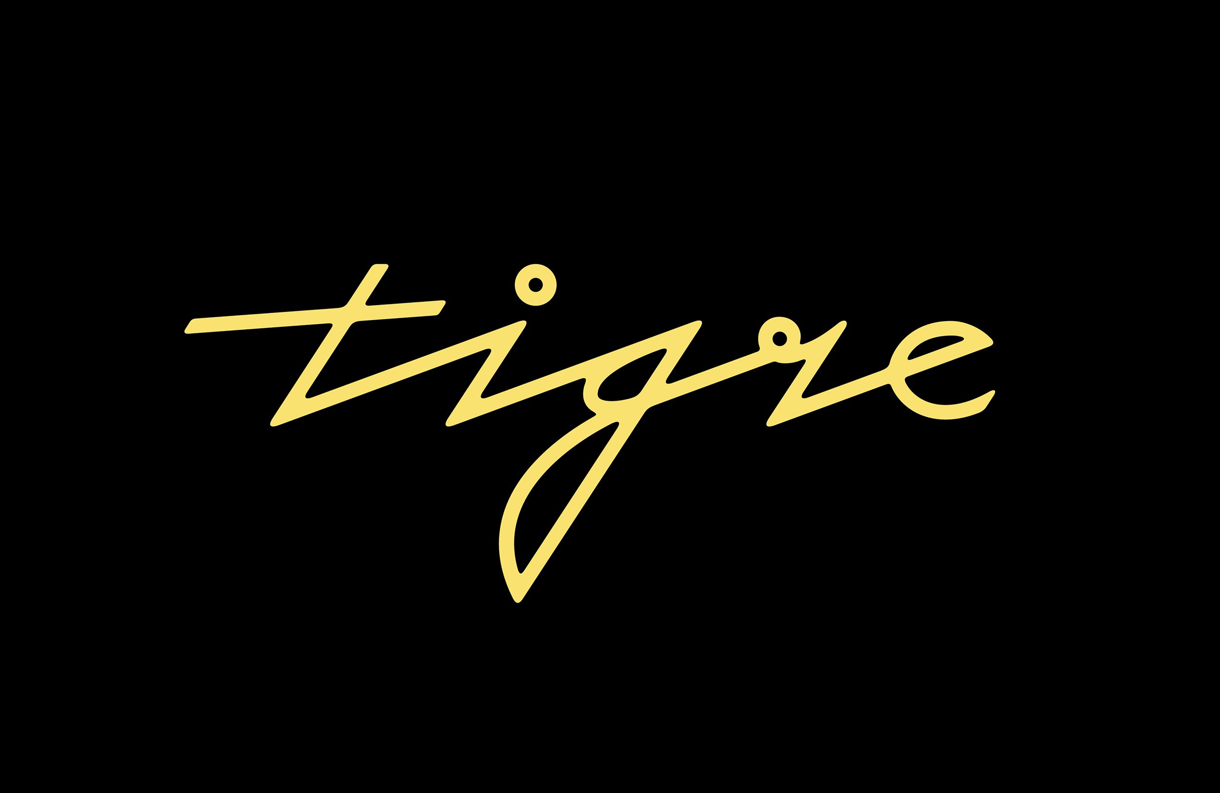

None other than Grace Jones emerged as a key influence on the typographic approach. Apparently, her name was mentioned many times during early meetings about the project, and this led the studio to thinking about her art/design collaborator Jean Paul Goude – namely, the iconic yellow poster for the single I’ve Seen That Face Before.
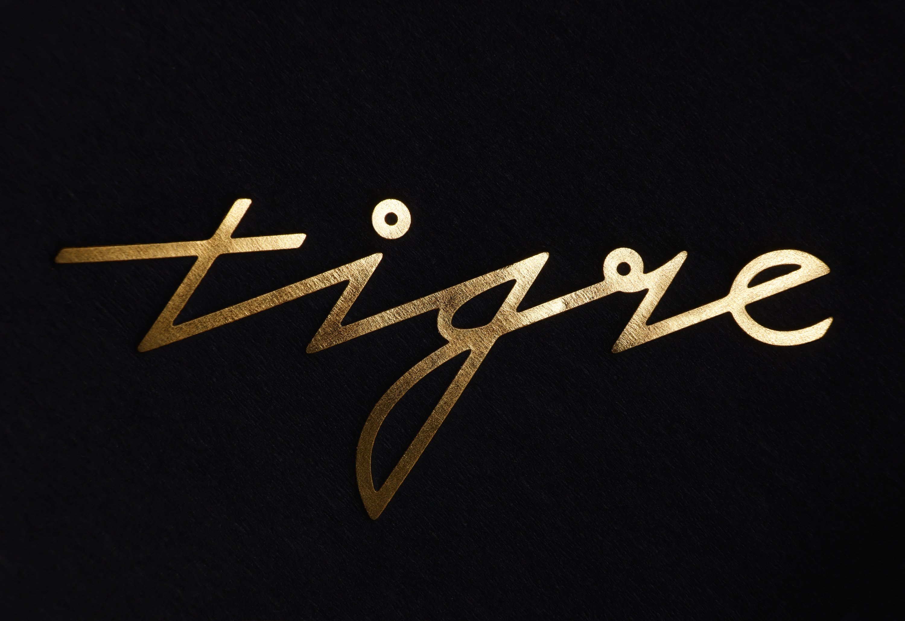
Aside from the deliciously spiky wordmark, the type is more pared back: for menus and other text applications such as business cards and online, Triboro paired perennial Linotype classic Franklin Gothic Condensed and a tightly spaced form of Söhne Breit, which its New Zealand-based creators Klim Foundry describe as ‘the memory of Akzidenz-Grotesk framed through the reality of Helvetica‘, and which references the type of the NYC subway system, rooting the identity even more firmly in its LES home.
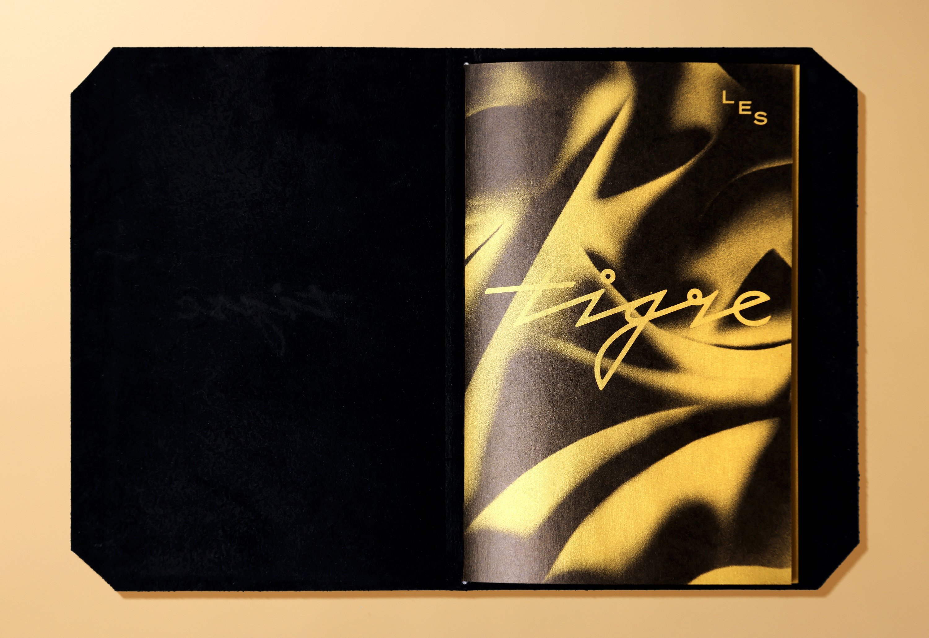
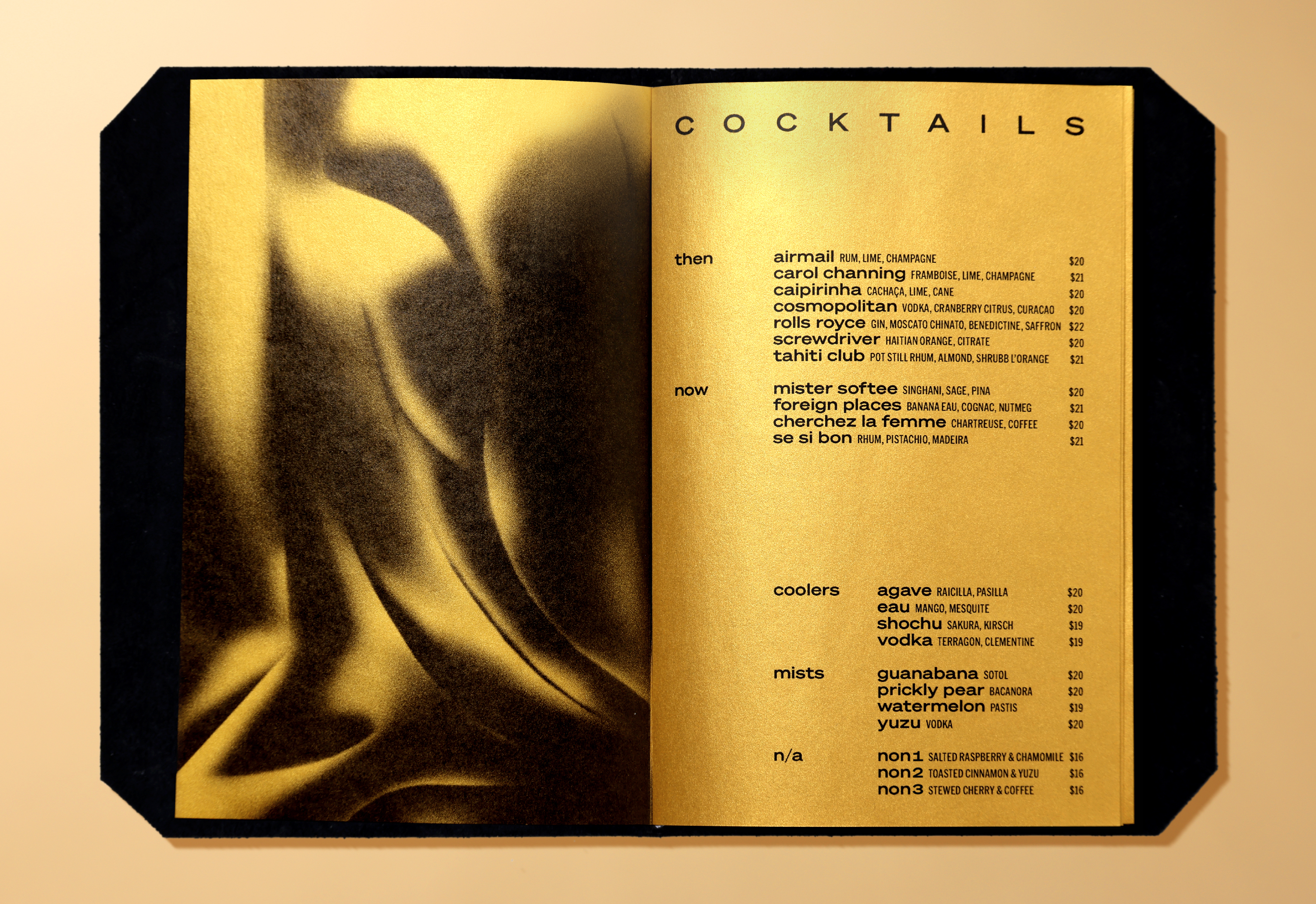
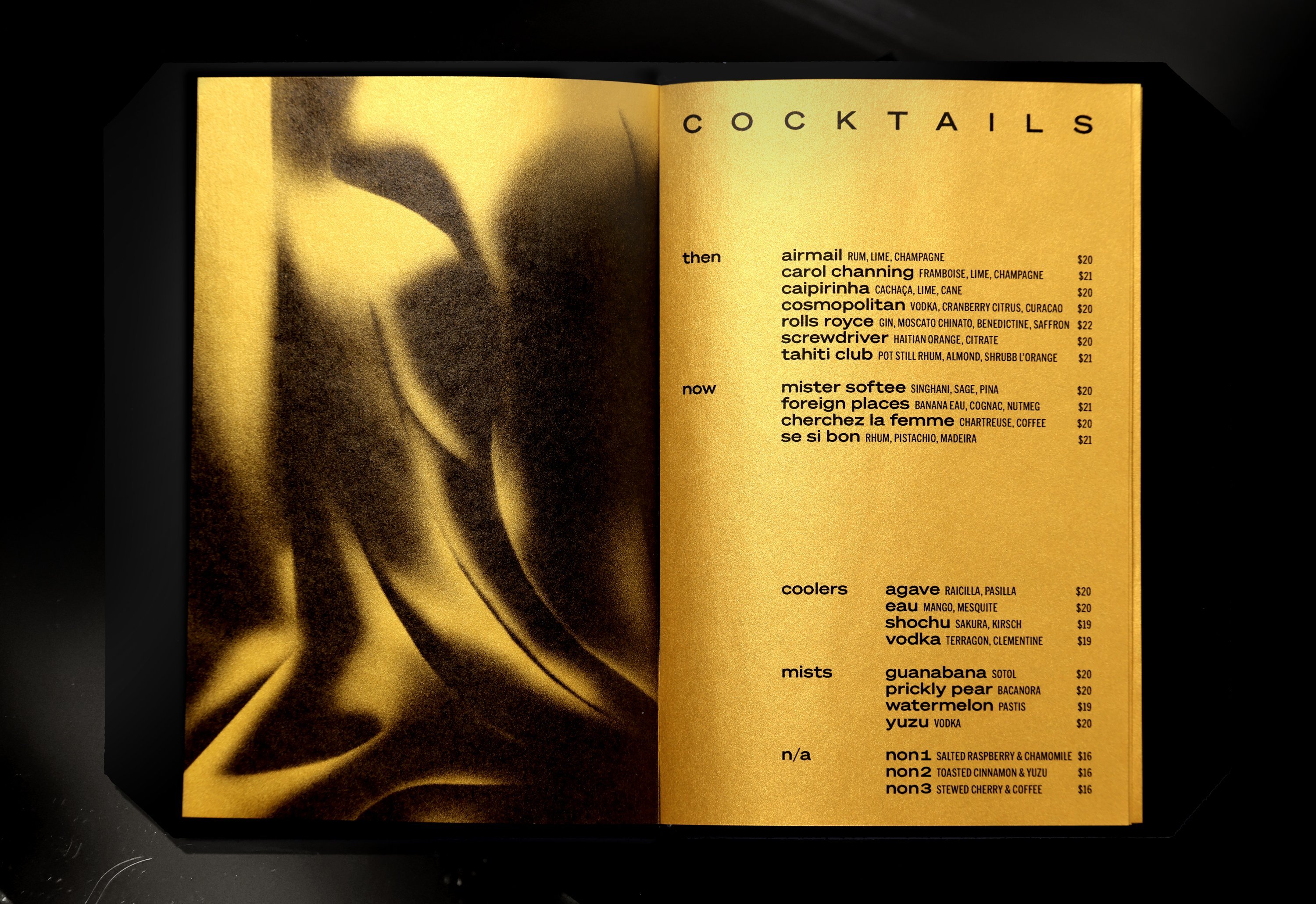
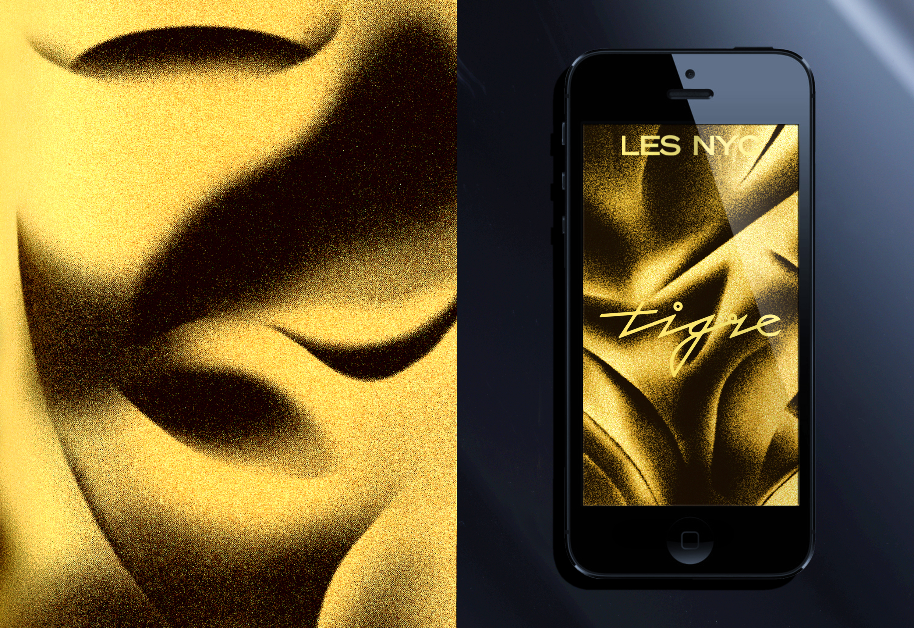
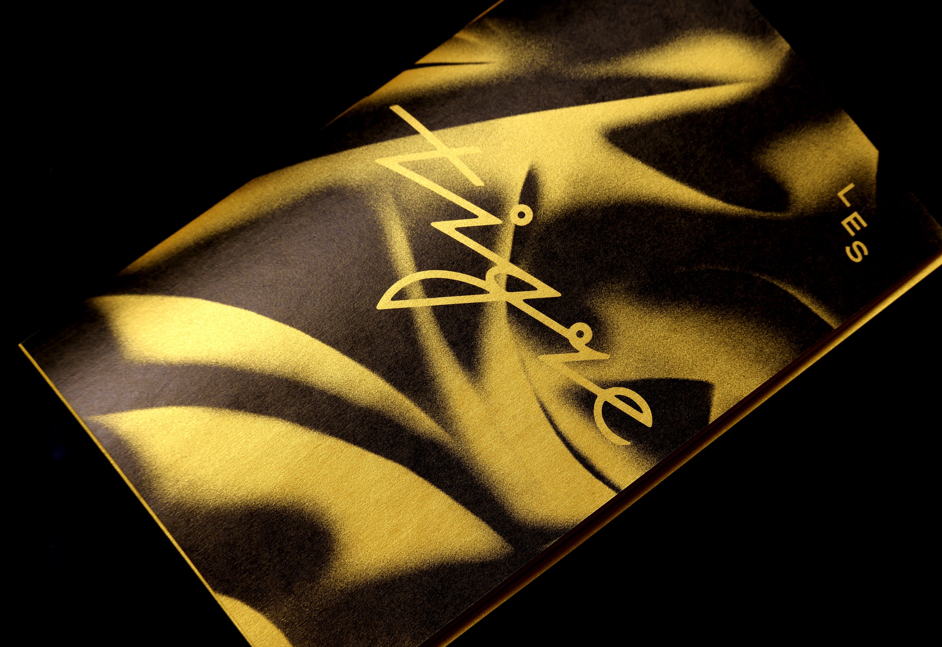
The menu is perhaps the best encapsulation of the branding system and the way its multifarious reference points coalesce into a smart, sophisticated singular design approach. The non-text-based pages use impressionistic, velvety tiger stripe-like imagery that heightens the glitter thing and takes it beyond bling and into a far more classy realm. To create these graphics, Triboro first painted a large abstract composition in Photoshop and used different tightly cropped sections from it for various applications across the branding.
If the whole Studio 54 vibe inspired the glammy side of the identity, and the 1970s and 80s downtown music scene informed the typography, these graphics look further back to the 1920s according to Triboro, which says it looked at early abstract photography – in particular, the work of American artist Francis Bruguière.
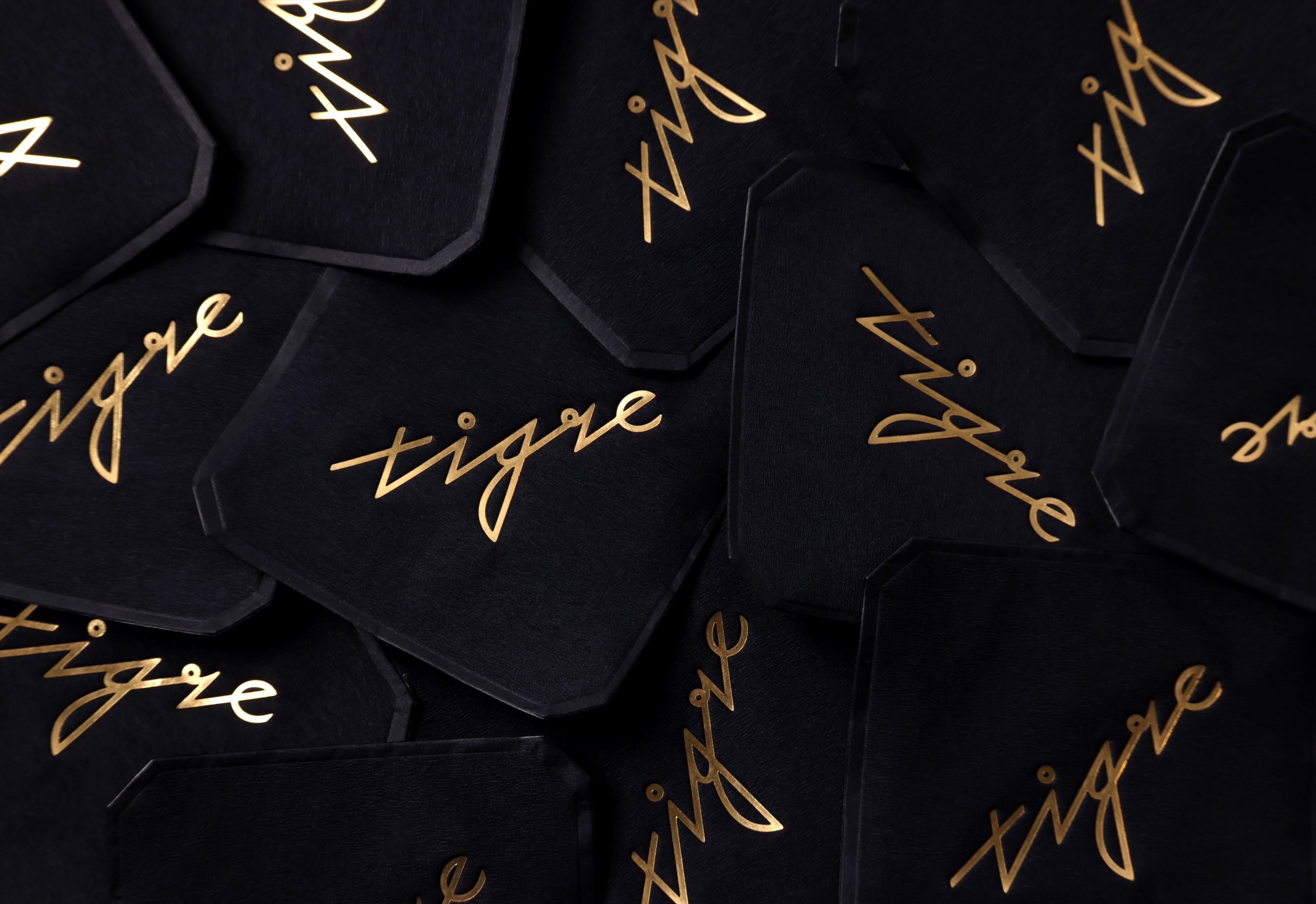
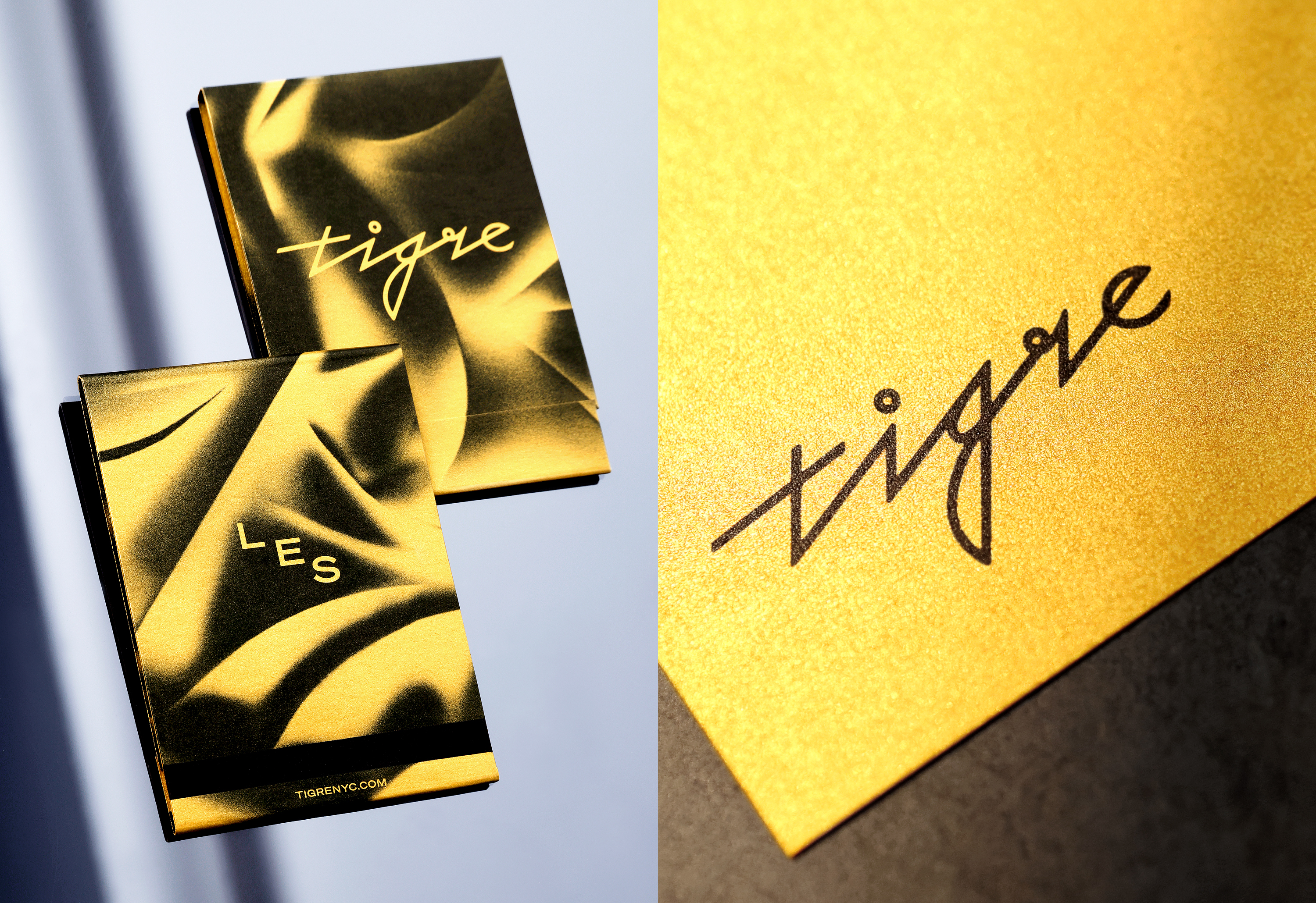
On first glance, the Tigre branding looks deceptively simple: a bit of black, a bit of gold, and some nice type. But this project is clever: it’s so much more than surface level ‘design that looks nice’ – not just thanks to all those hip reference points, but to the way it manifests in the physical realm as much as the two-dimensional and graphic. The tactility of the whole thing is superb: high-end production processes and materials echo the high-end nature of the bar itself, with use of gold foil stamping, splashes of black leather adding a subtly kinky twist, gold paper on the menus to give a louche lushness to it all, and metal details here and there to up the ante even more.
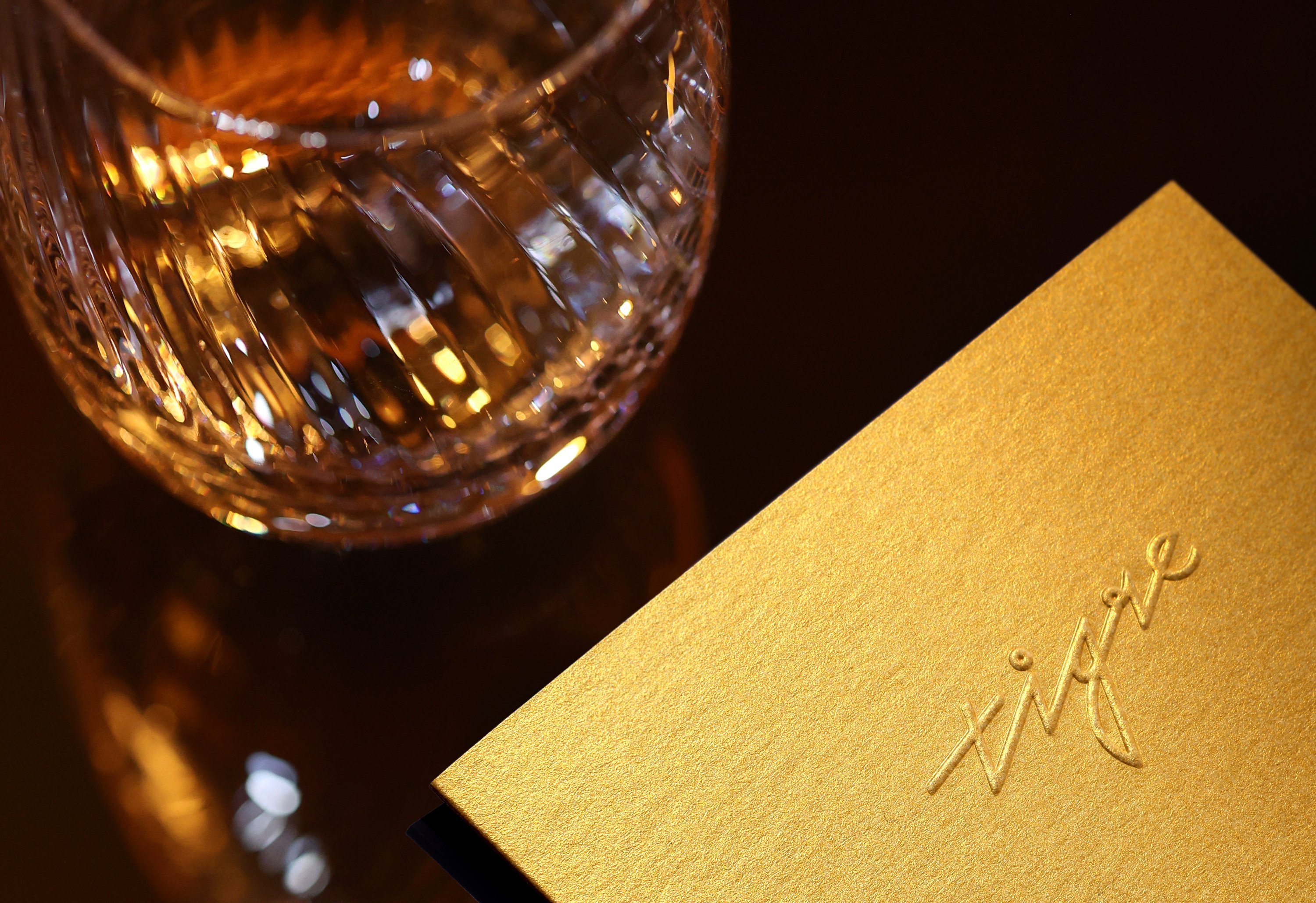
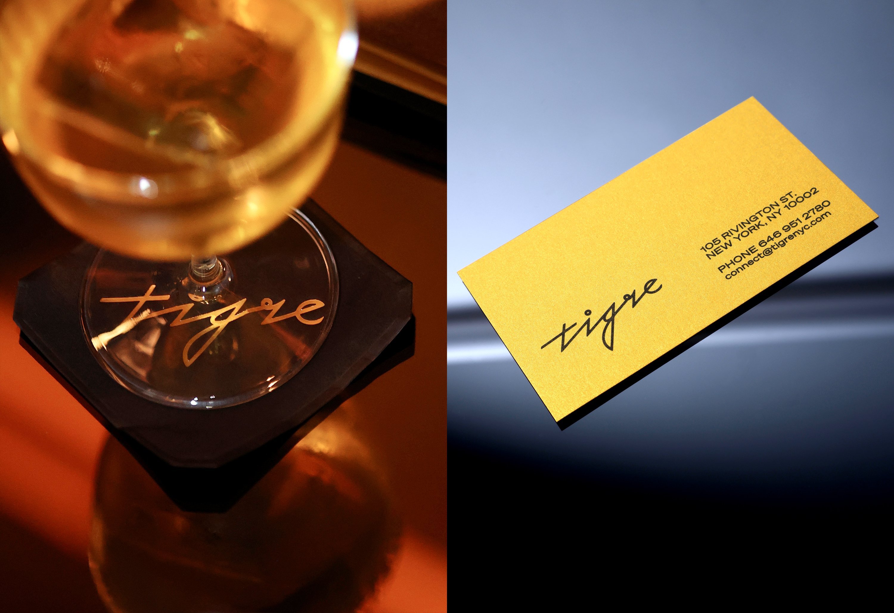
You can almost taste and smell and feel the seductive siren-call of a swanky, ‘hang the expense’ night out in the look and feel of it all: the space itself – all dark and sexy and just generally a bit luxe – in the black and gold colour palette. And in a rather delightful little twist (though maybe it’s just me) the wordmark’s sharp angles and playful quirks, like the open circle dot on the ‘i’ that matches a flourish where the ‘g’ meets the ‘r’, all feel very electroclash indeed, à la the aforementioned Le Tigre. It’s like it’s 2004 again, but much classier, and thoroughly contemporary – 2004 through the lens of Studio 54, perhaps.
