The Dinner Ladies by Universal Favourite
Opinion by Emily Gosling Posted 24 September 2024
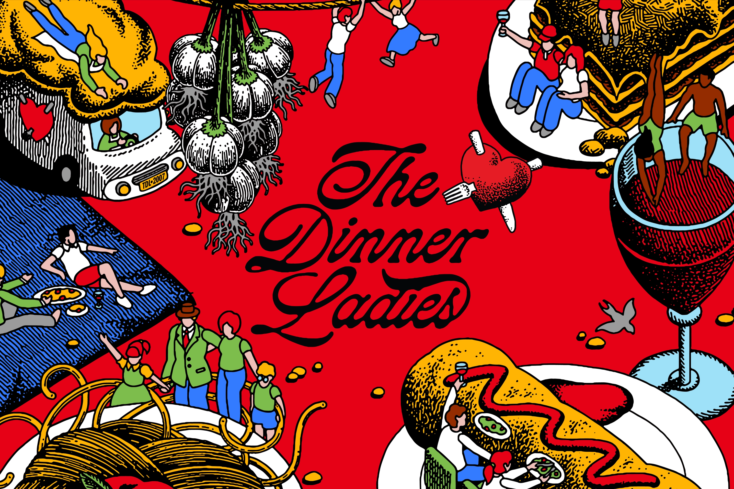
‘Dinner ladies’ doesn’t have the most glamorous connotations in England – depending on your experience at school, it likely conjures up memories of scoops of greying, tepid mash-adjacent slop unceremoniously plopped onto a plate; something to do with turkey dinosaurs; a troop of formidable but visibly jaded people responsible for making every school smell like on-the-turn cottage pie from around 11am most days of the week.
But it turns out ‘dinner ladies’ can mean something a lot less bleak. Australian frozen meal delivery service The Dinner Ladies started life from a Sydney shed belonging to one of its co-founders, and aims to help quell the chaos that often characterises family dinner time. Since its humble beginnings it’s grown into ‘Australia’s hottest frozen meal service’, according to Universal Favourite, the New South Wales-based creative agency that recently rebranded it.
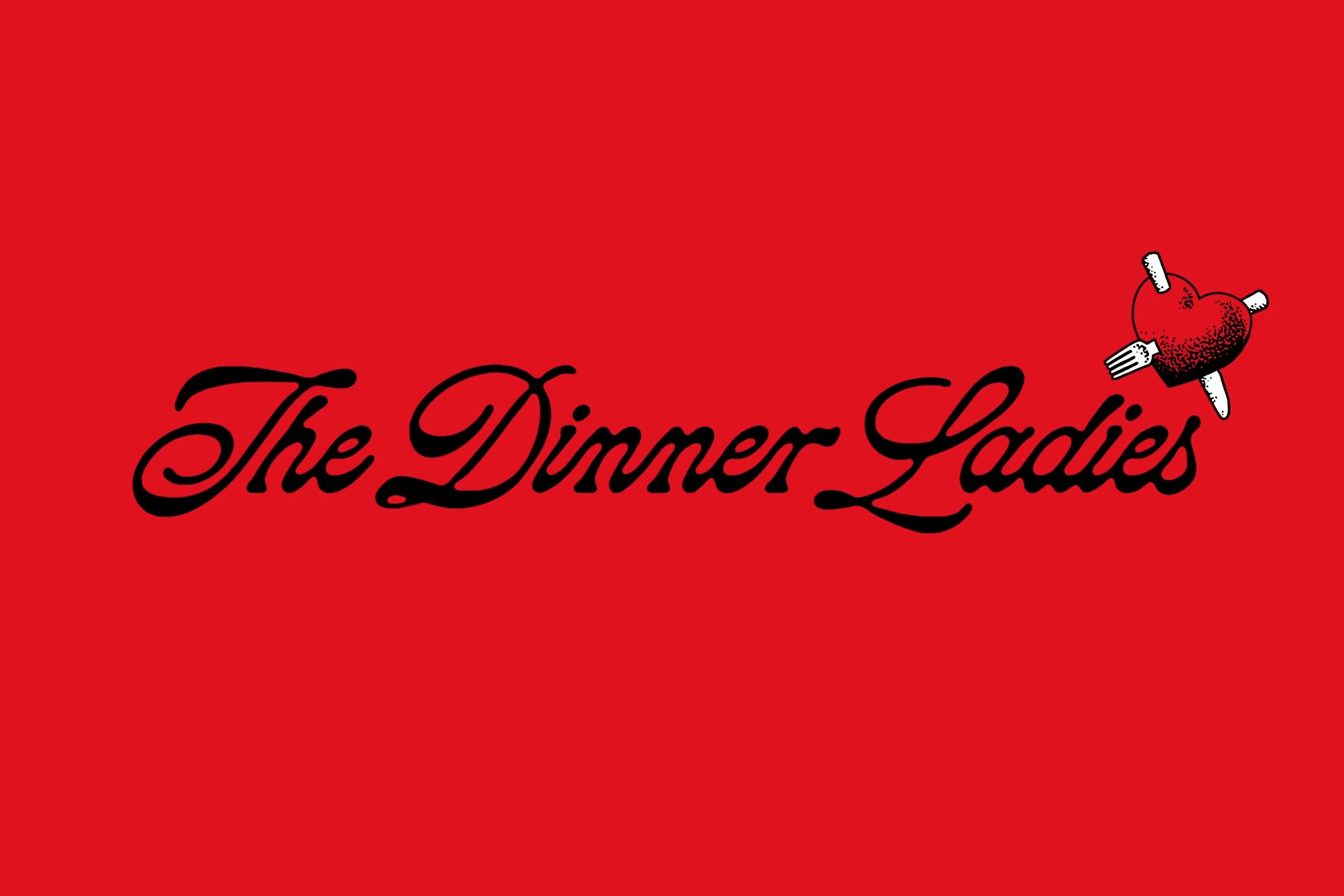
Having been around for 17 years now, The Dinner Ladies was due an update to reflect its growth and remedy the fact that over the years, the visual identity had become diluted and somewhat sprawling – it had ‘lost its attitudinal punch, and needed a big serve of reinvigoration’.
The studio worked across pretty much everything for the ready-to-heat comfort meal company, including verbal and visual identity; tone of voice and copywriting; packaging design; art direction and photography; website design and video. It initially undertook a deep dive into the brand’s history, looking at everything from its past website designs, to poring over logos hand-drawn on an envelope, to visiting the aforementioned shed where it all began.
From this research, the studio cherry picked the most powerful elements from the brand’s history, and updated or reconfigured them to create a cohesive, confident and thoroughly unique look, feel and voice.
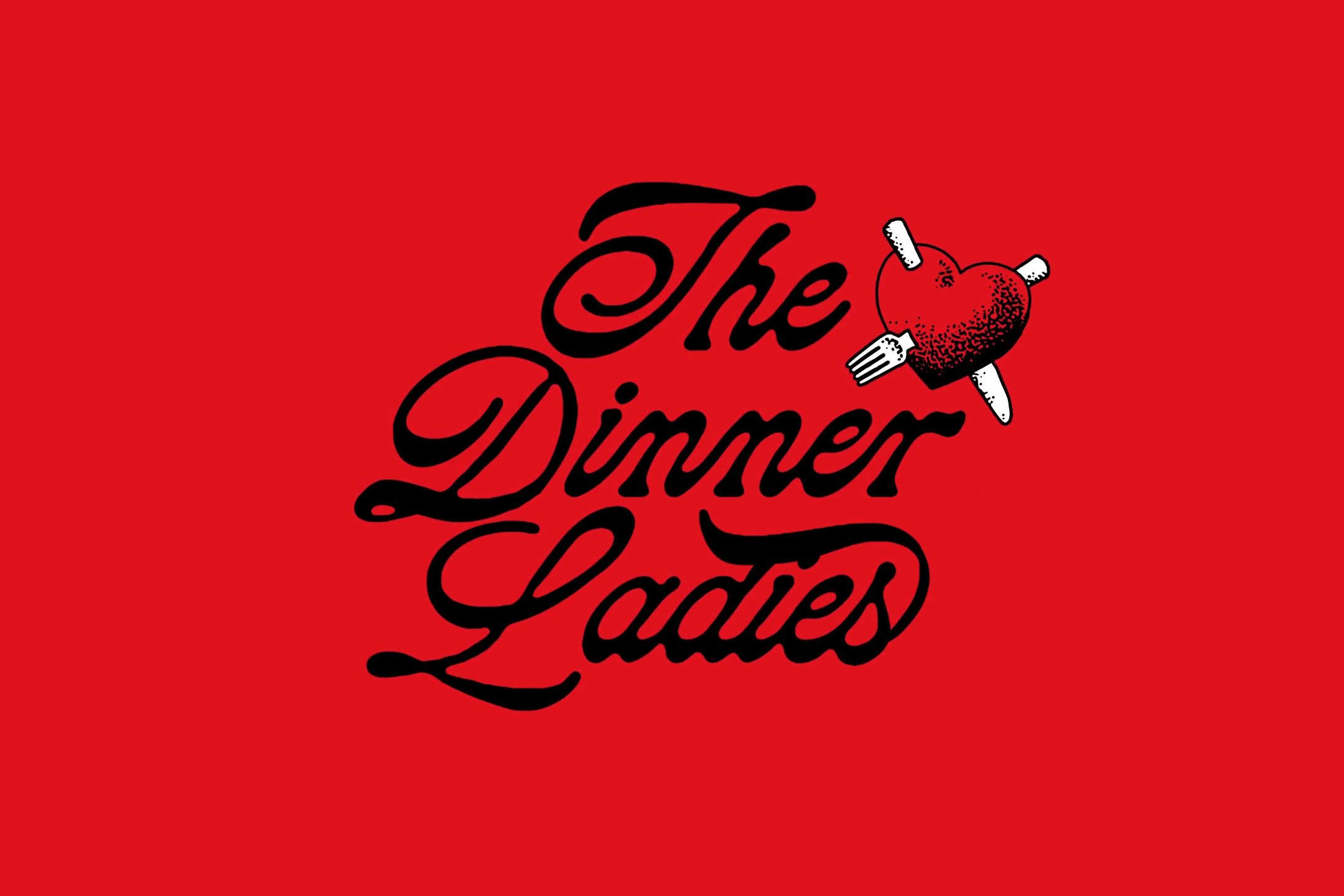
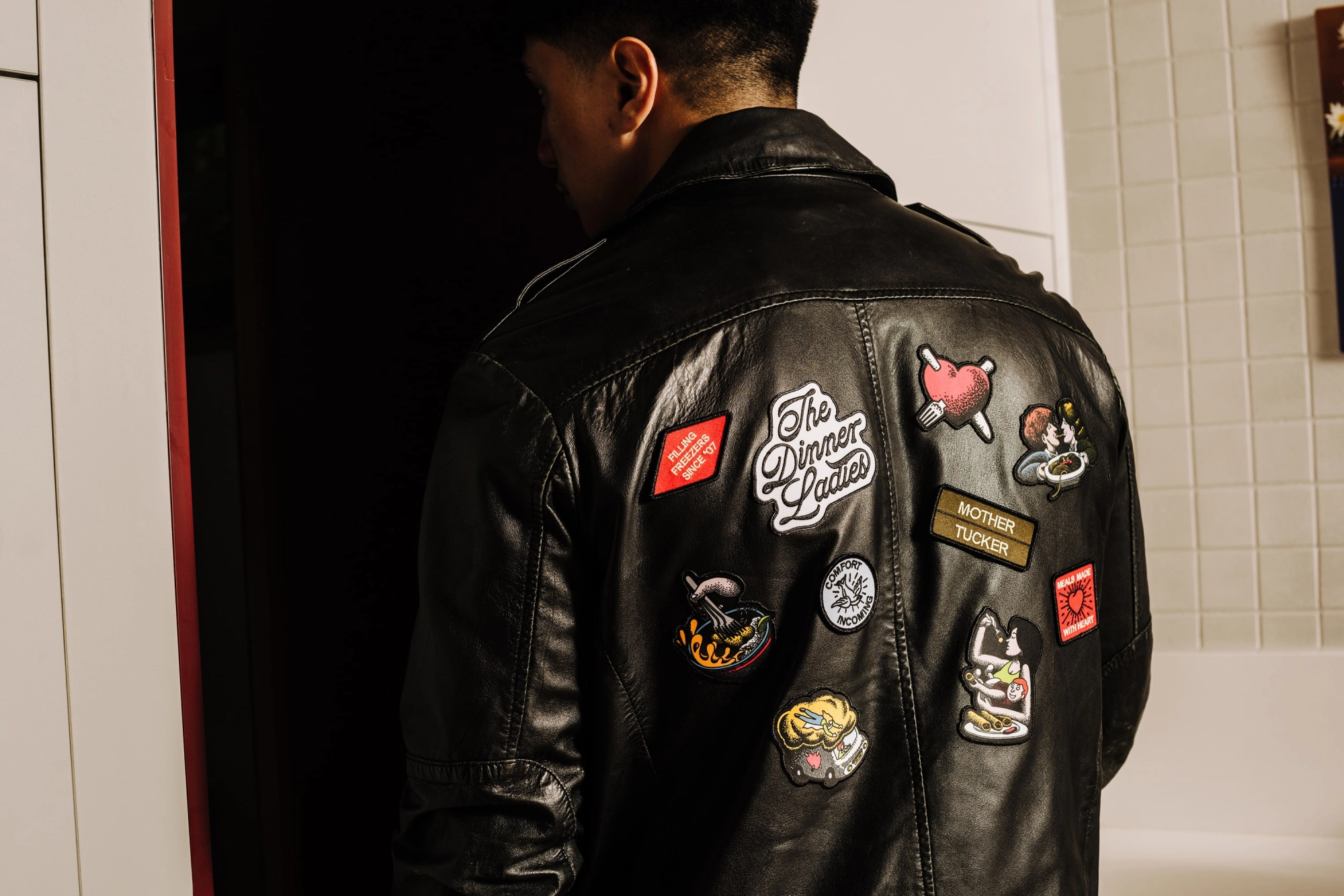
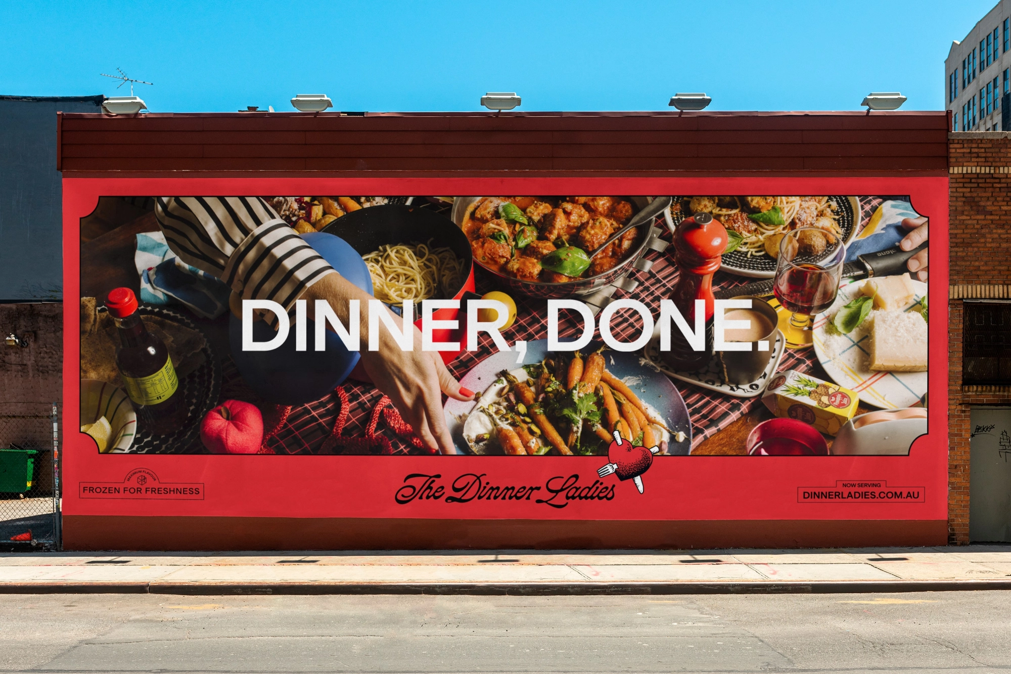
In a way that somehow eschews cliche or cheesiness, a heart is at the, er, heart of the branding. Where the previous designs had this in the form of a slightly dated looking tattoo-style aesthetic, Universal Favourite evolved the graphic through the separation of the heart shape and the scripty wordmark. In doing so, the identity immediately becomes both more contemporary; as well as being far more flexible and easy to scale across multiple different applications.
Illustrator Jake Foreman was commissioned to redraw the new device in his thoroughly distinctive style; it’s textural and somehow faintly antiquated, while still feeling very much 2024. The suite of illustrations act as both storytellers and functional graphic devices that add no end of standout and originality.
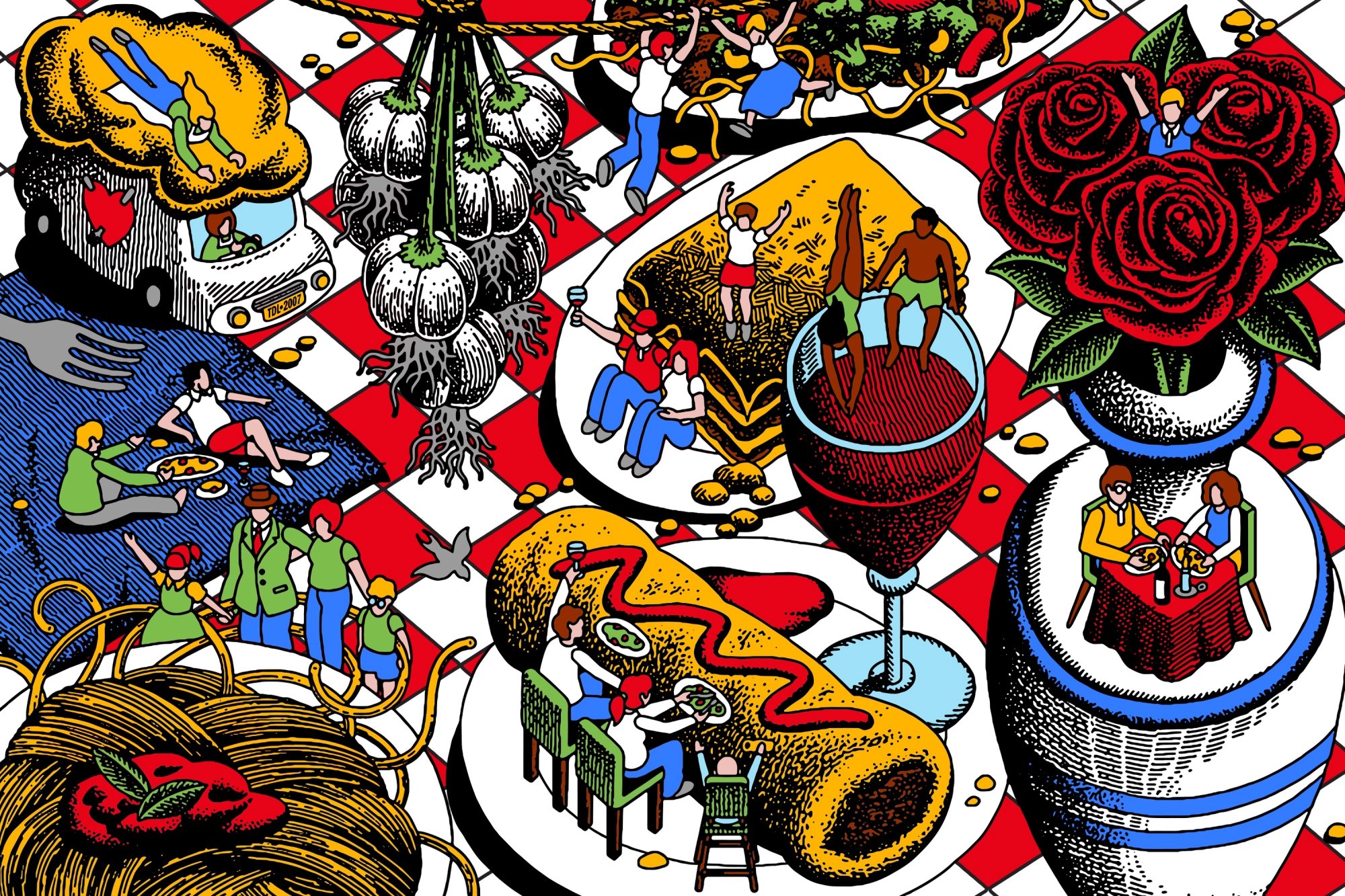
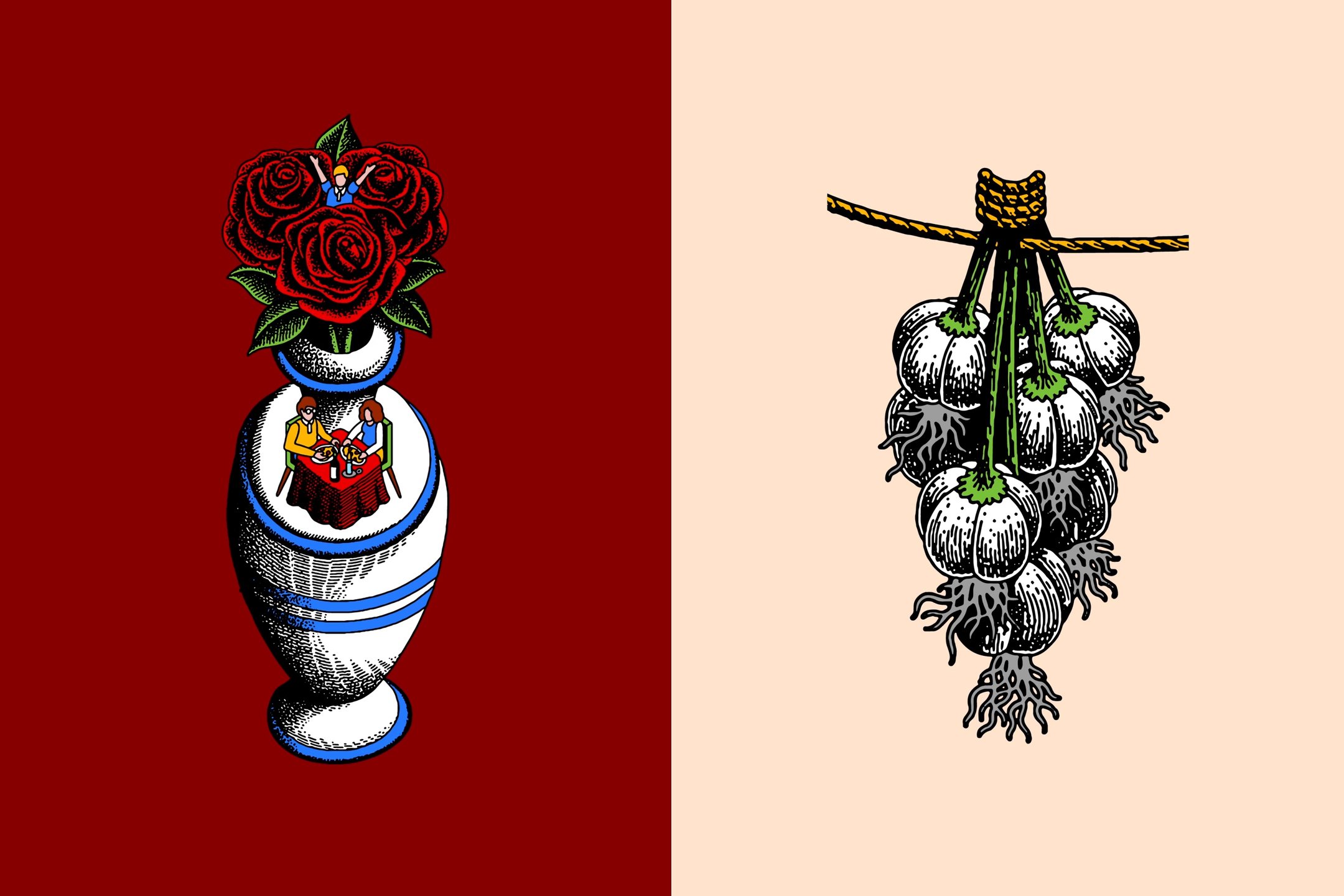
The colour palette retains the former branding’s red – a distinctive asset within the category – but it was tweaked to support the newly dynamic identity designs. Overall, the off-kilter combination of bold, warm but slightly muted colours fits like a glove: it’s bold, but not brash, with muted tones that let the illustrative nuances shine through.
The main wordmark for The Dinner Ladies is a deliciously inky, liquefied script serif; while the supporting type couldn’t be more different in style: the blocky, confident all-caps lettering of Denim by Prague-based Displaay Type Foundry form a no-nonsense counterpoint in headlines and call-to-action text in its Wide weight; while its Regular cut offers a still legible, but slightly less shouty and rather more friendly text for subheadings and bold copy. ‘With its subtle details, the typeface can be an attention-grabbing hero element that showcases the bold tone of voice but also work alongside more expressive moments’, says Universal Favourite.
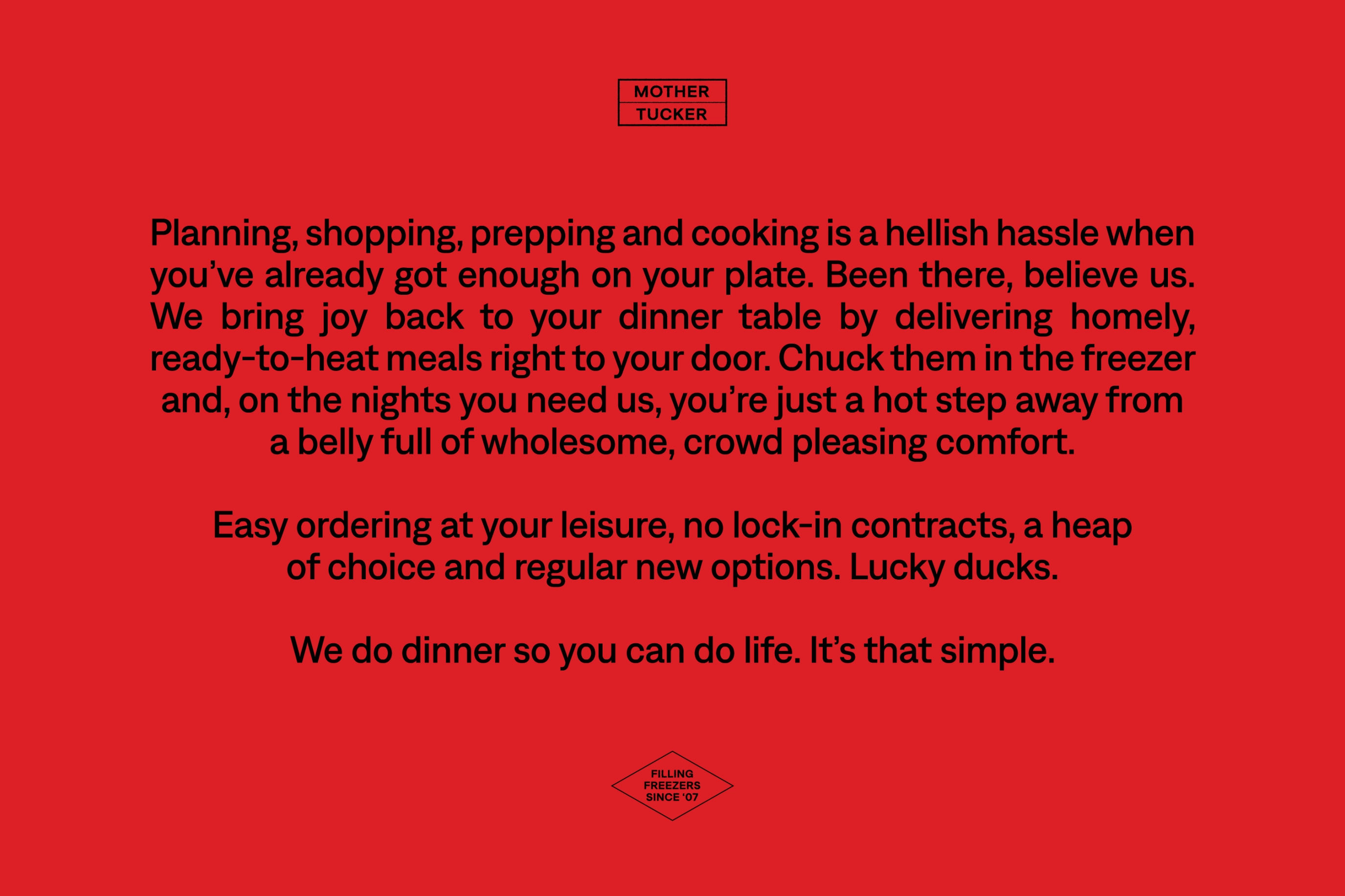
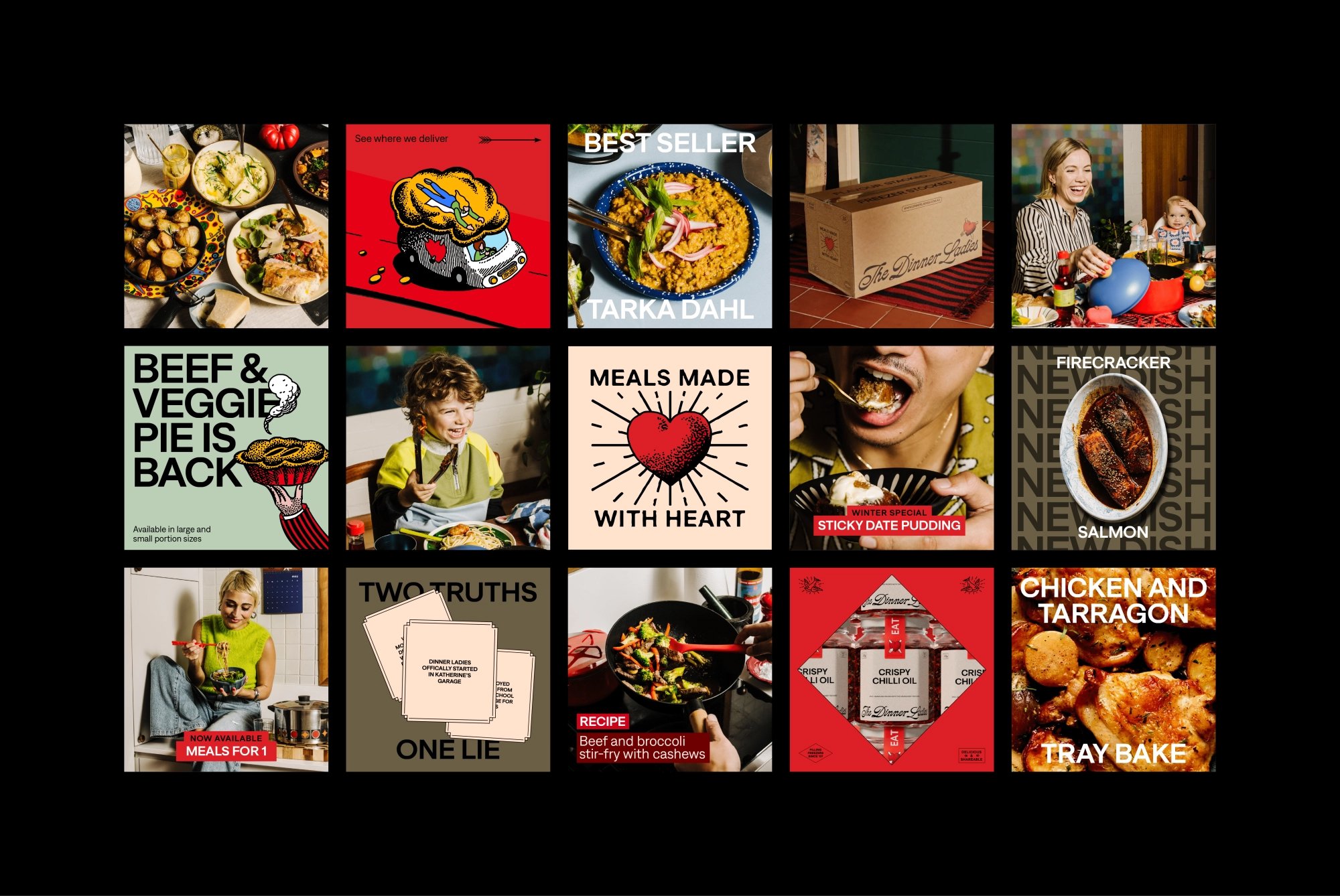
Copywriter Cat Wall was brought in to work on the tone of voice, which is a smart marriage of empathic but not condescending and direct but not brutal. ‘Whack on the oven, we’re bringing dinner’, for instance; or ‘Feet up, heat up, eat up’.
A key aim for the rebrand was helping The Dinner Ladies stand out in what Universal Favouriute describes as ‘an oversaturated landscape steeped in clichés and same-same messaging that claims to be the most healthy, convenient or delicious dinner time solution’. The new designs are anything but cliched; and somehow manage to buck the category trends while also still remaining relatable for The Dinner Ladies’ core clientele – ‘time-poor people who just want simple, genuinely good, homemade meals that help take the pressure off when it’s needed most’.
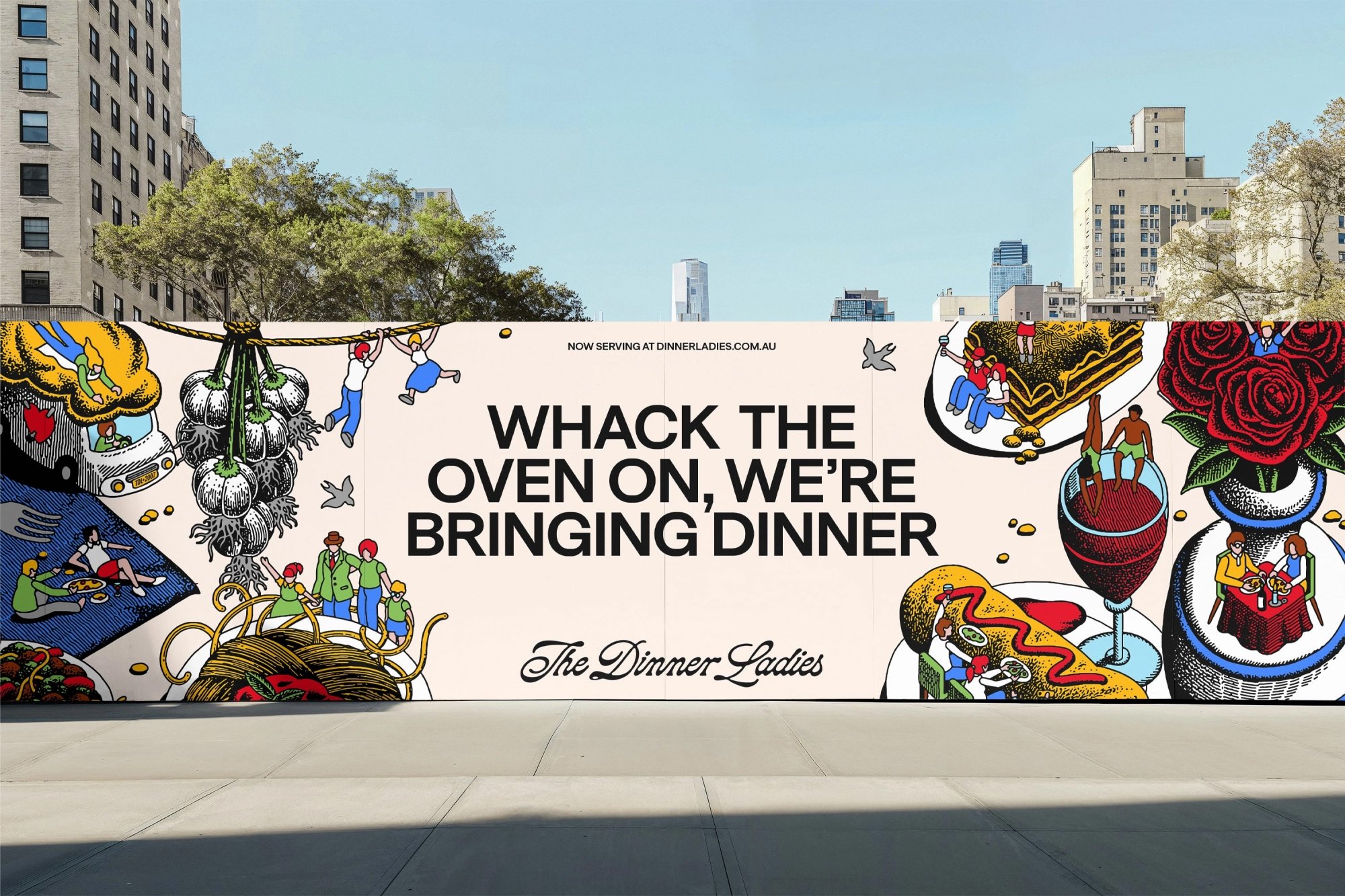
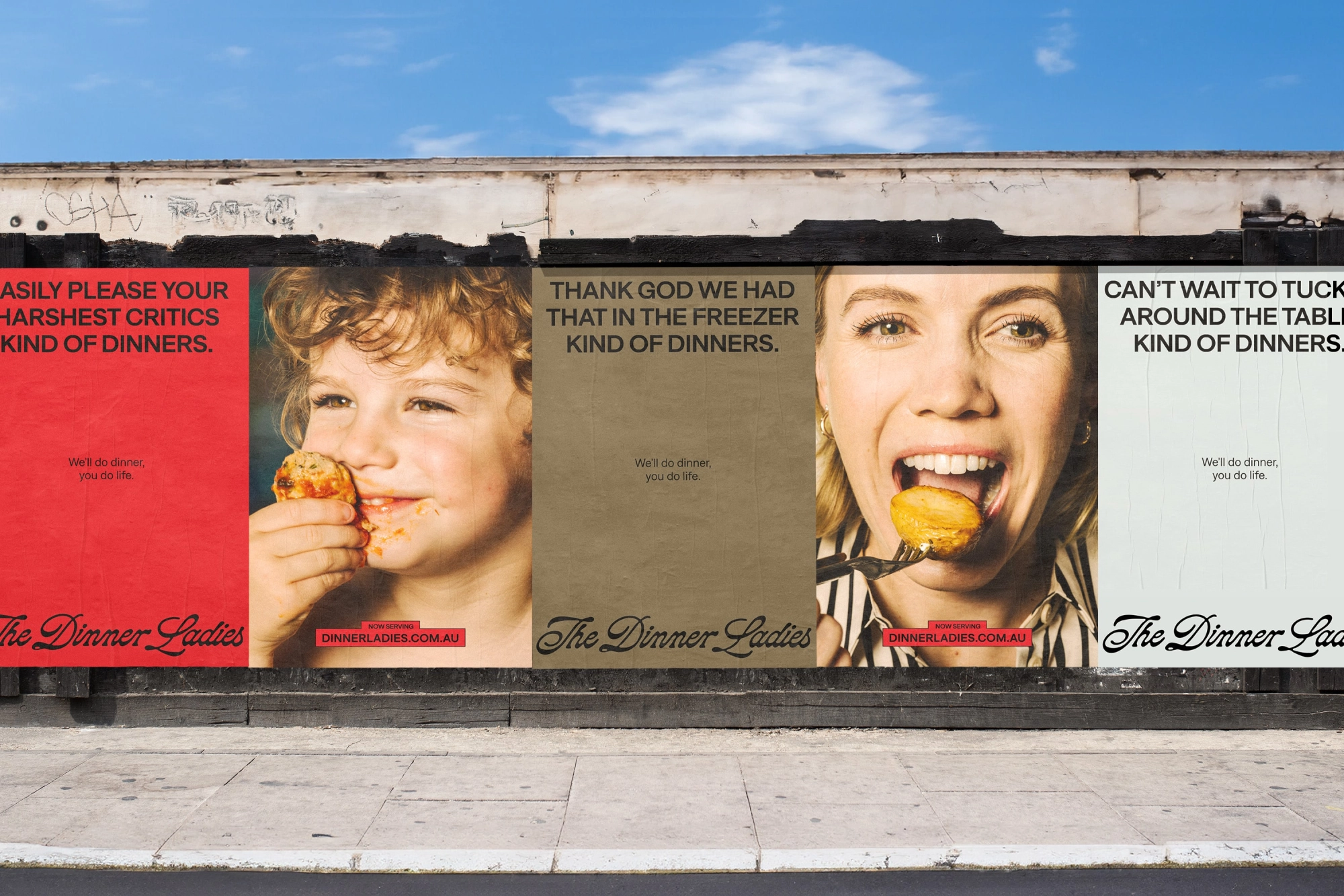
The branding world constantly harps on about building a distinctive ‘brand personality’, but that often seems to be lacking – not so in the case of The Dinner Ladies. In fact, it feels as though the distinctive personality thing is the central thread running through the entire brand. It’s in the logo, the beautiful wordmark, the punchy, playful but confident copy.
It’s so great to see an illustration style that feels genuinely unique: we’ve seen a few big trends in brand illustration recently, and these largely focus on more cheeky, skater-type styles with thick black linework and a sticker-like feel; or more faux-naif, in-your-face pops of colour. That’s not to say these styles haven’t worked – they’ve graced many a superb project, but they don’t scream originality.
The textural, wood cut-like aesthetic of the illustration for The Dinner Ladies, however, firmly bucks all recent trends and feels not only different, but totally suited to a brand that wants to steer clear of mumsy cliches, demonstrate the quality and provenance of its products, and elevate its credentials to stand out in a potentially confusing meal delivery market. It also – like the entire identity and brand system – just looks really, really lovely.
