Chyna Club by Bibliothèque
Opinion by Emily Gosling Posted 8 October 2024
Over the past few decades, high-street menu-scribbler Wagamama has become a rare beacon of actually-very-nice-food among a sea of uninspiring spicy chicken, Giraffes, and Five Guys (arguably, simply too many guys).
It turns out Wagamama has some pretty big-name siblings: Mayfair’s Michelin starred, celebrity-beloved Hakkasan; Thai stalwart Busaba; Cantonese eaterie Yauatcha; and Turkish restaurant chain Yamabahce all sit within the stable of restaurateur Alan Yau – described as a ‘visionary’ by Bibliothèque, the London design studio behind the superb branding for his latest venture, Chyna Club.
Situated within the Fontainebleau complex in Las Vegas, Chyna Club is a super high end restaurant serving ‘thoughtfully elevated Chinese cuisine’, according to Bibliothèque, which adds that the space is ‘an eclectic, cozy, club-like environment’.
‘Alan [Yau] has a deep understanding of both architecture and design, and these aspects of his projects are integral to his vision of the whole dining experience’, adds Bibliothèque, which was brought in to work on Chyna Club around two years ago.
The studio had worked with Yau on previous projects including his own identity and brand naming, 108, creating a gorgeous visual language based around a bespoke numerical system and abstract alphabet which ‘places the emphasis on the mystical and enigmatic’.
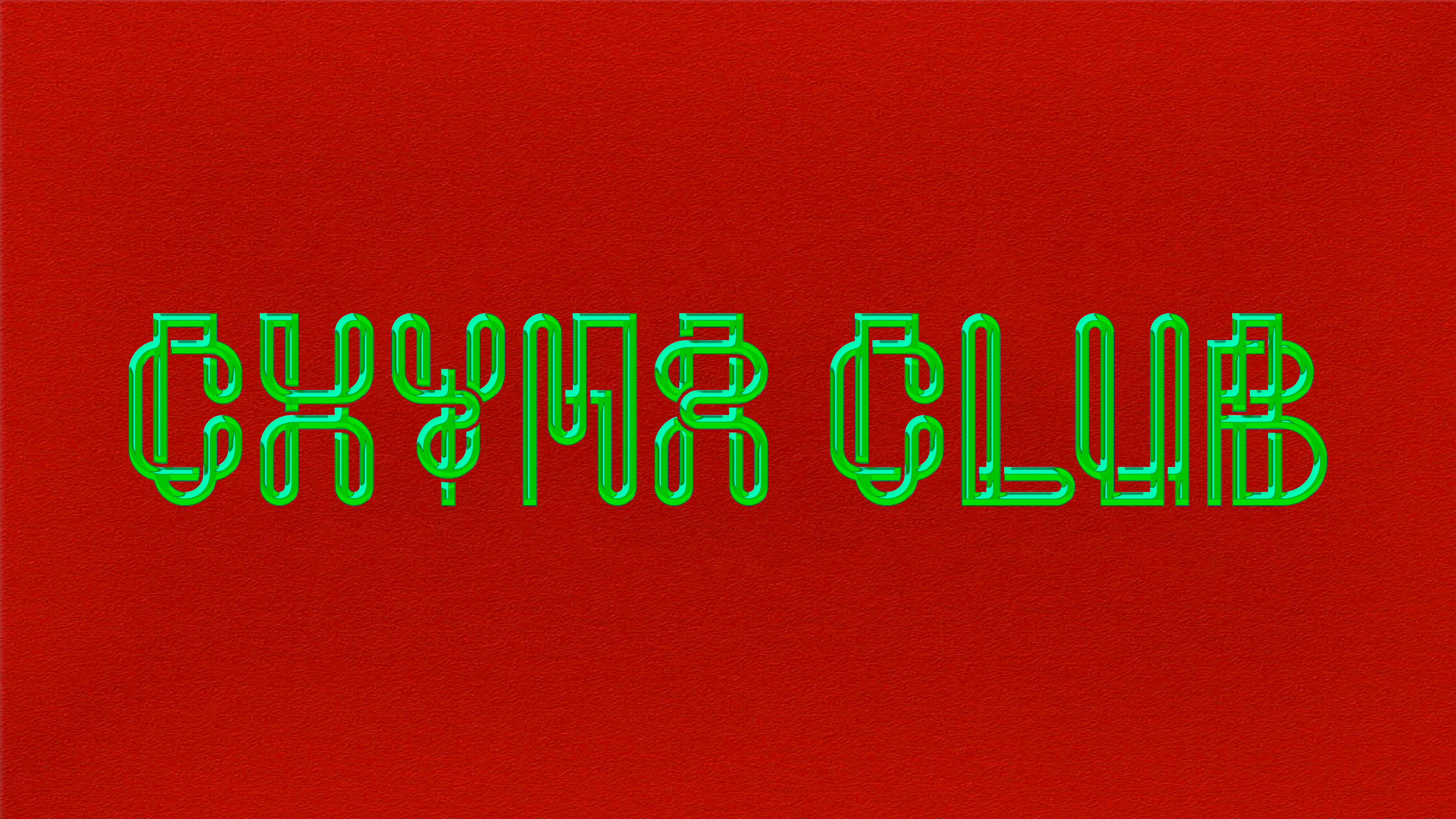
It’s not hard to see those ideas around enigma and the mystical play out in the Chyna Club identity, too, which comes to life in the striking approach to typography and the way in which letterforms are intrinsically symbols, patterns, and illustrative devices.
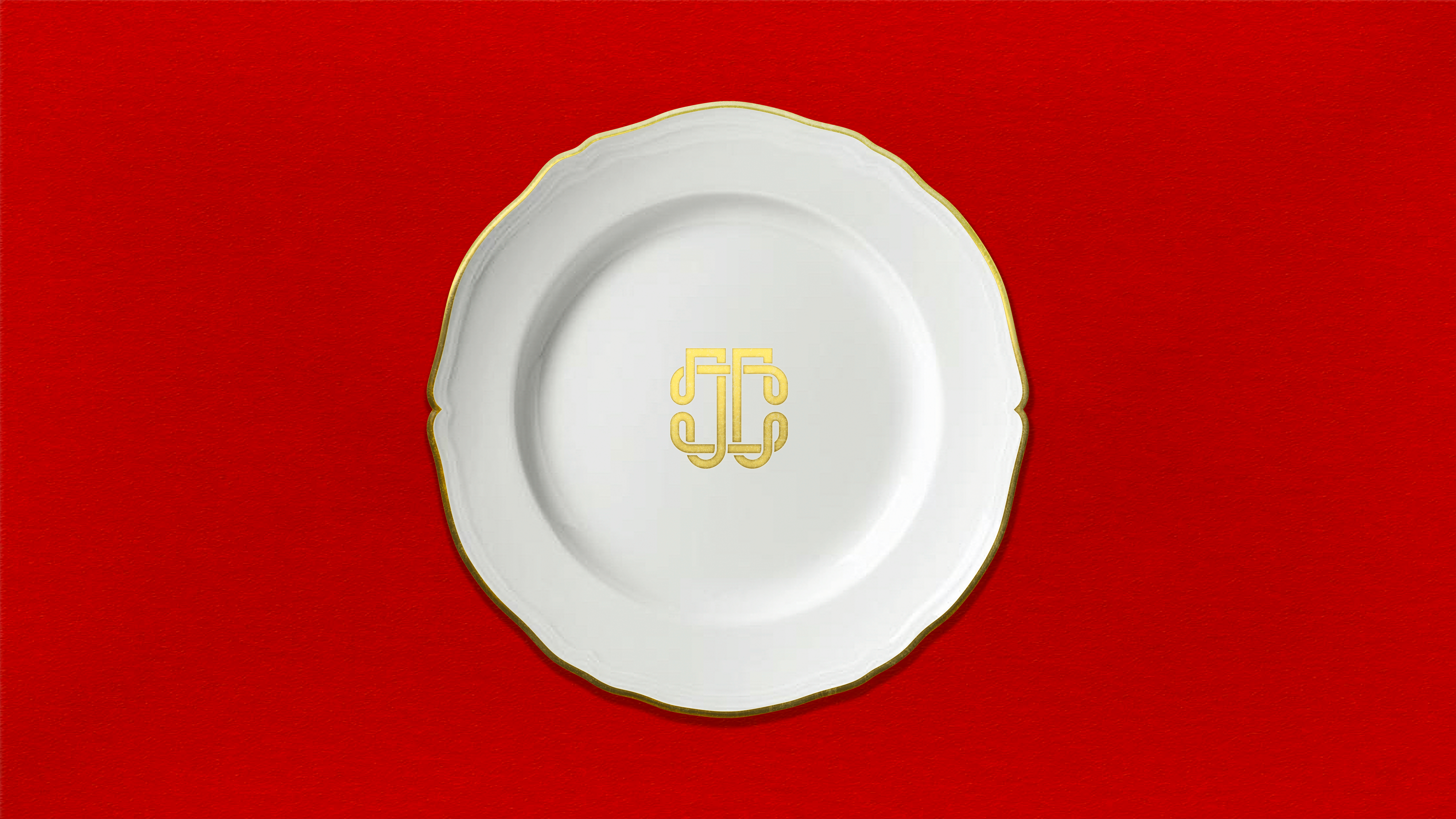
In Chyna Club’s identity, lettering isn’t just about conveying information: it becomes a central device that conveys so much more than language can. The Chyna Club wordmark is the star of the show here, and the shapes of the two ‘C’ letters within it are extrapolated and extended into a monogram in which they conjoin (not unlike the Chanel logo); while in other applications they repeat and tesselate to form decorative patterns. It’s subtle, and it’s very, very smart.
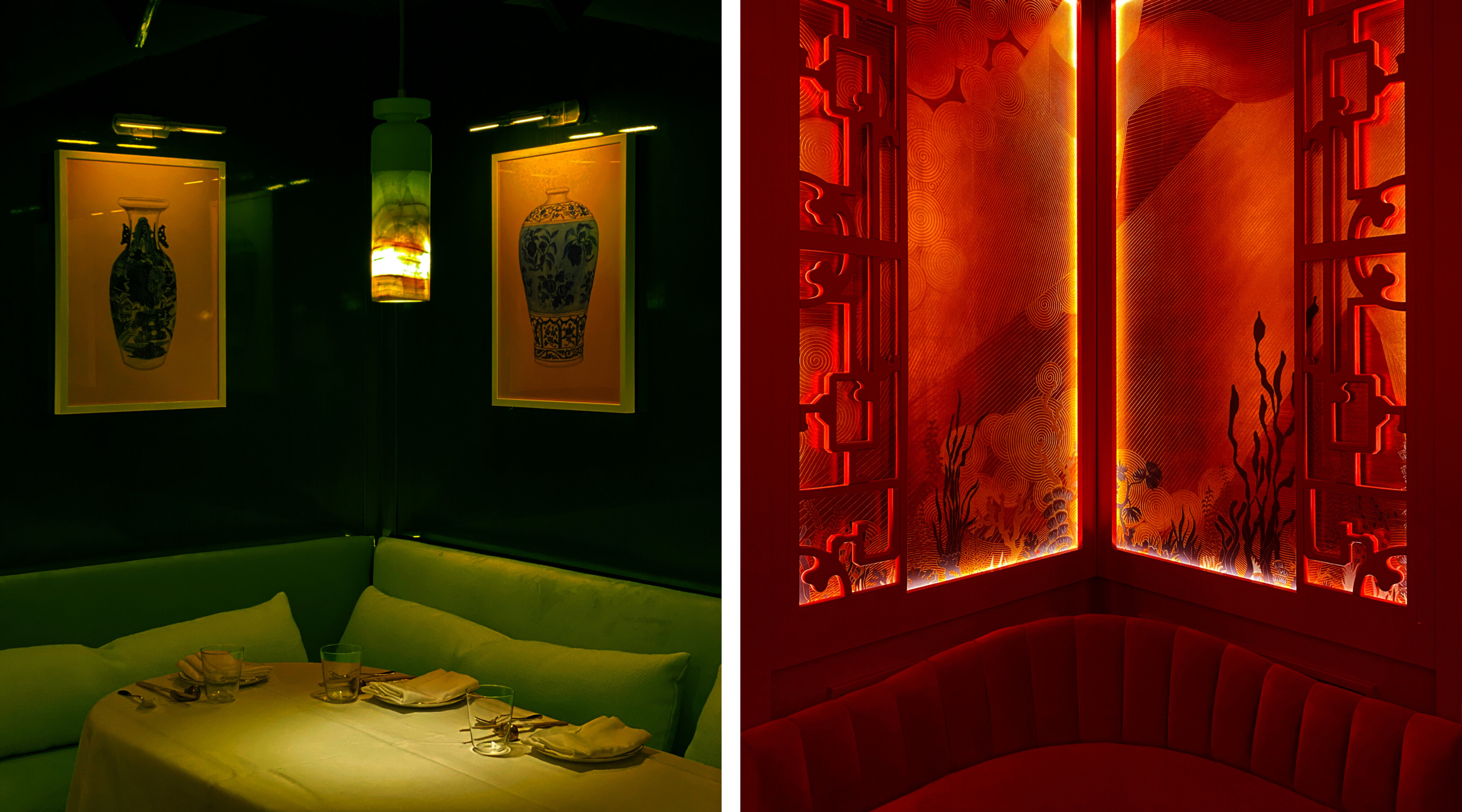
The designs were in part inspired by images of the glamourous cabaret entertainers of 1920s Shanghai. ‘In this period the intellectual elite of Shanghai and Beijing had embraced Western cultural influences of art, music and design and had turned them into something unique to them – particularly through music, where jazz evolved into its own genre known as Shidaiqu’, says Bibliothèque. ‘The visual language of Chyna Club resonates with this hybrid cultural aesthetic’.
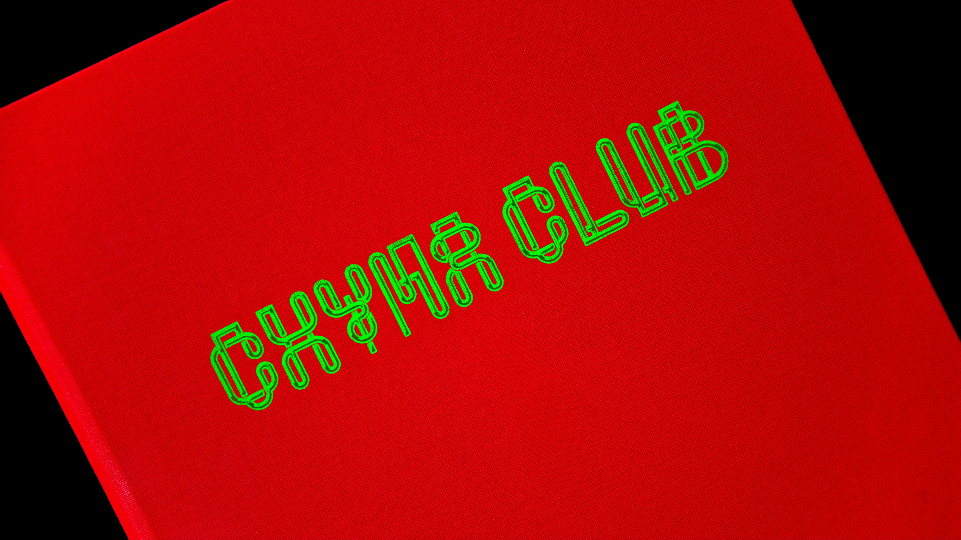
This marriage of cultures and eras plays out in that lovely typography again. The letters are formed of three-dimensional shapes that resemble neon tubing, especially in their shimmering luminous green.
That colour palette choice is certainly unusual. But it works – so much so that you don’t notice how unusual it is for a luxurious setting like Chyna Club until you actually have to think about it. Neon, of course, nods to the gaudy flashing lights of Chyna Club’s Vegas home; but it’s also been a very Gen Z coded trend for nigh-on a decade now. Dubbed ‘terminal green’, it’s been suggested that one reason this colour is so beloved by those wee digital natives is because it references an age of internet 1.0 that they can’t even look back at with nostalgia: they simply weren’t alive when the World Wide Web/Information Superhighway was that shonky.
As such, the green here succinctly marries old and new; tradition and technology; moneyed Boomer Vegas and a more youthful audience that welcomes a few playful touches with their Michelin starred dinners.
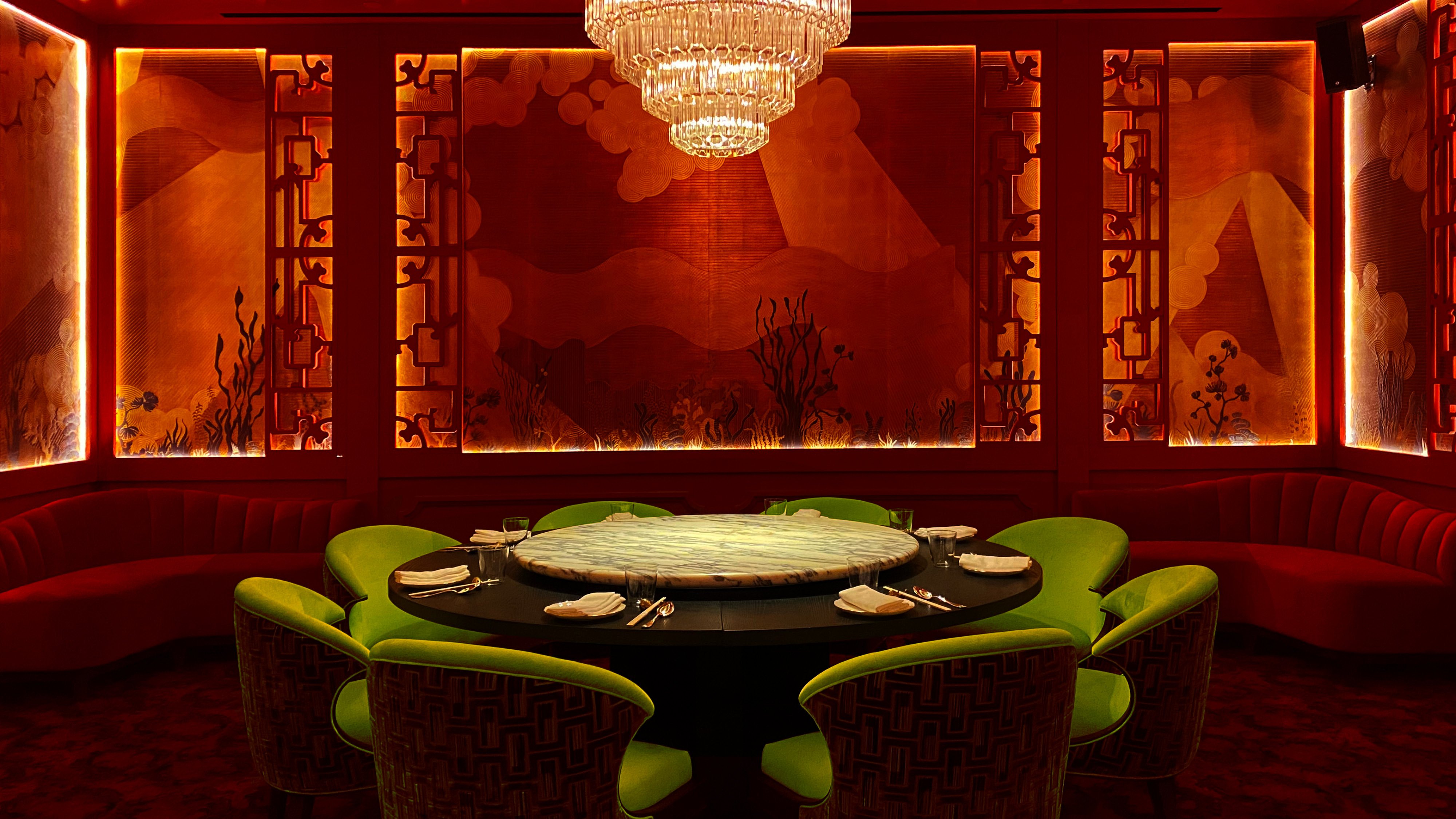
As with the rest of the identity the green helps to delineate new visual parameters for what we think of as ‘luxury’, shaking off staid tropes of tweeds and leather and brown and gold (though there is of course gold here too).
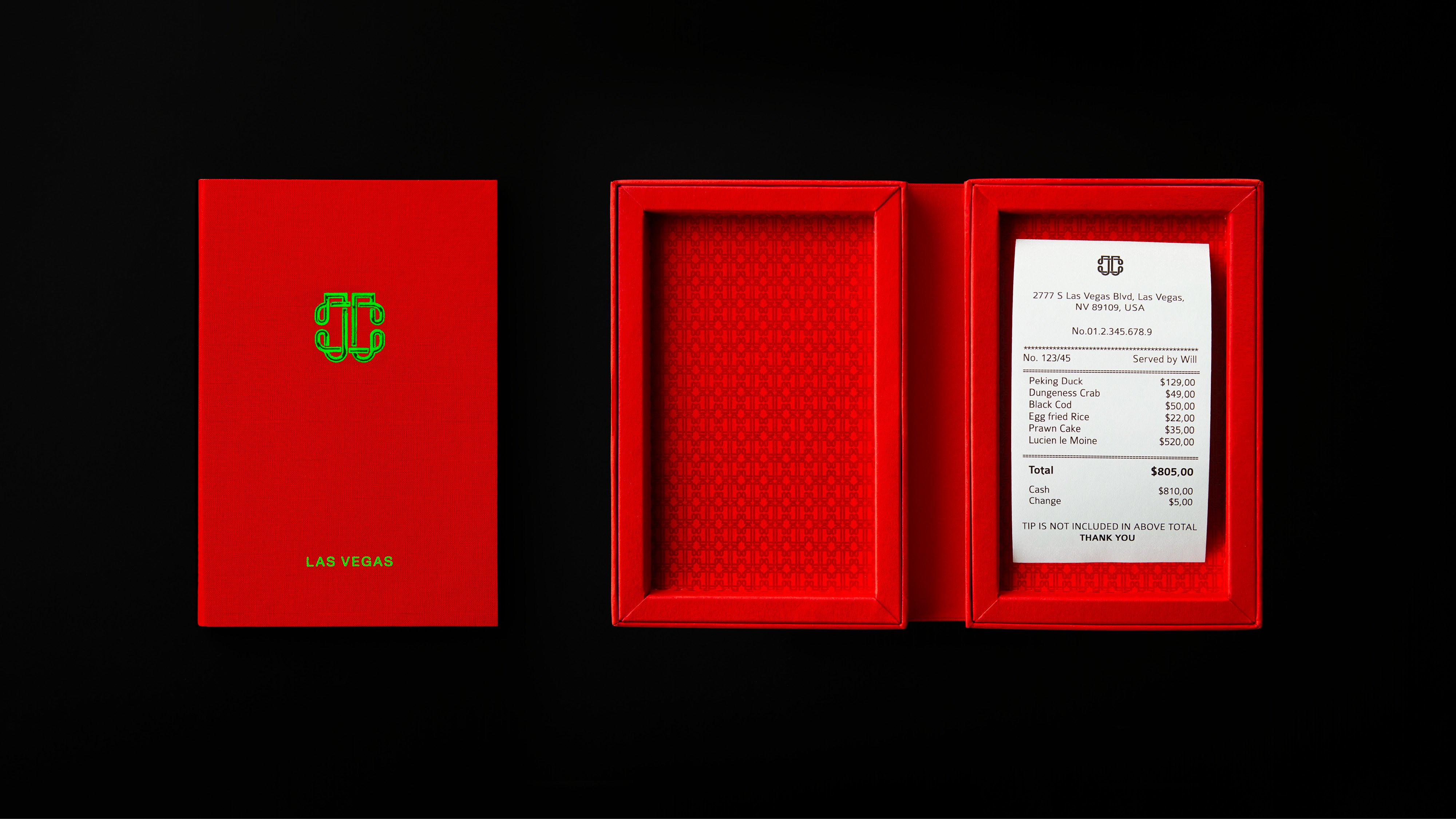
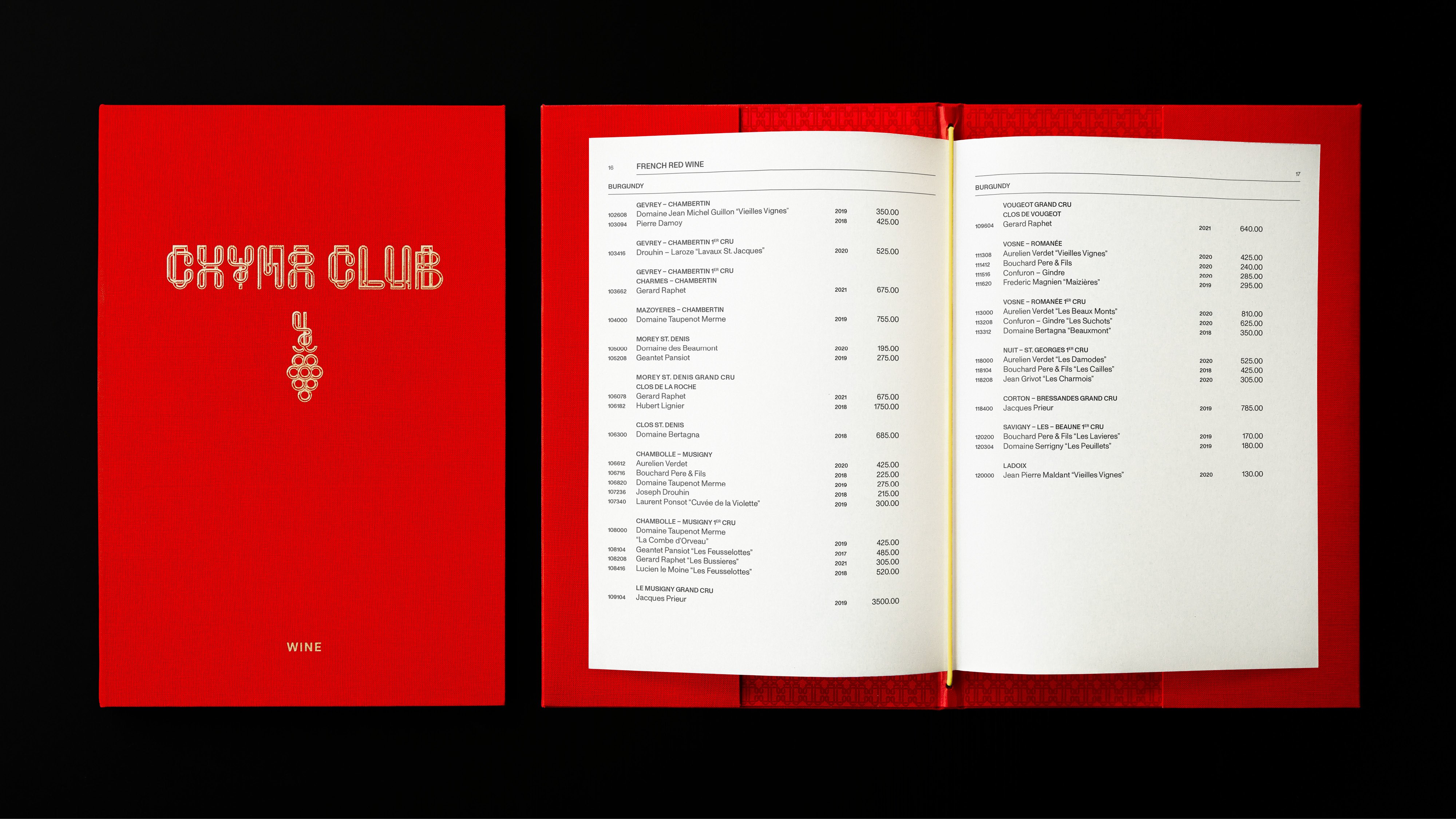
While red and luxury aren’t exactly an unexpected combination, the choice of shade here is daring: it’s bright almost to the point of pulsating, but Bibliothèque’s redefinition of high-end for Chyna Club is all about texture. Here, luxury is materiality: printed applications of the identity such as the menus use an array of materials and processes including screen-printed bookcloth and uncoated stock with contrasting high gloss ink, produced by Imprimerie du Marais in Paris, deemed by many to be the world’s finest print house.
Hand-made paper is used for what Bibliothèque describes as ‘smaller micro elements’, such as the chopstick wraps, while ‘receipts and credit cards are returned in a beautiful box – enhancing the sentiment of gratitude to the customer’.
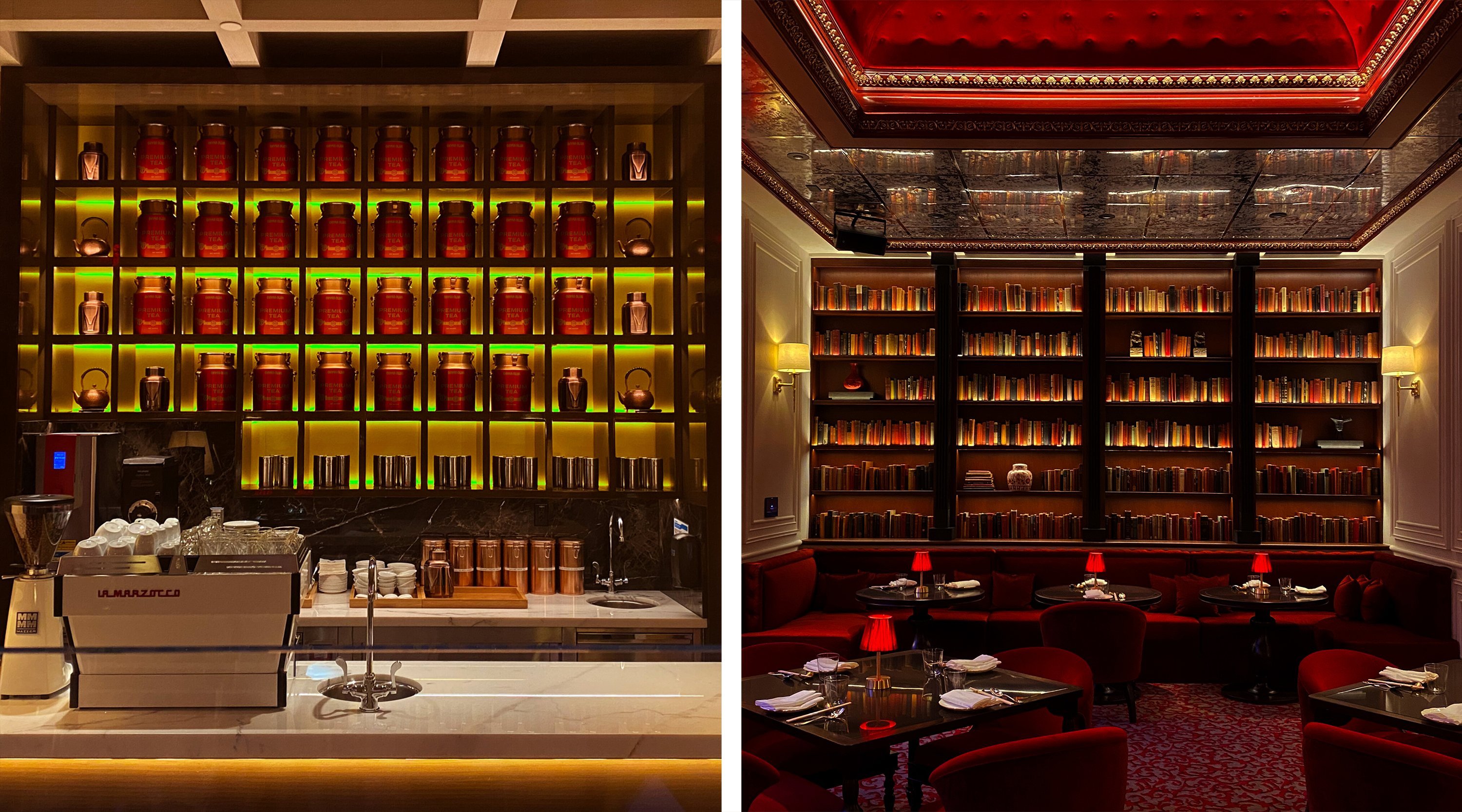
The identity is showy where it needs to be, and just as crucially, is totally pared back a lot of the time. The wordmark appears in the space as a sculptural lighting piece – which feels like its ultimate realisation, resplendent on the walls in neon – and sits alongside interior finishes ranging from ceramics, wood and brass to LED screens.
But that 3D wordmark is about as bombastic as the identity gets: the menu design is clear, simple and classy, using Monument Grotesk by Berlin-based type foundry Dinamo. A thoroughly legible sans serif, the letters’ honest, ‘unrefined, and idiosyncratic shapes’, as Dinamo puts it, make for a very confident aesthetic – but never look staid or boring or what you might expect for a menu bearing dinners around the $120 mark. That’s what makes it work, though: the whole look serves to justify the premium pricing but in ways that forge new visual tropes for fine dining in a thoroughly contemporary way.
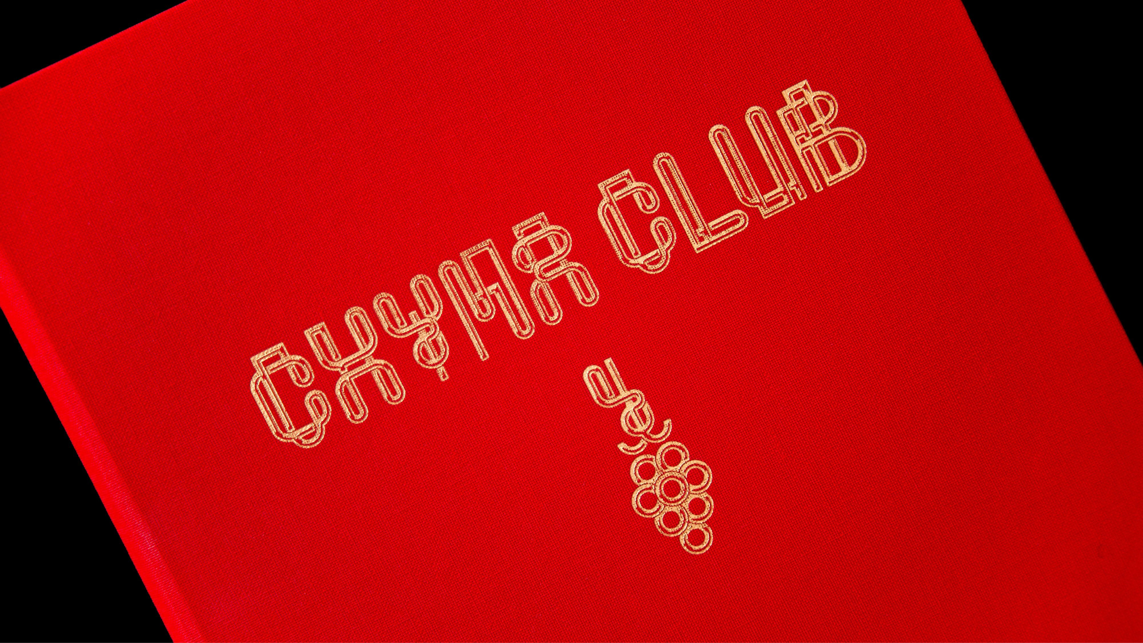
Designing the identity for such a space must present some interesting considerations for a design studio: unlike a high street restaurant, or a product that sits on-shelf, it doesn’t have to compete for attention or stand out from its peers: you go there because you know about it. And, so Bibliothèque says, if you’re a foodie type (I’m afraid I am not a foodie type), Alan Yau and his operations are things you would very much know about.
It raises interesting questions about what that identity has to do, if not differentiate or stand out. In the case of Chyna Club, it has what’s perhaps an even trickier task: embodying one man’s vision, and subtly but confidently expressing the level of class and luxury that Vegas high-rollers expect.
Managing to do that while also avoiding any of the cliches of fine dining or the outdated trappings of inherited luxury design cues is no mean feat, but if anyone can – and did – do it, it’s Bibliothèque.
