Saaristo by Bond
Opinion by Richard Baird Posted 20 March 2025
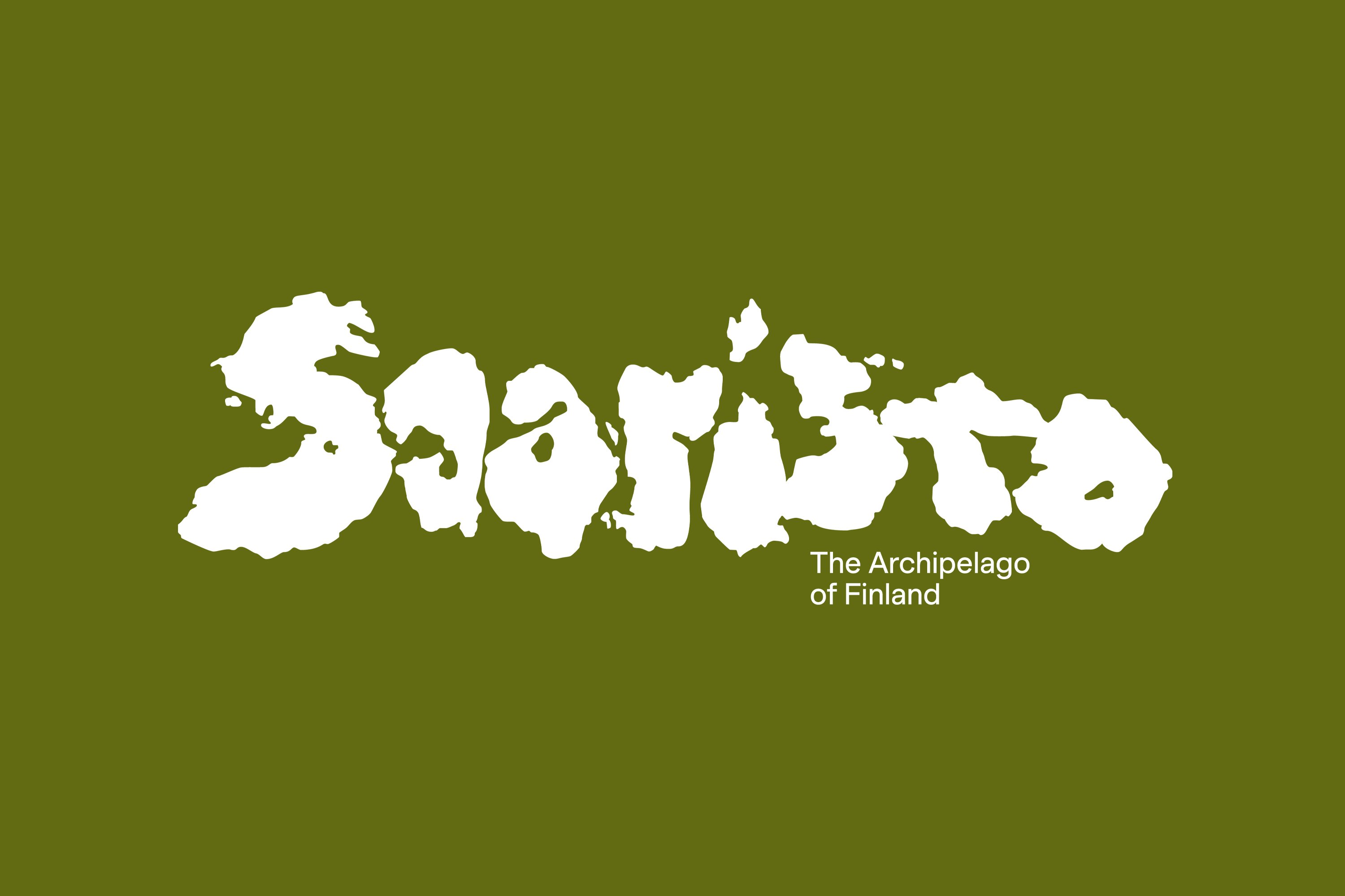
‘Saaristo’ is the generic term for ‘archipelago’ in Finnish, but – to the outside world – it’s sufficiently distinctive to refer to the entire region in Western Finland, which now makes up a new tourism brand. This brand intends to generate more interest in (and visitors to) the world’s largest archipelago: a collection of 40,000 islands. This scale makes it geologically significant, and a playground for those curious to discover the multitude of experiences that these islands can offer.
International design studio Bond (Cable Factory, Northstar Film Alliance & Anton&Anton) was brought in to underline the region’s ‘unique character’ and ‘bring to life its deep roots in Finnish culture’ through a unifying strategic brand identity. But how to unify such a vast and diverse area? It’s an unusual project, but not entirely unprecedented. Italian designer, Mimmo Castellano, developed a visual identity in 1975 for Isole Eolie in Italy. In that case, it was seven islands, a few short of Saaristo’s 40,000.
The creative concept ‘shaped by’ becomes a powerful synergetic expression, one that captures the effect these landmasses have on the fauna and floral that inhabits them, but also the experiences these places have on shaping the emotional and experiential worlds of those that visit the archipelago.
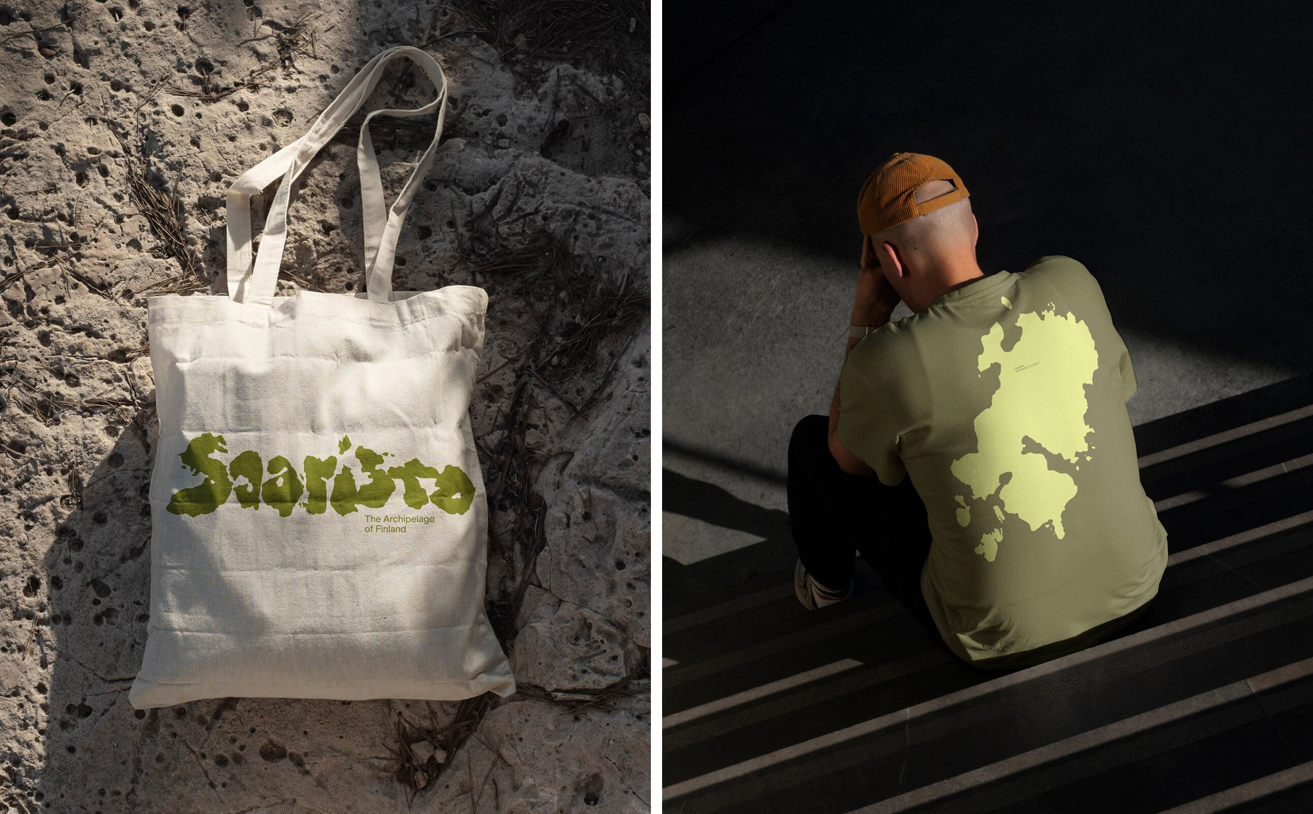
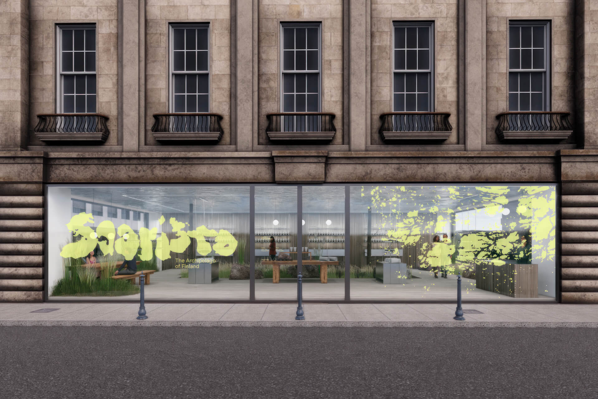
Just as the handholds of a climbing wall offer a multitudinous path up a rock face, the extent and difference of these individual islands offer visitors an unusual and vast range of possibilities. And this is beautifully realised through the tectonic nature of Bond’s central graphic device, the Saaristo logotype, from which a striking new visual language expands.
![]()
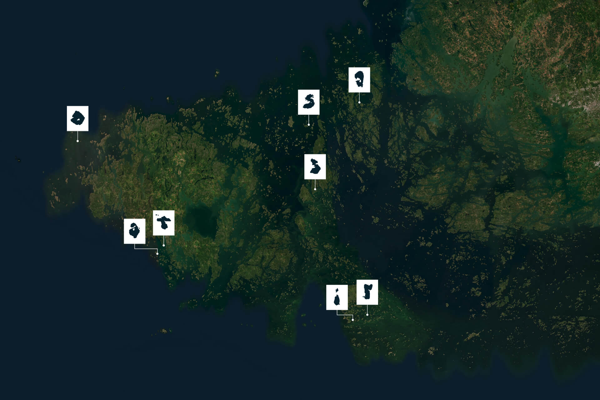
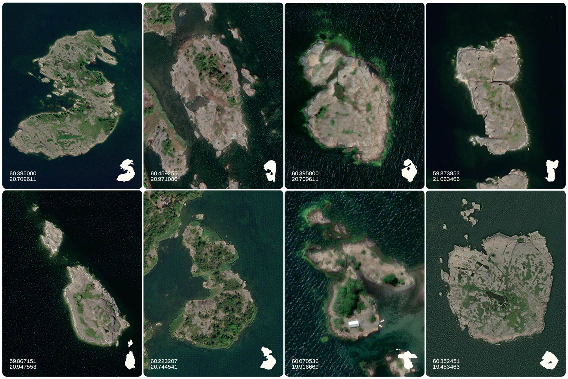
The particular genius of the work is the observation/recognition that there was a geological alphabet to work with. That, given a bit of time and patience, individual islands could be drawn out and used to spell ‘Saaristo’, with little adjustment. In this formal consolidation (islands as letterforms), an internal logic builds; unity and diversity. A generic name takes on a graphic value; an island-hopping adventure awaits!
In an era of maximalist design and diminishing attention spans, logotypes have been given iconic proportions, functioning like magazine mastheads. Make the logo bigger, louder and weirder makes absolute sense today. Bond’s work is tectonic and iconic, ancient and of the contemporary world. Does it scale down well? Not really, but there’s quite a bit more at play here.

Bond extends the central premise out further in the use of motion. This plays with scale and multitude, zooming in and out, from island to coastlines, and using these organic forms to connect imagery and video footage together. This also brings a sense of ‘aliveness’.
Where the logotype favours the satellite view, other elements of motion play with elevation, drawing in mountain profiles. These then become colour-blocked graphic devices or holding shapes for emotive and evocative images (bringing out the wind, waves, and ice but in tight close ups that include wind through hair). Just as the conditions shape the island, the promise is of an indelible mark made on those who visit.