Hip Pop by Robot Food
Opinion by Richard Baird Posted 8 April 2025

Running a design blog sharpens your eye for category conventions. Stick with it long enough, though, and you’ll start to see those conventions unravel. What once felt fixed begins to flex. This creates a challenge for writing about design: you’re constantly assessing the landscape, but that landscape is always shifting.
Take minimalism, for example. Once the dominant aesthetic of the 2010s, it’s now been replaced by maximalism. Visual codes that once signalled ‘premium’ are losing meaning, becoming unreadable to newer audiences. Meanwhile, disruptor brands are breathing new life into tired categories.
These upstarts often begin as indie darlings, only to be scooped up by the giants. In the soda market, Poppi is now part of the Pepsi portfolio. Thanks to lower manufacturing costs, the barrier to entry is lower than ever – so low, in fact, that even my East London yoga teacher has her own soft drink brand.


Much like craft beer and specialty coffee, the ‘lo-cal‘ and ‘living’ soda and kombucha space has exploded with creativity over the past five years. Cans have become CAN-vases. Where once there was subtlety and implication, now there’s an unapologetic pursuit of the ‘hip’. The minimal-as-premium look has been replaced by graphic exuberance – visual feasts promising immediate gratification, like a drinkable TikTok post.
Consumers in this space are prepared to be adventurous. Loyalty is low; impulse buys are high. Probiotic sodas and kombuchas – often priced two or three times higher than traditional sugary sodas – have become the new indulgence. It’s Epicureanism for the Instagram era: modest, sustained pleasure, bottled.
![]()


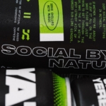
This evolving category has created a kind of design land grab. Enter Hip Pop, a brand playing in the same space as Poppi. With a focus on natural ingredients, bold flavour combos, and a big punch of taste, Hip Pop recently underwent a rebrand by Robot Food (Goldmine Gummies, Mercht & Electric Ink)– moving away from a conceptually rich but visually muddled identity. The previous look leaned on detailed illustrations and architectural themes, attempting, perhaps, to transport consumers to fantastical lands. Nice in theory, but let’s be honest – it’s just a drink. A quick hit. And the extended-condensed typography trend it employed? Tired by 2020. (I blame Druk.)


The new identity embraces big flavour and natural goodness through bold, high-contrast illustrations – simple, vibrant, and full of movement. There’s a kinetic energy in how ingredients are depicted, and this dynamic carries over into the upcoming website (yet to launch). A strong logotype anchors the design, offering a clear, consistent format that’s instantly recognisable. The interplay of illustration and colour helps differentiate each flavour while maintaining brand cohesion.
While Hip Pop clearly taps into the ‘attention economics’ of social media – visually optimised for scrolling and sharing – it also delivers real-world shelf impact. The brand’s choice to fully screen-print its cans, rather than using basic labels, gives it a more established feel. Ready for acquisition, perhaps?