Tangent GC Organic Soap by Carl Nas Associates
Opinion by Richard Baird Posted 13 October 2020
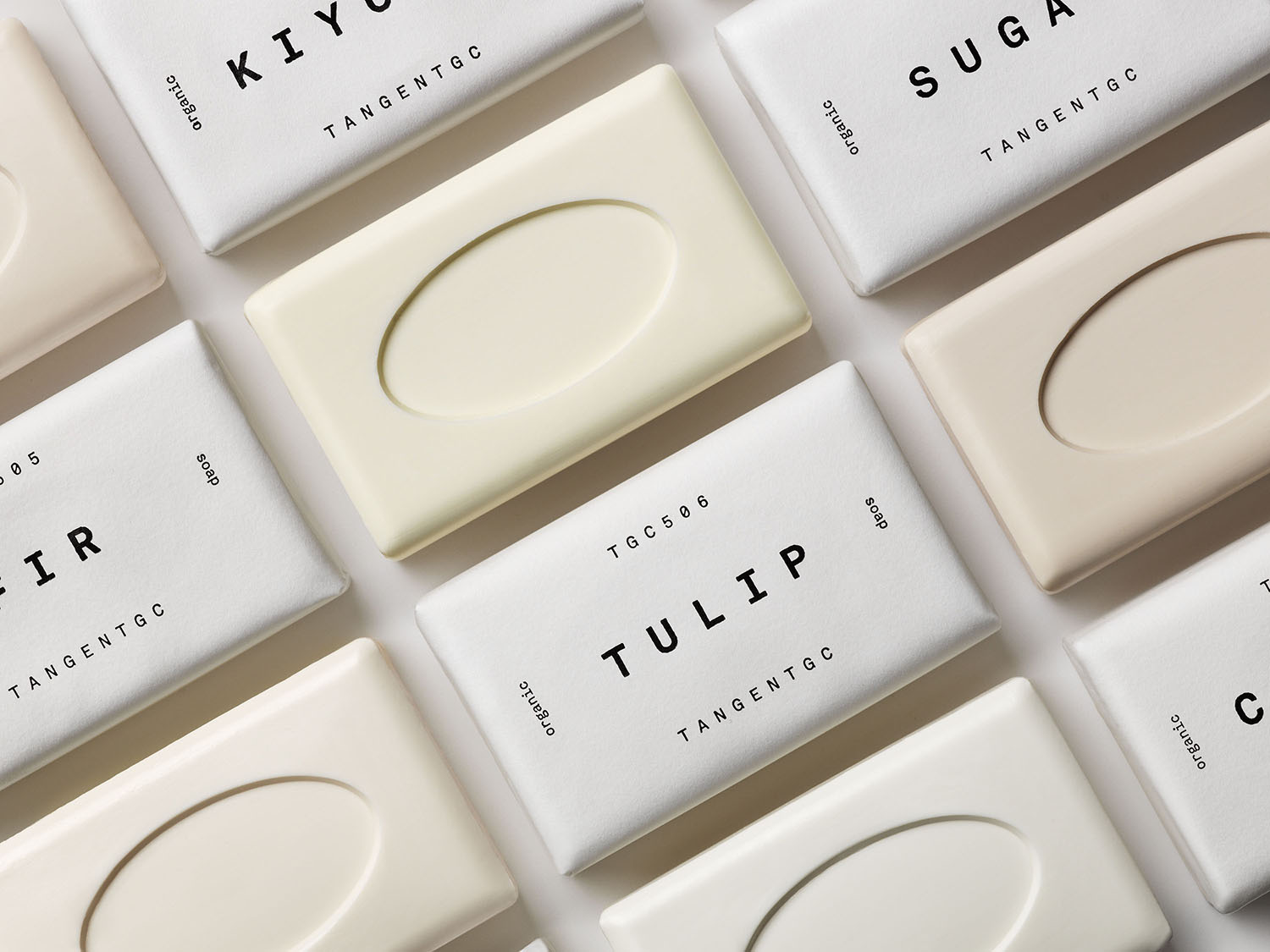
Tangent GC began as a Scandinavian organic garment and shoe care company developing products that intended to increase the life of clothing and footwear, and entered the organic skincare market in 2016. The concern given to the longevity of skin becomes an understandable extension of that original intention.
Carl Nas Associates, who have been working with Tangent GC on their packaging treatments for an ever-growing number of products over the last few years, worked on the brand’s new line of organic soaps. Just as with earlier work, which could be described as having a minimal sensibility (in the truest not trendiest sense of the word), this is very much about nuance and continuity. This post functions as an extension of previous posts. It reiterates the elegance and flexibility afforded by and present in the original type treatment and efficacy of good material choices and the communicative potential of surfaces and structures. This is a rare opportunity to see how a solution functions across time and within new contexts.
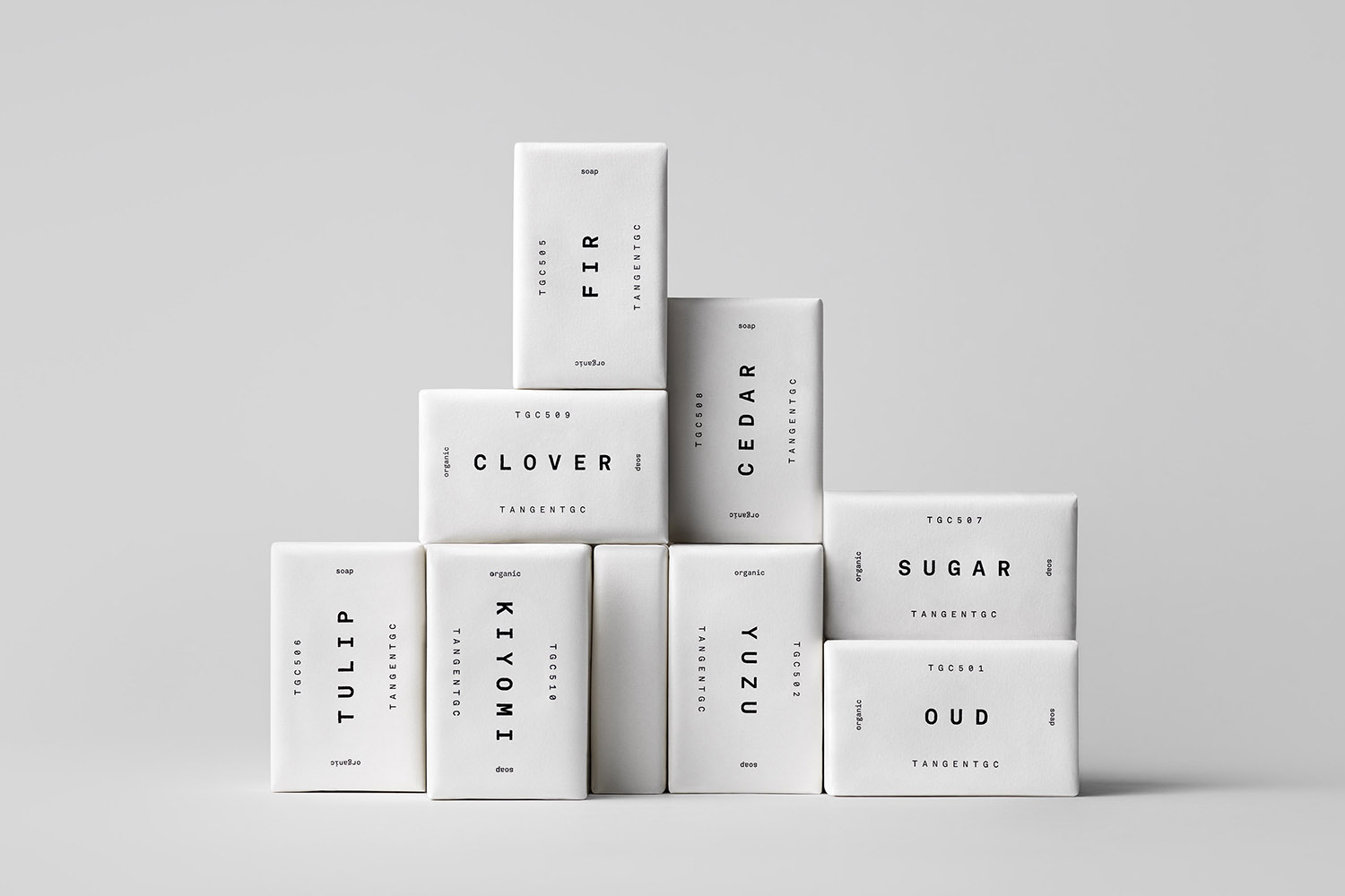
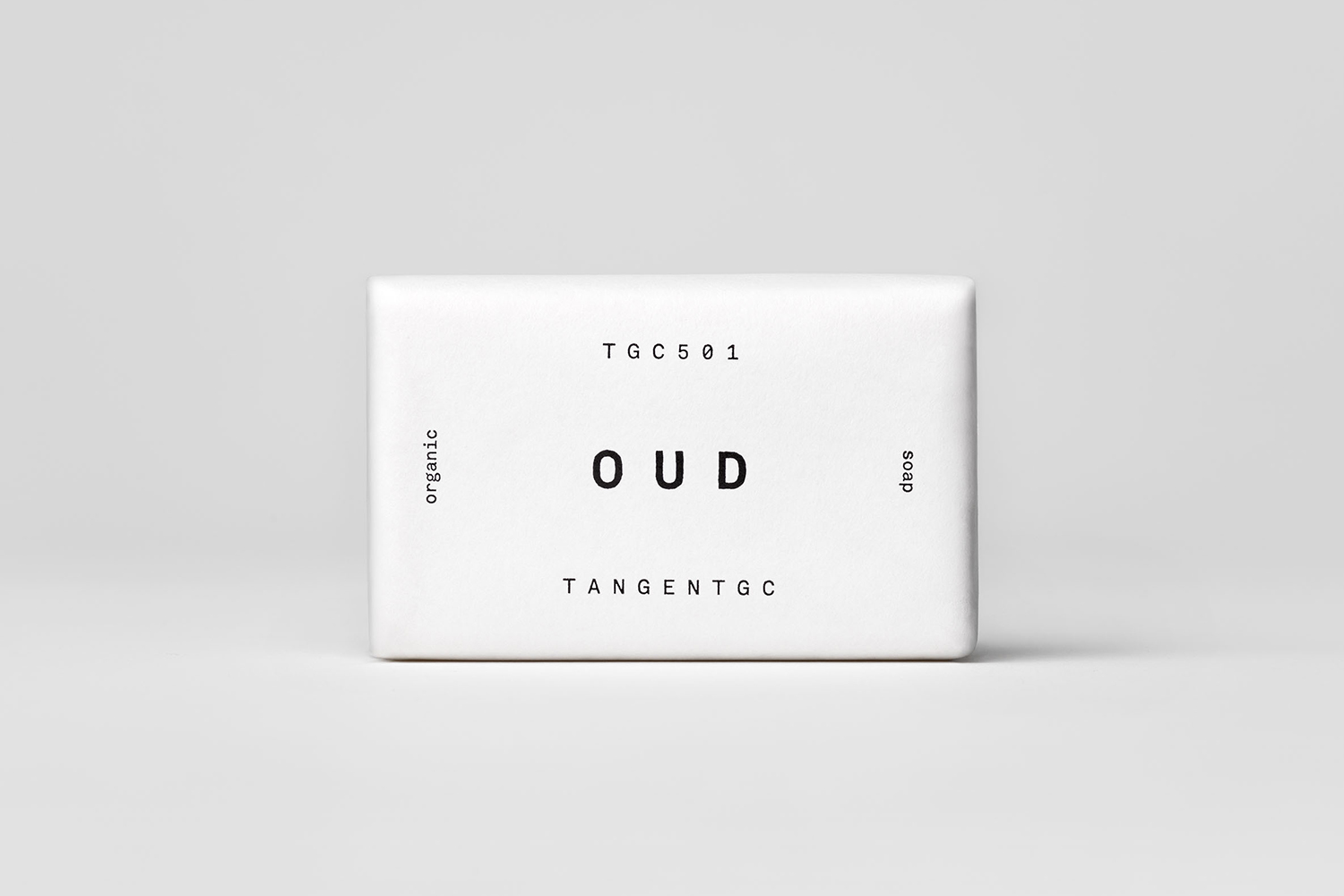
The company’s graphic identity, a typographical system designed by Essen International under the creative direction of Carl Nas, established an informational immediacy through the absence of superfluous stylistic detail and colour, whilst effectively structuring content and drawing out a distinction in the arrangement, orientation and typesetting of Akkurat Mono.
As Tangent GC ventured into the organic personal skincare market the company worked with London-based Carl Nas Associates to build out the graphic language initially laid down by Carl Nas while Creative Director at Essen International. This new phase saw the studio applying what was originally a graphic system for shoe and garment care to that of skincare packaging and organic hand cream. These were supported by campaigns that featured swirling fabrics and illustration by celebrated airbrush artist Syd Brak, which introduced a humanist aspect and showed that there was conceptual and visual potential.
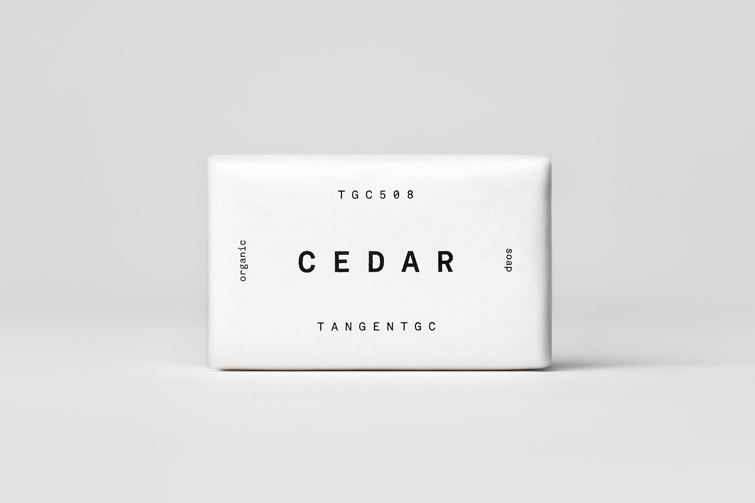
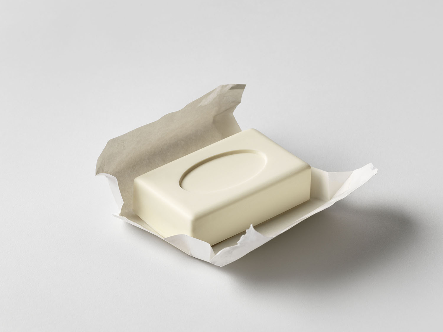
The Tangent GC Soap range is organic and vegan, cruelty and fossil free. And just as the product itself is “low-impact” the studio sought a low-impact packaging treatment. This materialised as a simple wrapping paper carrying the now recognisable typographic treatment that clearly connects the entire range, and also frames the available fragrances. The power of this is the return to the past. Paper, not plastic. A wrap not a box. Uncoated not coated. It is a useful reminder of the excess packaging used by large brands, and the potential of perceived value not being in the abundance of material but in the absence of materials and the material’s synergy with product and brand.
Where big brands using plastic bottles (and excess packaging) cannot help but articulate their new eco-positioning through large lettering, giving great prominence to “widely recycled”–the words of consumer rather than corporate responsibility–brands like Tangent GC are much more comfortable just doing the right thing, and allowing it to be felt, rather than read. That is not to say the former does not serve a broader purpose of raising awareness, only that today it seems a little late and a little disingenuous.
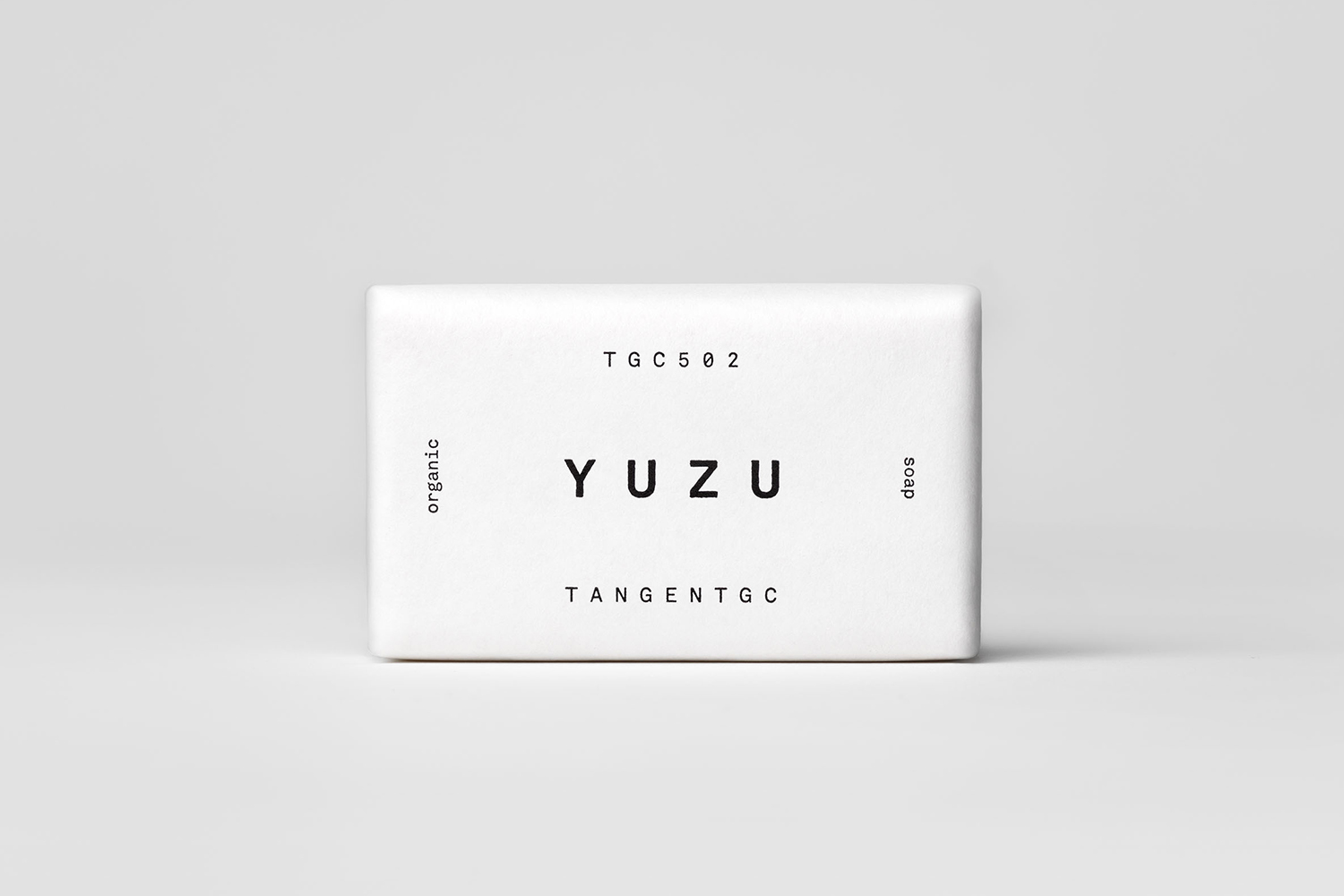
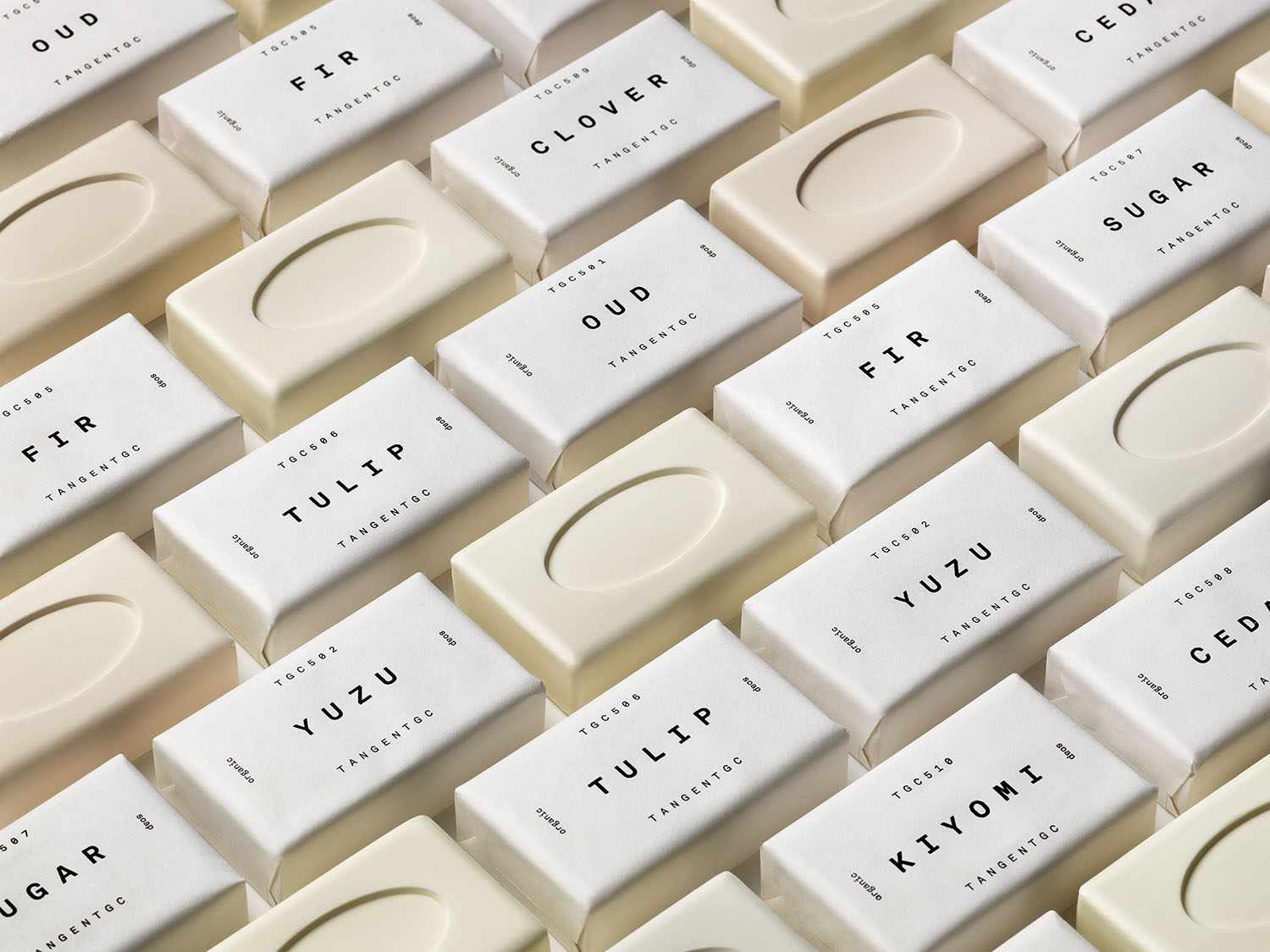
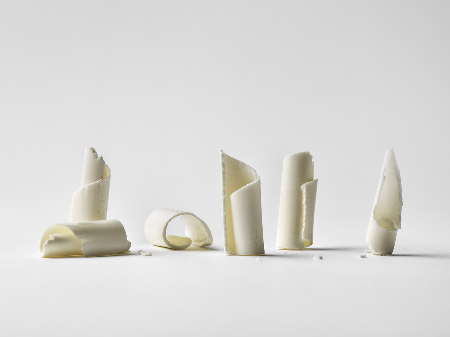
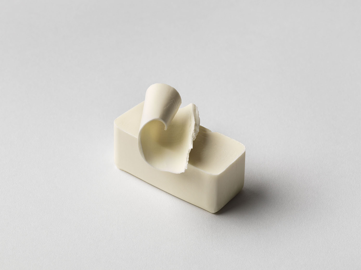
The launch imagery is another thing of note. These exist within a space between studio portfolio imagery and product photography. In this way, that dual purpose, serving both studio and client forms further continuity (no difference between the two online) and multiple purposes (brings value to both client and studio). This is increasingly common, and smart, particularly now that shooting portfolio imagery comes with new challenges and an expense that is harder to justify. Here, product and its packaging become a point of interest derived from the sculpting of one and the arrangement of the two. More by Carl Nas Associates on BP&O.
