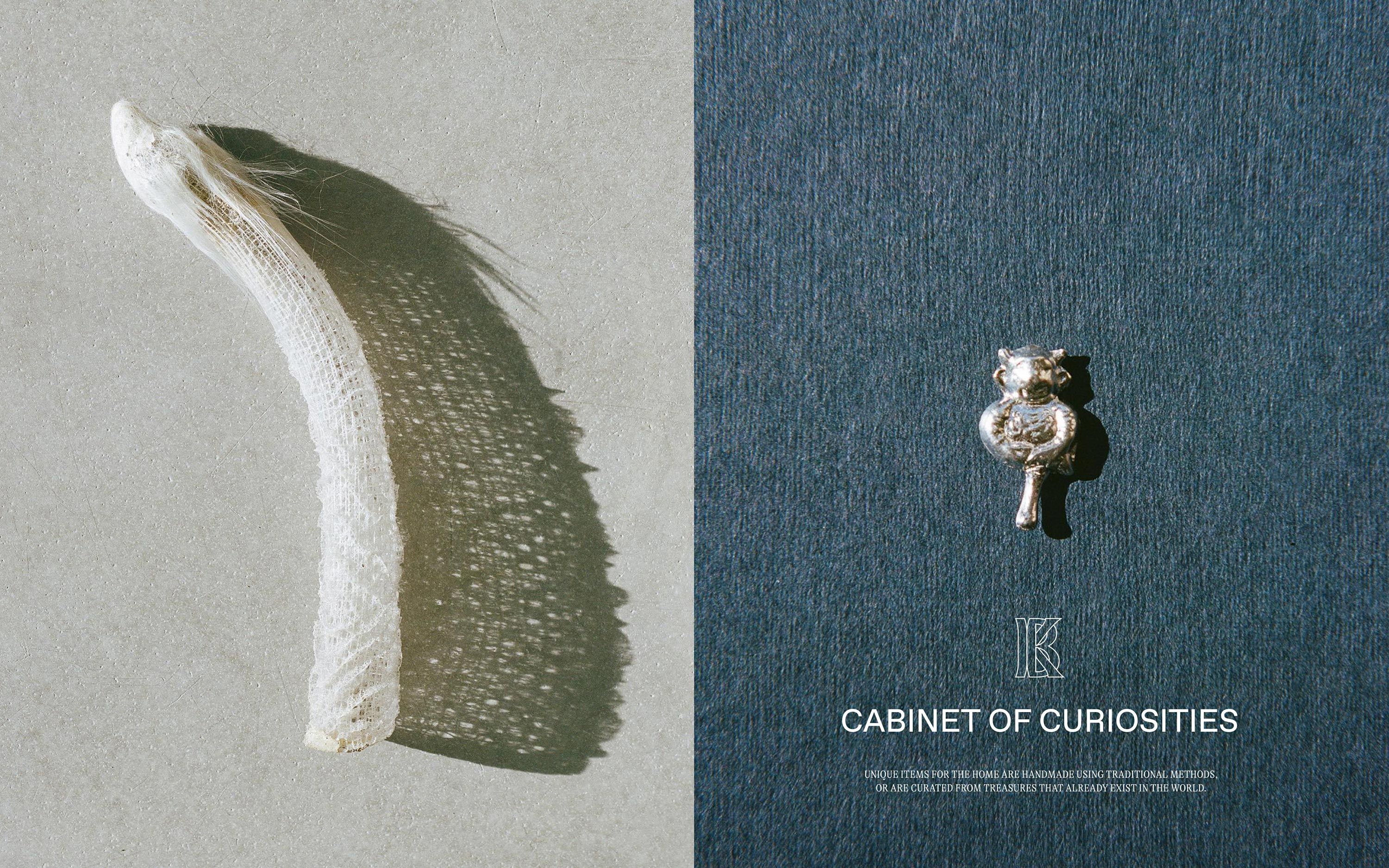
Kindred Black by Ania et Lucie
Opinion by Angelica Frey Posted 16 July 2024
There has always been something borderline magical about the fields of beauty, makeup and skincare – a hint of esoteric or mystical knowledge. When it comes to visual storytelling, this association offers plenty of rich inspiration, along with established style signifiers that are easy to follow. Nods to old-school apothecaries abound in the likes of Typology Paris and Le Labo, while alchemy and witchcraft are referenced in brands including Vyrao and Rituelle de Fille.
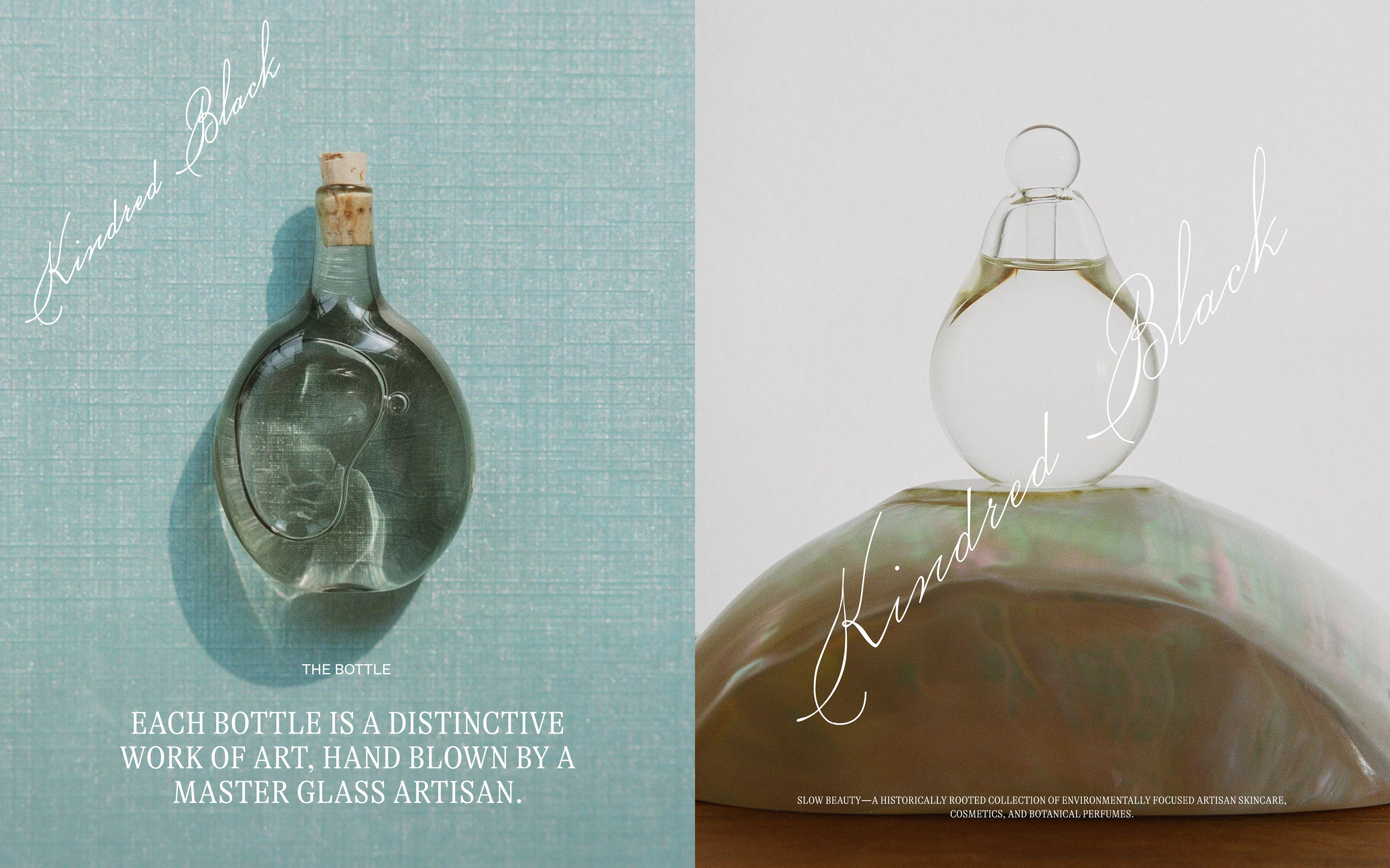
In this landscape, Pennsylvania-based Kindred Black (est 2015) – which describes itself as a high-end ‘destination’ for skincare, cosmetics, and botanical perfumes – makes its own contribution to the folklore of modern beauty with eclectic references to nature, ancient history and mythology (Aphrodite and Cleopatra are name-checked in product descriptions, for example). The brand is also passionately plastic-free, packaging its products in hand-blown glass vessels reminiscent of chemistry-lab ampoules or potion bottles. Both beautiful and functional, these covetable containers are part of the brand’s refill programme (currently the collection is 75% refillable).

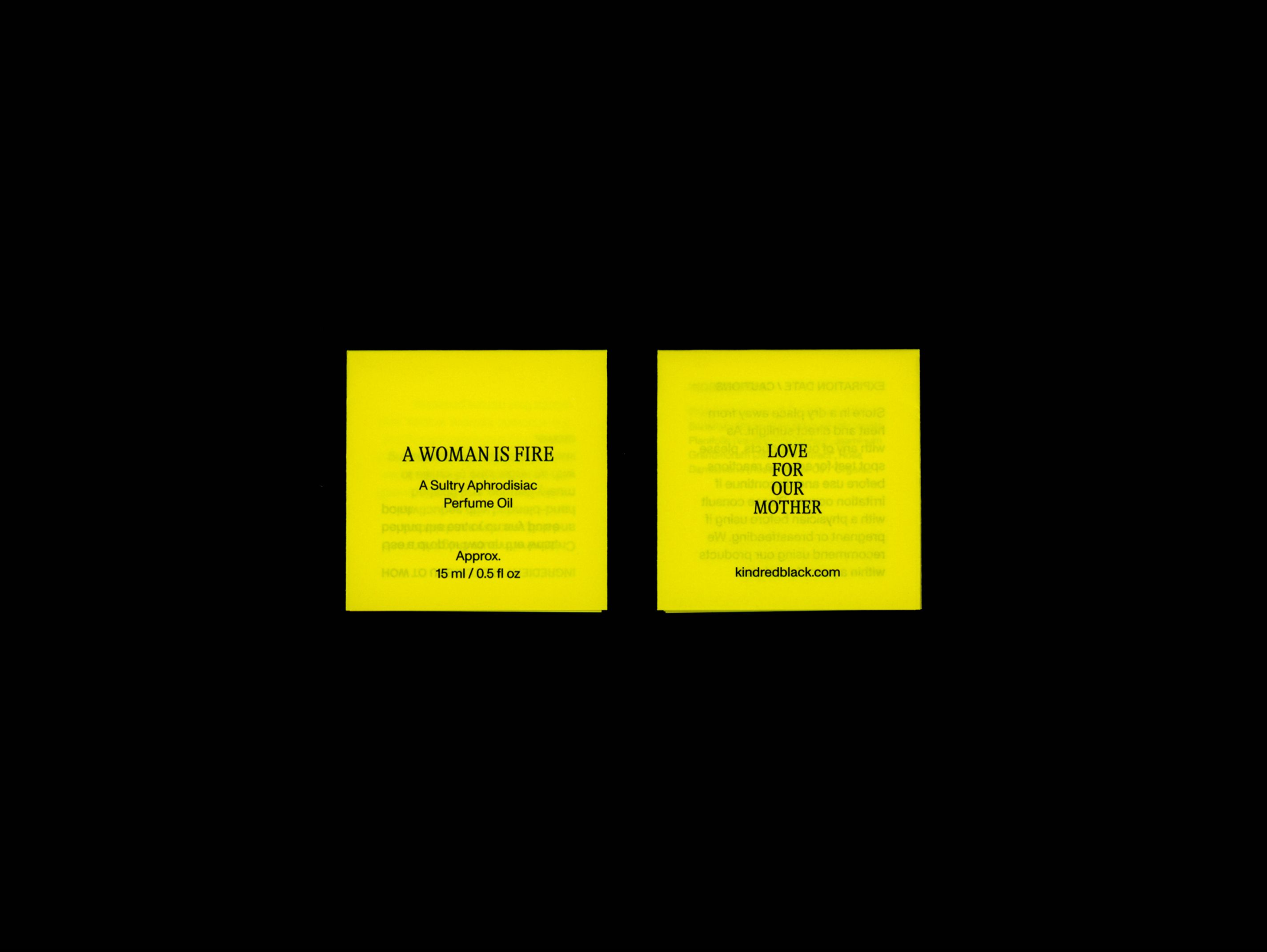
While Kindred Black started out as a curated storefront for a series of independent makers, the platform recently consolidated its lineup and developed its own in-house range. In this context, New York-based creative studio Ania et Lucie was enlisted to create a new brand identity. The result, according to the agency, is ‘a nod to the old apothecary world with branded marks that could feel as if they were stamped on the back of a silver charm’. The spirit of Kindred Black is captured in a new signature ‘Love for our Mother’, encompassing the brand’s mission to care for the planet while sharing products and rituals that ‘extend beyond the skin’ into all facets of life.
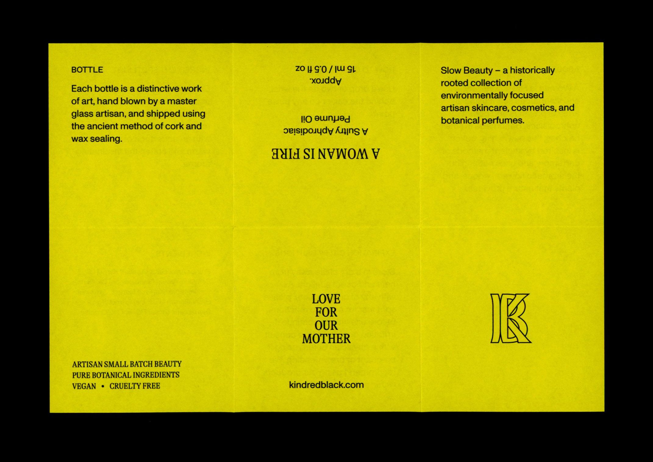
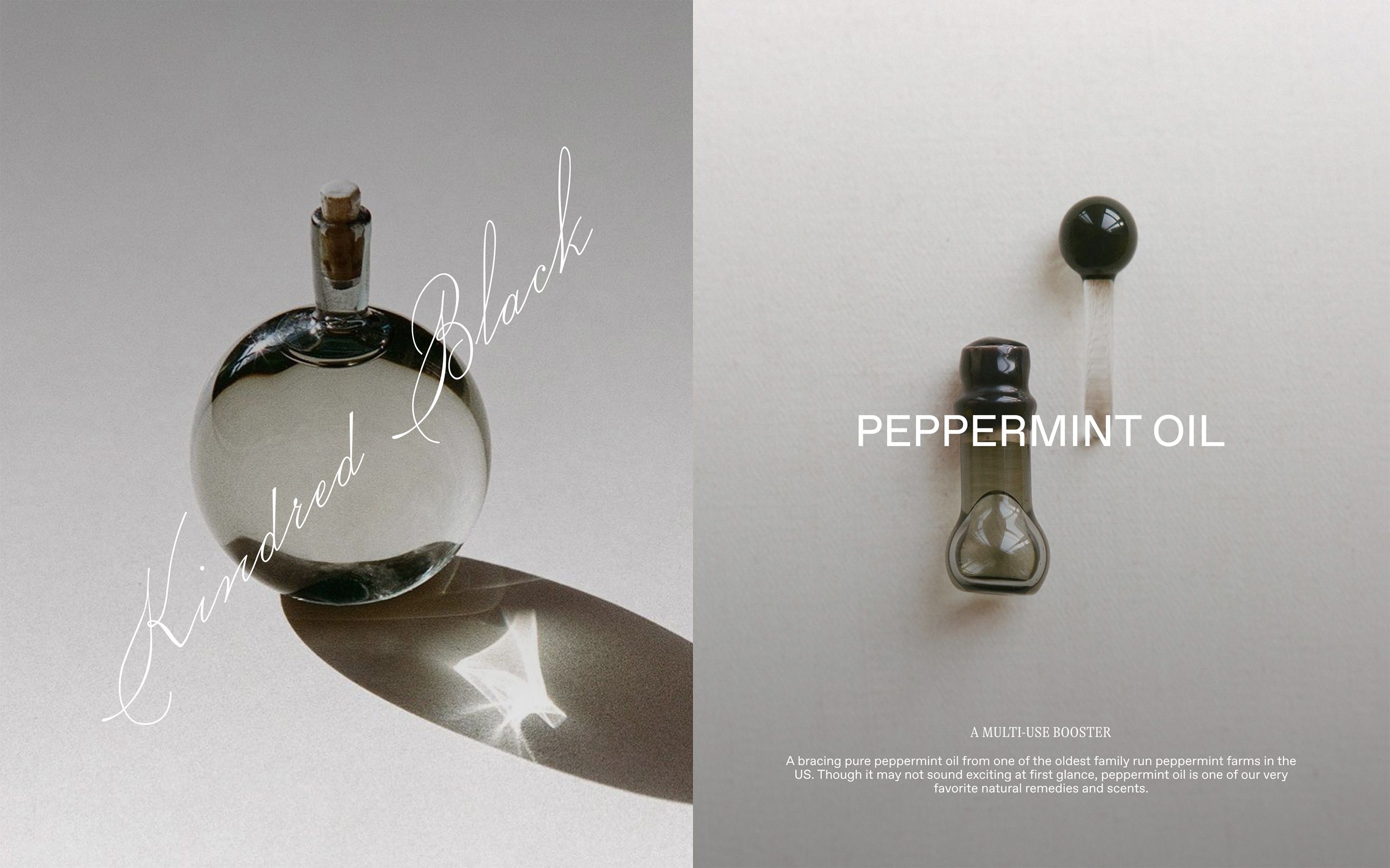
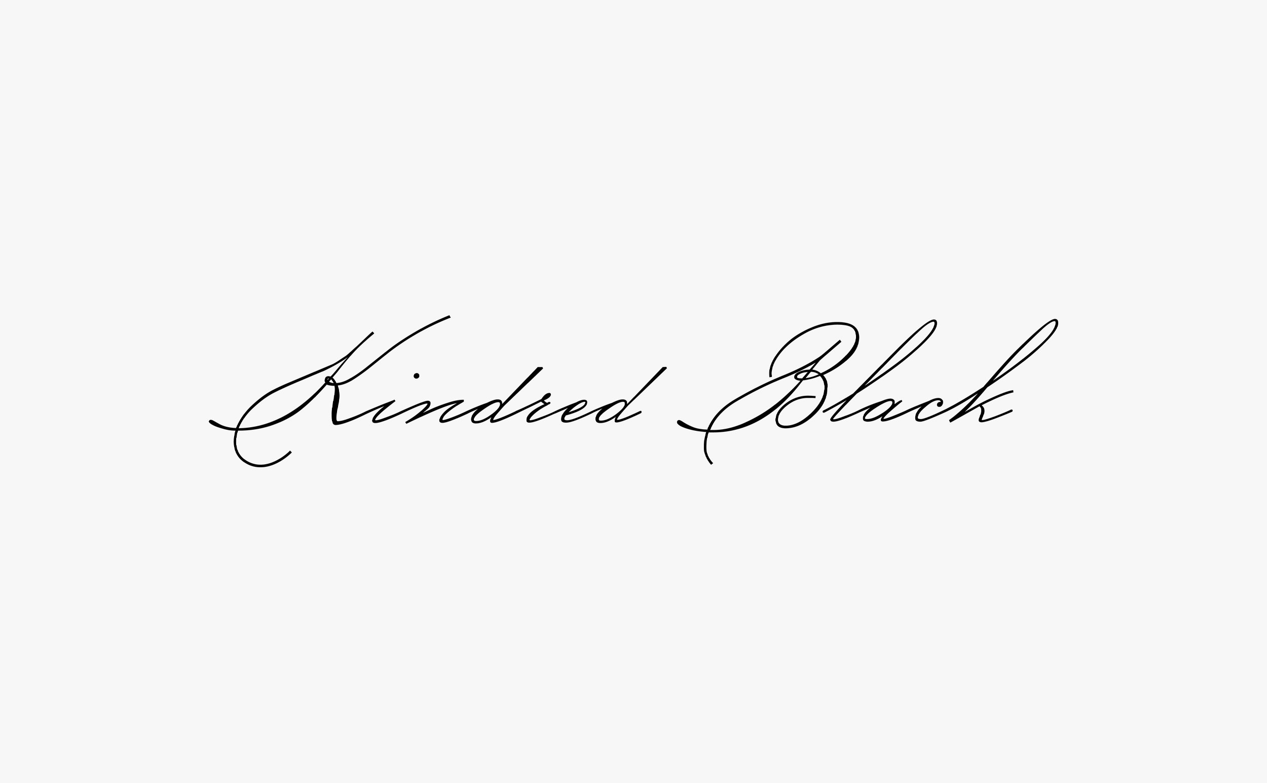
Like much of Ania et Lucie’s work, the aesthetic has a sense of timelessness with an emphasis on craft and elegance. Taking inspiration from classic scripts and hand-addressed envelopes, the creative duo designed a new wordmark, brandmark and typographic system (GT Alpina Condensed paired with ABC Monument Grotesk). The delicate wordmark mimics handwritten cursive, with a characteristic slant and capitalised initials sporting sleek curlicues. It is paired with a bold brand mark that neatly contrasts with some of the softer, more feminine elements of the identity. This supporting composition appears embossed on packaging, presenting interlocking initials in a motif that’s reminiscent of both Arts and Crafts typography and the Art Nouveau movement.
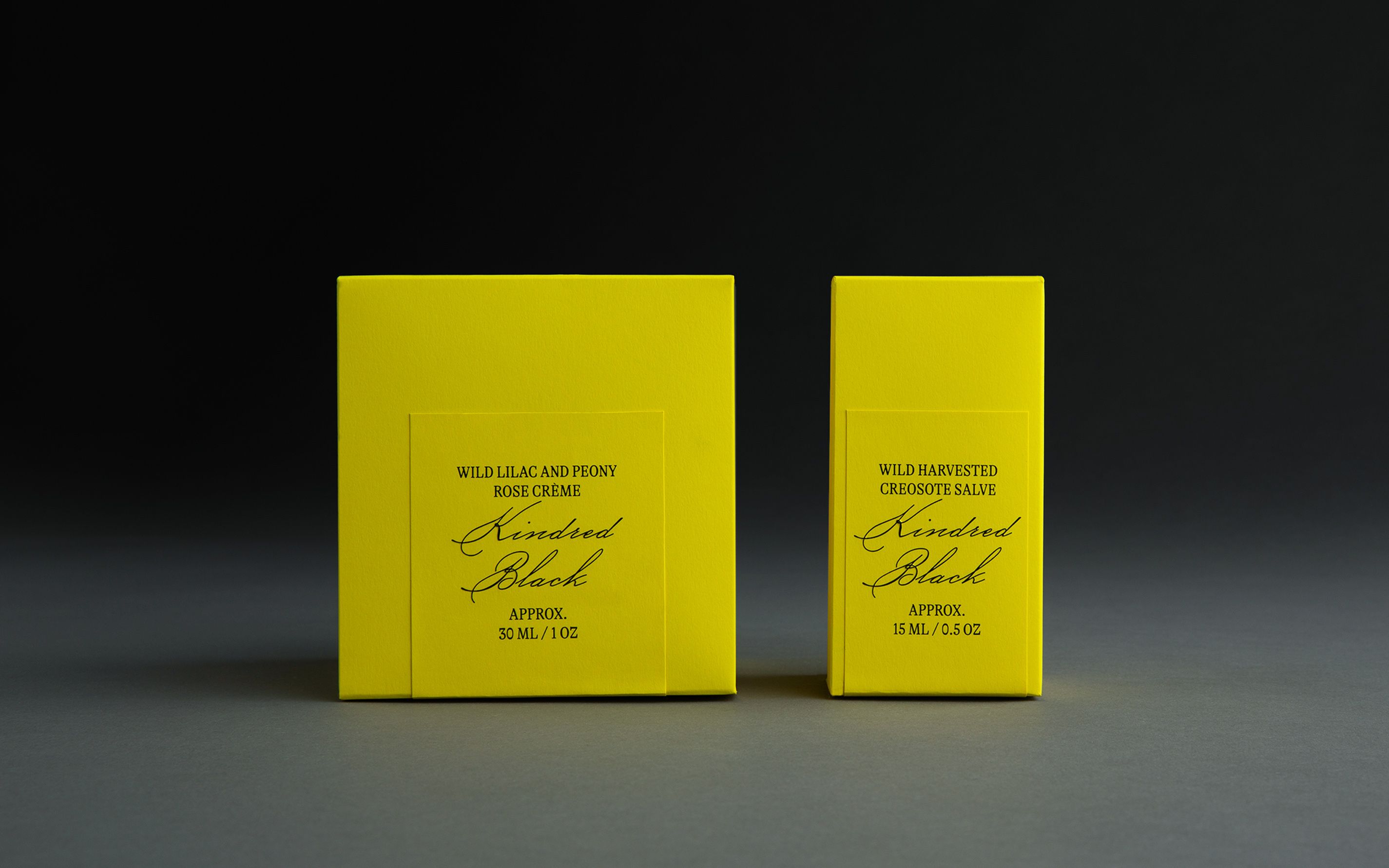
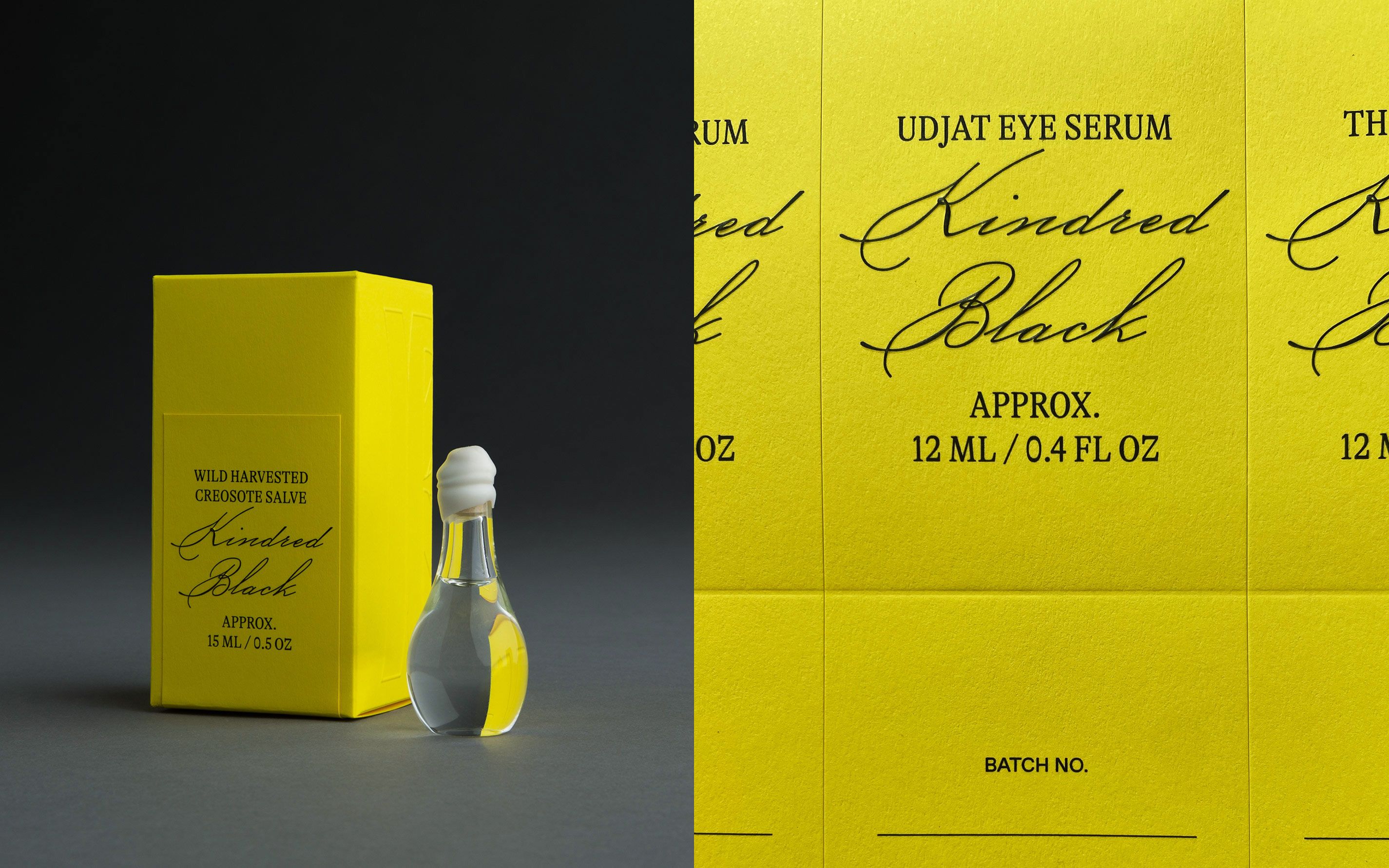
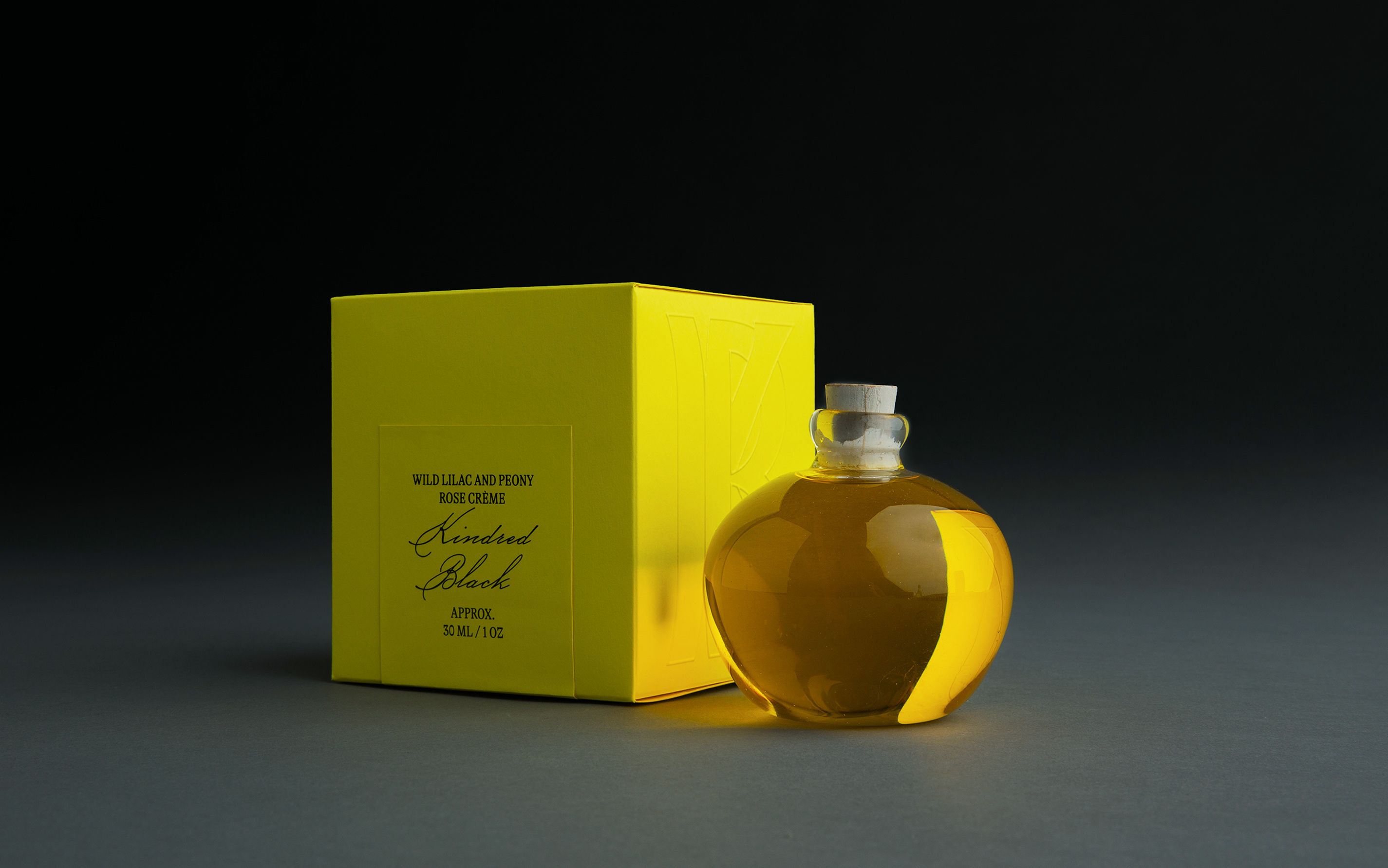
With each of the brand’s products individually crafted, one of the biggest challenges was to find a refined packaging solution to tie the brand’s appearance together. Ania et Lucie solved this by devising a streamlined system allowing two boxes to accommodate the various shapes, sizes and materials of Kindred Black’s vast inventory thanks to a series of adjustable and reversible inserts. The boxes come in a bright, slightly cool-toned yellow that would be perfectly at home in a Kandinsky painting. It’s a colour that pairs well with the glass vessels and containers as well as the products themselves. It’s fairly close in hue, for example, to the colour of Kindred Black’s Simmer Down Body Oil, while its brightness matches the Cloudless Eye Pigment and the Unicorn Multiuse Oil.
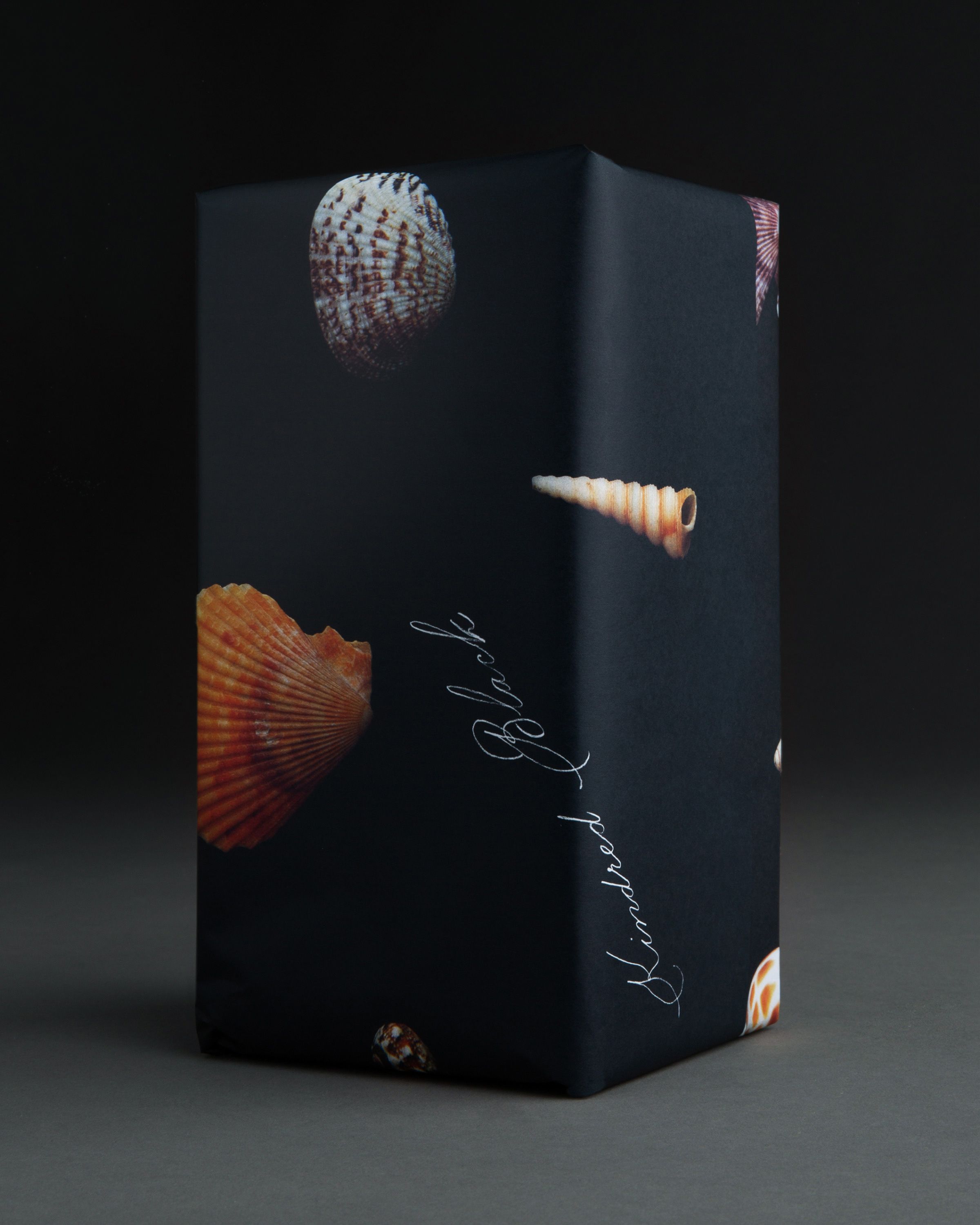
Said boxes, which were produced in collaboration with Paris-based printer Imprimerie du Marais, then contain product-specific labels and inserts. The addition of notecards, photo-printed wrapping paper and stickers adds an extra touch of personalisation while expanding the brand’s worldbuilding. One design for the wrapping paper, for example, features a series of seashells, which nods to the way nature and mythology are Kindred Black’s main muse.
By combining this robust one-size-fits-all structural solution with modern lettering, elegant curlicued script and a colour palette that feels very much of this time, Ania and Lucie fully emancipate Kindred Black from any association with a witchy Renaissance-faire aesthetic, positioning the brand as a platform that harnesses ancient practices but is fully immersed in the contemporary world.
