Ragged Edge creates refreshingly wholesome identity for AI notepad Granola
Opinion by Emily Gosling Posted 25 September 2026
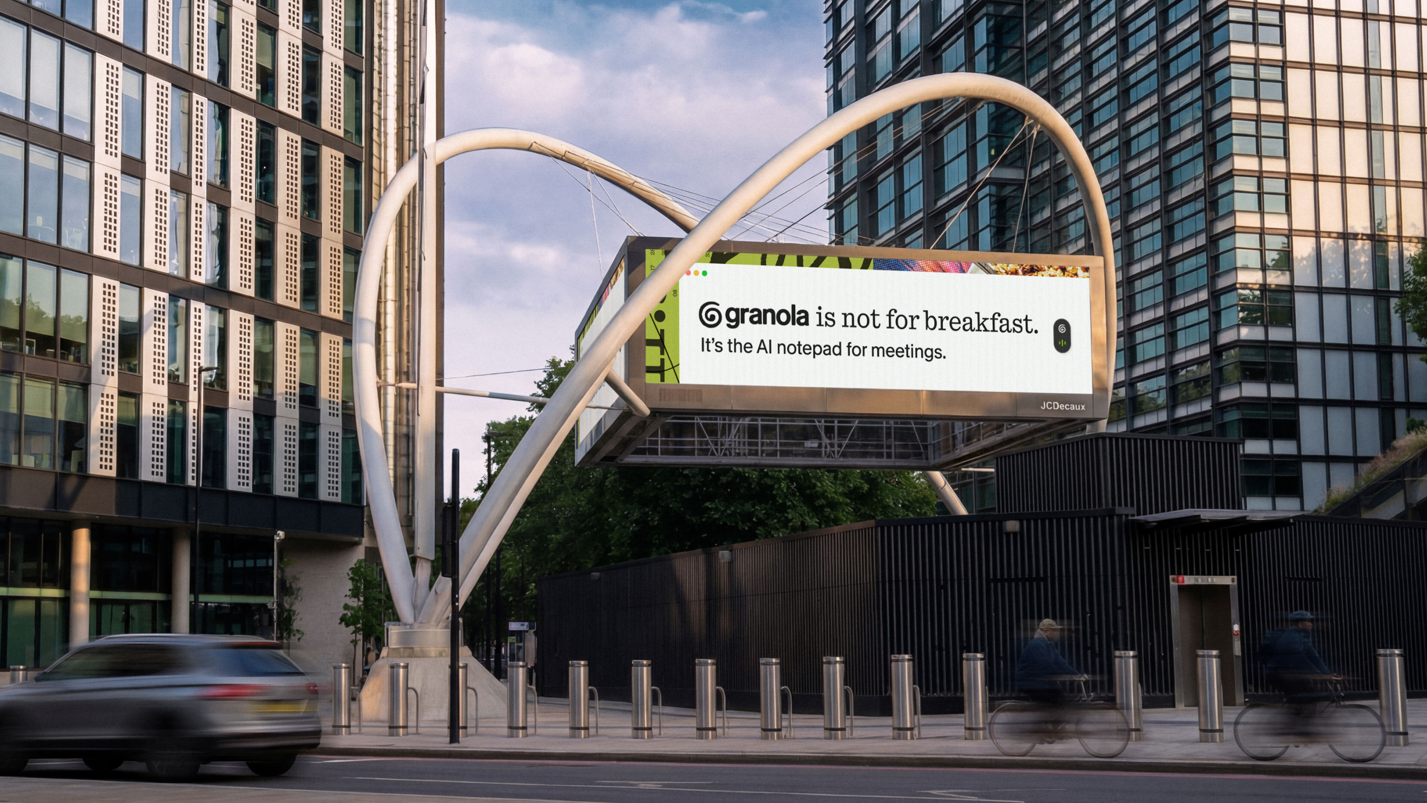
Granola is a brand that’s certainly made itself known in recent months – at least to those using various lines on the London Underground. Indeed, there was a time when you could barely move for its ads; its assertions that Granola was ‘not for breakfast’.
Those ads certainly caught my eye, then – especially in a sea of similar things vying for your attention – and did so long before I really had cause to think about Granola, and what it was, and how effective (or not) its brand design might be.
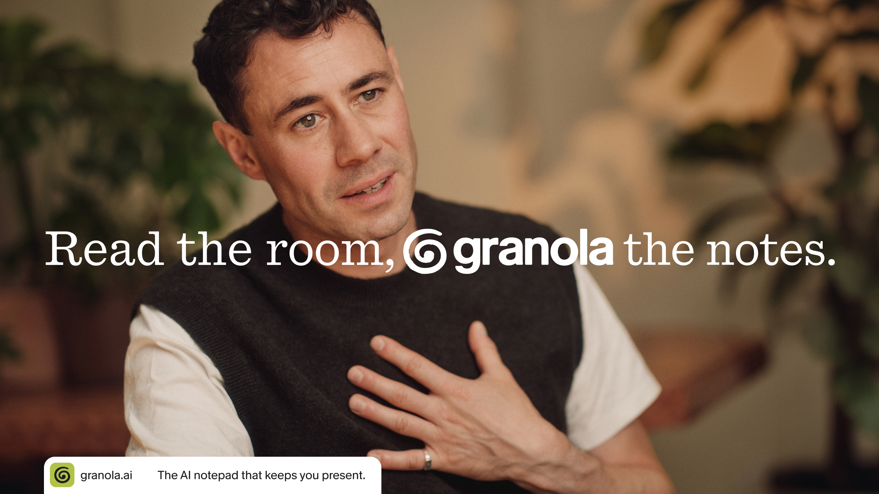
At first, I was honestly unimpressed with the name – it seemed to make no sense – but having had time to chew over it (pun semi-not-intended, I think), I can totally see why it works. ‘Granola’ connotes the everyday (‘you can, and should use this AI everyday!’). It’s so far from being exotic (‘AI isn’t a big scary awful tech entity that will take your job! It’s your boring old helpful, you-know-what-you’re-getting pal!’)
It’s GORPcore (remember that?), for software: unthreatening, friendly, absolutely, 100%, downright wholesome.

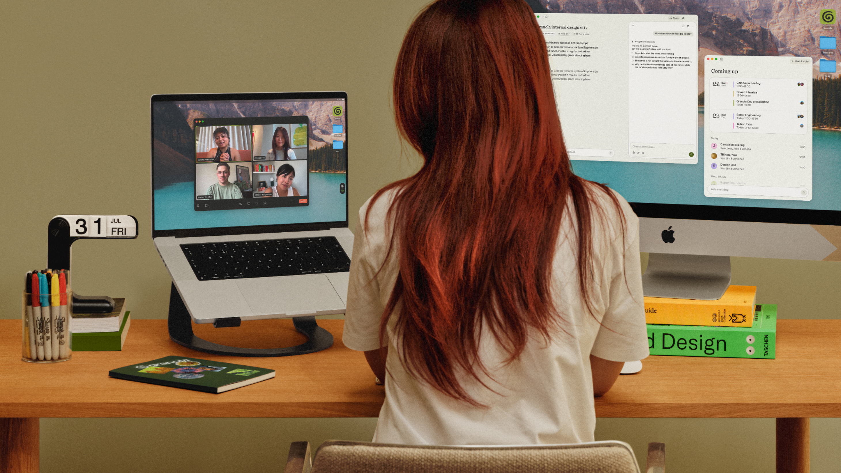
Indeed, it seems much of Ragged Edge’s approach to its brand design and resulting campaigns for Granola was about emphasising the platform’s stated point of difference to other Big Bad AI competitors: its humanness.
It’s probably worth explaining exactly what Granola is (and isn’t) here. It’s an AI notepad designed to take care of the note-taking around meetings, capturing what’s said and the context around it so users can spend less time frantically typing and more time actually paying attention. It can also help prepare for meetings beforehand and turn the resulting notes into something useful afterwards (or so it claims, at least).
That distinction is pretty central to the identity Ragged Edge (Omlet, Marshmallow, Unmind) has created. Rather than leaning into a very ‘Slick Shiny New Clever Silicon Valley Software’ vibe – all slick gradients, chilly interfaces, futuristic type and an overall ‘Fitter. Healthier. More Productive.’ energy – the identity goes in almost the opposite direction. It’s warm, tactile, slightly scruffy, and deliberately full of evidence of the human hand.
The logo, for instance, takes the form of a loosely drawn, swirly mark – apparently intended to suggest that the path to growth and progress is rarely a straight one, while also functioning as a ‘G’ for Granola, and doubling down on being very much wrought of the human hand.
While I understand the rationale behind the swirly logomark, I can’t help but get wayyyyy too caught up on where it falls flat on a conceptual level. If it is, as Ragged Edge says, meant to be not only a mark, but double up as a ‘G’ (for Granola), then surely every time it’s used in front of the brand’s name it therefore reads G-Granola?! Maybe I’m getting more worked up about this than I should, but it’s irritating, and a real bump in the road for me within an otherwise very lovely visual identity project.

On a more positive note, I really love the use of typography here. For the most part, Ragged Edge has opted to use Quadrant Notepad – one of a number of typefaces in the Quadrant family designed by Vincent Chan and released by foundry Matter of Sorts.
And I’m very much into the bespoke script used elsewhere in the identity: Ragged Edge worked with Berlin-based type foundry NaN to develop a typeface based on the handwriting of Granola co-founder Sam Stephenson, using hundreds of handwritten letters and multiple versions of individual characters. The result is appropriately irregular: letters change as they’re used, giving the script a genuine sense of humanity, rather than the uniform faux-humanity found in the majority of handwriting script fonts.
That idea of human messiness carries through to the identity’s illustrations, or what Ragged Edge calls “findings”: an assemblage of different snippets of photography, colour, texture and other elements that suggest the haphazardness of an actual working day, rather than the sort of thing that starts at 5am with an ice bath and ends with everyone bursting into applause because you’re such a great parent, or something. In the wrong hands, this collage, zine-leaning approach could be cheesy and hideous: in the deft hands of Ragged Edge, it just about avoids that.
The cut-and-paste feel is ameliorated by the colour palette, which uses warm, earthy shades for the most part – largely green (perhaps ‘gr’een = ‘gr’anola? Perhaps that’s a stretch, but we never know eh).
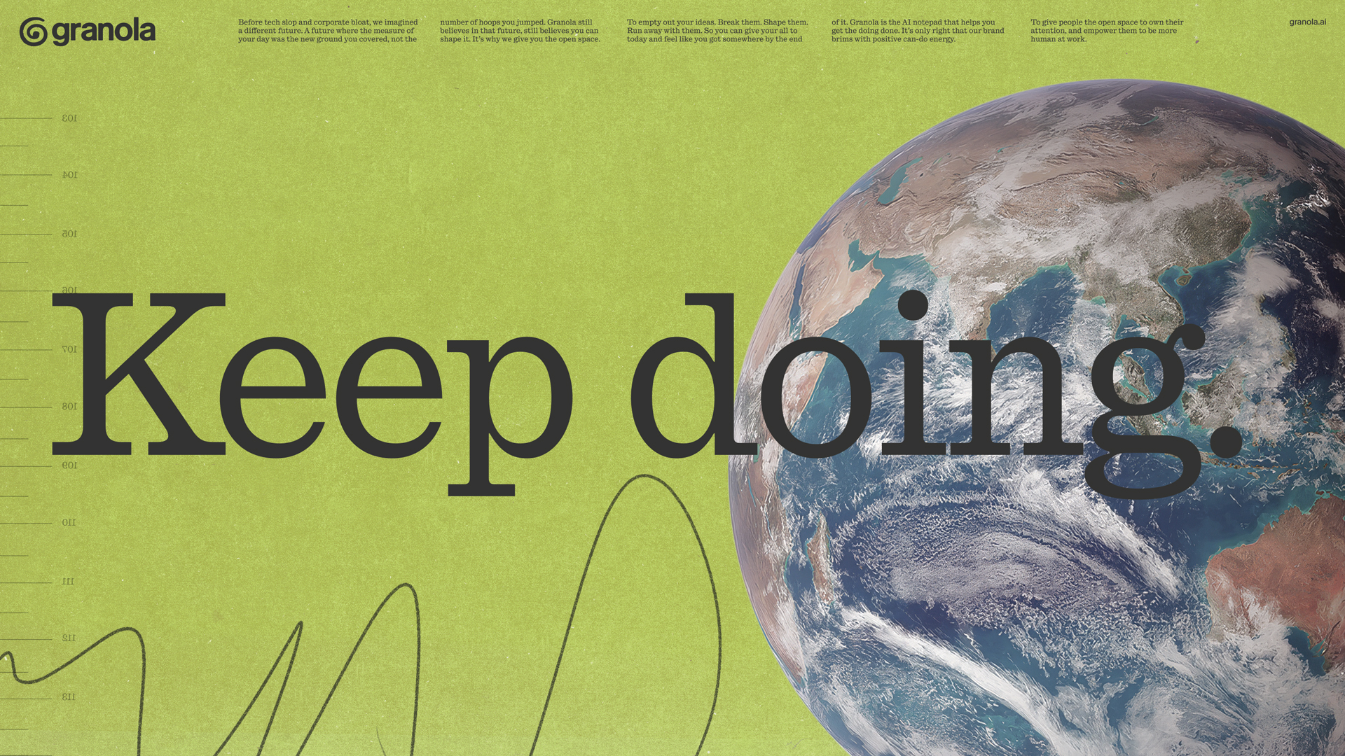
When it comes to the interface itself, Ragged Edge wisely chose to play down the collage thing and opt for calm over busyness – everything is relaxed, nothing is screaming at you, just as a normal day at work should be. All of which feels particularly apt for something whose whole proposition is essentially that your attention is worth protecting.
Overall, then, this is a really lovely piece of brand design: the bespoke script, the general warmth that somehow manages not to teeter over the line into ‘twee’. Yes, that whole ‘G’ symbol riles me likely more than it should do, but perhaps that’s on me: it’s a daft gripe for an otherwise lovely identity that has certainly proven itself to be distinctive and memorable.