Persillade by Clear Design
Opinion by Richard Baird Posted 8 May 2014
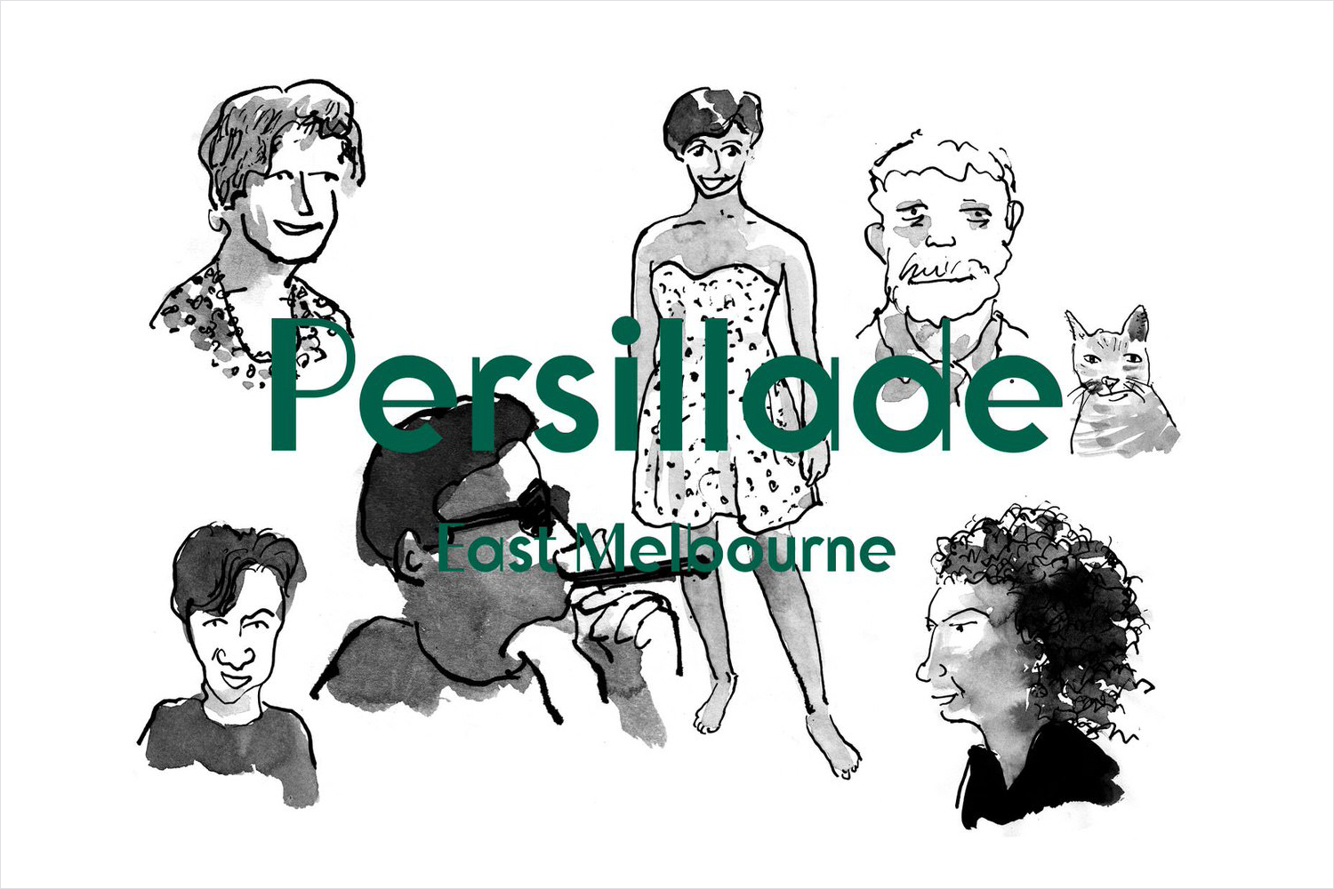
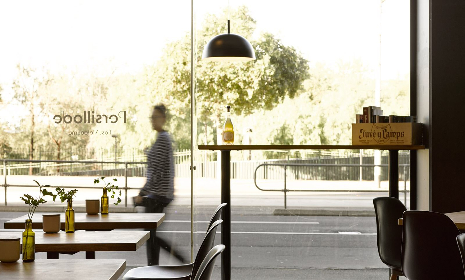
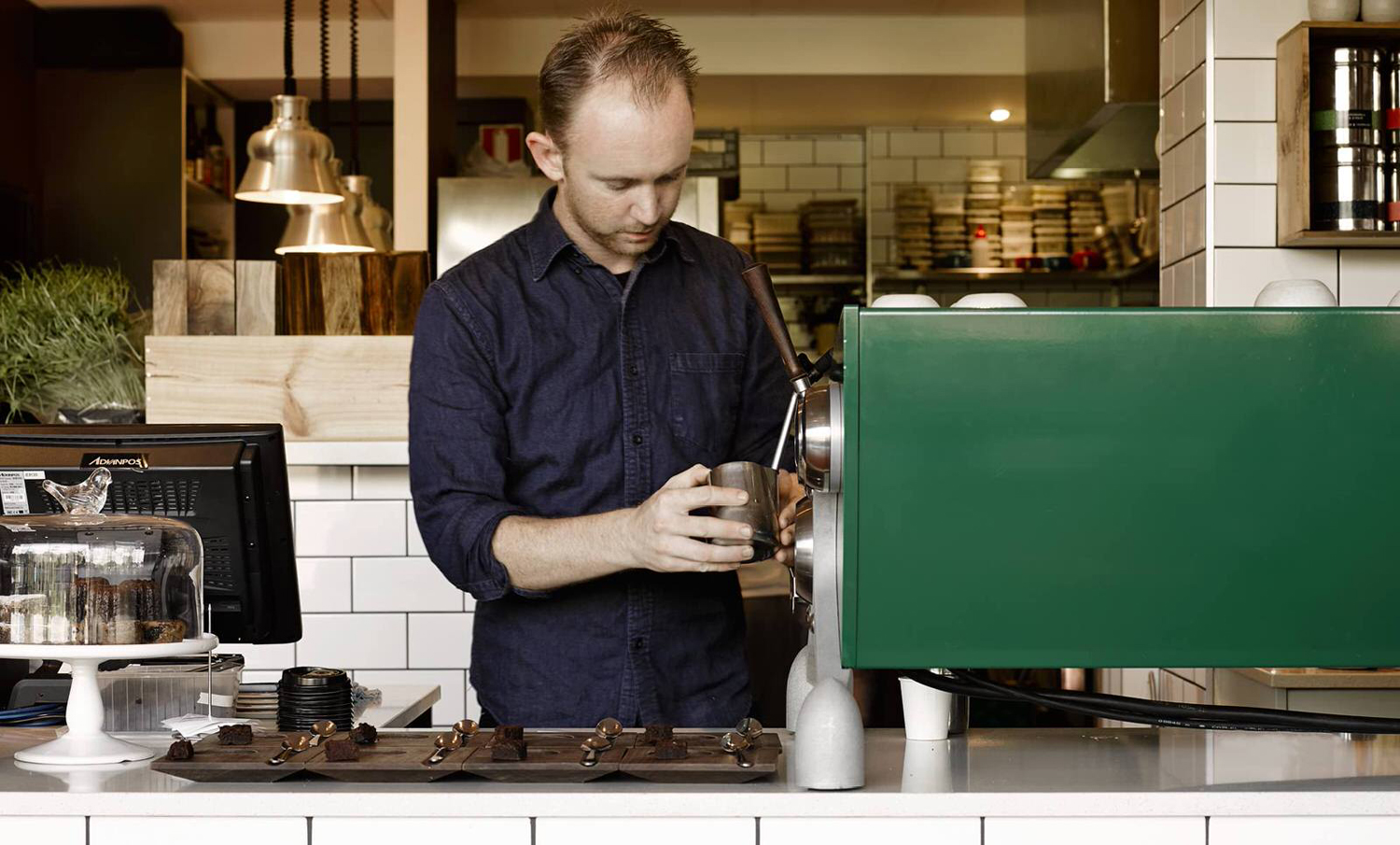
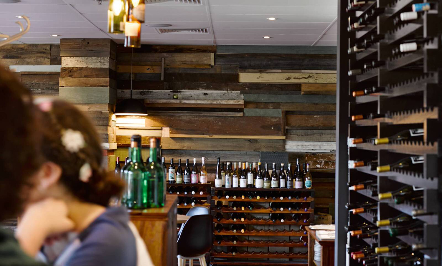
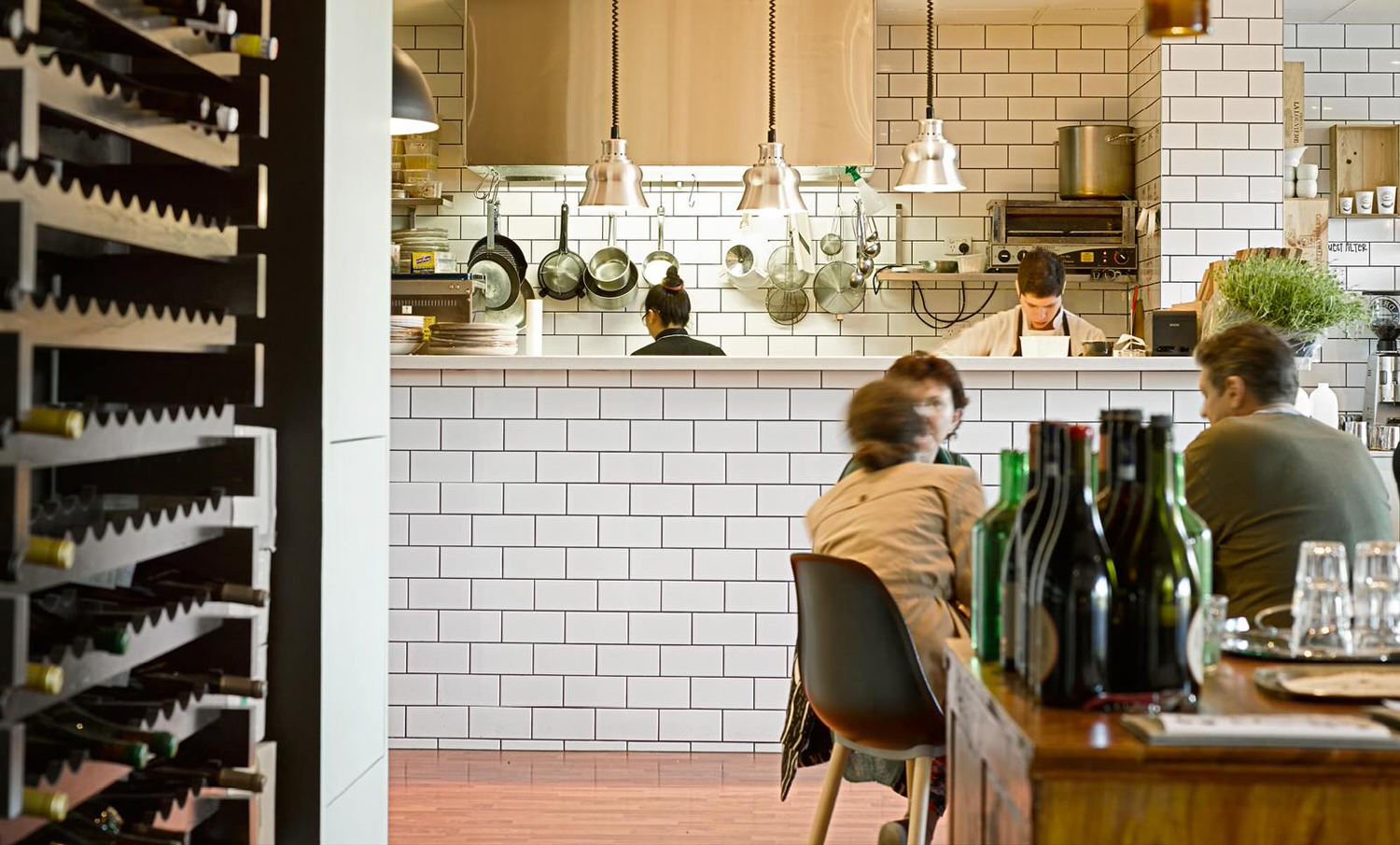
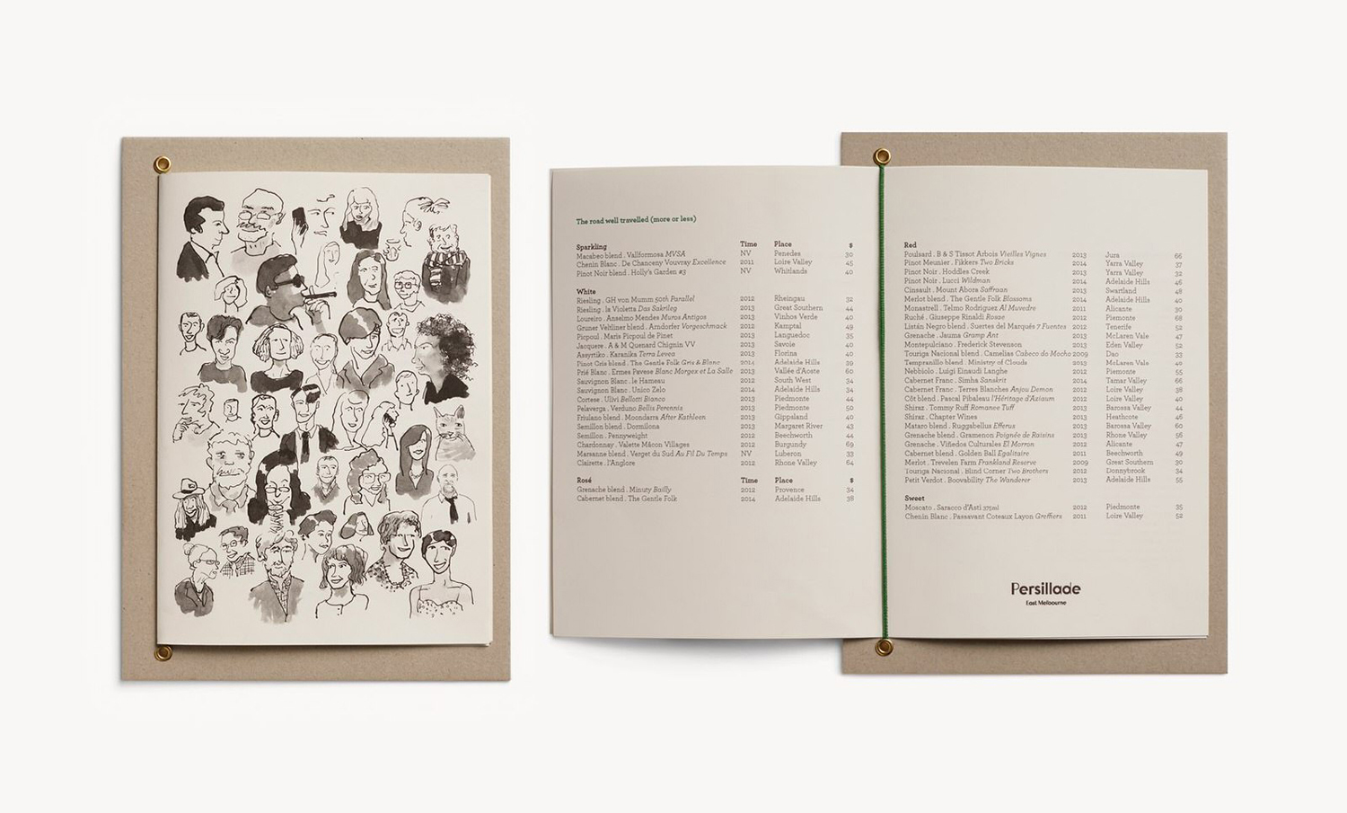
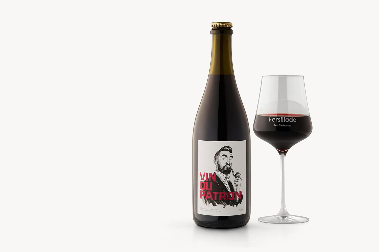
Persillade is a Melbourne cafe opposite Jolimont Station with a large double shop front and an interior of reclaimed wood and bottles, white tiles, steel, glass and classic furniture. Design studio Clear were commissioned by owners Aidan and Tanya Raftery to develop a graphic identity for the cafe that would bring some “much needed soul, texture and community to the very private neighbourhood of East Melbourne”. This went on to include a custom logotype, print assets such as menus and wine labels that feature illustration by Oslo Davies, as well as signage and interior design.
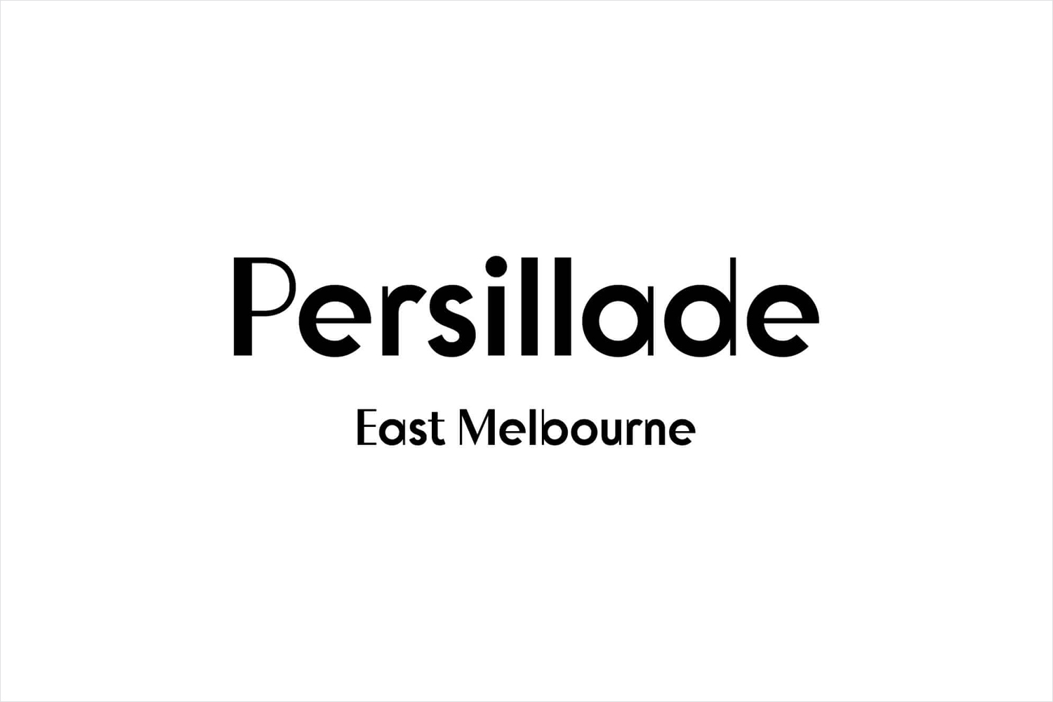

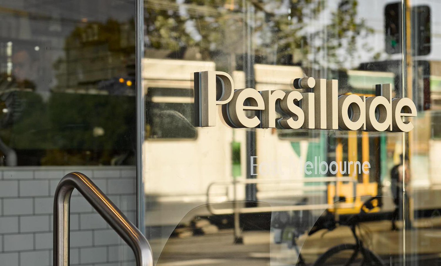
“Our approach was to ensure every touch point of Persillade was honest in material and filled with character. The logotype took design reference from early 19th century French signage. The use of colour was pared back and modest with highlight tones referencing the greens inherent with parsley. Community is bought to life through the commissioning of illustrator Oslo Davies who did on site character studies on notable locals and key personal of the business.” – Clear Design
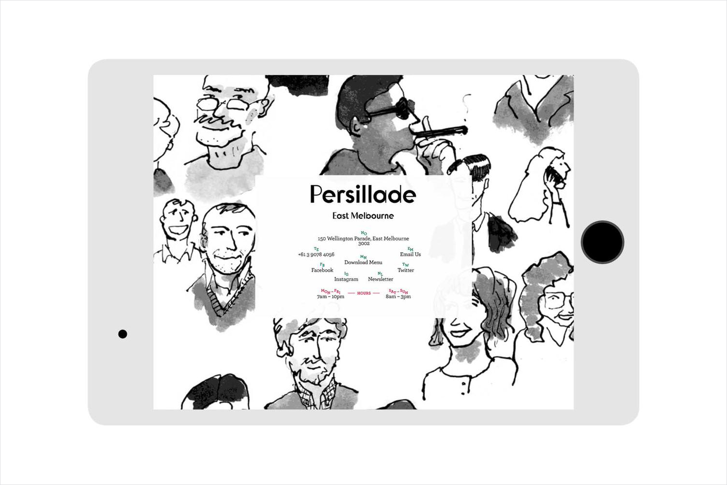
The juxtaposition of geometric type and hand drawn illustration makes for a striking aesthetic that mixes craft and classic design references to neatly resolve the themes of informality and high quality.
Oslo Davis’ illustration work has plenty of character and variety, the kind you get from appropriately outsourcing the work to a specialist, with a loose ink and watercolour rendering but a considered political cartoon-like sensibility. Each of the personalities has a good sense of movement and mixed expression in the line work while a mix of position, head, torso and full body and compositions that effectively connect the individual images.
The fine and heavy stroke widths of the typography offer a rigid contrast to the motion of the illustrations. The letters, unusual for today, appear clearly retrospective, well drawn and then built in three dimensions. While different in execution both type and illustration have their own expressive style that rather than directly mirroring the interior provide it with communicative breadth.
Design: Clear. Illustration: Oslo Davies. Opinion: Richard Baird.
“The interior is broken into to sections — cafe and dining. With the cafe walls cladded out with subway tiles and the dining room using reclaimed wood to line the walls. The idea of the reclaimed wood came about from one of many design development conversations where we all discussed the idea of creating a local ‘get away cave’ intermit and inviting. Each table is adorned with simple green glass bottles and a sprig of parsley.” – Clear Design
