Finchtail by Believe in
Opinion by Richard Baird Posted 23 April 2015
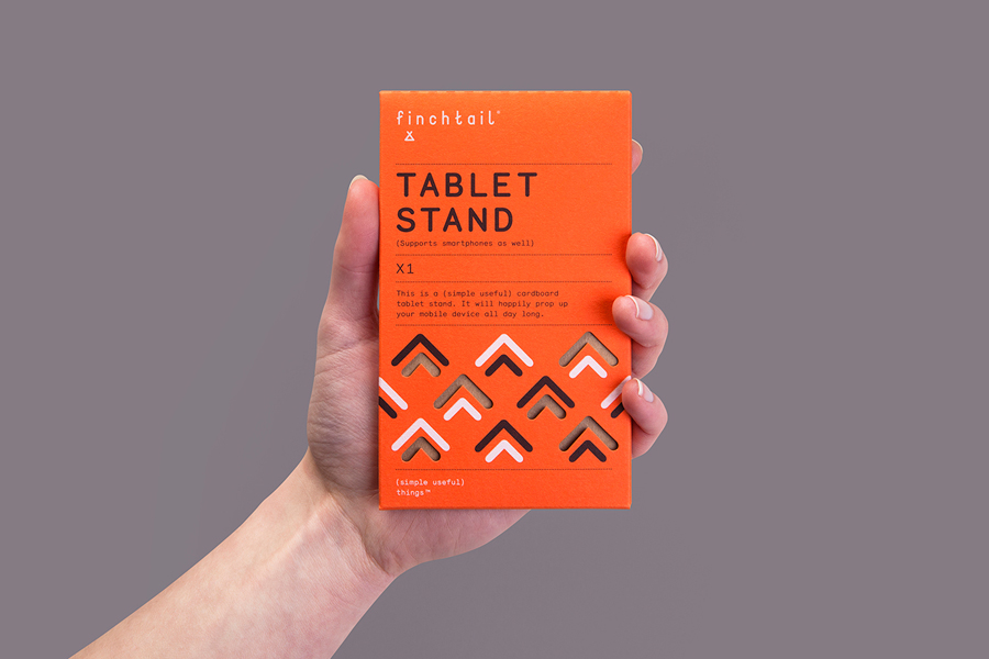
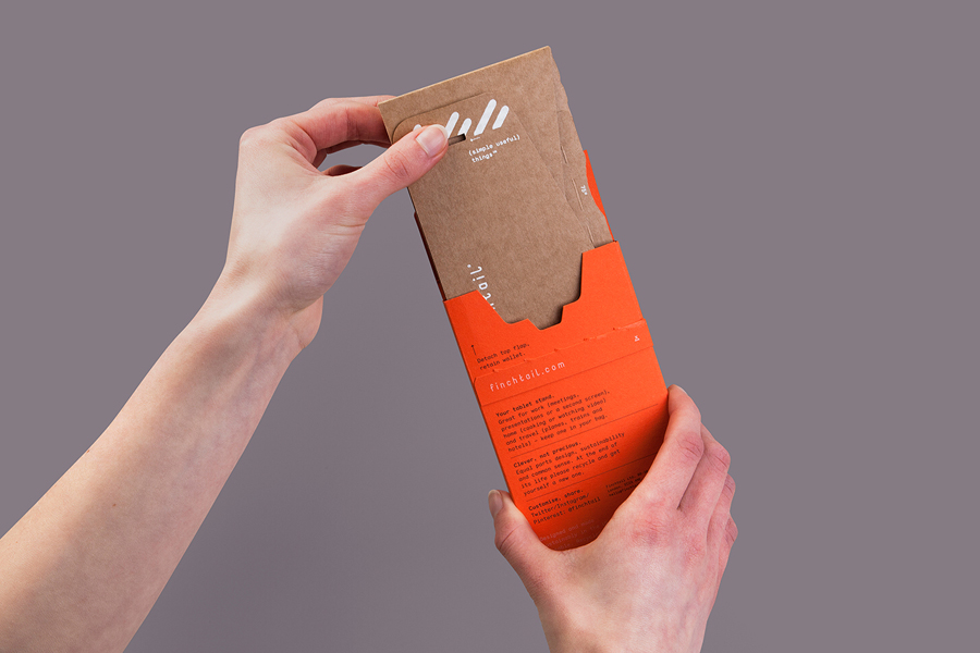
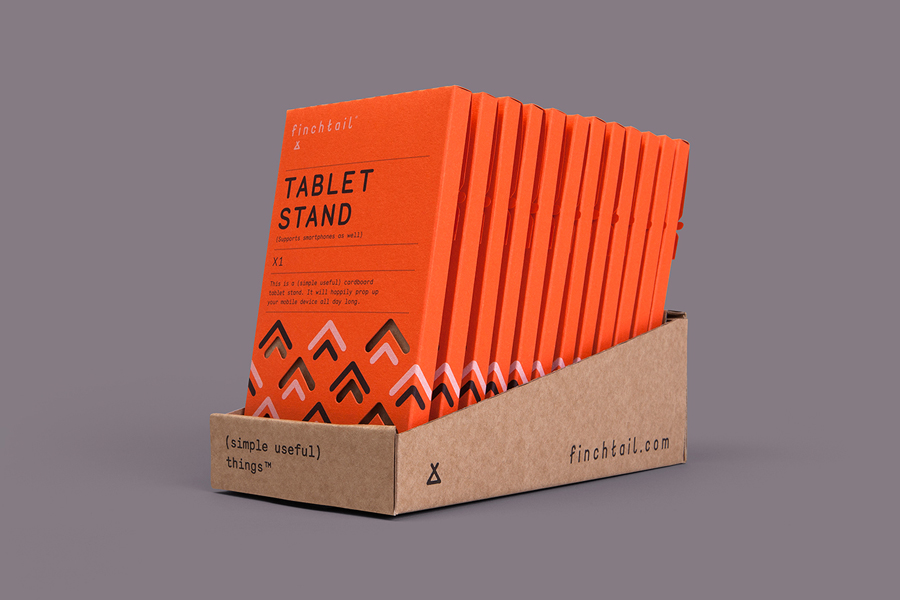
Finchtail is dedicated to the design and manufacture of simple, useful and sustainable solutions to everyday problems. Its first product, a low-cost, flat-packed card tablet and mobile phone stand, features a distinctive brand identity and packaging design treatment developed by UK based graphic design studio Believe in. Monospaced type and corrugated card sit alongside die cut detail, white ink, a bold pattern and a bright dyed board, carefully balancing moments of utility, quality and aesthetic flourish. Alongside visual identity and packaging design, Believe in went on to create point-of-sale, website, marketing materials and a stop-frame video in collaboration with Thank You Mam.

A logotype built from broadly spaced, condensed, monospaced and monolinear characters–their technical and mechanical uniformity and origin given small custom flourishes alongside a similarly weighted tail motif–secure distinctive character without undermining the typeface’s basic utilitarian associations, and is built upon in print.
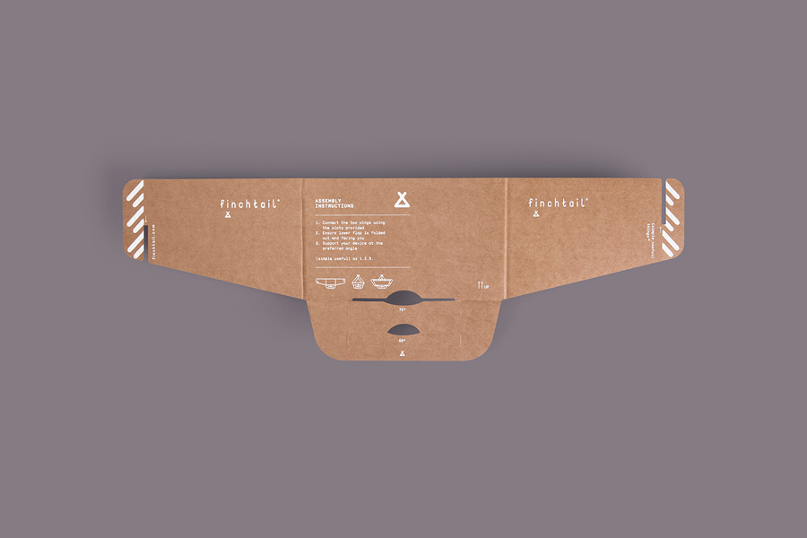
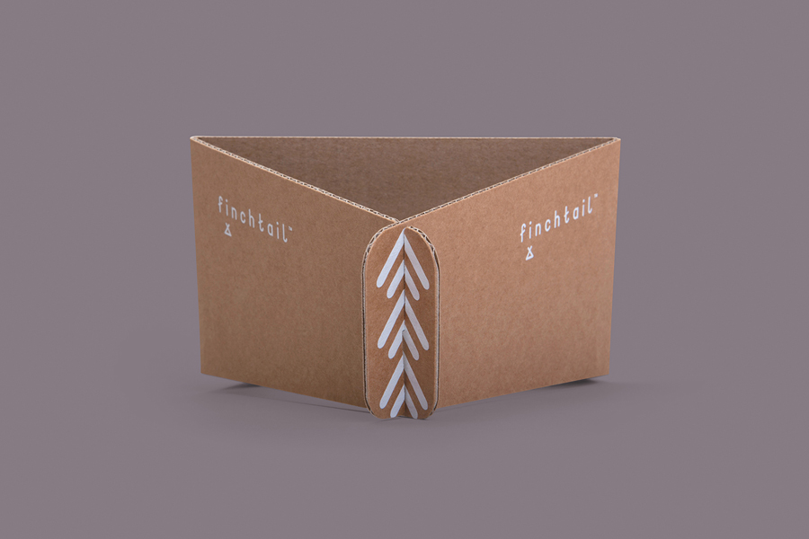
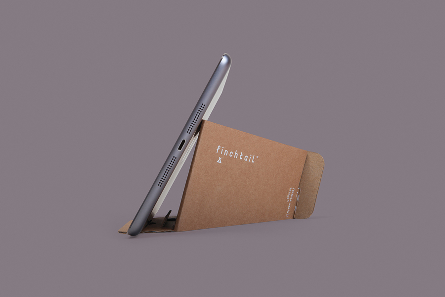
Believe in’s packaging effectively and cohesively broadens the logotype’s straightforward balance of utility and aesthetic distinction through an additional type choice, colour, language, form and print finish.
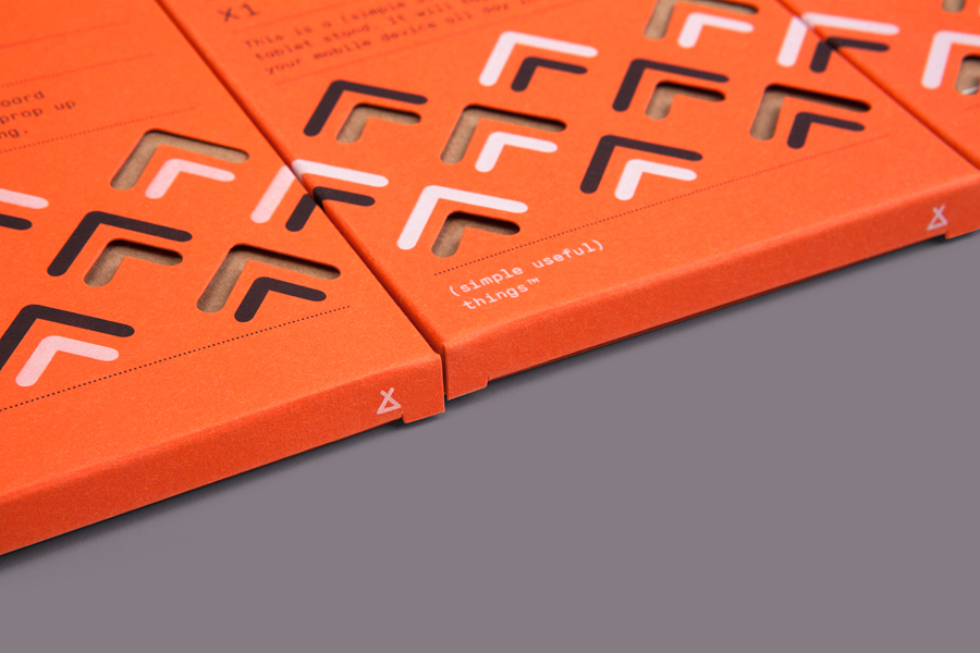
A chevron-like pattern, rendered with a similar monolinear quality as the logotype, and applied as a white and black ink and die cut detail, extracts a compelling and unique stylistic quality from industrial associations, and draws the resilience associated with corrugated board right into the design language.
This contrast also extends to a small copywriting component that, like the packaging, unites moments of basic communication with a more human and creative tone-of-voice through both straightforward and more emotive word choices.
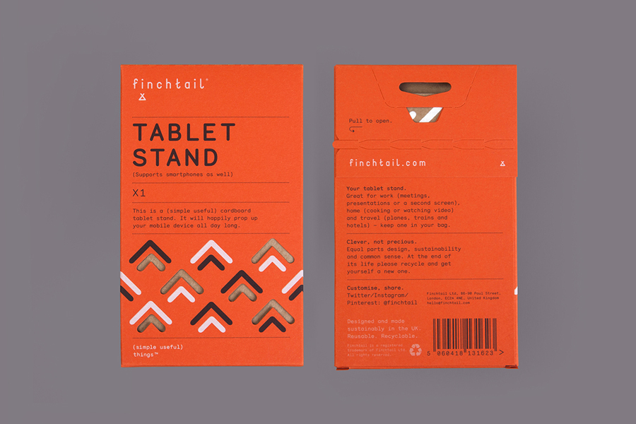
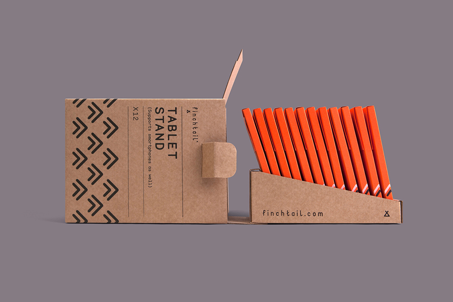
A dyed orange board—emergency, high-visibility, first aid travel kits come to mind—alongside white ink, cuts, perforations and a bold pattern, secures a contemporary impact and quality where the corrugated board of the product is ubiquitous and low-value. This contrast of material and colour, product and packaging, utility and ornament, is expanded upon through a durable, custom, corrugated card point-of-sale structural solution and its graphic design.
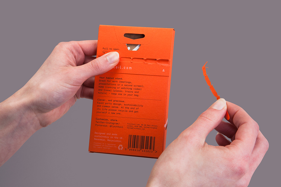
The packaging works well to emphasis and draw out the functional and design-led nature of the product, and tempers its low-cost manufacture with high-quality material choice and finishes. It adds value through its functionality as a sleeve—contributing to and improving product longevity—communicates the philosophies of the company, establishes a unique aesthetic quality through juxtaposition, fosters an emotional brand connection, and does a good job of leveraging a current favour for practical, well designed solutions underpinned by a sustainability and conscientiousness. More from Believe in on BP&O.
Design: Believe In. Opinion: Richard Baird. Fonts Used: Monosten
