Aultmore by Stranger & Stranger
Opinion by Richard Baird Posted 11 May 2015

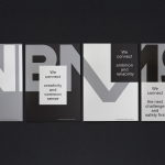
Aultmore is a rare Speyside single malt Scotch whisky known locally as “a nip of the Buckie Road” and is part of the ‘Last Great Malts of Scotland’ collection from John Dewar & Sons. Drawing inspiration from the misty and mysterious area known as ‘Foggie Moss’, a place where the distillery’s water filters through, London based graphic design studio Stranger & Stranger developed a label, bottle and packaging treatment that, while heavy on the heritage, individuality and craft cues inherent to the industry, sets a unique tone through image and the absence of image.

Stranger & Stranger confidently work together the themes of heritage, craft, individuality and experience in a way that leverages the well-established visual vernacular of the industry yet remain unique in their resolution and variety.
These include a proprietary structural design with a raised surface detail and a turned wood cork, the torn edges and texture of the label, blind emboss, deboss and foil print finishes, a handwritten component, batch number, and a contrast of serif, sans-serif and script.
Where you might expect to see one or two of these treatments, often due to expense, Aultmore features a wealth of detail without appearing extraneous, heavy-handed, or cluttered. This is largely due to a good use of unprinted white space, an eye for layout and a balance between visual and physical assets.


The image of the distillery, the surrounding land and mist—getting denser with the increasing age of the whisky—set a mysterious tone well, touches upon provenance and time in a way that is compelling, unique and interesting in its reduction, and works particularly well across a three-bottle range yet evident individually.
In many ways the treatment is far more nuanced than Stranger & Stranger’s other work, and while it does not break significantly from convention in the way we have come to expect from the studio, it does a great job of drawing distinction from familiarity and clear in its delivery of key values.
Design: Stranger & Stranger
Opinion: Richard Baird