Researchers In Schools by Paul Belford Ltd.
Opinion by Richard Baird Posted 18 January 2016

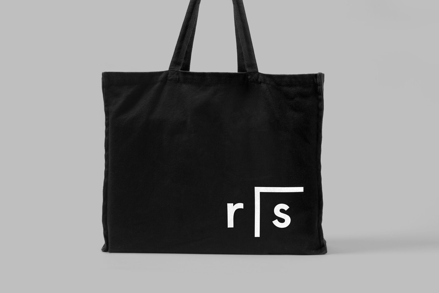
Researchers In Schools recruits and trains post-doctoral science researchers in the United Kingdom to become teachers with the intention of increasing subject expertise, promoting fields of research and improving university access. Researchers In Schools recently worked with London based graphic design studio Paul Belford Ltd. to develop a new brand identity system and visual language. This went on to include logo design and brand guidelines, business cards, illustration and tote bags.
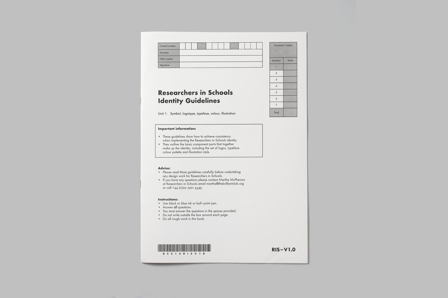
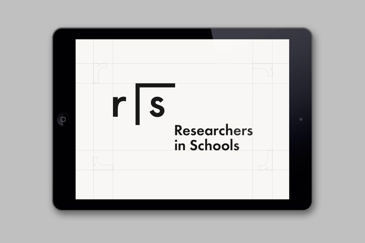
Paul Belford describe the organisation’s remit as literally putting researchers ‘into’ schools. This originally played out as an incredibly awkward and poorly resolved monogram, but is now conveyed using a simple mathematical expression. Although significantly more restrained, it is a huge improvement, particularly within the context of research and academia, with an element of play and sophistication drawn from the simple forms and structure of Futura.
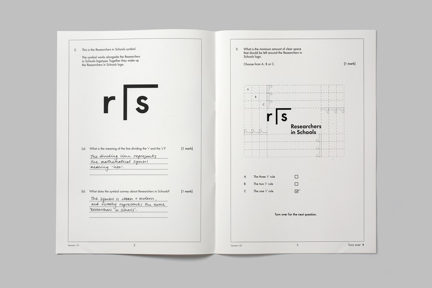
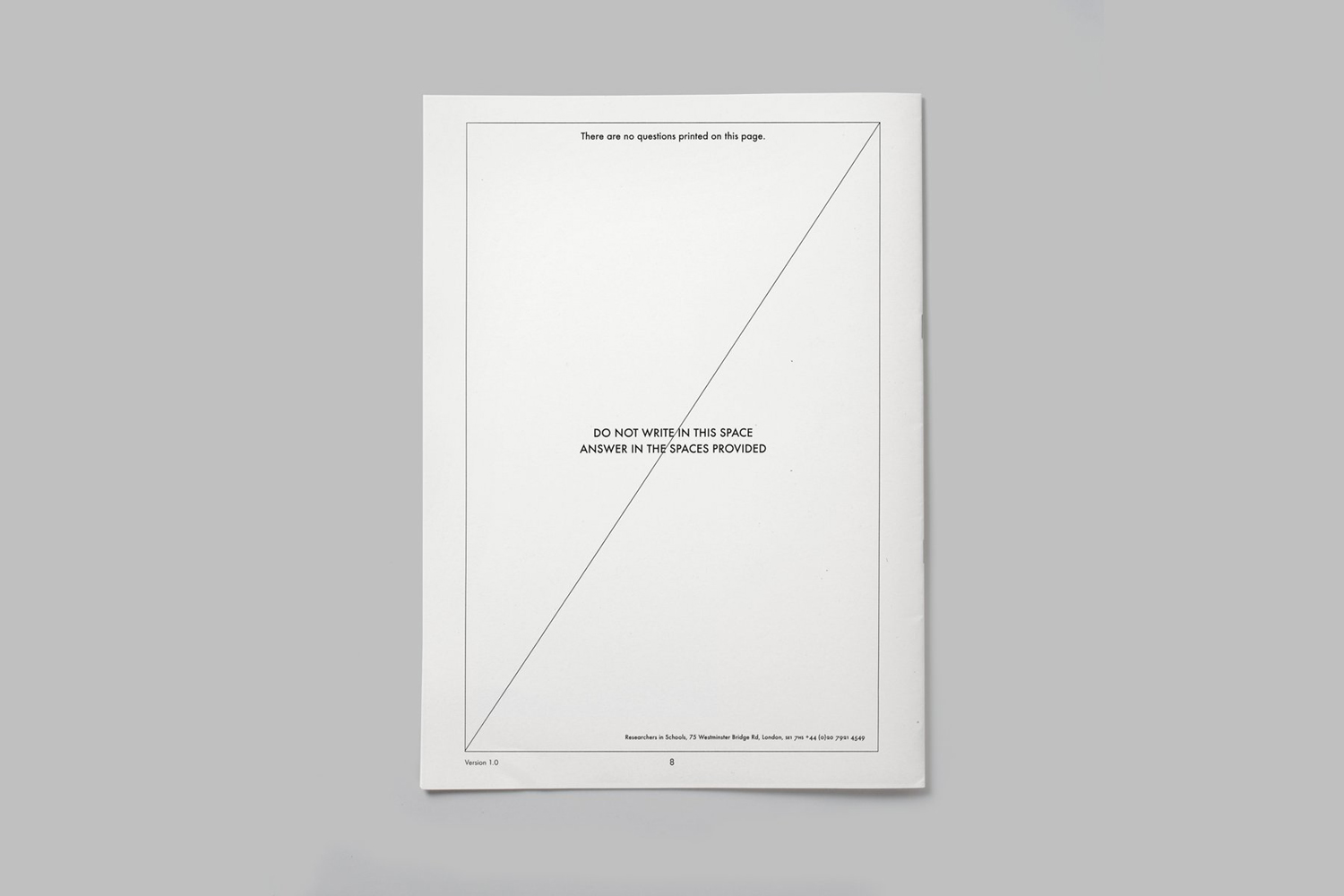
The brand guidelines are playful in their appropriation of the vernacular and visual language of academic examination, and function, at least internally, as fine expression of the organisation’s intention, touching upon the rigour of research and examination in its format and general sense of utility, but also the human consideration in the use of handwriting.
This is a particularly neat, surprising and accessible way of dealing with the correct and incorrect ways of implementing identity, sensitive to those who may not be designers, however, there is perhaps a tension between initial delight and the need to reference something quickly with as little friction as possible.
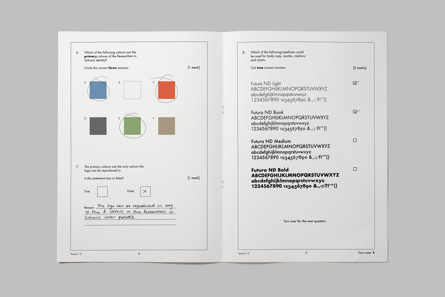
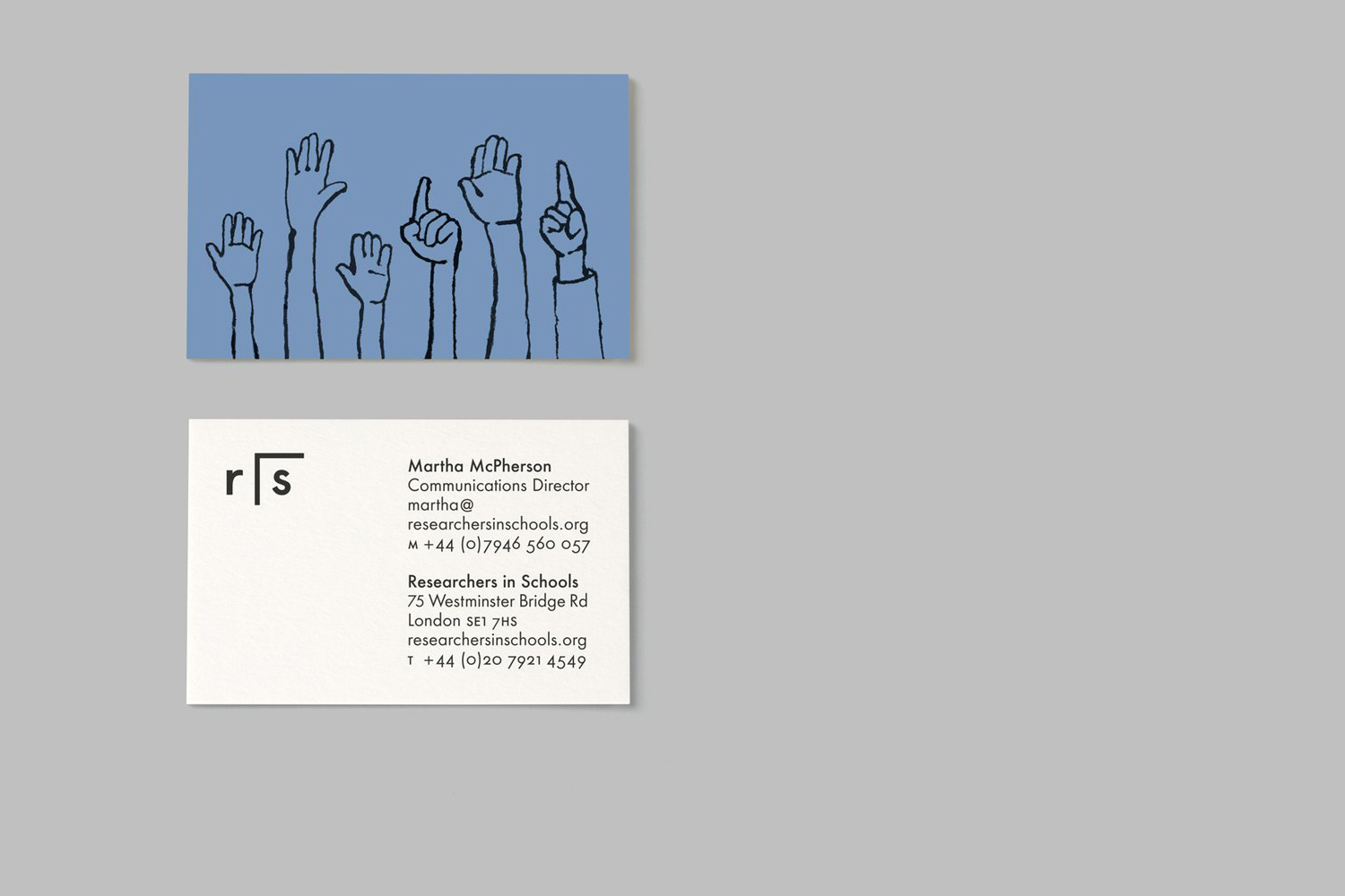
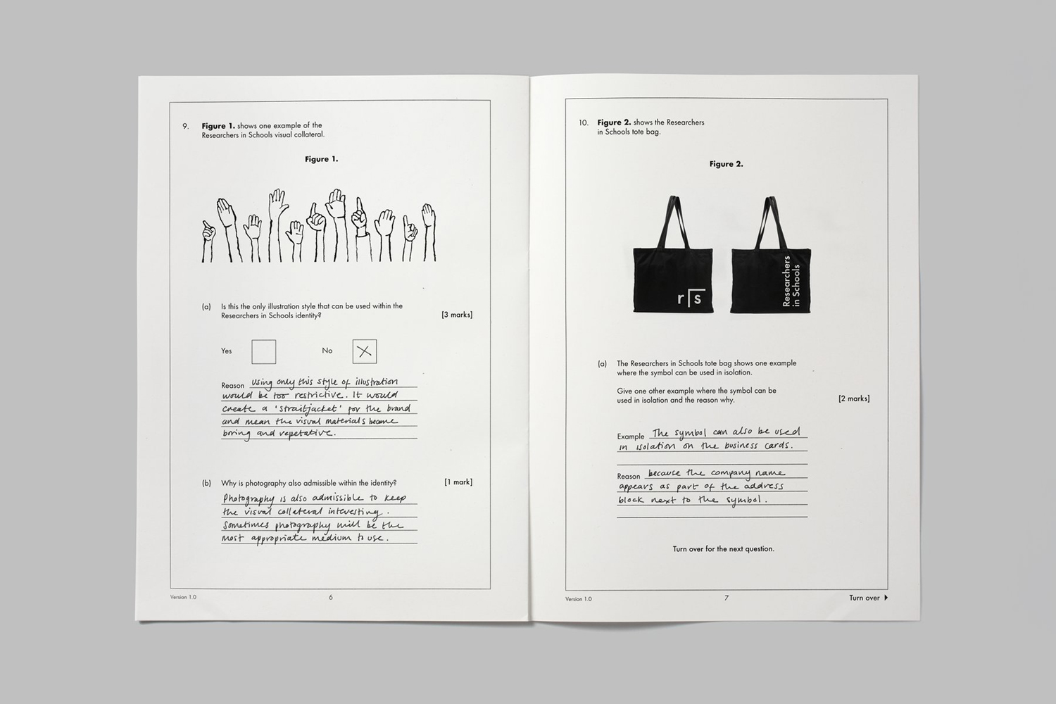
As an outward expression, the ideas that work there way through the brand guidelines come through in the juxtaposition of an economic palette of black ink, white paper and the reductive nature of the logo alongside the warmer and more accessible qualities of red, green and blue inks, and the use of illustration across business cards.
The hands up motif is a simple but powerful image, one of diversity, individuality, enthusiasm, and a respectful connection between teacher and pupil. Although the logo is intelligent and the guidelines practical and accessible, illustration adds a much needed emotive detail.
It is a simple, small-scale project with few assets that currently have yet to be extended online or really infuse the organisation’s communications with any real character, however, while there is a overall sense of restraint, there is enough detail, rooted in concept and communicative agenda, to keep it interesting.
Each individual asset is precise in its intention and together make a good connection between research and eduction, organic learning and structured examination. These acknowledge the intelligence and the things familiar to those that the organisation looks to engage, whilst also making sure there is a link to the education and individual needs of young people. More from Paul Belford Ltd. on BP&O.
Design: Paul Belford Ltd. Opinion: Richard Baird. Fonts Used: Futura.
