Linden Staub by Bibliothèque
Opinion by Richard Baird Posted 19 July 2016
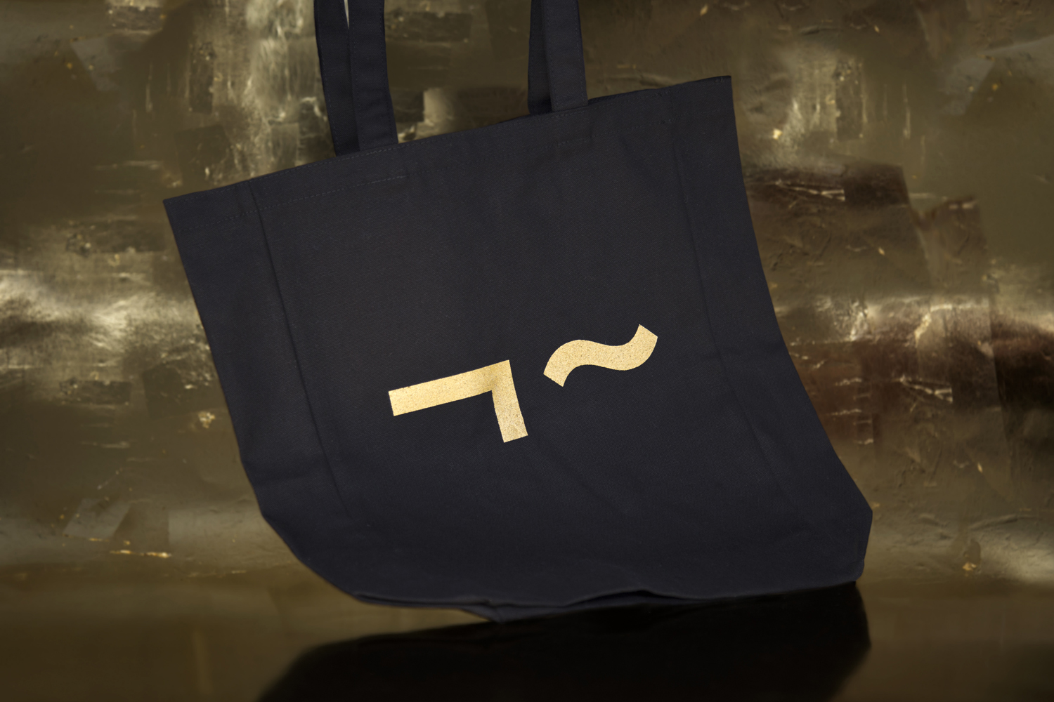
Linden Stuab is a UK-based model agency challenging industry conventions with their mantra ‘Empowering Women’, and by acting as a mother agency to all of their models. The name Linden Staub, derived from the maiden names of the two founding partner’s mothers, is an expression of this, and alongside the agency’s strong human-focus, was the basis for their new brand identity, created by graphic design studio Bibliothèque. This links a variety of collateral, from stationery and business cards to model cards, tote bags and a new digital platform that takes a journal-like approach to content.
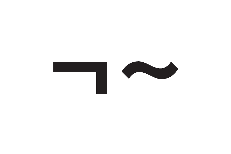
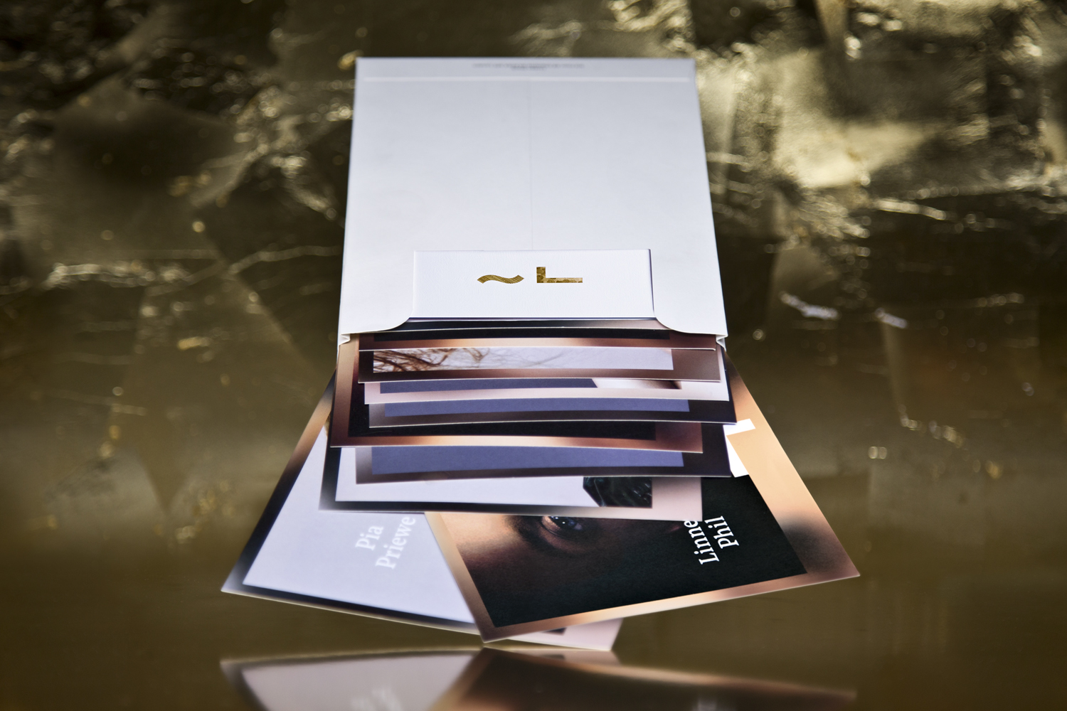
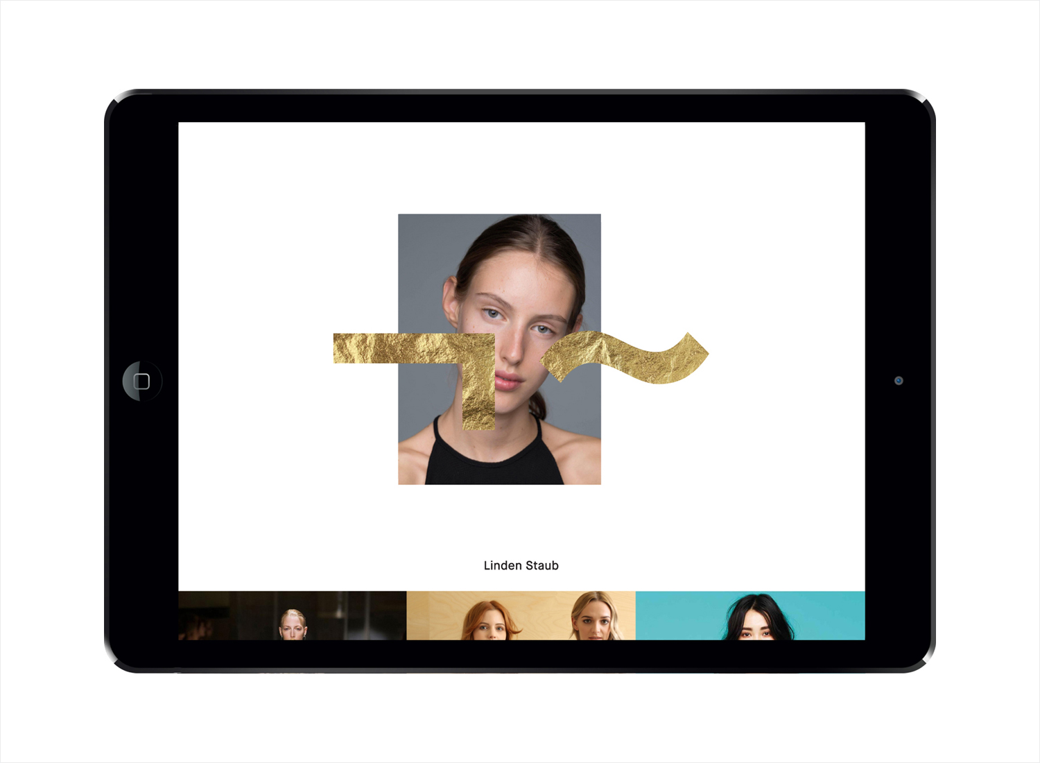
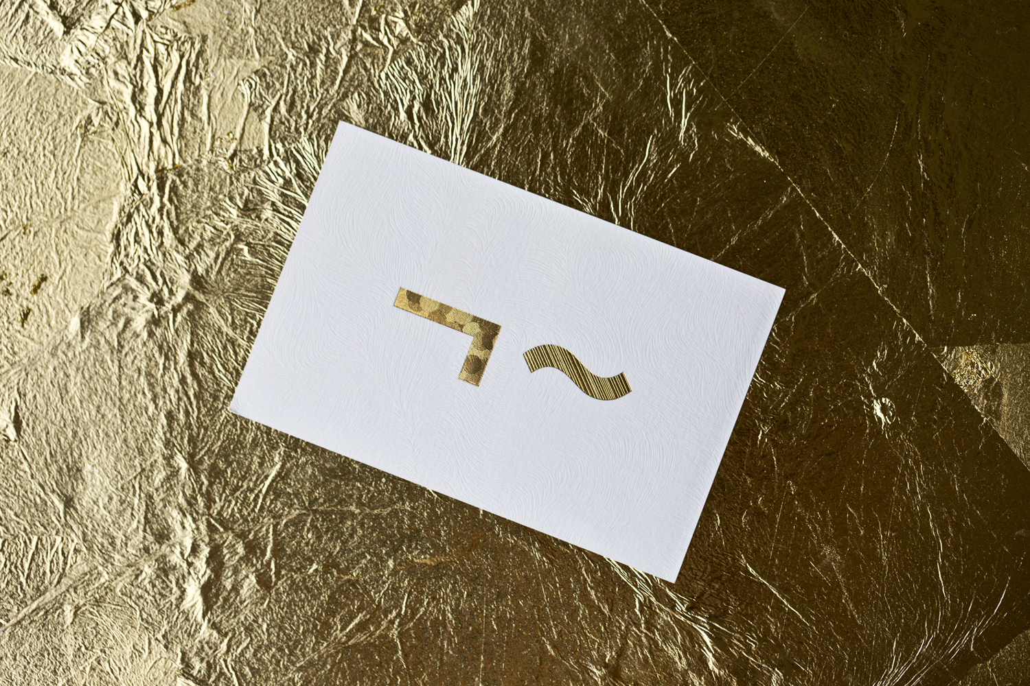
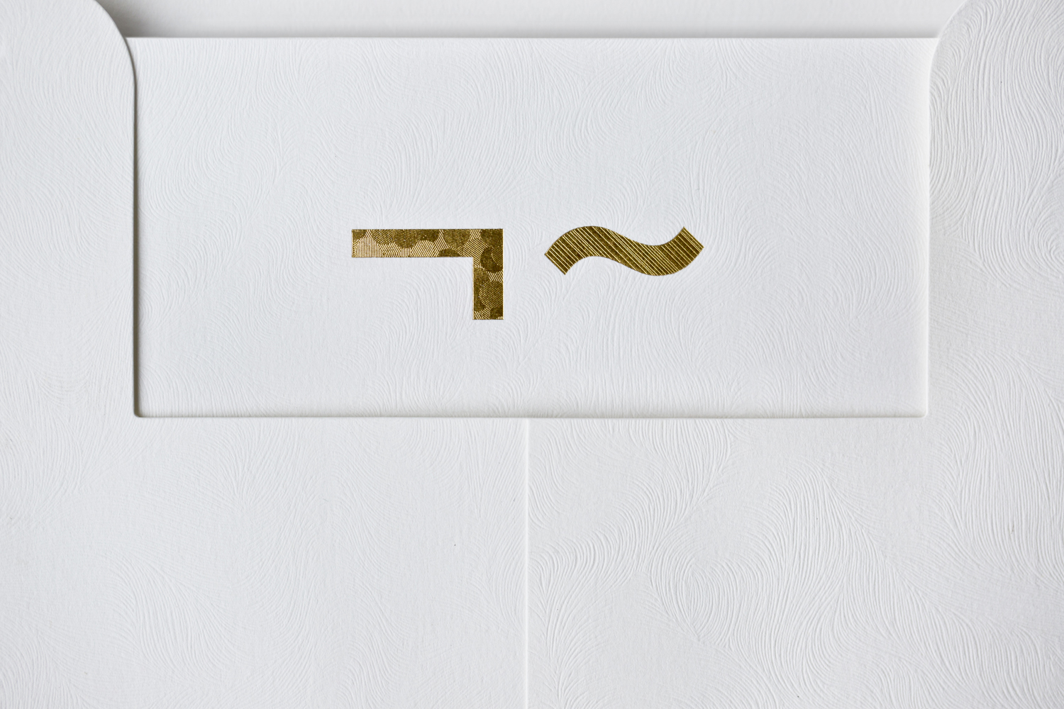
At the heart of Bibliothèque’s brand identity work for Linden Staub is a logomark that moves between monogram and stylised face. Its monolinear lines and simple forms manage to find a smart and natural balance between the human and personable and the reductive and high fashion. Although faces in logos seem to be in-vogue at the moment, this feels well-intentioned (aesthetic derived from a genuine and alternative business approach), considered in its rendering and generous in its implementation.
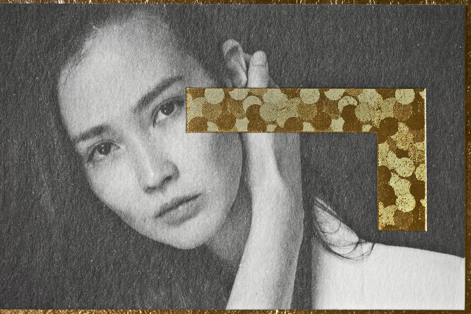
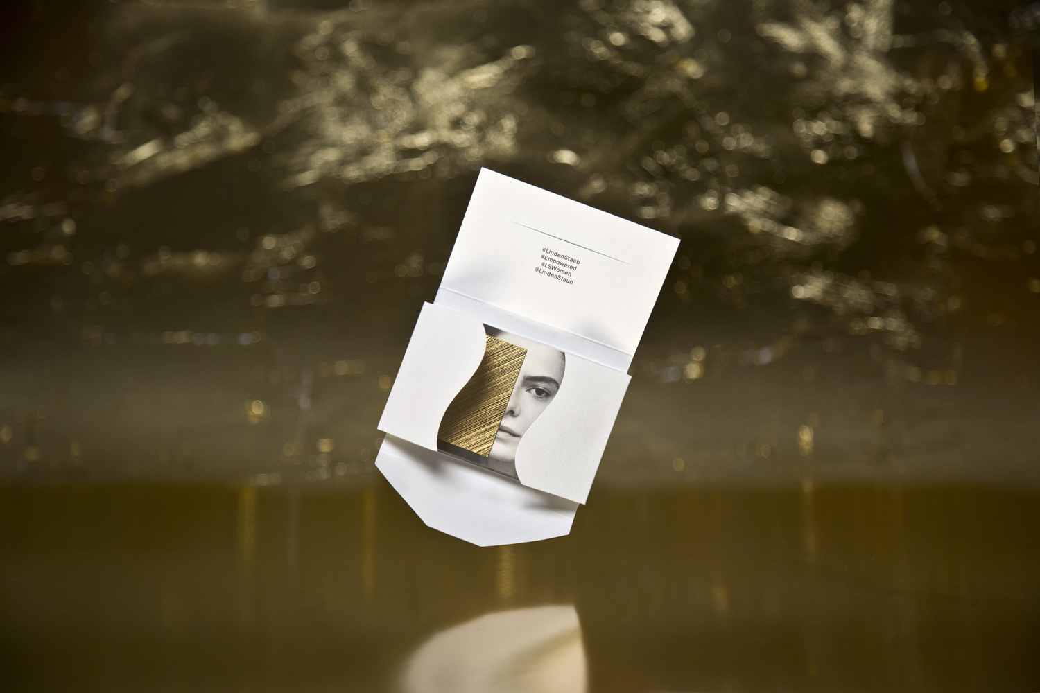
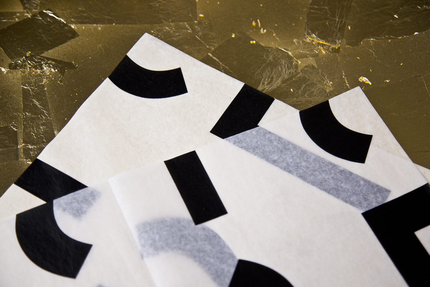
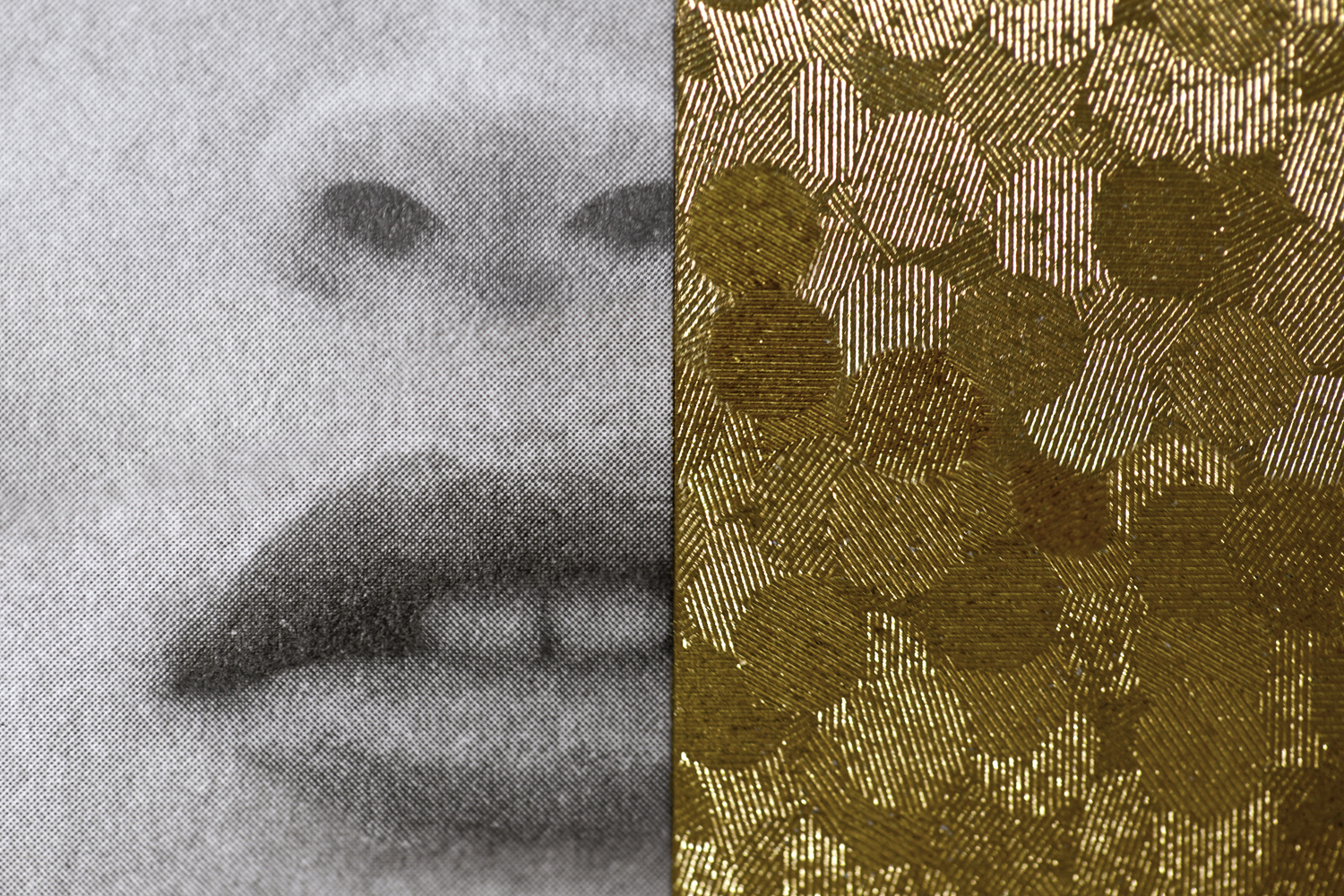
The materiality of identity; a blend of papers and boards with G.F Smith’s Coltskin emboss (the continuity between the fluidity of line in mark and physical texture is neat), and gold foils with unusual microstructures, layer identity with a fine detail. Where gold foils and G.F Smith papers proliferate, unique combinations and unfamiliar variations add further character. Restrained in colour and constrained by form, these material choices and print finishes appear individual, attractive and glamorous, yet manage to avoid the ostentatious.
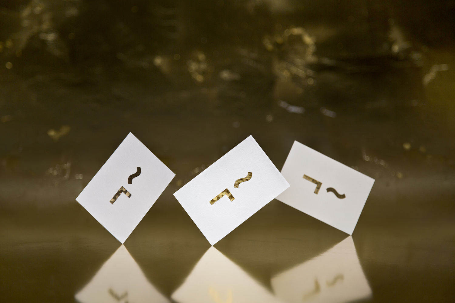
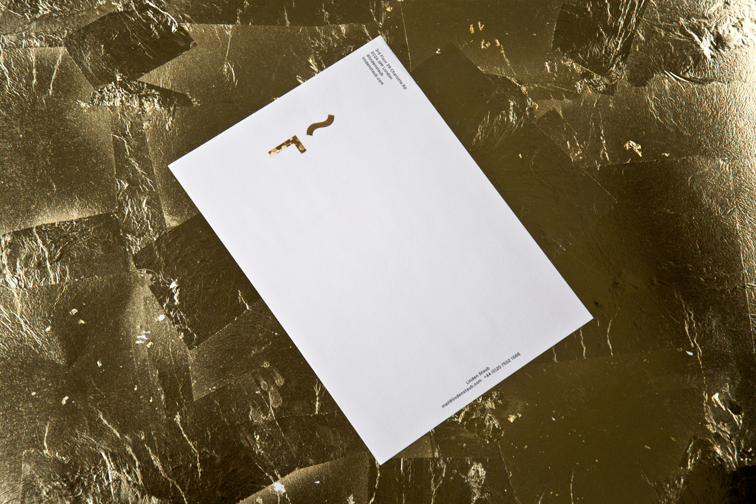


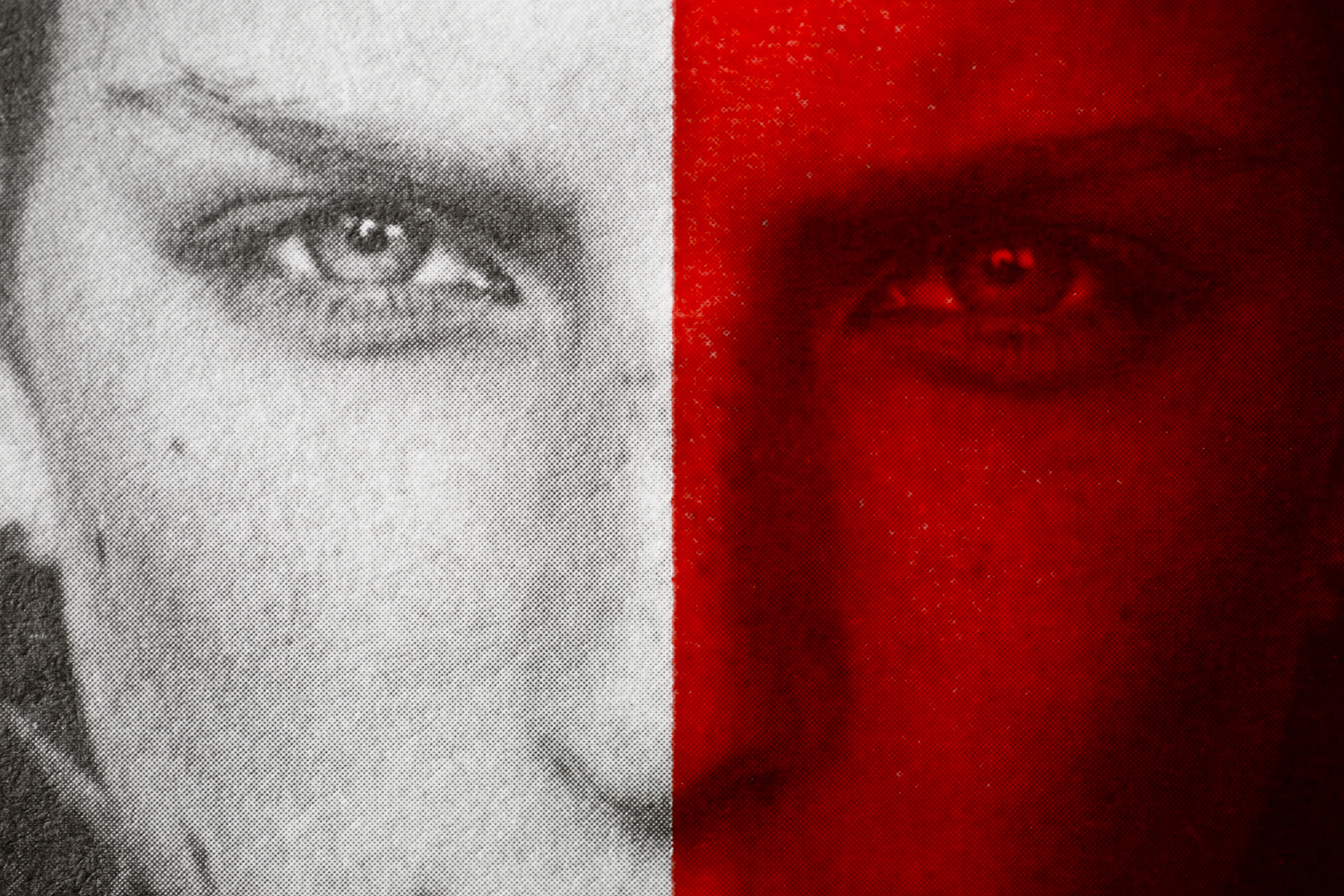
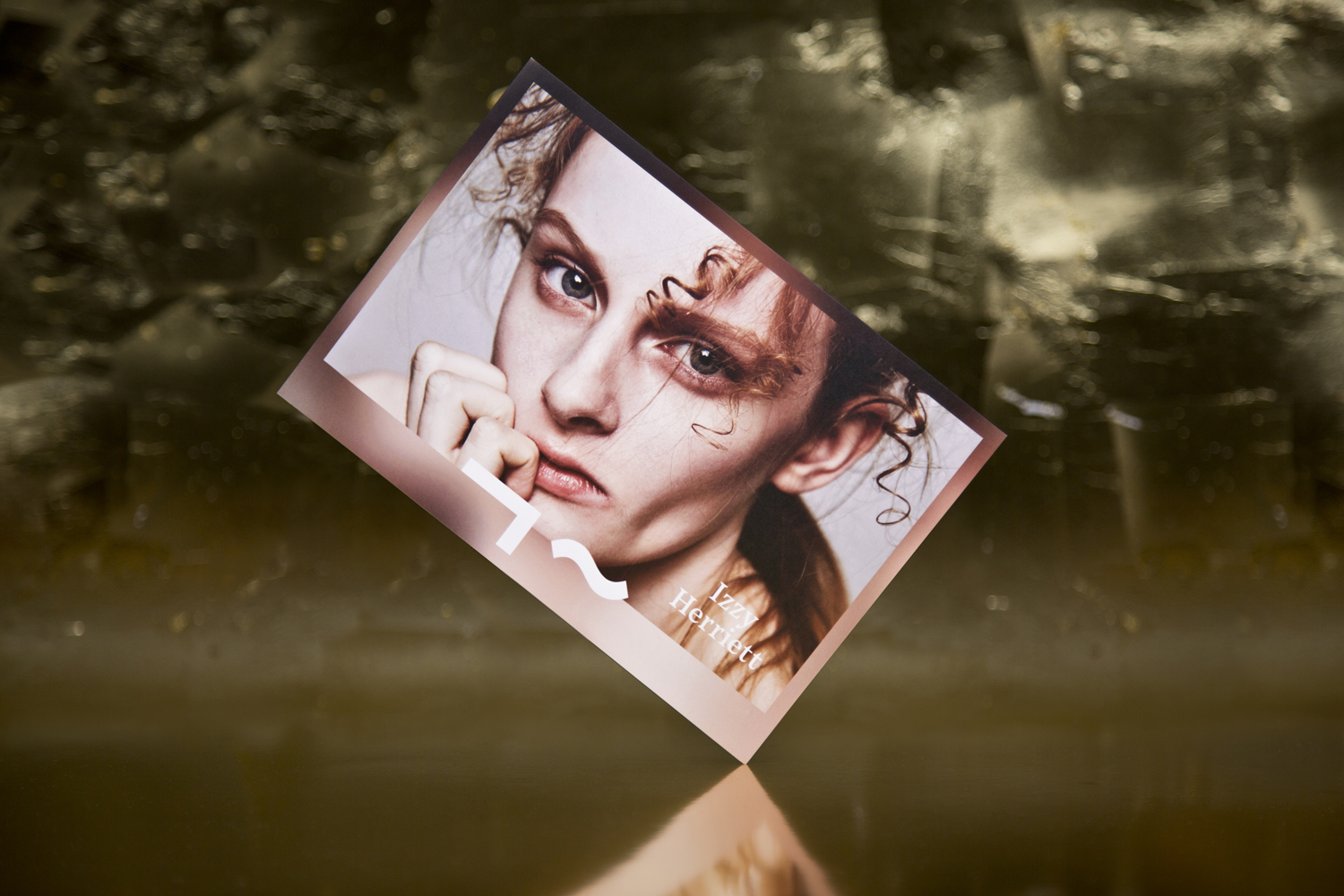
An interesting duality runs throughout print. This can be seen in the contrast of Noe Dispaly and Maison Neue, black and white image overlaid with solid foil or red ink, detailed photography punctuated by geometric form and the dual orientation of business cards. This could easily be attributed to the partnership between Linden Staub’s founders, or between agency and model but, at their most fundamental, serve to divide information, add an edgy and challenging quality in the obstruction of face, or to make a strong connection between the identity of models and the identity of their management.
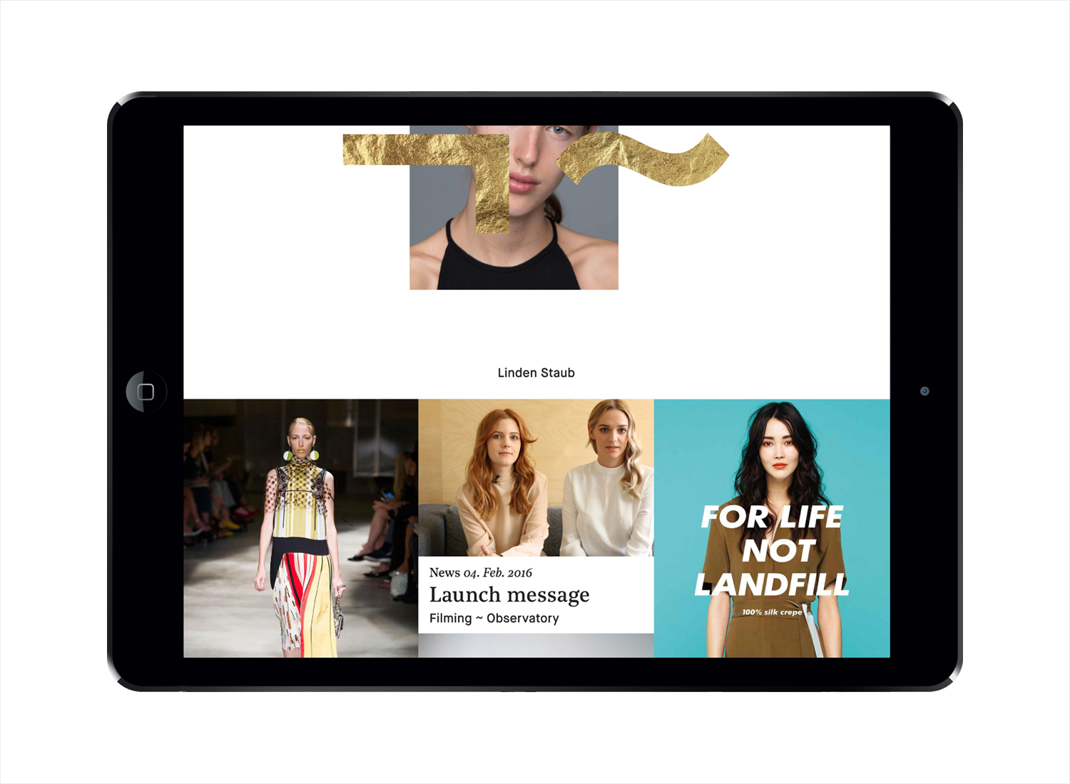
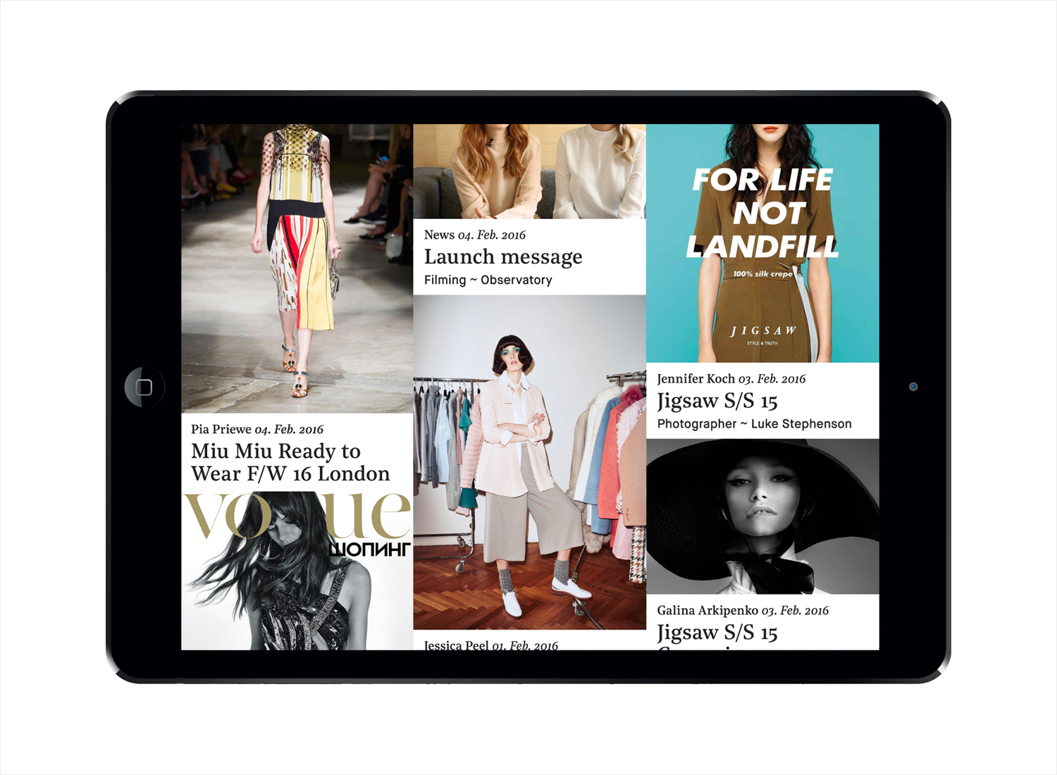
The personal approach of Linden Straub also manifests itself well online. Designed in collaboration with developers Archive, the website has the capacity to hold a variety of diverse content, allowing visitors to connect with models on a more personal level. This is emphasised by a front page with a social media and journel-like format, and the use of @, hashtags and emoji. Other neat neat details include type contrast—classical flourish meets contemporary reduction—and in the motion of columns when scrolling. More from Bibliothèque on BP&O.
Design: Bibliothèque. Opinion: Richard Baird. Fonts: Maison Neue & Noe Display.
