Richard Baird
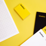
Kinetica by Face
Kinetica is an international industrial design studio located in Santa Catarina, Mexico, that specialises in non-standard architectural projects. Their new visual identity, created by ‘supermodernist’ design agency Face, utilises a bold black and yellow colour palette, a straightforward sans-serif logo-type, plenty of space and a grid based collateral layout to establish a restrained and contemporary interpretation of heavy industry infused with subtle architectural cues....
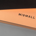
Mi&Mall by Atipo
Mi&Mall is an online shopping destination and resource that brings together and supports small to medium designer brands for people interested in fashion, trends and exclusive collections. Based around a simple logo-type, ampersand, a pale colour palette and a tactile print and material choice, Mi&Mall’s visual identity, created by Spanish multidisciplinary design studio Atipo, mixes high fashion and boutique craft...
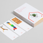
Minke Design Store by Studio Lin
Minke is a Tokyo homeware store that stocks hard to find designer objects and furniture. The store’s identity, created by New York based design firm Studio Lin, neatly resolves the classic and the contemporary, the structured and the anarchic, creativity and practicality through a union of bold serif, modernistic structure, random geometric detail and a bright but restrained primary colour palette....
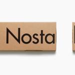
Nostalgi and Classic Racks by Bedow
Nostalgi is a hat and shoe rack, now considered a Swedish furniture classic, designed by Gunnar Bolin in 1937 and manufactured by Essem. Taking its cues from Essem’s functionalist past and artisanal manufacturing processes, Stockholm based graphic and product design studio Bedow, developed a packaging solution for Nostalgi that contrasts two vastly different sizes of Futura, reflecting the products bold,...
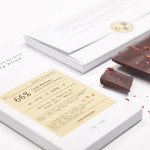
Casa Bosques Chocolate by Savvy
Casa Bosques is an initiative, founded by Mexico based design studio Savvy, to develop a variety of seasonal and sustainable products through a collaborative process across multiple disciplines. The initiative’s first product line, a range of 12 chocolates inspired by the months of the year, were created by master chocolatier Jorge Llanderal using high quality Ecuadorian cocoa fused with spices...
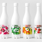
Olvi Cider by Bond
Olvi is Finnish independent brewery that produces a broad range of beers, waters, juices, and soft drinks. Their latest range of dry, light and sweet ciders, branded and packaged by Helsinki based design studio Bond, working in collaboration with Stina Persson, were developed to have ‘a strong shelf impact with natural and pure design which stands out from competitors green bottles’....
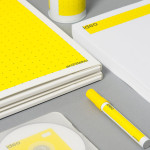
Ideo Architekci by For Brands
Polish design studio For Brands (formerly Artentiko) have published images of their latest visual identity project commissioned by Wrocław based architectural studio Ideo Architekci. Based around a modular and dynamic grid based framework, modernistic typeface and a bright industrial colour palette, Artentiko’s solution manages to capture the fundamental aspect of architectural planning and a consistent but expansive approach....
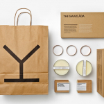
Spritmuseum by Stockholm Design Lab
Spritmuseum (formerly Vin & Sprithistoriska Museet) is a Stockholm based art gallery, museum, tasting room, meeting-place, bar, restaurant and open-air café with a unique spirit theme. Its new identity, developed by multidisciplinary design agency Stockholm Design Lab, is based around a bold word-mark constructed from a typeface now synonymous with the Absolut brand (and Swedish design) and pairs it with a simple but iconic four stroke...
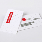
Modhouse by A Friend Of Mine
Modhouse is an Australian design and building firm that specialises in sustainability, modular construction techniques and interior design. The company’s new brand identity, created by holistic design studio A Friend Of Mine, visualises their specialist approach with a set of elemental and geometric containers, bold sans serif typography and a colour palette that juxtaposes bright creative colours with warm architectural greys....

Privacy International by Paul Belford Ltd.
Privacy International is a UK based non-profit organisation established in 1990 to monitor the security intrusions of governments and business, increase the awareness of data protection concerns and establish ‘new forms of privacy advocacy’ at an international level. Made up of computer professionals, academics, lawyers, journalists and human rights campaigners the organisation has worked on initiatives across fifty countries and is...
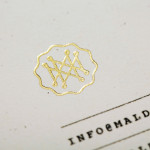
Mal de Mar by Face
Mal de Mar is a San Pedro, MX based business and on-line journal where art, design, architecture, photography and travel combine. The journal’s new identity, developed by ‘supermodernist’ design agency Face, captures and binds the timeless pursuit of knowledge and experience through travel and culture with that of the modern technological world with a contemporary fusion of light, symmetrical and consistent line...

Etxe by Blok
“Etxe is a small, innovative industrial design studio based in Mexico City. Their philosophy is to design to the very essence of a product. There is no room for extraneous elements; they believe that the beauty and artfulness of a product lies in its purest functionality. The identity itself is thus a distillation of their unique approach.” – Blok...