Brand Identity Design
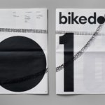
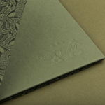
Bikedot by Studio Sutherl&
The concept of a brand today rarely has a sense of physicality. The hand (or indeed roller), the mark-maker, usually feels totally absent. It makes sense really, considering our primary interaction with a brand is often online; but when a project comes along that’s so obviously delighting in the possibilities of print processes, inks and paper it feels like a...

Norwegian Banknotes by Metric Design
If you consider all the tangible expressions of a country’s brand, money, with its essential function as a measure of value, could easily be considered one of the most important touchpoints. In this sense a country’s banknote is often the first point of physical contact with that place prior to travel. The shape, feel, colour, language, security features, artwork and heritage of...

Printed by Somerset by Leo Burnett
Somerset is described as being Canada’s top printer, known for its precision, attention to detail and ability to pull off complex jobs. Alongside reproduction services, Somerset, a family-run business, also provides extensive print finishing services. Inspired by this, the stacked paper of the press, and with the intention of engaging a new generation of designers, Toronto based studio Leo Burnett developed a new brand identity...
Estones de Mishima by Folch
Vins de Mas Sersal is a Spanish wine producer, founded by winemaker Salvi Moliner and sommelier Sergi Montalà in 2008. Inspired by the lyrics of Qui n’ha Begut from the album Set Tota La Vida (Thirsty The Whole Life) by singer, songwriter and friend of Salvi and Sergi, David Carabén of the indie band Mishima, the winery created a special...
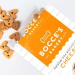
Bocce’s Bakery by Robot Food
Bocce’s Bakery creates nutritious handcrafted dog treats from natural, nutritious, locally sourced and seasonal ingredients from its premises in the New York borough of Brooklyn. Each of the bakery’s treats are batch-produced from four or less ingredients, brought together using simple wheat-free recipes, and born of a passion for conscientious organic cookery and inspired by Bocce, a biscuit loving dog who was carrying a few extra pounds. Bocce’s reached out...
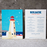
Smack Lobster Roll by & Smith
Smack Lobster Roll is a takeaway business, located on Mayfair’s 26 Binney Street, serving freshly cooked lobster in brioche rolls, as well as a variety of other fillings. In conjunction with a name change, formerly Smack Deli, and to coincide with the opening of a second site on Dean Street in Soho, British graphic design studio & Smith worked with Smack to...
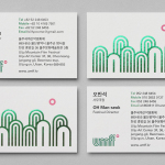
Ulju Mountain Film Festival by Studio fnt
UMFF is a film festival that takes place at the Ulju Arts Centre located in the South Korean city of Ulsan, and draws its name from the Ulju mountains to the west. Studio fnt worked with the film festival to develop a new visual identity treatment, which went on to include logotype, iconography, business cards, stationery, t-shirt design and signage, based around a contemporary...
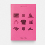
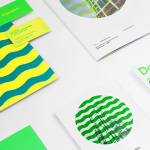
Zuzunaga by Folch
Zuzunaga is a homeware and fashion accessory business founded in ’07 by London and Barcelona based artist and designer Cristian Zuzunaga. Zuzunaga’s products, which include towels, tech covers, cushions, shawls, shoes and upholstery fabrics, are informed by contemporary living and seek to find a charm, warmth and humanity within the digital world. Products are characterised by lines, pixels, geometric abstractions and a...
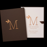
The Mansion on Marylebone Lane by Pentagram
The Mansion on Marylebone Lane will be a 22-unit high-quality residential development in Central London with lower ground, ground and seven upper floors, roof terraces and two basement levels. It will feature reflective glazed terracotta external cladding with a subtle variation in colour and shade to achieve an element of interest and complexity, while the reverse will be a white reflective glazed terracotta...
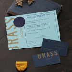
Brass Union by Oat
Located in the Union Square neighbourhood of Somerville, Massachusetts, Brass Union is a pub and cocktail bar with a small plate dinner menu. It takes over the space formerly occupied by the restaurant and music venue Precinct, both of which incorporated the historic nature of the building as a former police station into their names. To British readers, Brass Union would comfortably...
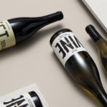
Woodland Wine Merchant by Perky Bros
Woodland Wine Merchant is described by Perky Bros, the design studio behind its new visual identity, as a tidy and eclectic wine store in Nashville, Tennessee that carefully curates wines from artisan producers practicing natural and sustainable methods, and hunts for and gathers the best value wines from around the world. Perky Bros’ identity solution was inspired by the collision of two worlds—the...
El Semillero by Anagrama
El Semillero is a large residential development program, managed by Fraterna, that intends to create a sustainable environment with expandable housing solutions based around basic needs and “economic flexibility” – presumably spaces that keep pace with current economic changes, improved social mobility and are accessible to a variety of income groups. Set at the heart of the Mexican city of Monterrey,...