
Checklist by Anagrama
Checklist is a Mexican event planning business that specialises in ‘milestone occasions’ such as birthdays, anniversaries and graduations as well as corporate events. Checklist caters ‘exclusively for their client’s unique needs’ and can also provide options that are environmentally friendly. Design agency Anagrama recently devised an ‘institutional’ visual identity solution for Checklist that mixes the age and authority of a heraldic shield,...
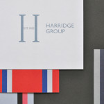
Harridge Group by Igloo
Harridge, formerly Ealing Travel Services, is a corporate travel group made up of Harridge Business Travel, Harridge Luxury and Harridge Events. London-based design studio Igloo were recently commissioned to design the group’s visual identity and brand architecture which would reference its “significant history and experience”. Their design solution, a combination of serif detail, sans-serif characters and a modern colour palette and pattern set, drawing on...
Jeremy Maxwell Wintrebert by Hey
Jeremy Maxwell Wintrebert is a glassware designer and manufacturer currently working in France with a free hand glass blowing philosophy mastered while traveling internationally across the US and Europe. Spanish design agency Hey recently developed a new visual identity solution for Jeremy that captures the heat, craft and art of glass blowing through a smart combination of colour and laser...

Adrián Key by Face
Adrián Key is a San Pedro based architecture firm and architect working with the rich and famous from “one of the most exclusive corners of northern Mexico”. Design agency Face Creative developed a new visual identity for the firm with a “clean, simple aesthetic with bold and modern touches, an icon that cleverly encases the name of the brand in its design, and...
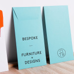
One To Be by Coast
One To Be is a Brussels based furniture design and manufacturing workshop that crafts custom wood pieces for residential refurbishments, bespoke kitchens, office and retail spaces, exhibitions, art installations and one-off pieces for private individuals. The workshop’s visual identity, a logo-centric solution executed across dyed uncoated paper choices by design agency Coast, is straightforward in its presentation of craft, functionality and...
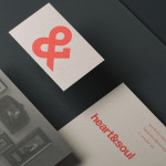
Heart & Soul Interiors by Band
Heart & Soul is an Australian interior decoration firm, specialising in residential properties, with a holistic, adaptable and flexible philosophy. Adelaide-based design studio Band were commissioned by the firm to update their brand identity so that it would better reflect their contemporary approach. Based around the duality of a heart/ampersand marque, a sans-serif logotype and print that juxtaposes a modern bright red...

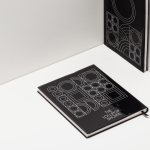
Bricos by Anagrama
Bricos, originally named Mayoreo Electrico Monterry, is an electrical hardware store servicing the North East and Monterry regions of Mexico. As part of an expansion plan the company approached design agency Anagrama to create their new identity, packaging propositions and retail environments with the consistency expected from international customers....

Voimaosakeyhtiö SF by Werklig
Voimaosakeyhtiö SF is the parent company to over 69 different manufacturing businesses in Finland and majority shareholder in the power company Fennovoima, a company that delivers energy to each of these businesses through a share-holder based co-operative scheme. Voimaosakeyhtiö SF’s new visual identity, stationary, website and brand guidelines, developed by Helsinki based design agency Werklig, resolve the cool Finnish environment, the theme of energy and...
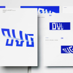
OVG by Studio Dumbar
OVG is a Dutch company that specialises in the development, redevelopment and restoration of buildings and land across Europe. Studio Dumbar created their brand identity around the changing nature of our landscapes to characterise the solid reliability and innovative approach of the company....
The Lollipop Shoppe by Studio Makgill
Established in 2007 The Lollipop Shoppe is a contemporary retailer designer furniture and accessories located in Brighton, UK. With its own range in development and another store set for London they challenged Studio Makgill to develop an identity that could reflect their growing ambitions, convey a straightforward business nature and unify the shop’s modern and classic product ranges....
Great British Chefs by Hat-trick
Great British Chefs is an application that gives its users access to videos, cooking tips and shopping lists from a range of customisable menus built from over 180 dishes created by twelve of Britain’s top chefs. The apps identity, designed by London based studio Hat-trick is a series of ‘C’ shaped logo-marks created from kitchen implements that resolve the ideas of...
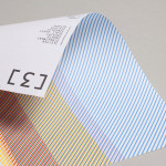
3angrymen by Build
3angrymen is a London based production and digital content company with a client list that includes the NSPCC, ChildLine, Barclaycard, Hovis, Palmolive and TKMaxx. Their new brand identity, designed by Build, draws out the fine colour bands of their previous logo to craft a new, contemporary and sophisticated scan line pattern. Paired with a monospace type choice and contemporary monograms Build’s...