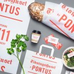
Tidningshuset by Pontus by Bold
Tidningshuset by Pontus is a 1000 m2 lunch restaurant, deli and bakery committed to sustainability, simplicity and quality, and was developed by famous Swedish chef and restauranteur Pontus Frithiof with the intention of challenging industry conventions. The restaurant is on the ground floor of a building owned by Dagens Nyheter, Sweden’s largest daily newspaper, which is situated in the newspaper district of Stockholm....

Swedish Forest Industries Federation by BVD
With the intention of better communicating the endless possibilities of the forest, the concept of Bioeconomy and a commitment to a sustainable future, Skogsindustrierna, the representative of the Swedish pulp, paper and woodworking industries, worked with Scandinavian design studio BVD to help move them away from a complicated tonality and give their communication a clarity, focus and accessibility. With this in mind,...
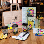
Österlånggatan 17 by Lobby Design
Bockholmengruppen is a Stockholm based restaurant group and owners of both Nytorget 6 and Nybrogatan 38. The group recently expanded, taking over Le Bar and opening Österlånggatan 17 in its place, a modern local restaurant with a menu of home cooked dishes with a twist, located at the centre of Stockholm and attracting locals and tourists alike. Scandinavian design studio Lobby Design worked with the Bockholmengruppen to create a visual identity...
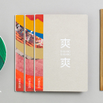
Shuang Shuang by ico Design
Shuang Shuang is new restaurant experience, located on London’s Shaftesbury Ave, that brings a contemporary twist on hotpot—a long-established and family favourite throughout China and East Asia, and a fun and social way of eating—to the United Kingdom. Shuang Shuang worked with London based graphic design studio ico Design on naming and interior design, as well as brand identity. This extends across signage, tableware, menus and...
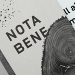
Nota Bene by Blok
Nota Bene is a restaurant, located on Toronto’s Queen Street West, with a menu made from locally-sourced and seasonal ingredients. It was opened by chef David Lee and business partners Yannick Bigourdan and Franco Prevedello in 2008, and was awarded “Best New Restaurant” by Toronto Life and enRoute Magazine soon after. To coincide with the restaurant’s 2016 relaunch—which saw David Lee take...
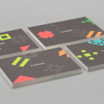
Thanda by Karoshi
Thanda is a luxury home accessory business bringing high-end artisanal products crafted by people in South Africa to the UK market. It does this with the intention of helping to support local communities, promoting ecological awareness and proving that sustainability does not have to compromise aesthetic. Thanda worked with London based graphic design studio Karoshi to articulate and express this positioning and the...
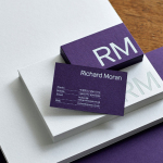
Richard Moran by Journal
Richard Moran is a lifestyle and portrait photographer with over 25 years of experience. He has worked with international businesses such as GSK, Pizza Express and Grey Goose Vodka, and secured a reputation as a passionate, straight-talking professional with a meticulous attention to detail and a portfolio of high-quality and emotive work. With a desire to communicate this and with the intention of...

Lune Croissanterie by A Friend Of Mine
Lune Croissanterie is a Melbourne based bakery dedicated to the craft of Viennoiserie. After gaining a cult following and amassing long cues it quickly outgrew its small shop and moved into a larger warehouse space in the suburb of Fitzroy which features a distinctive interior design by Studio Esteta. To coincide with this move, Lune Croissanterie worked with the Australian graphic design studio A Friend Of Mine to...
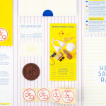
Hernesaaren Ranta by Werklig
Hernesaaren Ranta is an outdoor seaside area, located to the south of the Finnish capital of Helsinki, open during the summer months. It has food vendors, boat docks and terraces, and is part of an ongoing development project that also includes residential buildings. Graphic design studio Werklig were commissioned to create a comprehensive brand identity system for the entire area that, alongside...
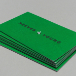
Reeves & Young by Matchstic
Reeves & Young is an Atlanta based construction and sub-contracting business that was formed in 2015 following the merger of Reeves Contracting Company and Potts Construction. To coincide with this merger, Reeves & Young worked with American graphic design studio Matchstic to develop a new brand identity that would convey the combined strength of the two businesses but would also be sensitive to...
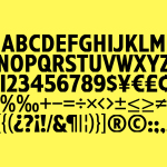
Have A Great Day Films by Hey
Have A Great Day Films is the production company of French filmmaker Jérôme de Gerlache. Jérôme is said to have a taste for professional risk-taking and a distinct way of making short films, advertisements and TV comedies. Barcelona based graphic design studio Hey recently worked with Have A Great Day Films to develop a brand identity that would reflect Jérôme’s personality, convey a...
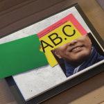
Antenne Books by OK-RM
Antenne Books is a London based distributor of independent publishers with a web shop that covers art, photography, design, illustration, theory, writing, fashion and culture. Their extensive catalogue of books, magazines and journals includes work by authors and artists such as Matt Lambert and Lutz Bacher, and the publishers Lodret Vandret and The Renaissance Society, amongst many others. Antenne Books recently worked with graphic design studio...