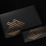
Melba at The Savoy by Pentagram
Melba is a pâtisserie and cafe, located on the corner of The Strand and Savoy Place in London’s North Bank, and is one of nine places to eat and drink at The Savoy hotel. The patisserie is described as offering a glimpse into the exclusive and luxury world of The Savoy, and is the first time that the hotel, accessed via private...
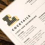
Libertine Liquor Bar by CODO
Libertine is a bar and restaurant, located on Indianapolis’ Mass Avenue, that celebrates the pioneering American spirit with an emphasis on classic cocktails, craft distillers, boutique wines and an evolving menu. It is recognised as one of the best restaurants and bars in the country, and as being instrumental in the city’s growing and continued support of local food and independent...
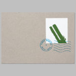
From Babies With Love by Paul Belford Ltd
From Babies With Love is an organisation that sells organic baby clothes, blankets and accessories, as well as a range of greetings cards online. The money raised from the sale of these goes to SOS Children’s Villages, a scheme that supports babies who have lost parents to war, famine, disease or poverty, by placing them with families and within communities that are safe and stable. London based Paul...
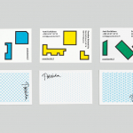
Poseidon Helsinki by Kokoro & Moi
Poseidon Helsinki centralises the tasks of architect and builder with the intention of delivering higher quality construction projects based around visionary and uncompromising design solutions. Poseidon’s values are deeply rooted in a love for Helsinki, a belief in aesthetically ambitious architecture and expansive urban spaces, and improving the capacity and quality of the city through sensitive renovation and attic conversions. Poseidon’s visual identity, inspired...
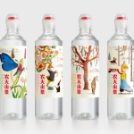
Nongfu Spring Mineral Water by Horse
Nongfu Spring is a bottled mineral water brand and a leading Chinese beverage business. Nongfu worked with British design studio Horse to develop a new package design treatment that, using labels illustrated by designer Brett Ryder and a distinctive structural design with a slim profile and proprietary leak-free sports cap, would engage the youth market....
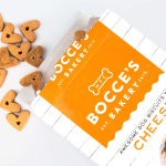
Bocce’s Bakery by Robot Food
Bocce’s Bakery creates nutritious handcrafted dog treats from natural, nutritious, locally sourced and seasonal ingredients from its premises in the New York borough of Brooklyn. Each of the bakery’s treats are batch-produced from four or less ingredients, brought together using simple wheat-free recipes, and born of a passion for conscientious organic cookery and inspired by Bocce, a biscuit loving dog who was carrying a few extra pounds. Bocce’s reached out...
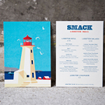
Smack Lobster Roll by & Smith
Smack Lobster Roll is a takeaway business, located on Mayfair’s 26 Binney Street, serving freshly cooked lobster in brioche rolls, as well as a variety of other fillings. In conjunction with a name change, formerly Smack Deli, and to coincide with the opening of a second site on Dean Street in Soho, British graphic design studio & Smith worked with Smack to...
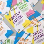
Guggenheim Helsinki NOW by Kokoro & Moi
NOW was a free exhibition presented by The Solomon R. Guggenheim Foundation that took place throughout May at Taidehalli in Helsinki. The exhibition unveiled the six shortlisted proposals for a Guggenheim museum in the capital, visualised, analysed and interpreted data drawn from the 1,715 projects submitted, and was also a chance to view the fifteen designs that received an honourable mention. The exhibition was extended to...
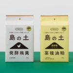
Organic Fertilizer of Awaji Island by UMA
島の土 / Island of Soil is an organic fertiliser created to help develop good quality soil and draw out and compliment the natural power of the land. The range is made using livestock feces and processed vegetable scraps from animals raised and produce grown on the Japanese island of Awaji. It comes in two varieties, a poultry manure and sawdust mix, and a rapeseed...
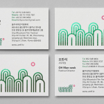
Ulju Mountain Film Festival by Studio fnt
UMFF is a film festival that takes place at the Ulju Arts Centre located in the South Korean city of Ulsan, and draws its name from the Ulju mountains to the west. Studio fnt worked with the film festival to develop a new visual identity treatment, which went on to include logotype, iconography, business cards, stationery, t-shirt design and signage, based around a contemporary...
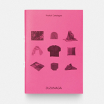
Zuzunaga by Folch
Zuzunaga is a homeware and fashion accessory business founded in ’07 by London and Barcelona based artist and designer Cristian Zuzunaga. Zuzunaga’s products, which include towels, tech covers, cushions, shawls, shoes and upholstery fabrics, are informed by contemporary living and seek to find a charm, warmth and humanity within the digital world. Products are characterised by lines, pixels, geometric abstractions and a...
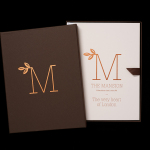
The Mansion on Marylebone Lane by Pentagram
The Mansion on Marylebone Lane will be a 22-unit high-quality residential development in Central London with lower ground, ground and seven upper floors, roof terraces and two basement levels. It will feature reflective glazed terracotta external cladding with a subtle variation in colour and shade to achieve an element of interest and complexity, while the reverse will be a white reflective glazed terracotta...