
PizzaLuxe by The Touch Agency
PizzaLuxe began in 2011 as a single restaurant located on London’s Brick Lane hand making good-value, freshly baked pizzas using locally sourced, ‘deluxe’ ingredients. To coincide with an expansion into the Stratford’s Westfield Centre, the brand approached Edinburgh-based design studio The Touch Agency in 2013 to develop a new visual identity that would communicate their core values within a more ‘polished’ environment. In 2014, The Touch Agency continued...
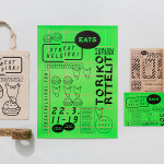
Streat Helsinki by Kokoro & Moi
Streat Helsinki is a festival that looks to explore and question what street food can and should be. It began this year with three events — a series of talks, opportunities to eat and time to party — held at different venues across the city. Eats, the largest of the three, was held in the Tori Quarters and included 40 food...
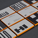
The Counter Press by The Counter Press
The Counter Press is a letterpress studio and workshop located in an old chocolate factory in the East End of London. They work exclusively with hand set wood and hot metal type on antique presses to create contemporary typographic design, artwork and limited edition prints. While taking on small outside projects, founders David Marshall and Elizabeth Ellis are keen to stress they are not...
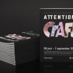
Attention: Craft by Snask
Attention: Craft was an exhibition of innovative and experimental art created by eleven leading Swedish and Norwegian artists, and part of an annual programme run by and held at Stockholm’s Liljevalchs, the first independent public museum for contemporary art in Sweden. The exhibition took place between June and September this year and featured artists such as Karin Bengtson, Linus Ersson and Hanne Friis....
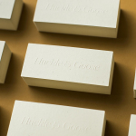
Huckle & Goose by Cast Iron
Huckle & Goose is an online food service that delivers weekly seasonal recipes to subscribers with the intention of making it simple and easy for the conscientious home cook to plan meals according to what’s in season at the local farmers’ market. Colorado-based Cast Iron Design were appointed to bring Huckle & Goose to life, developing a brand identity which included a...
Reachin’ by Karoshi
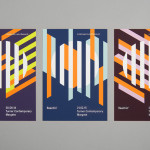
Reachin’ is a regular charity event established in 2012 to engage with a younger demographic and raise awareness and funds for Myeloma UK, an organisation dedicated to finding a cure for Myeloma, a rare cancer of the bone marrow. Money made from each event is complemented by the online sale of branded t-shirts, vests and tote bags. Designed by Karoshi, Reachin’s brand...

Rendez-vous des Créateurs by Marks
Rendez-vous des créateurs 2014 was an event that took place in September at experimental meeting, performance and exhibit space Flux Laboratory in the Swiss town of Carouge. The exhibition was an opportunity for those servicing the graphic design chain to show off finishes, materials and techniques under the title “onomatopoeia of printing”. Participants included silk screen printer Atelier Fuerm, binder Bubu, hot stamper...
Here East by dn&co.
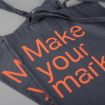
Here East is a 1.2 million sq ft commercial space developed by Delancey and housed within the former Olympic Press and Broadcast Centre near Hackney Wick in East London. Here East is described as an ecosystem looking to attract businesses from the design, technology and modern manufacturing sectors who are looking to scale, and those of scale looking to behave more creatively....
Soma by Manual
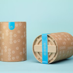
Soma is a water filtration brand that is described by Manual, the design studio behind its brand identity and packaging treatment, as bringing together sophisticated design, sustainability and charity. These values are evident within Soma’s first product, a glass water carafe that uses a 100% compostable filter, its packaging, and the commitment to charity donations that comes with each sale....
Merchants of Beverage by Manual
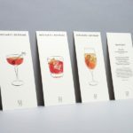
Merchants of Beverage is an online service that aims to make buying and gifting luxury items easy. Products include wines, spirits and Champagne’s, as well as hand-blown crystal stemware and professional barware. Each item has been handpicked and curated by a team of experts and sourced from a variety of international artisans. The service’s new brand identity, which included monogram, logotype,...
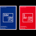
Sim Smith Gallery by Spin
Sim Smith is contemporary art gallery that specialises in the representation of emerging British artists. The gallery, having established relationships with curators and collectors, complements its exhibitions with artistic projects developed in collaboration with design studios, arts and cultural festivals, as well as charities, national institutions and global retail brands. The gallery’s brand identity, designed by Spin, takes the open white...
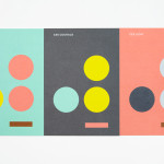
Coalition for Engaged Education by Blok
The Coalition for Engaged Education, formerly New Visions Foundation, is an LA based organisation, led by Dr Paul Cummins, that helps vulnerable children and young adults to realise their potential through an approach to education that respects and inspires them. CEE recently worked with design studio Blok to develop a new visual identity that would mark the organisation’s new national ambitions....