
Next To The Ocean by Lundgren+Lindqvist
Valand Academy in Sweden offers a complete range of undergraduate, postgraduate and artistic research opportunities. This is a unique educational environment, the only one of its kind in Sweden. Next to the Ocean is an exhibition of works created by 23 of the students from the BFA, MFA and research programmes, which was held at Röda Sten Konsthall in Gothenburg. The exhibition serves...
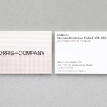
Morris+Company by Bob Design
Morris+Company dovetails the individual strengths of founder Joe Morris and the talents of a wider company of designers. This is expressed by a recent renaming, moving from Duggan Morris Architects to Morris+Company, and throughout the studio’s new graphic identity, designed by Bob Design. This is codified within a brand guidelines document of type, imagery, texture, pattern, words (by Emma Keyte) print finish and material...
Arper 2018 by Clase bcn
Arper is an Italian furniture company producing chairs, tables and furnishings for community, work and home spaces. They seek an elegant resolution of function, form and finish which is founded on a total design philosophy that covers design, production and long-term impact. Arper commissioned Spanish studio Clase bcn to develop and design a new on and offline graphic identity for all...
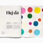
Essem Design Product Catalogue 2018 by Bedow
In 2014 Bedow worked with Essem Design, a Swedish manufacturer of artisanal hallway products and furniture, to develop a new graphic identity. This included logotype, adverts, catalogue, product sheet and stationery design. The concept was based around the simple gesture “Hej—Hej då”, hello and goodbye in Swedish and a reference to the most common phrase used in the hallway. This verbal...
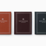
Näsby Slottspark by Bedow
Näsby Slottspark is a residential property development located in Täby, a municipality situated north of Stockholm. The development is built around a 17th-century castle and its gardens, and is made up of three distinct structural groupings, Södra Parken, Norra Parken and Strandängarna. Each of these is characterised by a Scandinavian simplicity, lightness and truth to materials inside and out and...
The East Cut by Collins
The East Cut unifies the three distinct downtown San Francisco areas of Transbay, Folsom and Rincon Hill into a single and modern metropolitan community. It is a unique an area, now recognised by Google Maps, that contains the newest and largest building in the city but also those that are the oldest and historically rich. Collins worked to develop a name and graphic identity for this new...
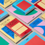
Helsinki by Werklig
In August 2017 Scandinavian design studio Werklig was commissioned to develop the graphic identity for the Finnish city of Helsinki, a capital with an urban region of roughly 1.4 million inhabitants and 751,000 jobs. The challenge was to resolve a disparate and fragmented visual system that represented a broad range of public services, departments and development projects that were helping and...
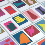
Cult 20 Years, Event & Exhibition by Toko
In 2017 Australian furniture retailer Cult celebrated its 20th anniversary. They marked this with an event and exhibition and worked with design studio Toko to develop a graphic identity to unify these and bring to light their extensive catalogue. Through a mix of bright illustrative silhouettes across invitations, packaging, postcards, flags and banners, the art direction of some Cult’s ranges, and...
UNSW Built Environment by Toko
UNSW Built Environment (BE) intends to develop global leaders in architecture, planning and construction, and help shape resilient, connected, smart and inclusive future cities through its undergraduate, postgraduate and postgraduate research courses. As part of this, the faculty also runs an annual programme of events for students, academics, industry professionals and the general public. These serve as a platform to find out...
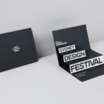
Sydney Design Festival by Re
Sydney Design Festival has been running for 20 years, making it one of the oldest design festivals in the world. It provides its visitors with an opportunity to understand design practice in all its forms, to bring to light problem, process and response, and to foster a closer connection with the designers and businesses helping to shape our collective futures. With a...
CCA Architecture by Manual
The Architecture Division of the California College of the Arts (CCA) is an internationally recognised leader in architecture and interior design education. Its programs, which focus on digital technologies and material systems, design research and urban agency, were developed to prepare students for creative practice where material innovation and formal experimentation meet social engagement and cultural collaboration. CCA Architecture strives to...

London School of Hygiene & Tropical Medicine by Spy
The London School of Hygiene & Tropical Medicine (LSHTM) was founded in 1899 and has established itself as a world leader in the fields of research and postgraduate education in public and global health. The university is made up of more than 4,000 students and 1,000 staff across 100 countries, and is one of the highest-rated research institutions in the United Kingdom....