Ridley by RE:
Ridley is a pioneer of digital architectural services and operates as a central hub from which builders, developers and architects can collaborate. Originally established, and continuing to operate as an architectural documentation specialist, Ridley, from its premises in Australia and the Philippines, has also grown to become a leader in Virtual Design Construction. This is a practice that involves attaching live...

Bec Brittain by Lotta Nieminen
Bec Brittain is a New York based lighting and product designer who is driven by a “love for luxurious materials, intuitive forms and forward-thinking technology.” Working with her small team from a studio in Brooklyn, Bec Brittain creates products that explore and experiment with new production techniques and materials that push the boundaries of American-made centrepiece lighting design. Each piece is created and inspected by Bec and produced using a...
Folk by IYA Studio
Folk is a British contemporary menswear, womenswear and footwear brand, founded in 2001, with stores across London, one in Amsterdam and collections that are stocked internationally. Folk describes its pieces as simple everyday wear with subtle, innovative and playful detailing with a focus on custom fabrics and unique trims. These values are reflected throughout its brand identity, created by IYA Studio over the...
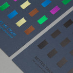
Taidehalli by Tsto
Taidehalli is an art gallery, also know as Helsinki Kunsthalle, with a significant 86-year history. It is set within the walls of a distinctive building created by Jarl Eklund and Hilding Ekelund, and during its lengthy residency has secured its place as a key space within Finland for the exhibition of contemporary artworks. Taidehalli’s new brand identity, recently redesigned by Helsinki and New York based design...
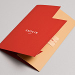
Skovin by Heydays
Skovin is Norwegian, high-end, solid wood floor specialist that combines ancient craftsmanship with modern technologies. By mixing a wood veneer business card and a traditional name drawn from the old word Skøyen, the area in Oslo where the company was founded, with geometric shapes and die cuts, panels of flat colour and sans-serif typography, Skovin’s identity, designed by Heydays, intends to...

Neometro & Nine Smith Street by Studio Hi Ho
Nine Smith Street is the latest residential property project from Neometro, a company that describes itself as having a reputation as Melbourne’s most design-focused development group and recognised as one of the first holistic design and construction businesses in Australia. Neometro are dedicated to creating architectural buildings that are beautiful, functional and timeless, and have a sense of place and belonging. Neometro’s brand...

Space Division by Inhouse
Space Division is an architectural studio established in 2010 with an office in Auckland, New Zealand. It looks to contribute to and positively impact on the lives and environments of its clients and the communities it serves by producing simple and succinct spaces. The studio describe their projects as being inclusive and client-focused with physical constraints, budgets, time frames and compliance being...
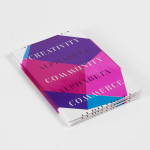
Making: by Garbett
Making: is the Australian Institute of Architects’ 2014 conference. Working in collaboration with creative directors Sam Crawford, Adam Haddow and Helen Norrie, Sydney based design studio Garbett developed a brand identity for the conference, which included logo, lanyard, merchandise and print design, that explores the role of the architect as maker of environments and connections that extend beyond the bounds of traditional practise. This was expressed...
Scotland Can Make It! by Graphical House
Scotland Can Make It! is a limited edition collection of souvenirs, created by leading Scottish designers and artists in collaboration with manufacturers from across the country, for the Glasgow 2014 Commonwealth Games. The souvenirs are described by Graphical House, the design studio behind the collection’s brand identity and website, as being part of a programme of events that celebrate ‘Scotland’s cultural heritage, creative...

The Empire Café by Graphical House
The Empire Café is a pop-up venue located in Glasgow’s Merchant City that looks to explore Scotland’s relationship with the North Atlantic slave trade through coffee, sugar, tea, cotton, music, visual art, poetry, debate, workshops, walks, film and literature. The café’s brand identity, a ship-like logo, bold sans-serif typography and both a limited and rich approach to print, designed by Graphical House, is described as linking a contemporary ‘artistic programme...
Alphabeta by Village Green
Alphabeta is an extensive property redevelopment project, designed by architects Studio RHE and located in London’s Finsbury Square, that is described as the latest architectural expression of the ‘new economy’. Due to open in late 2014 and managed by Resolution Property, the project will reconfigure a ‘substantial landmark building’ to create a new standard in contemporary work environments for the creative and technology sectors. The space will feature large...
Lorient — Aura by Believe In
Aura is a new range of high end products from door sealing system manufacturer and specialist Lorient. These include drop seals, perimeter seals, door bottom seals, threshold plates and ramps designed with a distinctive curved profile that is described by Lorient as creating a sophisticated visual aesthetic that also spreads and diffuses sound. Design studio Believe In recently worked with Lorient to develop a brand identity for...