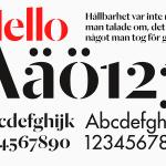
Essem Design by Bedow
Bedow worked with Essem Design, a Swedish manufacturer of ‘artisanal hallway interiors’ to develop a new brand identity treatment. This included logotype, advert, catalogue, product sheet and stationery design based around “Hej—Hej då”, hello and goodbye in Swedish, a reference, Bedow explain, to the most common phrase used in the hallway....

In Bed by Moffitt.Moffitt
In Bed is an online store that is a celebration of almost everything we love to do in bed. It has a generous yet tightly curated collection of homeware items that include handmade ceramic and wood saucers, bowls and mugs created by Japanese and American designers, as well as a range of high-quality linens. In Bed worked with Australian design studio Moffitt.Moffitt to...

Mark Milton by ico Design
London-based design studio ico Design have recently completed their brand identity work for Mark Milton, a jeweller with a family heritage within the industry that dates back to 1947, and who carefully selects and retails a range of necklaces, earrings, bracelets and rings for women. Bound by the theme of curation, ico Design’s solution provides the Mark Milton brand with a high quality communicative breadth...
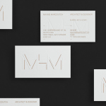
MHM Architects by 26 Lettres
MHM Architect is the studio of independent Canadian architect Maxine H. Marcovitch who, working with a team of professionals, trade and closely with clients, creates “beautiful, innovative, and unconventional architectural spaces.” The studio’s new brand identity, developed by 26 Lettres and which included a logotype, blind embossed business cards, portfolio with open stitch detail and website, delivers a familiar but appropriate...
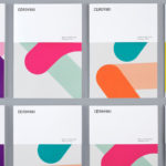
Cerovski by Bunch
Cerovski is a young Croatian print production studio that revels in the challenge of “nebulous finishing, microscopic editions, absurd materials and crazy deadlines”. Bunch worked with Cerovski to develop a new brand identity for the studio—which included a custom logotype and typeface, website, and a variety of printed collateral—that delivers a distinctive contrast of utility and creative flourish, technology and individualised service...

Raiffeisen Rechenzentrum by Moodley
The Raiffeisen Rechenzentrum is a customised IT infrastructure service provider and subsidiary of Raiffeisen Landesbank with a modern, ‘high availability’ and maximum security data centre located in Austria. Design agency Moodley recently developed RRZ’s brand identity—which included a logo, business cards, brochure and website—based around a single sans-serif, a contrast of humanistic and technological imagery and a white, black and bright...
Cemento by S-T
Cemento is the UK distributor of an Italian lightweight concrete product that can be used for wall panelling and furniture. Inspired by brutalist design — a movement that grew out of early 20th century modernist architecture and described by Wikipedia as being “linear, fortresslike and blockish” — London based studio S-T developed a visual identity for Cemento that included logo, logotype, brand...

University of the Arts Helsinki by Bond
“The Finnish Academy of Fine Arts, Sibelius Academy and Theatre Academy Helsinki merged in the beginning of 2013 into the University of the Arts Helsinki. Bond created the complete branding solution for the new university. The strategy for the identity was to create a distinctive set of logotypes based on a common design language, and to introduce an anchor symbol...

Vibe Select by Studio Constantine
Vibe Design Group are described by Studio Constantine, the design studio behind the brand identity of Vibe’s new sub brand Select, as a “multi award-winning Melbourne based architectural design practice” who produce “fiercely contemporary and conceptual buildings for the top end of the Australian residential market.” Studio Constantine worked with Vibe in the process of “productising and branding a new consulting...
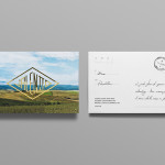
Valentto Olive Oil by Anagrama
Valentto is a Mexican cold-pressed virgin olive oil produced by Olivarera Italo-Mexicana – a Mexican Italian collaboration – created for commercial kitchen and restaurant use. Multidisciplinary design agency Anagrama recently developed a new brand identity and packaging solution for Valentto that juxtaposes the natural detail of Italian landscapes alongside the industrial utility of a square tin structural choice, described by Anagrama as being...
Insiders by Garbett
Insiders is the membership program of Sydney Opera House launched to nurture customer loyalty, increase market share and raise the frequency of attendance through priority booking, discounts, dress rehearsal ‘sneak peeks’ and invitations to meet staff and artists. Multidisciplinary design agency Garbett were commissioned to ‘evolve’ the Insiders visual identity, positioning it as a retail product with greater focus on communicating the value proposition for members,...
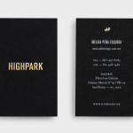
Highpark by Face
Highpark is a new residential project located in the middle of San Pedro Garza García and described by Face – the agency behind the development’s visual identity, print work and website – as ‘arguably one of Latin America’s most affluent municipalities’ and widely credited as an “architectural masterpiece”. Face go on to say that the “project needed to speak volumes about the...