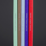
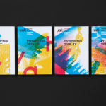
Strategy Thinking Issue 5 by Strategy
Strategy Thinking™ is an ongoing self-published series from New Zealand, Australia and Tokyo based graphic design studio Strategy. It provides the studio with a concise and compelling platform to showcase their work, communicate how they help their clients, and convey the insight and creative thinking that unites their five studios. The series also includes in-depth case studies and articles. The latest edition...
Reel by Richards Partners
Reel, formerly Reel Good, is a digital production company telling memorable stories and crafting digital experiences from its offices in Auckland, New Zealand. It has positioned itself at the intersection between new technologies and established filming techniques, and delivers both creative and distribution services. These include providing direction, production, post-production, animation and music to clients such as New Zealand Air, Casio, Warner Music...
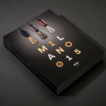
ECC Milano 2015 by Inhouse
ECC is a high quality lighting, furniture and product supplier for both the home and commercial markets. It represents a variety of brands, some of which include Jeremy Coal, Parri and Lumina, and has showrooms throughout Australia and New Zealand. As part of its continued commitment to these brands, ECC attends Salone Internazionale del Mobile di Milano, an annual event that...

John Reynolds’ Blutopia by Inhouse
John Reynolds is a New Zealand based contemporary artist, Arts Foundation Laureate, Sydney Biennale headliner and Walters Prize nominee. John began painting large abstract panels, however, has moved towards creating work with a typographic and structural foundation and has embraced smaller formats which has, amongst others, included postcards and stamps. Blutopia is a full colour reproduction of John Reynolds’ Bluetopia series from 2014...

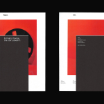
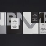
Life or Death by DIA
Life or Death is a New York and LA based full-service public relations and management business with hip hop roots. It draws its name from the idea that, within the music industry, there is no middle ground, it is either life or death. This abstraction and dual notion manifests itself within the firm’s new brand identity system, designed by DIA, as...
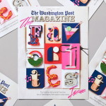
The Washington Post Magazine by Snask
Following an extensive studio search The Washington Post, one of America’s most widely circulated newspapers, commissioned Stockholm based graphic design studio Snask to illustrate The Favorite’s Issue with a fun and tactile idea that would unite, amongst others, topics such as food and drink, music, art and the outdoors. Snask’s concept is informed by the essence and characteristics of each topic, and individually visualised...
UAL 2016–17 Campaign by Spy
The University of the Arts London is Europe’s largest specialist arts and design university. It is made up of six colleges, each with its own unique character and programme, yet unified in their effort to deliver a high quality creative eduction. This united position is expressed through a visual identity system developed by Pentagram partner Domenic Lippa. Based around a robust, black and white...
FS Silas Launch Campaign by Believe In
FS Silas is a new sans-serif and slab-serif font family from British type foundry Fontsmith, each available in five weights and an italic. The family is described as having a squareness of rounded forms with dynamically angles terminals and slabs capable of offering contemporary brands the opportunity to employ different voices with one typographic system. Fontsmith worked with graphic design studio Believe In to...
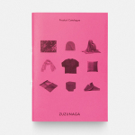
Zuzunaga by Folch
Zuzunaga is a homeware and fashion accessory business founded in ’07 by London and Barcelona based artist and designer Cristian Zuzunaga. Zuzunaga’s products, which include towels, tech covers, cushions, shawls, shoes and upholstery fabrics, are informed by contemporary living and seek to find a charm, warmth and humanity within the digital world. Products are characterised by lines, pixels, geometric abstractions and a...
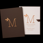
The Mansion on Marylebone Lane by Pentagram
The Mansion on Marylebone Lane will be a 22-unit high-quality residential development in Central London with lower ground, ground and seven upper floors, roof terraces and two basement levels. It will feature reflective glazed terracotta external cladding with a subtle variation in colour and shade to achieve an element of interest and complexity, while the reverse will be a white reflective glazed terracotta...
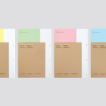
VBMS by Studio Dumbar
Visser & Smith Marine Contracting is the market leader for subsea power cable installation in Europe. It provides and lays grid-to-grid connections for offshore wind farms and similar facilities. Following investment from and partnership with dredging and marine experts Boskalis, Studio Dumbar worked with VMSC, now named VBMS (VolkerWessels Boskalis Marine Solutions) to provide strategy, brand identity and creative direction that would help launch...
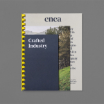
Enea by Clase bcn
Enea is a contemporary furniture manufacturer with a site in the Basque Country. Collaborating with designers Josep Lluscá, Gabriel Teixidó and the trio Lievore Alhterr Molina, Enea has developed a catalogue of versatile, comfortable, durable and functional products for the private and commercial markets. Seeking to differentiate itself from its competitors and with a desire to avoid cliches of the...