Brochure Design
OSESP by Polar
When São Paulo-based studio Polar was tasked with rebranding one of Brazil’s most important cultural institutions – the Orquestra Sinfônica do Estado de São Paulo (São Paulo Symphony Orchestra), better known as OSESP – its solution was an identity system that doesn’t just depict classical music but actively embody it. OSESP’s previous identity had served it well, with its 2003-2007...
RTS Cambridge Convention by Studio Kiln
The Royal Television Society’s annual two-day event at The University of Cambridge brings together leading television industry bigwigs to ponder the present and future of the small screen. This year, over 350 luminaries descended on Cambridge to contend with such weighty topics as ‘the future of media, the impact of AI, and the role of opinion in news’. Quite a...
Autex Acoustics by Marx Design
With manufacturing and sales teams throughout Australia, UK and the USA, Autex has grown to become the market leader in interior acoustic products in New Zealand, and the go to choice for leading architects aspiring to reduce the amount of atmospheric noise within cutting-edge residential and commercial spaces. Their products are innovative, produced in a variety of forms and colours,...

Think Packaging by Seachange
Cutting and creasing since 2010, Think is a design-driven structural packaging agency with an over-arching emphasis on form: ‘the neat bevels, the tight creases, the perfect fit’. The team of cardboard engineers has an international reputation thanks to its portfolio of award-winning work for global studios and brands, from startups to industry leaders, including Marx and Supply (New Zealand), OMSE...
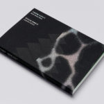
Leandro Erlich: Both Sides Now Catalogue by Studio fnt
Both Sides Now was an exhibition of works by Argentinian contemporary artist Leandro Erlich. This took place at the Seoul Museum of Art between December 2019 and March 2020. Erlich’s installations employ mirrors, reflective surfaces, water and other materials to form optical illusions with the intention of transforming familiar, everyday spaces. Studio fnt worked to develop an identity for the exhibition that would...
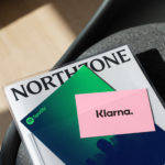
Northzone by Ragged Edge
Northzone is an early stage venture capital fund with the insight necessary to cut through the hype of funding and recognise strong teams doing good work. From their offices in London, Stockholm and New York they partner with founders at Seed, Series A and Series B stage across Europe and America. London-based Ragged Edge worked with Northzone to create a brand identity that would...

Brigade Court by Jack Renwick Studio
In The London Borough of Southwark sits the Grade II listed building and former headquarters of the London Fire Brigade, the city’s first fire station and a site currently under development. This will see it transformed into residential apartments with period conversations of the original Victorian building alongside a modern new-build. It is a one-of-kind property development that offers a...

Leandro Erlich: Both Sides Now by Studio fnt
Both Sides Now, a title borrowed from Joni Mitchell’s famous song, is a solo exhibition of Argentinian contemporary artist Leandro Erlich’s work that took place at the Seoul Museum of Art between December 2019 and March 2020. Erlich’s installations, often receiving international acclaim, mirrors, reflective surfaces, water and other various materials to create optical illusions to transform familiar, everyday spaces such as...
Northstar Film Alliance by Bond
North Star Film Alliance (NSFA) is a joint venture between Estonia, Latvia and Finland. The Alliance intends to develop and promote themselves as one filmmaking region to international film and TV productions. It is a competitive marketplace, with other countries provide low tax rates and incentives to film big-budget spectacles on their stages using local crews. Together, the three countries...
OneFourFive Clarendon by Studio Brave
OneFourFive Clarendon is a modern workspace, developed by Salta, designed by Architectus and created for future-focused businesses looking to situate themselves in Southern Melbourne. The development aims to attract like-minded progressive people with a conscious focus on connectivity and local activity. With this in mind, Melbourne-based Studio Brave developed the narrative ‘A Life Unlimited’ as a way to express how the...

Outline by Studio South
Outline is a six lot freehold property development opportunity from Fearon Hay Architects located on Kings Road on the border of Mount Eden and Mount Roskill in a culturally and historically rich neighbourhood in Auckland. Each lot is 95m2 with the capacity to build four levels and include a roof living space totalling 300m2 of floor area. Studio South worked with Fearon Hay...
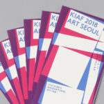
Korea International Art Fair 2018 by Studio fnt
Each year KIAF plays host to and brings to the Korea domestic market the artworks of international artists and galleries. This year, the 17th Korea International Art Fair took place between the 4–7 October in the city of Seoul. With a desire to become the pre-eminent art platform of South Korea, serve as a conduit between the Asian and international art...