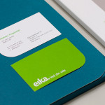
Eika by Mission
In response to the financial crash the Terra-Gruppen, a Norwegian financial group owned by and in alliance with 80 local banks, looked to take positive steps to reaffirm its commitment to local customers and the continued contribution it makes to the growth and development of the communities it serves. This came in the form of a rebranding exercise that led to the name Eika and...
Coma by Mucho
Coma is an independent analysis, strategy and executive coaching business located in Spain. It provides support to individuals, businesses and institutions with the aim of fostering talent and leadership. Coma’s philosophy is focused on forward momentum and progress. This philosophy is expressed by the firm’s new brand identity, developed by global design studio Mucho, through illustrative paths that finish on a comma. These link...
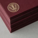
Molly Watson by Studio Blackburn
Molly Watson aids business leaders in the development and deployment of communication strategies that ‘accelerate and enrich the delivery of their goals’. Molly recently commissioned London-based design agency Studio Blackburn to help articulate this business proposition and to stand out through the creation of a new brand identity that included a logotype, yet-to-launch website, stationery, business cards, templates and CV...
Intu by Heydays
Intu is a Norwegian accounting and consultation firm and real-time technological solutions provider located in the town of Bodø. Design agency Heydays developed a new brand identity solution for Intu—which included naming, logotype, business cards, print communication, custom typography and website design—based around the link between the firm’s two key services and the software it uses to deliver these efficiently....
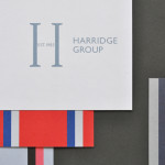
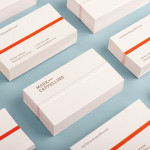
Harridge Group by Igloo
Harridge, formerly Ealing Travel Services, is a corporate travel group made up of Harridge Business Travel, Harridge Luxury and Harridge Events. London-based design studio Igloo were recently commissioned to design the group’s visual identity and brand architecture which would reference its “significant history and experience”. Their design solution, a combination of serif detail, sans-serif characters and a modern colour palette and pattern set, drawing on...
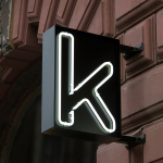
Kontoret by Werklig
Created by consultant Ray Lindberg with the intention of setting new standards for flexible work environments, Kontoret provides low-cost office space by the hour, with wireless internet, printers and coffee, to freelancers, chief executives, local businesses and international travellers in the centre of Helsinki. Inspired by the “essence and basic needs of office work and the aesthetics of the classic office...
Platform by Pentagram
Platform is a not-for-profit organisation that aims to “increase the interest and participation of underrepresented groups in the fields of technology and entrepreneurship, with a particular focus on African-Americans, Latinos and women” and “to help influence and inspire the next generation of innovators, inventors and entrepreneurs” through its website, conferences and providing “access to current leaders and role models”. Platform’s visual identity, designed...
Bedre Kommunikasjon by Work In Progress
Bedre Kommunikasjon is a oslo-based consulting firm, run by communication specialist Nils M. Apeland, that offers personal, professional and independent advice to business, drawn from 20 years of analysis, strategy, promotion, media relations and crisis management experience. Multidisciplinary design agency Work In Progress recently worked with Nils to develop a new visual identity solution which included a logo, business card and stationery design...
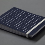
Willow Tree by Bunch
Willow Tree, one of London’s leading business consultancies, worked with graphic design studio Bunch to develop a new but traditional-looking visual identity with an attention to detail. Based around a WT monogram, created by typographer Spencer Charles, utilised as a mix of embosses, carved in seals and simulated watermark, and using purple cloth, black leather, cream paper and handmade coffee pottery, Bunch’s solution embraces a...
Mark Cappellino by Perky Bros
Mark Cappellino is described by Perky Bros, the Tennessee-based studio behind his new logo and stationery, as a leadership consultant who travels the worldwide helping individuals and teams better communicate through stronger relationships. Their design solution, “based on the behavioural beliefs that shape his practice”, “plays on the typographic device called the em dash, meaning an interruption of thought” and...
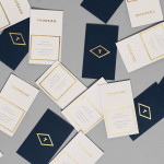
Tourean by Anagrama
Tourean is a British multinational venture capital firm that manages a variety of lifestyle subsidiaries within the music, design, events, social media and fashion industries. Their new visual identity, developed by design agency Anagrama and drawing inspiration from the Tourean name – a compounding of the words taurean and tour created to convey the values of strength, fortitude, courage and integrity as well as...
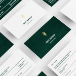
Guy Bauer by Anagrama
Guy Bauer is a Chicago-based video production company ‘committed to creating stories that elicit feelings’. The company’s new visual identity, based around a quill logo – conveying their story-telling philosophy – a stationery solution that references the film industry in its layout and a deep green color palette, designed to convey depth and reliability, was recently developed by independent design agency Anagrama....