Coaster Design & Beer Mats
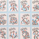
Double Diamond by Alec Tear
Our seemingly indefatigable fetishisation of the ghosts of branding past (i.e. why the design world is still talking about JKR’s Burger King rebrand nearly half a decade on) is perhaps little surprise: whether we’re consciously doing so or not, and to whatever extent we’re even aware we’re looking at something archival, returning to an amorphous yesteryear — real or imagined,...

Tigre by Triboro
LES Tigre – not to be confused with seminal electroclash/riot grrrl combo Le Tigre – is a cocktail lounge in Manhattan’s Lower East Side area, which opened at the end of last year and apparently combines ‘sophistication and refinement in drink, sound and ambiance’ with an entrance that boasts ‘an original graffiti-worn door’. So far, so hip, amirite? It all...
Dirty Vegan by Jens Nilsson
Having been a vegan for almost 20 years now, various tropes have come and gone. In the early days, for the health conscious it was pretty much all about brown paper packaged Holland and Barrett goods, and references to the Young Ones cooking lentils. For the not so health conscious (hello!) it was ketchup sandwiches. Gradually the Quorn contingent came...

Antara 128 by Mucho
GT Alpina is described by type foundry and BP&O regular GrilliType as a workhorse serif that also delights in playing with the very meaning of concept, reaching into the ‘grab bag of typographic history to resurrect shapes some may falsely see as too expressive’. This feels an apt description for Antara 128, and the visual identity created by Mucho that...
Gustini by Koto
Like many a geriatric millennial, a lot of my childhood was joyfully spent in front of the telly absorbing cultural pillars like Zig and Zag, Stoppit and Tidyup, and, of course, Wales’ finest export after Charlotte Church, Fireman Sam. Alongside the titular Sam, the show starred icons including ‘Naughty’ Norman Price (fun fact – my dad once mended the boiler...

La Oficina del Parque by Studio Ingrid Picanyol
Last month @designershumour shared a meme titled, ‘When I ask my client to send their logo in vector format’. The god-tier client supplies logo.ai, from which point there’s a sliding scale of disgust and incredulity from logo.psd to logo.jpg and logo.doc. The punchline is logo.xls. The joke resonated, attracting over 30k knowing likes (or eyerolls). At one point or another,...
Jupiter by Triboro
Triboro worked on its first restaurant branding project over a decade ago, at a time when the folklore was that if you were a restaurant serving traditional food the visual language should evoke the region and time period of the cuisine. This was intuitive and, as Triboro founder David Heasty recounts, led to some well-crafted and beautiful results but often leaned...
Ascari by Blok Design
Ascari is an Italian restaurant which two locations, one on Queens Street East and another newly opened establishment on King St West. Toronto, Canada. It is named after the proprietor’s hero, Formula 1 legend, Alberto Ascari, (who was also known for his love of food). To reflect both the passion for good simple food and racing, design studio Blok developed an identity that brings together...
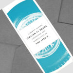
Spanjorskan by Lobby Design
Spanjorskan is a Spanish restaurant located at Nybrogatan 42, Stockholm. It features a distinctive interior of warm and traditional detailing, a mix of wood, tiling and comfortable upholstery, and modern elements of exposed utilities, solid blocks of colour and feature lighting. Spanjorskan also has a distinctive menu with a sense of the theatrical and celebratory to it in colour, presentation and serving,...

St. ERHARD by Bedow
With a desire to stand out, and in response to the extensive saturation of heritage-related visual cues throughout the German beer market, brewery St. ERHARD worked outside of the country with Swedish studio Bedow to develop a modern graphic identity for three of its brews. Farmer, Mayflower and Saison are premium beers, each of which are crafted, brewed and bottled by St. Erhard in...
The Broadview Hotel by Blok
The Broadview Hotel is located within one of Toronto’s most recognisable architectural landmarks. This was built in 1891 by a wealthy businessman who recognised the strategic importance of the East End as the city was expanding. It has been home to a business centre, acted as a political and social hub, and used as a hotel, boarding room and more recently, a...
High Street Wine Co. by Conductor
High Street Wine Co. is a wine bar and shop located in the Pearl neighbourhood of San Antonio, Texas. UK-based graphic design studio Conductor, working closely with architects Dado Group, created a visual identity that expresses something of the cheerful personality of its hosts, the ambience and community of a busy bar and its distinctive interior design. Drawing on the name for...