Colorplan Papers and Boards
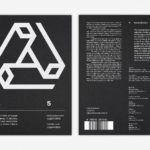
LogoArchive Issue 5
The technical limitations of the mid-century—the need for a steady hand and a precise mind for mechanical reproduction—demanded that an exceptional level of care and creativity be given over to shape and space, association and perception. These considerations created a rich corporate and consumer form language and range of graphic techniques. These have been partly marginalised, usurped by modern print...
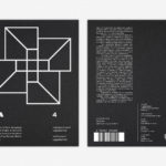
LogoArchive Issue 4
The first issue of LogoArchive was conceived, designed and sent to the printers within a day. It was inspired by a panel discussion that took place the day before at Somerset House as part of the exhibition Print! Tearing It Up. Following a successful launches of the first, second, third and Extra Issue, LogoArchive returns with its fourth release. This is...
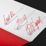
LogoArchive ExtraSpecial Issue – Canada Modern (Signed)
Following its third release, LogoArchive mixed things up with an Extra Issue in collaboration with Canada Modern. Designed and edited by Blair Thomson, and documenting the forms and colour of Canada’s modernist symbols, this issue was distinguished from the series by its Colorplan Bright Red and full-colour gatefold Chrolomux insert dedicated to the work of Gottschalk+Ash for outdoor advertising company Claude Neon....
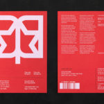
LogoArchive Extra Issue – Canada Modern
The first issue of LogoArchive was conceived, designed and sent to the printers within a day. It was inspired by a panel discussion that took place the day before at Somerset House as part of the exhibition Print! Tearing It Up. Following the successful launch of three issues, LogoArchive returns with a very special Extra Issue in collaboration with Canada Modern,...
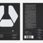
LogoArchive Issue 3
The first issue of LogoArchive in print was conceived, designed and sent to the printers (for quotation) within a day. It was inspired by a panel discussion that took place the day before at Somerset House as part of the exhibition Print! Tearing It Up. Following a successful launch of the first and second issues, LogoArchive returns with its third release...
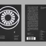
LogoArchive Issue 2
LogoArchive Issue 1 was conceived, designed and sent to the printers for quotation within a day. It was inspired by a panel discussion that took place the day before at Somerset House as part of the exhibition Print! Tearing It Up. In the momentum of its design and production (undertaken by WithPrint) LogoArchive seeks an immediate connection between the agency...
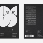
LogoArchive Issue 1
This first edition of LogoArchive in print was conceived, designed and sent to the printers for quotation within a day. It was inspired by a panel discussion that took place the day before at Somerset House as part of the exhibition Print! Tearing It Up. Today’s zine format and the revival of the independent publishing spirit of the past is a...
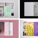
BP&O Collections — Inserts
A continually updated gallery of graphic identity design work, reviewed and published on BP&O, that feature an insert component. Where inserts have traditionally sat loosely within newspapers and magazines, quite separate from content and often adverts, the examples here are bound in and characterised by a proportional difference, either smaller than the cover, punctuating content in size, colour and content,...
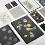
Jackalope Hotels by Fabio Ongarato Design
Jackalope Hotels is a luxury hospitality experience developed by Melbourne-based Louis Li, a hotelier described as having a penchant for the avant-garde. The first Jackalope Hotel is situated in the heart of the Mornington Peninsula, Victoria, Australia. It is unique in its location, surrounded by the hotel’s vineyard, in its architecture and interior by Carr Design, and in its visual...
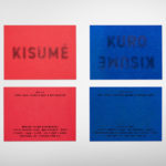
Kisumé by Fabio Ongarato Design
Kisumé is a Japanese restaurant located on Melbourne’s Flinders Lane. It is described by Fabio Ongarato Design, the studio behind its visual identity, as an unconventional, slightly twisted and artfully executed experience. The restaurant intends to immerse guests in an intriguing view of Japanese traditions, and fuses these with the owner’s obsession with beauty and sensuality. This is expressed by a “brutally sophisticated and...
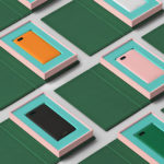
Chaos by Socio Design
Inspired by fashion’s current fascination with customisation, technology and a “sense of light-hearted fun”, creative duo and stylists Charlotte Stockdale and Katie Lyall created Chaos, a new UK luxury lifestyle brand producing limited edition and personalised tech and travel accessories. Through form and finish, materiality and graphic design, Chaos products, which include phone cases and charms, zips and luggage tags, express the brand’s take on practicality...
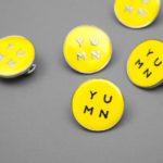
Yumn by Filthymedia
Yumn is a casual luxury restaurant located within Croydon’s Boxpark, a pop-up mall for independent and global fashion and lifestyle stores, cafes and restaurants, housed within converted shipping containers. Yumn is a smaller and more intimate version of Yumn Brasserie with a similar approach to interior in its mix of blue pinned leather upholstered seating and high quality finishes, but shares...