Colour in Use: Pastels
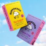
Superkeen by B&B Studio
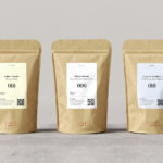
There has never been more awareness of allergens and inflammatory ingredients, with lupins and sulphites now on the mainstream radar alongside common culprits like gluten and dairy. At the same time, nostalgia and anemoia (‘a feeling of yearning for a past that you never experienced’) have become driving forces shaping contemporary tastes. Direct-to-consumer cereals neatly bridge a gap in this...
Soft Services by Decade
Skin is the human body’s largest organ while skincare is the fastest growing segment of the beauty industry. Yet with all their promises of ‘dewy’, ‘glowing’ and ‘blemish free’, most products on the market, are focused on the face. Direct-to-consumer business Soft Services creates skincare products for specific body skin problems, such as acne, ingrown hairs, stretch marks and fungal...
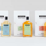
Kininvie by Here Design
The Kininvie distillery was established in 1990 as a third home for William Grant & Sons – it was initially built to relieve pressure on stock at neighbouring sites in Dufftown. Kininvie Works is a more recent development, created as an innovation arm to develop new recipes and processes. As such it is liberated from the rules and regulations that...
Metamorphoses by A Practice For Everyday Life
Metamorphoses is a contemporary art gallery that curates unique pieces by makers who turn one thing into another. It takes a special interest in works that are inspired by the past while displaying keen attention to present issues. These pieces, selected by the gallery, are often drawn from a body of work by artists who reflect on aspects of cultural...
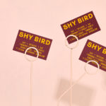
Shy Bird by Perky Bros
Shy Bird is a all-day café, rotisserie and bar in Cambridge, Massachusetts. Its core mission is to elevate chicken, and the experience of eating chicken into the realms of the exceptional through gastronomic know-how, a beautiful interior and a visual identity designed by American studio Perky Bros. Drawing their inspiration from the red junglefowl, the “original chicken” and descendant of the domestic chicken, and...
Tea & Glory by Socio Design
Tea & Glory are loose-leaf tea experts and are described as the antithesis of fast-paced coffee culture. In the same spirit of ancient tea drinking rituals, the brand is interested in the continued promotion of slow-living, a lifestyle that seeks to place more focus on the small details and experiences of everyday life. With a desire to better express this position Tea &...
Broadgate by dn&co
Broadgate is the largest pedestrianised neighbourhood in Central London. It is adjacent to the busy transport hub of Liverpool Street station, surrounded by Shoreditch, Spitalfields, Old Street and the City, made up of a diverse community and uses that span innovation, finance, food, retail and contemporary cultural activities. The area will receive a £1.5 billion investment to further its development...
Di Beppe by Glasfurd & Walker
Di Beppe is a casual Italian caffé and ristorante, located in Vancouver’s Gastown neighbourhood, “inspired by the Italian immigrant’s desire to share a piece of home while living abroad”. Di Beppe is said to honour the sense of deep pride and self-assured nature associated within Italian culture through a classic and authentic Italian dining experience and in the design of its graphic identity,...
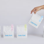
Little Wolf by Perky Bros
Little Wolf is an American small-batch coffee roastery, subscription service and café created by former accountant turned coffee roaster Chris Gatti. Tennessee-based graphic design studio Perky Bros recently worked with Chris to developed a new graphic identity that would link a variety of assets. These included stationery, business cards, individual coffee bags, tote bags, merchandise, subscription boxes and website. Perky Bros describe their...
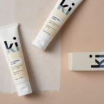
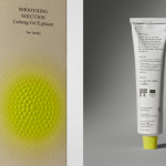
Ki Sunscreen by Akin
Ki Sunscreen was developed by national skincare clinic Caci to protect against the harsh New Zealand sun, and the skin damage and premature ageing that UVA and UVB rays can cause. It is made from the latest generation of ingredients proven to protect, and those that help to control oils and maintain a matt finish. This balance between clinically proven effectiveness and cosmetic...
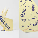
Sydlexia: Making Sense Of Dyslexia by BBDO Dubai
Sydney Dyslexia intends to challenge the misconception that dyslexia is a learning disability, and instead, move the conversation forward, to more appropriately address it as a learning difference. Sydlexia is an innovative and pioneering platform, created by Sydney Dyslexia, to help aid this change, and offers new techniques and training methods to help facilitate “dyslexia correction”. Dyslexia is the most common learning disorder....
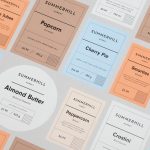
Summerhill Market by Blok
Summerhill Market is a family-run business, managed by the third generation, with premises on Toronto’s Summerhill Avenue and a smaller location—a floral boutique—on Mt. Pleasant Rd. The store has 200 employees, a butchers, bakery and deli, a BBQ in the summer and offers a variety of catering services. Summerhill Market is admired for its high quality products, and its ability—since 1954—to consistently redefine what...