
East Sydney Early Learning Centre by Toko
East Sydney Early Learning & Community Centre is a state of the art space located on Bourke Street. It provides childcare places for parents living or working in the inner city suburbs of Sydney. The centre, designed by ABA Architects, features five play rooms set over three levels, indoor playground on each floor and an open-air play area on the top floor. The space...

The Playlist Co. by Blok
The Playlist Co. is a Canadian business providing music management and consulting services, AV construction, live music and playlists for a wide range of spaces and events, nationally and internationally. They are renowned for their encyclopaedic knowledge of music, and have collaborated with a some of Canada’s top hospitality brands, as well as local bars such as Buca, Canoe and Bar Raval. The Playlist Co....
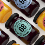
Danish Selection by Kontrapunkt
Danish Selection is a new range of high-quality fruit spreads cut with alcohol. The range includes blackcurrant infused with Jamaican rum, orange with cognac and a wild blueberry variety with Scotch whiskey. Orkla, the company behind Danish Selection, worked with Copenhagen based graphic design studio Kontrapunkt to develop a packaging treatment that would clearly communicate this new concept to consumers. Kontrapunkt’s solution is...
LeMise by DIA
LeMise is a Brooklyn based art and design advisory business, established by Andi Potamkin, described as being guided by the concept of mise-en-scene. LeMise considers the environment as a whole and works with its clients to bring together works of art and design, drawn from a vast network of designers and artists, to enhance space. New York graphic design studio DIA worked with Andi to develop...

Swedish Forest Industries Federation by BVD
With the intention of better communicating the endless possibilities of the forest, the concept of Bioeconomy and a commitment to a sustainable future, Skogsindustrierna, the representative of the Swedish pulp, paper and woodworking industries, worked with Scandinavian design studio BVD to help move them away from a complicated tonality and give their communication a clarity, focus and accessibility. With this in mind,...

Nota Bene by Blok
Nota Bene is a restaurant, located on Toronto’s Queen Street West, with a menu made from locally-sourced and seasonal ingredients. It was opened by chef David Lee and business partners Yannick Bigourdan and Franco Prevedello in 2008, and was awarded “Best New Restaurant” by Toronto Life and enRoute Magazine soon after. To coincide with the restaurant’s 2016 relaunch—which saw David Lee take...

Bombonería Pons by Mucho
Bombonería Pons is a family owned Barcelona based business, established in 1960, dedicated to producing the finest handcrafted chocolates. With a desire to engage with a younger consumer Bombonería Pons worked with international graphic design studio Mucho to develop a brand identity that would be sensitive to its traditional values and history yet give it a contemporary appeal. This extended across packaging, brochure, stationery, business cards and...

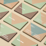
f32 by Blok Design
f32 is an American trend-watching company, founded by Gina and Lisa Priolo, with an office in LA and a commitment to finding and championing artists and brands that will go on to shape global culture. f32 worked with graphic design studio Blok Design to better express this vision, and their refined and highly contemporary aesthetic sensitivities. This was achieved through naming and...
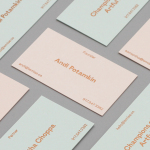
Mamen Diego by Atipo
Spanish graphic design company Atipo recently worked with Madrid based architecture and interior design studio Mamen Diego to create a new brand identity treatment that would extend across and unite a variety of print and digital assets. These included business cards, stationery, brochure and website. Although there is not much information about the philosophies or positioning of Mamen Diego—their new website is yet to launch...
Johnny Roxburgh by Bunch
Johnny Roxburgh is an entertainer and party designer working with the rich and famous nationally and internationally. He has over thirty years of experience and has held a royal warrant for the last nine. In the words of The Scotsman, Johnny is capable of turning the whims and fancies of the world’s wealthiest one percent into glittering realities. These have included, but are certainly not limited...
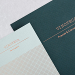
Vinoteca by dn&co
Vinoteca is a group of London based restaurants, founded by business partners and friends Brett Woonton and Charlie Young, that were inspired by the wine bars of Spain and Italy. Aside from the restaurant experience, and as a testament to the quality of their wine list, these restaurants also operate as local wine retailers. dn&co. were commissioned to refresh and formalise Vinoteca’s brand identity. With...
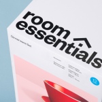
Room Essentials by Collins
Room Essentials is a line of modernist home furnishings created and sold by American retailer Target. The range covers over 2,000 products across 60 categories, and includes items such as blankets, lighting, chairs, tables and tableware. While securing significant revenue for the retailer, the range has, over the last five years, experienced a downturn in sales generated by its Millennial...