Condensed Logotypes

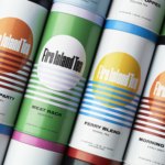
Fire Island Tea by Stephen Moss
Fire Island has always seemed far more a mythical utopia than a real, physical geographical, location to me; in part simply because of its name: Fire Island seems wrenched straight out of Greek legend – elemental, fearsome, alluring, almost a contradiction as surrounded by water yet inherently burning. But mostly, it’s thanks to Frank O’Hara, whose mid-20th-century poetry eschewed the...
Precise by Design Bridge
Mortgages aren’t exactly the most sexy or fun concepts, nor are the companies that offer them. Likewise, the sector isn’t exactly known for a bold or forward thinking approach to brand design. But it’s often the more traditionally dull-leaning brands or companies that make for the most creative – not to mention difficult – branding projects. Perhaps that’s part of...
RSPCA by JKR
It’s often the launch of major charity rebrands that puts the gulf between how the design world views something, and how the rest of the world might, into sharp relief. Countless headlines abound bemoaning the £££millions ‘spent on a new logo’, as if that’s just about all there is to it, and now the children/animals/elderly etc will directly suffer as...

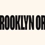
Brooklyn Org by Mother and Mother Design
Mother New York and Mother Design (Fhirst, Brooklyn Org, Peerspace) have overseen the rebirth of Brooklyn Community Foundation as the commandingly named Brooklyn Org. The sea change arose from a desire to distance the organisation from ‘notions of traditional philanthropy, seen largely today as elitist, dysfunctional, and detached’. If that sounds like a solution to a problem that shouldn’t exist...

Black Bee Honey by OMSE
It was yesterday I made a run to the local supermarket to pick up some essentials. I had two choices, turn left to Waitrose or right to Morrisons. Despite being somewhat price conscious, I enjoy looking at the packaging at the higher-priced Waitrose, so went left–let’s say it’s the cost of being a designer. Anyway, honey was on the list....
Curve Club by Wildish & Co.
For a type-nerd (hello!) there are few things more seductive than a beautiful, beguiling letterform. But what makes such shapes even more siren-like is when they leap off the page and come to life, not just in motion, digitally; but in a physical environment. The branding for new private members club Curve Club, then, certainly ticks a lot of boxes...
Peerspace by Mother Design
Straight up, I’ll admit that I struggle to resist a condensed sans typeface set in uppercase. I’ll also confess that I’ve spent the last hour (no lie), trying to identify this one… Helvetica? Hell no. Railroad Gothic? The wrong track. Söhne? Sö not. Must be Knockout? Another blow. For Druk’s sake is it Druk? Well, whatever it is, it’s neatly...
Everybird by Marx Design
Few products have successfully integrated ethical, sustainable and environmental concerns with a product than coffee. It’s hard to imagine a time when the conditions of cultivation (both human and environmental) were not equal to flavour and – if we’re getting technical – whether the roast is blended or single origin. With its smaller volumes, the speciality coffee market has challenged...

Yes You Can by Marx Design
Yes You Can is a non-alcoholic ready-to-drink range developed by former Olympic athlete Tyler Martin. It exists in the growing direct-to-consumer space alongside more traditional channels of distribution that includes major liquor retailers across Australia. Yes You Can launched with three products aimed at a young ‘social “seltzer” crowd’ looking for healthy and sophisticated alternatives to other ready-to-drink products. Helping...
Leapling Films by F37
Leapling Films is a Manchester-based independent production company founded by ‘leap year baby Chris Lane’. For those that don’t know, this included myself until an hour ago, the word ‘Leapling’ is used to describe somebody who was born on the 29th February. Chris is a member of The Production Guild. His work has been seen by millions of people worldwide, and his credits as...
Northstar Film Alliance by Bond
North Star Film Alliance (NSFA) is a joint venture between Estonia, Latvia and Finland. The Alliance intends to develop and promote themselves as one filmmaking region to international film and TV productions. It is a competitive marketplace, with other countries provide low tax rates and incentives to film big-budget spectacles on their stages using local crews. Together, the three countries...

OneFourFive Clarendon by Studio Brave
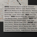
OneFourFive Clarendon is a modern workspace, developed by Salta, designed by Architectus and created for future-focused businesses looking to situate themselves in Southern Melbourne. The development aims to attract like-minded progressive people with a conscious focus on connectivity and local activity. With this in mind, Melbourne-based Studio Brave developed the narrative ‘A Life Unlimited’ as a way to express how the...