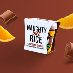
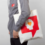
Naughty But Rice by Robot Food
Naughty But Rice is a rice pudding range created by The Hain Daniels Group in response to an increase in the dessert’s popularity in the United Kingdom. Unlike the product’s of established and mainstream brands, Naughty But Rice, as the name suggests, offers consumers a modern and indulgent twist on the traditional favourite, with flavours that include Coconut & Raspberry, Salted Caramel and Chocolate...
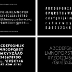
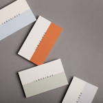
BP&O Collections — Custom Typography
A collection of custom typography designed as part of a new brand identity project, reviewed and published on BP&O. Between them, these highlight how sans-serif reduction and serif flourish, and significant character or nuance can contribute to a distinctive and communicative brand identity. This selection includes inline, monolinear, extended, condensed, calligraphic, brush drawn and metal type-inspired examples, and features the graphic design studios Lundgren+Lindqvist, Designers...

Torafuku by Brief
Torafuku has a simple yet adventurous menu that reinterprets pan asian flavours as modern shared dishes. These are made from good quality and locally sourced ingredients, which are complimented by a variety of contemporary cocktails, a carefully curated wine list and local craft beers. Torafuku is located on the border of Vancouver‘s historic Chinatown and features an open and reductive urban interior space of leather upholstered benches, light...
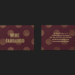
Wine Fandango by Moruba
Drawing inspiration from New York neon, and its show business associations, graphic design studio Moruba have developed a new brand identity treatment for Wine Fandango, a restaurant and wine bar, located in the Spanish city of Logroño, that features a rich interior design of textured glass, wood floors and furniture, ceramic tiles, exposed brick and gold fixtures. Wine Fandango’s identity is made up of custom typography and logotype, patterns,...
Melba at The Savoy by Pentagram
Melba is a pâtisserie and cafe, located on the corner of The Strand and Savoy Place in London’s North Bank, and is one of nine places to eat and drink at The Savoy hotel. The patisserie is described as offering a glimpse into the exclusive and luxury world of The Savoy, and is the first time that the hotel, accessed via private...
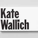
Kate Wallich by Shore
Kate Wallich is an American award-winning choreographer, dancer and director whose work has been commissioned and presented nationally and internationally by arts organisations such as On The Boards, The Frye Art Museum and Northwest Dance Project, amongst many others. Alongside Lavinia Vago, Kate Wallich is also founder of Seattle based contemporary dance company The YC, and teaches her own brand of movement...
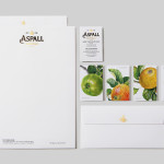
Aspall by NB Studio
Aspall is a British family run cyder maker with a significant history, now into its eight generation and third century. In response to increased competition from both the Cyder and Vinegar categories, Aspall recently worked with NB Studio to help reinvigorate and re-craft its brand identity. This included new logo and packaging treatments for retail and trade as well as website, point...
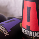
Awestruck Hard Cider by Buddy
Awestruck is a premium hard cider range from Gravity Ciders. It was created to offer America’s craft brew fanatics a refreshing alternative to beer. Awestruck is made from 100% fresh-pressed New York State apples and infused with unique flavours that reflect the company’s enthusiasm for experimentation. The range includes Lavender Hops, Hibiscus Ginger and Eastern Dry. Design studio Buddy were commissioned by Gravity...
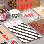
DF / Mexico by BuroCreative
DF / Mexico is the latest restaurant concept from the creators of Mexican market food experience Wahaca. Located on London’s Hanbury St. the restaurant combines an informal diner-style setting with Mexican fast-food and modern American influences. Its brand identity, a broad combination of print, signage, environmental graphics and website design by BuroCreative, is built around a simple mix of condensed type,...
SSU by Snask
The Swedish Social Democratic Youth League, abbreviated to SSU, is a branch of the Swedish Social Democratic Party, associated with the Swedish Trade Union Confederation, and one of the largest youth leagues in the country with a membership of over 10,000. In response to an upcoming general election, which took place on September 14th, the SSU looked to readdress its visual identity which had...
Tamarindo by La Tortillería
Tamarindo is a kitchen and bar with an international menu due to open in October 2014. Located in Ourense, Spain, Tamarindo was created as a refreshing alternative for local walkers who are used to traditional bars and restaurants, and is described as a place with two distinct moods and spaces, the casa cocina or house/kitchen, a place for coffee and...
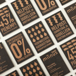
Miinus by Bond
Miinus is kitchen created by Finnish furniture manufacture Puustelli. As the name suggests, Miinus was developed around the philosophy of reduction, the process of removing superfluous elements to leave only the minimum, most functional aspects intact. Helsinki based design studio Bond where commissioned by Puustelli to develop a brand identity for the kitchen that would extend across stationery, print, retail and exhibition spaces. By utilising...