
New York Architecture Book Fair by Pentagram
Storefront for Art and Architecture is an independent not-for-profit art and architecture organisation, located in New York’s Soho, dedicated to advancing architecture, art and design. To further this remit the organisation developed the New York Architecture Book Fair, an event and platform that brings together authors, designers, publishers, critics and readers to consider, through a programme of discussion, installation and pop-ups,...
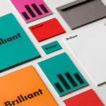
Brilliant by The Studio
Swedish employee engagement consultancy Netsurvey and Bright, experts in customer surveys, have been merged and rebranded as Brilliant by The Studio. This merger and rebranding intended to create a new platform capable of encapsulating the skills and corporate cultures of both companies and develop a visual expression that people from each could identify with and stand behind. In the same spirit as The Studio’s...

Outline by Studio South
Outline is a six lot freehold property development opportunity from Fearon Hay Architects located on Kings Road on the border of Mount Eden and Mount Roskill in a culturally and historically rich neighbourhood in Auckland. Each lot is 95m2 with the capacity to build four levels and include a roof living space totalling 300m2 of floor area. Studio South worked with Fearon Hay...

Fredrik Værslev As I Imagine Him by Zak Group
Fredrik Værslev as I Imagine Him is an exhibition of work by Norwegian contemporary artist Fredrik Værslev produced over the last decade. The exhibition runs from September 2018 to January 2019 at Astrup Fearnley Museet in Oslo. Through a focus on process, modes of abstraction and representation, motions between the painterly and the architectural and in the use of untraditional tools...
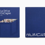
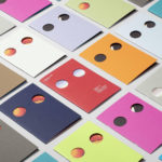
Nunchi by Bedow
Nunchi is an Italian startup and the vision of Cedric Naudon, a self-confessed gastronome. This follows his ambitious project to create an entirely new creative neighbourhood of restaurants, fashion boutiques and design stores in Le Marais, Paris. Nunchi intends to frame and connect all of Cedric Naudon’s gastronomic projects. The first of which is a reimagining of Edouard Nignon’s classic cookbook L’Heptameron des Gourmets,...

Senja Cosmetics by Werklig
Senja is a Scandinavian premium cosmetics brand, founded by Senja Parkkinen, with a range of toners, cleansing foams and oils made from active natural ingredients all manufactured in Finland. With a desire to communicate an all-natural and contemporary positioning and capture the fresh air and harsh environmental conditions that produced many of these ingredients, the brand worked with Werklig to develop a...
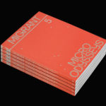
Migrant Journal No.5 by Offshore Studio
Migrant Journal is a six-part exploration of migration in all its forms. It covers, as you might expect, the current and pressing political and socio-cultural implications of the mass migration of people, yet also delves deeper into the more abstract movement of ideas, power and information around the globe. Migrant Journal, in its breadth but a continuity of theme, intends...
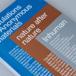
Speculations On Anonymous Materials by Zak Group
Speculations on Anonymous Materials (2013), nature after nature (2014) and Inhuman (2015) is a trilogy of exhibitions, curated by Susanne Pfeffer, that took place at Fridericianum, Europe’s oldest public museum, located in the German city of Kessel. The exhibitions, which mark the institution’s turn towards post-humanist thinking, intended to demonstrate how current artistic practices shift the theoretical boundaries separating the...
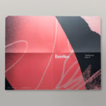
Everlea by Studio Brave
Everlea is a new property development described as a private sanctuary of townhouses located in the Melbourne suburb of Keysborough, an expanding community marked by its space and natural surroundings of native trees, shrubs, parkland and a landscaped network of safe pedestrianised streets. Developed by SB&G, working in collaboration with Bruce Henderson Architects, landscape architects Tract and Kathy Demos, Everlea “offers a pairing of design expertise guided by...
Schubertíada Vilabertran by Mucho
Schubertíada is an annual festival run by Associació Franz Schubert that celebrates the works of the 19th-century Austrian Romantic composer Franz Schubert. This takes place in the Spanish municipality of Vilabertran in July. The festival includes a programme of chamber concerts, lied recitals, instrumental solos and lectures. Schubert is known, not just for his compositions, but for his contribution to Lieder; German poetry...
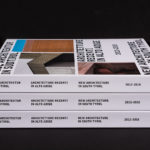
New Architecture in South Tyrol 2012—2018 by Studio Mut
New Architecture in South Tyrol—a travelling exhibition and catalogue—brings to light the unique architectural boom happening in Alto Adige, also known as South Tyrol, the predominantly German-speaking northern-most province of Italy. Selected by an international jury, the catalogue focuses on fifty-nine buildings from the region, realised between 2012–2018, and have gained local contemporary architects international recognition. These buildings are marked by...
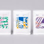
Felt Coffee by Studio fnt
Felt is a coffee shop in Seoul with their own brand of speciality coffee which has been sourced by way of direct trade and roasted in Gyeonggi-do, a populous (relevant later) province of South Korea. They opened their first store in September 2015 and a second in October 2018. The team at Felt see every part of the coffee experience;...