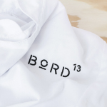
Bord 13 by Snask
Bord 13 is a restaurant, located on Malmö’s Engelbrektsgatan, with a menu that steers clear of the overfished, the modified and unnatural. It is a collaboration between chefs Robert Jacobson and Besnik Gashi, a former Souschef and a Head Sommelier from world-renowned Noma, and features a brand identity and interior design by Scandinavian studio Snask. This extended to material, lighting and furniture...
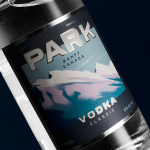
Park Distillery Vodka by Glasfurd & Walker
Park is a bar, restaurant and distillery located in the Canadian resort town of Banff, within the Banff National Park, and the province of Alberta. It is a region of diverse natural beauty, with mountains, prairies, forests and desert badlands that attract walkers, campers and skiers. Park Restaurant is a celebration of Banff’s alpine history and lifestyle. This runs throughout its interior, campfire-inspired menu and a...
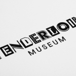
Tenderloin Museum by Mucho
The Tenderloin Museum tells the story of, and celebrates, the people and rich history of the Tenderloin district, a 31 block region of San Francisco. The museum’s permanent exhibition covers the area’s rebuilding, from 1906, following the great earthquake, until the present, and captures its diversity. It is a neighbourhood that has been filled with, what Mucho, the graphic design studio behind the...
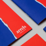
Arrels by Hey
Arrels (roots in English) is a Spanish shoe brand, established by cousins, friends and partners Javier & Pepe Llaudet, and inspired by the Mediterranean, its traditions, rhythm, colour and creative atmosphere. Javier & Pepe also draw on the city of Barcelona (the place they want to be), the countryside (where they are from), and their passion for music. These inspirations make their way into Arrels’ new brand identity,...
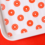
Bronuts by One Plus One Design
Bronuts sells handmade donuts and freshly brewed coffee to the local community of the Exchange District in Winnipeg, Canada, and, as the name suggests, is run by two brothers. Bronuts’ location draws a variety of customers, from young professionals and corporate offices to college students. It has a warm interior of light wood, white tiles, exposed architectural surfaces and low-hanging bulbs. Much like its interior, Bronuts’ brand identity,...
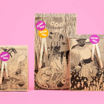
Moomin & Moomin Shop by Bond, Finland
The Moomins are characters from a book, picture book and comic book series created by Swedish-speaking Finnish illustrator and writer Tove Jansson. These were published in Sweden and Finland between 1945 and 1993. Alongside the comic strip, the characters have also featured in their own television series and film, and populate the theme park, Moomin World, on the Finnish island...
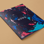
The Hugo by Studio Brave
The Hugo is a new residential property development, made up of 23 apartments, located in the Melbourne suburb of Foostcray. It is a hi-tech building with a distinctive perforated façade, and a design that leverages natural light and air flow. Its apartments were designed to be flexible and secure, with a particular focus on livability, functionality and beauty, and feature interiors...
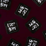
Bier Bier by Tsto
Bier Bier is located on the ground floor of a striking Art Nouveau building in the centre of Helsinki, and part of The We Are Group, alongside wine bar Vin Vin, restaurant Story and wine importer and wholesaler Viinitie. It has over 100 different types of beer and an interior of dark wood panels and carved frames, ocean green walls, light wood...
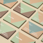
Mamen Diego by Atipo
Spanish graphic design company Atipo recently worked with Madrid based architecture and interior design studio Mamen Diego to create a new brand identity treatment that would extend across and unite a variety of print and digital assets. These included business cards, stationery, brochure and website. Although there is not much information about the philosophies or positioning of Mamen Diego—their new website is yet to launch...
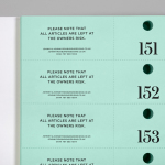
Johnny Roxburgh by Bunch
Johnny Roxburgh is an entertainer and party designer working with the rich and famous nationally and internationally. He has over thirty years of experience and has held a royal warrant for the last nine. In the words of The Scotsman, Johnny is capable of turning the whims and fancies of the world’s wealthiest one percent into glittering realities. These have included, but are certainly not limited...
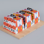
Bottura by Foreign Policy
Bottura is an Italian restaurant and food store with space in Singapore’s Suntec City Mall. It has a contemporary interior of exposed utilities painted black, white suspended ceiling and surfaces, dark wood and steel furniture, glass, concrete and steel counters, warm spot and low-hanging lights and an open kitchen working from authentic family recipes rooted in the owner’s hometown of Bologna. This interior is punctuated...
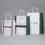
The Hyundai Department Store by Studio fnt
The Hyundai is a well-known, well-thought-of and well-established South Korean department store that this year will celebrate its 44th anniversary. To coincide with this, The Hyundai launched a new brand identity system developed by Seoul graphic design company Studio fnt. This builds on the logotype and colour palette created by New York’s Base Design earlier in 2015, and introduces a Korean logotype, patterns,...