Designers Anonymous

Soma by Manual
Soma is a water filtration brand that is described by Manual, the design studio behind its brand identity and packaging treatment, as bringing together sophisticated design, sustainability and charity. These values are evident within Soma’s first product, a glass water carafe that uses a 100% compostable filter, its packaging, and the commitment to charity donations that comes with each sale....
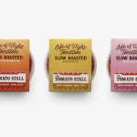
The Tomato Stall by Designers Anonymous
The Tomato Stall is a grower of speciality tomatoes whose distinct flavour is attributed to the increased sunshine they receive from being farmed on the southern English island of the Isle of Wight. From these, The Tomato Stall produces a range of ‘tomato inspired’ artisanal products that are stocked by farm shops and delis throughout the UK and sold from...

Designers Anonymous by Designers Anonymous
Designers Anonymous is London-based multidisciplinary design agency with global clients from a variety of sectors. The agency has appeared on BP&O on a number of occasions, with highlights including their packaging work for Zest and Patchett’s, and their identity work for Fuller’s hospitality brands The Parcel Yard, The Tokenhouse and Brewer St. Following the launch of their new website this...

Fika by Designers Anonymous
Fika is a bar and kitchen located on London’s Brick Lane with a rustic menu prepared on site and to order, all of which can be taken away. Created by Designers Anonymous, Fika’s visual identity, which extends on-line, in-print and as signage, is an illustrative and photographic mix of characters, cartoons and quirky compounded imagery bound by a consistent logo,...

The Tokenhouse by Designers Anonymous
The Tokenhouse is a gastropub – run by hospitality brand Fuller’s – located on London’s Moorgate road. Designers Anonymous – the agency behind the branding of Fuller’s King’s Cross pub venture The Parcel Yard and fair-trade coffee range Brewer St. – developed a visual identity for the venue that appropriates 17th century history, gives it a contemporary vector treatment, a creative but cohesive diversity...

Brewer St by Designers Anonymous
Brewer St. is a new fair-trade coffee range developed by UK based hospitality brand Fuller’s to take advantage of continued coffee market growth and build on the day-time custom of their pubs, bars and hotels. London based graphic design studio Designers Anonymous, following their successful rebranding of Fuller’s flagship King’s Cross pub The Parcel Yard, developed a visual identity solution for the brand based around...
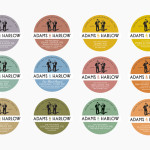
Adams & Harlow by Designers Anonymous
Adams & Harlow is a brand of Lincolnshire made pork pie that has a rich heritage dating back to 1910 and continues to bake on its original premises under the management of the founder’s granddaughters. The brand’s new packaging and identity, created by London based Designers Anonymous draw together the personalities and history that underpin the brand with a quirky but traditional illustrative and typographic...