Duplex Business Cards

LCBA by Studio Bergini
Not a new project, but a lovely one nonetheless; it seems there couldn’t have been a more perfect fit for London Centre for Book Arts than Studio Bergini when it was looking for a design team to task with creating its new visual identity. Formed by two Central Saint Martins grads – Norwegian Kristian Hjorth Berge and Italian Francesco Corsini (hence...
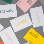
Lumik by Hey
Lumik is a Spanish lighting design and manufacture company, and partnership between the traditional metalworking company of Francesc and Ferran Martí, and interior designer and art director Frank Domínguez. Together they have 65 years of experience, and have built a catalogue of products with simple forms, moments of colour, elements of play and the industrial. These move between those that are...
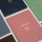
Innovation Properties by 25AH
Innovation Properties is a Scandinavian developer creating modern, functional and timeless homes in and around Stockholm. The developer recently worked with graphic design studio 25AH to create a new brand identity that would run across business cards, stationery and project brochures, and in conjunction with a new website, also designed by 25AH....
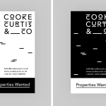
Cooke Curtis & Co. by The District
Cooke Curtis & Co. is an award-winning estate agent with an office in Cambridge, United Kingdom. It has a portfolio and a thorough understanding of properties throughout the city and in neighbouring villages. Although the business was established last year, its founders have over thirty-five years of industry experience. Local graphic design studio The District were commissioned by the estate agent to develop a visual identity that...

Faymus by Studio Brave
Faymus is a Melbourne based property developer committed to building intelligent and sustainable spaces and ecosystems for tomorrow’s living in a way that is sensitive to the heritage and diversity of local communities. Property developed by Faymus is rooted in a philosophy that anticipates rather than follows change, interlinks tradition and innovation, and, working collaboratively with affiliated professionals, covers planning, build and interior design....
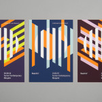
Reachin’ by Karoshi
Reachin’ is a regular charity event established in 2012 to engage with a younger demographic and raise awareness and funds for Myeloma UK, an organisation dedicated to finding a cure for Myeloma, a rare cancer of the bone marrow. Money made from each event is complemented by the online sale of branded t-shirts, vests and tote bags. Designed by Karoshi, Reachin’s brand...
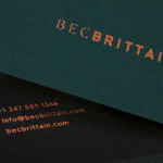
Bec Brittain by Lotta Nieminen
Bec Brittain is a New York based lighting and product designer who is driven by a “love for luxurious materials, intuitive forms and forward-thinking technology.” Working with her small team from a studio in Brooklyn, Bec Brittain creates products that explore and experiment with new production techniques and materials that push the boundaries of American-made centrepiece lighting design. Each piece is created and inspected by Bec and produced using a...
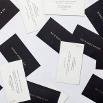
Shaun Ford & Co. by Savvy
Shaun Ford & Co. is a Canadian bespoke furniture an interiors business that creates tailored environments for the sophisticated, style conscious consumer, and whose work revolves around a timeless approach to space. Each piece of furniture is designed with careful consideration given to the years that it will have to coexist within a particular environment and with the intention that each acquires further...
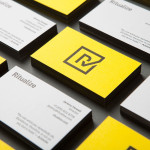
Ritualize by Shorthand
Ritualize is a cross-platform fitness and lifestyle app that utilises leaderboards, education, challenges and exercises to establish and track small habits that should lead to improved physical and mental health, and a sense of well-being over time. Shorthand, an independent brand identity and graphic design studio based in Newcastle, Australia, were recently commissioned to help bring the app to market. This included naming,...
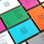
KVGD by Kerr Vernon
KVGD is a Glasgow based graphic design studio run by Kerr Vernon that works within the fields of brand identity design and print, has a ‘be nice, do good work’ philosophy, and a reputation for producing engaging, thoughtful and crafted projects. The studio’s client base is diverse, local and national, and includes businesses such as gallery, event and creative workspace The Whisky Bond,...

Iona Brown by Sam Flaherty
Iona Brown is a London based contemporary jewellery designer who favours classic simplicity, understated detail, precise finishes and minimalist lines, shapes and materials. Graphic designer and art director Sam Flaherty recently worked with Iona to develop a new visual identity for her expanding collection. Built around a customised logotype and a simple print and packaging treatment that uses few but good quality and contrasting...
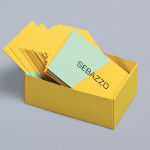
Sebazzo by Bunch
Sebazzo is the London based interactive studio of digital design duo Sebastien Hefel and Michael Azzopardi. The studio creates applications, websites and generative installations for a variety of brands and specialises in ‘innovative e-learning environments’. Design agency Bunch recently created a visual identity and stationery solution for Sebazzo that conveys digital design as a craft and the duality of the partnership...