Logo Design Trends: Dynamic Logos
OSESP by Polar
When São Paulo-based studio Polar was tasked with rebranding one of Brazil’s most important cultural institutions – the Orquestra Sinfônica do Estado de São Paulo (São Paulo Symphony Orchestra), better known as OSESP – its solution was an identity system that doesn’t just depict classical music but actively embody it. OSESP’s previous identity had served it well, with its 2003-2007...
Beams by Only Studio
The Beams is ‘an expansive new venue and event space on the Royal Docks in the heart of East London’ (that’s as long as you prefer your cartography loosely impressionist). Manchester-based Only Studio was tasked with branding the former Tate & Lyle sugar factory. The award-winning agency has previous form in the field of London industrial-eyesores-turned-cultural-juggernauts: it was also responsible...
Philharmonie Luxembourg by NB Studio
It is fair to say that rebrands of music organisations, of which there have been a number in the past few years, have benefitted from the recent explosion of graphic design into the world of sound and motion. Music has always inspired other forms of art, but these new digital tools are uniquely suited for producing design solutions for these...
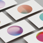
Curve Club by Wildish & Co.
For a type-nerd (hello!) there are few things more seductive than a beautiful, beguiling letterform. But what makes such shapes even more siren-like is when they leap off the page and come to life, not just in motion, digitally; but in a physical environment. The branding for new private members club Curve Club, then, certainly ticks a lot of boxes...
Mode by Gretel
How to make a data business approachable yet hold gravitas? Can it be engaging yet authoritative, sage yet cool? These are the implicit tensions NY-based Gretel has grappled with in its branding of Mode, a data intelligence and technology business seeking to widen its appeal. Gretel has established a brand identity which is triumphant and clean. It balances the contradictions that so...
Eurostar by Design Studio
Train related rebrands are often some of the most divisive when it comes to the design community Twittering classes. That’s perhaps unsurprising when you consider the ubiquity of Standards Manual books on design studio coffee tables – and the fact that they’re among the rare graphics projects that get broadsheet attention (for better or worse, as the swathes of National...
Forskningsrådet by ANTI
2022 was, let’s say, an interesting year for Forskningsrådet (The Norwegian Research Council). The public institution, which provides public funding for research and innovation across a wide range of fields, usually operates without controversy or intense public scrutiny. This changed in September 2021 when Norway held its national elections and got itself a change of government. And along with that,...
Peerspace by Mother Design
Straight up, I’ll admit that I struggle to resist a condensed sans typeface set in uppercase. I’ll also confess that I’ve spent the last hour (no lie), trying to identify this one… Helvetica? Hell no. Railroad Gothic? The wrong track. Söhne? Sö not. Must be Knockout? Another blow. For Druk’s sake is it Druk? Well, whatever it is, it’s neatly...
Den Norske Filmskolen by Neue
Den Norske Filmskolen (The Norwegian Film School) provides a broad range of practical film courses taught by a full-time teaching staff and guest lecturers and instructors with active careers in the national and international film industries. It is the only one of its kind in Norway, developed as a separate department at Lillehammer University College in 1997 and now part of Inland Norway University of...

14 Islands by Bedow
14 Islands is a Swedish digital development studio that focuses on the design and build of distinctive and creative user experiences for companies such as Google, Adidas and Plume. Although its products are diverse, and include websites, apps and web-based games, these are linked by the studio’s commitment to balancing good design principles and technical performance with natural and playful...
Konserthuset Stockholm by Kurppa Hosk
Konserthuset Stockholm is home to the internationally recognised Royal Stockholm Philharmonic Orchestra, and is described as one of Sweden’s most famous and important cultural institutions. Graphic design studio Kurppa Hosk worked with the institution to create a brand identity that would integrate the corporate aspect of venue, one of iconic status and significant cultural legacy, with the passion and dynamism of the...
Primary by DIA
Primary is a new co-working space in New York that introduces health and wellness into the workplace. This can be seen in the approach to interior design; a mix of wood, contemporary soft furnishings and greenery, experienced in the fusion of office space, business events and relaxation classes, and expressed throughout Primary’s brand identity, created by graphic design studio DIA. DIA were tasked...