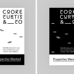
Cooke Curtis & Co. by The District
Cooke Curtis & Co. is an award-winning estate agent with an office in Cambridge, United Kingdom. It has a portfolio and a thorough understanding of properties throughout the city and in neighbouring villages. Although the business was established last year, its founders have over thirty-five years of industry experience. Local graphic design studio The District were commissioned by the estate agent to develop a visual identity that...
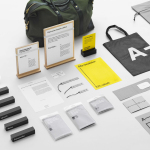
A-TO-B by Stockholm Design Lab
A-TO-B is a retail destination dedicated to all things travel. It curates and sells smart practical products for the modern traveller, complimented by insight and advice. Whether it be an around the world trip or the daily commute, a preference for small private labels or well-known bag brands, A-TO-B has it covered. Venue Retail Group—owners of A-TO-B and over 150 shoe, bag and...

Have A Great Day Films by Hey
Have A Great Day Films is the production company of French filmmaker Jérôme de Gerlache. Jérôme is said to have a taste for professional risk-taking and a distinct way of making short films, advertisements and TV comedies. Barcelona based graphic design studio Hey recently worked with Have A Great Day Films to develop a brand identity that would reflect Jérôme’s personality, convey a...
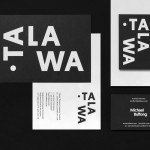
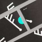
Talawa by Spy
Talawa, Jamaican patois for “small but feisty”, is an all black theatre company that looked to address the lack of opportunities for minorities and their marginalisation at the time of its founding in 1986. Since then it has established itself as one of the most successful theatres of its type in the United Kingdom. “Our work is informed by the wealth...
Life or Death by DIA
Life or Death is a New York and LA based full-service public relations and management business with hip hop roots. It draws its name from the idea that, within the music industry, there is no middle ground, it is either life or death. This abstraction and dual notion manifests itself within the firm’s new brand identity system, designed by DIA, as...

Ona by Mucho
Ona is a Spanish boutique travel agent providing its clients with personal, unique and private tours, day trips and stays in Barcelona and Catalonia. Its experienced guides offer professional insight into local culture, gastronomy, history, architecture, art and design, and provide round-the-clock assistance. Ona’s brand identity, designed by Mucho and based around the tagline “Tailored travel experiences”, is an unusual and distinctive...
Fosnavåg Konserthus by Heydays
Fosnavåg is a city on the island of Bergsøya, situated off the west coast of Norway not far from the Altantic Ocean. It is home to a variety of maritime businesses including fishing, logistics and shipbuilding, and now the location of Fosnavaag Cultural Centre, a new concert hall founded by the local community. Fosnavaag Cultural Centre’s brand identity, created by Scandinavian graphic design studio...
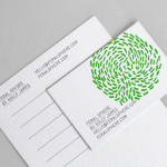
Yksi elämä by Tsto
Yksi elämä is a Finnish project set-up with the intention of encouraging people to become more interested in their own well-being and to improve public health care on both a professional and organisational level, as well as society in general. The project is a collaborative endeavour between the Brain Association, Diabetes Association and Heart Association of Finland. Design studio Tsto were asked...
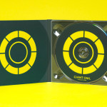
Giant Owl Productions by Alphabetical
Giant Owl is a London-based independent production company that creates television programmes, commercials and short films for clients such as Channel 4 and Rimmel London. Design agency Alphabetical recently developed a new brand identity solution for Giant Owl—which included an animated logo, flat colour palette, glow-in-the-dark paper and bold illustrative detail—that leverages a simple observation to balance an expected technicality with a playful...
Feral Sphere by Mind
Established by Goldsmiths graduate Holly James earlier this year, Feral Sphere is a UK-based fashion label that creates simple, colourful and comfortable clothing and accessories made from organic cotton using 100% renewable solar and wind energy. The label’s brand identity and packaging solution, created by Mind Design working in collaboration with illustrator Lenia Hauser, was “inspired by Japanese Shinto spirits...
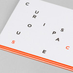
Curious Space by Mash Creative & May Ninth
Curious Space is a London-based scenographers—a specialist scene setter—that creates “unique and inspiring spaces for museums, galleries and more”. Their visual identity, developed by Mash Creative and May Ninth, ‘splits apart to create a physical space that intrigues whilst the type can sit either horizontally or vertically in numerous layouts within the dotted grid”, establishing a flexible and unusual yet structured...

Newscope Films by Karoshi
Newscope Films is an independent, UK-based producer of feature films, television programmes and micro-budget movies for an international market. United by their mission to develop innovative, highly conceptual and original genre films, multi-disciplinary design agency Karoshi created a ‘progressive new identity solution which would capture this brand spirit whilst remaining accessible to a broad audience’....