Edge Painted Detail
Nordoff & Robbins by Pentagram
For decades, Pentagram has been one of the most famous and renowned design consultancies in the world; but when it comes to the charity sphere, music therapy organisation Nordoff & Robbins is far less starry – it’s not, say an Oxfam, or an RSPCA, or Médecins Sans Frontières. Arguably that’s all the more reason for it to bring in the...
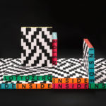
Inside Lottozero by Studio Mut
Inside Lottozero was an exhibition of international artists that covered a wide-range of artistic disciplines. It was conceived by Arianna and Tessa Moroder and curated by Alessandra Tempesti. The exhibition took place at Lottozero / textile laboratories in Toscana, Italy and ran until November 20th, 2016. Under the concept of “Non-stop Fruition”, the exhibition opened with a 12 hour overnight event in...
Osofor by Paul Belford Ltd.
Osofor will be a digital-first and lab-grown diamond jewellery business able to create stones of any shape and cut. It will offer a modern and sustainable luxury brand to those who desire the material qualities of diamonds without the environmental and sociological impact. Osofor intends to distinguish itself further by fusing enduring aesthetic desirability and artisanal practice with experimental materials, unexpected production processes,...
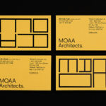
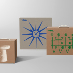
MOAA Architects by Inhouse
MOAA Architects was founded in 2010. It has an office in Hamilton, New Zealand, and a portfolio of new builds and renovations that span the residential, education, commercial and public sectors. Highlights include their work on St. Johns Church, a square plan rotated 9 degrees off the street grid, and Piako House, a renovation and extension of 1940s domestic planning to meet a 21st...
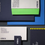
Enea by Clase bcn
Enea is a contemporary furniture manufacturer, located in Spain’s Basque Country, collaborating with respected designers such as Josep Lluscá, Gabriel Teixidó and the trio Lievore Alhterr Molina. Enea has a distinctive catalogue of versatile, comfortable and durable products, developed for both the private and commercial markets, with unique character in their play with form, colour and texture. With a desire to differentiate...

OpenView by Pentagram
OpenView is a Boston-based business dedicated to investing in and helping to grow what are described as expansion-stage companies that are working in the software development sector. OpenView has a unique hands-on approach, and worked with Pentagram’s Natasha Jen to express this through positioning, tone of voice and visual identity design. This included custom typography, stationery, business cards, website and...
Francina Models by Mucho
Francina Models is a Barcelona-based fashion agency, led by Mireia Verdú, with over 30 years of experience. It was the first modeling agency in Spain to offer an acting and training academy and, over recent years, has began to diversify, committing itself to the discovery of new talent and the representation of a variety of fashion profiles and international models. With a desire to...
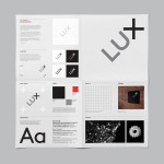
Lux Capital by Mucho
Lux Capital is an American venture capital firm investing in the fields of science and technology, partnering with inventors who challenge the status quo and what we currently understand as the laws of nature to bring futuristic ideas to life. Graphic design studio Mucho developed a simple brand identity for Lux Capital that expresses the collaborative nature of today’s innovations, and the remixing of...
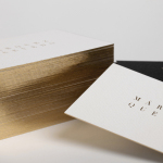
Marquez Quevedo by La Tortillería
Márquez Quevedo is a San Pedro based architectural practice that balances space, proportion, materials, form and colour to compose creative spaces filled with movement. Drawing on what is described as the practice’s sophisticated style and vision Mexican graphic design studio La Tortillería developed a new brand identity for Márquez Quevedo with a sense of space, structure and materiality, both in image and physical texture, that links business cards, stationery...
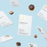
Bombonería Pons by Mucho
Bombonería Pons is a family owned Barcelona based business, established in 1960, dedicated to producing the finest handcrafted chocolates. With a desire to engage with a younger consumer Bombonería Pons worked with international graphic design studio Mucho to develop a brand identity that would be sensitive to its traditional values and history yet give it a contemporary appeal. This extended across packaging, brochure, stationery, business cards and...
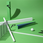
The Practical Man by Garbett
The Practical Man is an online retail destination for men’s sports style and fitness, activewear and equipment, but also editorial content that covers reviews, fitness-focused travel guides and in-depth insight into new brands. It curates a catalogue of world-leading products that exist at the intersection of fashion and sports performance, designed by innovative and passionate brands with progressive approaches. Australian graphic design studio Garbett worked with The Practical Man...
Vitra by BVD
Vitra is a Swiss furniture manufacturer that holds the European license to many of Herman Miller’s ranges. It has a large and diverse catalogue of contemporary home and office furnishings, furniture for public spaces and timeless classics by notable designers such as Charles & Ray Eames, George Nelson and Verner Panton. After years of admiring Vitra’s range of furniture, Scandinavian graphic design studio BVD...