Envelope Design
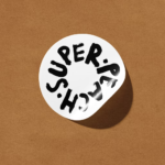
Super Peach by Pentagram
Restaurant brand Momofuku began life with its New York Noodle Bar in 2004 and in the two decades since, has opened more than 15 restaurants across North America, each building on founder chef David Chang’s vision of boundary-pushing cuisine. Since its naissance Momofuku “became known for reshaping Asian-American cuisine and challenging dining conventions with a bold and innovative approach,” according...
Hotel Park Ave NYC by Colt
Located on the corner of Park Avenue South and East 30th Street in Manhattan’s Midtown, Hotel Park Ave is the artist formerly known as the Mondrian Park Avenue. Its change in name is thanks to its change in owner: international hospitality company Lore Group announced its acquisition of the site and mooted its subsequent rebrand late last year, and to...
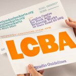
LCBA by Studio Bergini
Not a new project, but a lovely one nonetheless; it seems there couldn’t have been a more perfect fit for London Centre for Book Arts than Studio Bergini when it was looking for a design team to task with creating its new visual identity. Formed by two Central Saint Martins grads – Norwegian Kristian Hjorth Berge and Italian Francesco Corsini (hence...

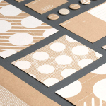
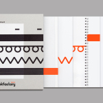
Printed by Somerset by Leo Burnett
Somerset is described as being Canada’s top printer, known for its precision, attention to detail and ability to pull off complex jobs. Alongside reproduction services, Somerset, a family-run business, also provides extensive print finishing services. Inspired by this, the stacked paper of the press, and with the intention of engaging a new generation of designers, Toronto based studio Leo Burnett developed a new brand identity...
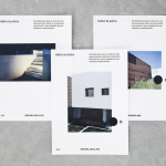
Obra Blanca by Savvy
Obra Blanca is an architecture studio, established in 2013, with offices in the Mexican city of Veracruz. The studio looks to transcend Mexico’s architectural landscape, remain independent and resistant to trends, and free to experiment and explore. It attributes a building’s value to its coherence, craftsmanship, materiality, functionality and context. Obra Blanca represents the last step in construction, the stage at which a building stops being just a structure and...
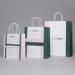
The Hyundai Department Store by Studio fnt
The Hyundai is a well-known, well-thought-of and well-established South Korean department store that this year will celebrate its 44th anniversary. To coincide with this, The Hyundai launched a new brand identity system developed by Seoul graphic design company Studio fnt. This builds on the logotype and colour palette created by New York’s Base Design earlier in 2015, and introduces a Korean logotype, patterns,...
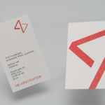
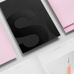
Studio Una by Studio Una
Studio Una is graphic design business, run by Sebastian Hager and Sebastian König, with an office in the German city of Hamburg. The duo works within the fields of visual communication and brand identity design, online and in print, and describe themselves as attaching great importance to the aesthetic effect of design, alongside strong concepts and strategic decisions. This positioning is conveyed...
4B Arkitekter by Commando Group
4B Architects is an architecture studio with offices in Oslo, Norway, an experienced team and a holistic approach. It has a particular interest in low energy and sustainable projects, and has built a portfolio of restorations, public, cultural and commercial buildings, private housing and outdoor spaces. The studio’s team of founding partners (from its inception in 1971) and a generation of...
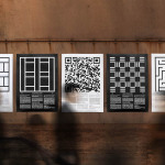
K. Apeland by Bielke&Yang, Norway
K. Apeland is a Norwegian independent civil engineering consultancy that specialises in construction technologies, and applies its experience to new builds, remodelling projects and renovation. It has a favour for steel-wood and concrete structures, which has won the consultancy a number of awards, and has a broad portfolio that covers public infrastructure, private offices and housing, as well as viewing platforms,...
Edouard Malingue Gallery by Lundgren+Lindqvist
Edouard Malingue Gallery exhibits work by emerging and established artists from around the world across its 6000 sq ft space in central Hong Kong. Through collaborations with international curators, and its own publications, alongside solo exhibitions, the gallery looks to introduce art into public spaces and to stimulate public discourse. The gallery features an interior that juxtaposes the white unblemished walls and plinths you might...
Bubu by Bob Design
Buchbinderei Burkhardt, now shortened to Bubu, is a family-owned binding specialist established in 1941. It is now run by third-generation family members and has locations in the Swiss cities of Zürich and Mönchaltorf. Bubu provides consultancy and prototyping services, curates an extensive binding library of over 2000 books, and offers a wide variety of soft and hardcover binding techniques. These include the familiar and utilitarian...
Studio South by Studio South
Studio South, formerly APLUS, is graphic design studio working within the fields of brand identity and packaging from their office in the city of Auckland, New Zealand. In conjunction with a new name and site launch, which coincides with the expansion of studio space, South have also developed a new visual identity treatment. This extends across business cards, folders and headed paper, a...