Etched Illustration

The Clydeside Distillery by Manual
The Clydeside Distillery was set up in 2014 with the intention of reviving distilling in Glasgow and telling the story of Scottish Whisky through a visitor’s centre. The distillery was set up by the Morrison’s, a family with a century-long history within the Scottish Whisky industry as both owners and operators. San Francisco based Manual travelled to Glasgow to work closely with founders, architects...
Feroz by Mucho
Feroz, located on Barcelona’s Carrer Tuset, is described as being a fashionable destination that transitions from evening restaurant into late-night club. It features a distinctive interior design created by Pablo Peyra Studio. This exists in the grey area between something close to period colonialism, moments of kitsch and modern luxury. It has an undeniable character and specificity, one that is fully committed...

Penley Estate by Parallax Design
Penley Estate is a family run winery established in 1989 by Kym Tolley and located in the wine growing area of Coonawarra, Australia. It produces wines that are described as having discernible regional character and are made from fruit grown in Terra Rossa soil; a red clay type created by the weathering of limestone. Penley Estate, since its inception, has...

Grand Ferdinand by Moodley
Grand Ferdinand is hotelier Florian Weitzer’s fifth hotel. It features a distinctive interior of green leather upholstery and Lobmeyr chandeliers, rooms with ornate and functional furnishings, and a restaurant that is said to serve the best French champagne and the grandest Viennese cuisine, all set within a landmark building located on Vienna’s Ringstraße. Grand Ferdinand has a philosophy that celebrates the past whilst moving forward. This meeting of tradition...
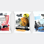
The London Crisp Co. by B&B Studio
The London Crisp Co. is a new hand cooked British crisp range, now available in local pubs throughout London, with a packaging treatment developed by B&B Studio. Absent the story you might expect from a small artisan crisp brand and avoiding the current favour for reduction, B&B Studio’s approach goes all in for provenance and visual impact, embracing a rich...
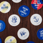
Seafarers & Ostro by Inhouse
Seafarers is a recently rejuvenated seven floor habour front building located in Auckland’s Britomart precinct that will house, over two floors, Michelin starred chef Josh Emett’s flagship restaurant, due to open in stages throughout 2014, as well as brasserie and bar Ostro. The brand identity for the building, restaurant and brasserie, developed by Inhouse, draws on the rich history of the space—once known as...

F. Whitlock & Sons by Marx
F. Whitlock & Sons is a New Zealand based producer of pickles and sauces with a heritage that dates back to 1877, a heritage that over the last century had disappeared from the packaging. Design studio Marx, in collaboration with running with scissors, sort to bring back and celebrate this with a mix of copywriting wit and illustrative authenticity based around Fred Whitlock’s love of...
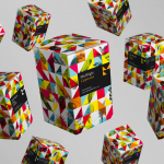
MidNight Cocktails by Mucho
MidNight is an “innovative” range of cocktail boxes that intend to “revolutionize the way people create cocktails both in bars and at home”. Design studio Mucho were commissioned to develop packaging and brand identity for MidNight that would “retain the tradition and elegance of cocktail making” whilst reflecting the new method of storing and serving. Based on the geometric reinterpretation of the ‘M’ and the...

Kozel Limited Ed. by Yurko Gutsulyak
Czech brewer Velkopopovický Kozel have recently launched a limited edition packaging solution for their tinned light beer. Created by Ukraine-based studio Yurko Gutsulyak, the design unites regional and national illustrative detail across a wood print and light tissue wrap neatly conveying tradition, craft, heritage and provenance in a unique and distinctive way....