Fonts In Use: Geometric Sans-serif
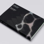
Leandro Erlich: Both Sides Now Catalogue by Studio fnt
Both Sides Now was an exhibition of works by Argentinian contemporary artist Leandro Erlich. This took place at the Seoul Museum of Art between December 2019 and March 2020. Erlich’s installations employ mirrors, reflective surfaces, water and other materials to form optical illusions with the intention of transforming familiar, everyday spaces. Studio fnt worked to develop an identity for the exhibition that would...
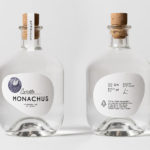
Monachus Distillery by Bedow
Atop of Croatia’s Istria peninsula, just where the land slips into the Adriatic sea sits the tiny small-batch gin distillery of Monachus. Stone shores, botanical covered hillsides, the smell of pine and scattered pin cones characterises the landscape. Drawing on this, the natural history of Istria and the name Monachus, borrowed from Monachus Monachus an endangered Mediterranean monk seal, Swedish design studio Bedow created a...
Avo Consulting by Bleed
Avo is a Nordic technology and management consultancy with offices in Norway and Sweden. Since its founding in 2016 it has seen rapid growth, expanding from 5 to 85 employees in three years. It has done this through a strategic rethinking of the way in which consultancy services are delivered, removing the buzz words associated with the industry, solving business problems...
Leandro Erlich: Both Sides Now by Studio fnt
Both Sides Now, a title borrowed from Joni Mitchell’s famous song, is a solo exhibition of Argentinian contemporary artist Leandro Erlich’s work that took place at the Seoul Museum of Art between December 2019 and March 2020. Erlich’s installations, often receiving international acclaim, mirrors, reflective surfaces, water and other various materials to create optical illusions to transform familiar, everyday spaces such as...
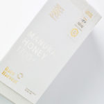
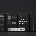
Rare Harvest by Marx Design
The True Honey Company (TTHC) dedicates itself to the production of mānuka honey, a monofloral variety produced in Australia and New Zealand from the nectar of the mānuka tree. It has a unique colour and texture and a high level of dietary Methyglyoxal, an organic compound with antibacterial and antiviral properties. With a price range starting at 60.00AUD and rising to 230.00AUD per jar,...
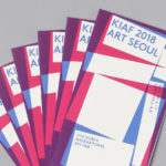
Korea International Art Fair 2018 by Studio fnt
Each year KIAF plays host to and brings to the Korea domestic market the artworks of international artists and galleries. This year, the 17th Korea International Art Fair took place between the 4–7 October in the city of Seoul. With a desire to become the pre-eminent art platform of South Korea, serve as a conduit between the Asian and international art...
The True Honey Co. by Marx Design
The True Honey Company (TTHC) dedicates itself to the production of mānuka honey, a monofloral variety produced in Australia and New Zealand from the nectar of the mānuka tree. It has a unique colour and texture, and a high level of Dietary Methyglyoxal, an organic compound with antibacterial and antiviral properties. With a price range starting at 60.00AUD and rising to 230.00AUD per jar,...
Paco Rabanne by Zak Group
Paco Rabanne is Spanish designer and French fashion label established in 1966 with a catalogue of ready-to-wear garments, shoes, fragrances and accessories. Rather than an interest in the past, Paco Rabanne, who originally trained as an architect, has created strong silhouettes from new materials, and often rejected the spirit and art of the time. Paco Rabanne’s creative director Julien Dossena worked...
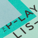
The Playlist Co. by Blok
The Playlist Co. is a Canadian business providing music management and consulting services, AV construction, live music and playlists for a wide range of spaces and events, nationally and internationally. They are renowned for their encyclopaedic knowledge of music, and have collaborated with a some of Canada’s top hospitality brands, as well as local bars such as Buca, Canoe and Bar Raval. The Playlist Co....
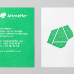
Altaskifer by Neue
Alta Quartzite is a natural building material quarried from the mountains of Norway’s Alta region with a unique green/grey colour, fine texture and hard wearing non-slip properties. These make it a good choice for both interior and exterior applications, from roofing, paving and staircases, to roads and walkways. Although it is material with a long history of use it is...
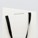
Wadha by Two Times Elliott
Wadha is a Islamic fashion brand for women, established in 2010 in the city of Doha, Qatar, by Wadha Al Hajri. Garments by Wadha are characterised by unique fabrics and cuts, contemporary, clean and slightly irregular shapes, and single colour. This aesthetic is reflected throughout Wadha’s brand identity, designed by British graphic design studio Two Times Elliott, not only in typographic form and...

Swedish Forest Industries Federation by BVD
With the intention of better communicating the endless possibilities of the forest, the concept of Bioeconomy and a commitment to a sustainable future, Skogsindustrierna, the representative of the Swedish pulp, paper and woodworking industries, worked with Scandinavian design studio BVD to help move them away from a complicated tonality and give their communication a clarity, focus and accessibility. With this in mind,...