Designed by Graphical House
Scotland Can Make It! by Graphical House
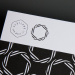
Scotland Can Make It! is a limited edition collection of souvenirs, created by leading Scottish designers and artists in collaboration with manufacturers from across the country, for the Glasgow 2014 Commonwealth Games. The souvenirs are described by Graphical House, the design studio behind the collection’s brand identity and website, as being part of a programme of events that celebrate ‘Scotland’s cultural heritage, creative...

The Empire Café by Graphical House
The Empire Café is a pop-up venue located in Glasgow’s Merchant City that looks to explore Scotland’s relationship with the North Atlantic slave trade through coffee, sugar, tea, cotton, music, visual art, poetry, debate, workshops, walks, film and literature. The café’s brand identity, a ship-like logo, bold sans-serif typography and both a limited and rich approach to print, designed by Graphical House, is described as linking a contemporary ‘artistic programme...
Collective Gallery by Graphical House
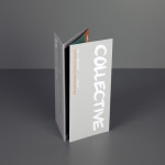
Collective is a contemporary visual arts organisation founded in 1984 to help new and emerging artists exhibit their work in Scotland’s capital city Edinburgh. The organisation delivers a diverse programme of new exhibitions and commissions, and is described as being “fundamental to the cultural vitality of the country”. Following a move to The City Observatory, Glasgow based design studio Graphical House worked with...
Saxa by Graphical House
Saxa is an independent on-line dealer, publisher and commissioner of original and editioned works from international artists with differing perspectives and cultures, taking a curatorial and collaborative approach to make these available to collectors, galleries, institutions and the general public. Saxa’s visual identity, created by UK-based design agency Graphical House and inspired by crystalline structures, conveys the idea of buyer and artist networks through the coalescing and...