
Anthem by Anagrama
Anthem will be a scouting and transfer business within the professional football market working predominantly across Spain, Switzerland and Mexico. Anthem will also be responsible for organising and promoting a variety of sporting events. Design agency Anagrama were recently commissioned to develop a new brand identity for the company—which included a logo, logotype and stationery set—that would communicate the prestige,...

Puebla 109 by Savvy
Puebla 109 is a three floor 20th century townhouse, located in the Roma Norte colonia of Mexico City, “where art, design and gastronomy converge” in the form of an evolving space utilised as a place to work in the morning, as a restaurant to eat lunch in the afternoon and as a bar to have cocktails in the evening. Puebla 109’s new brand identity—which includes...
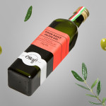
Olaf Olive Oil by Anagrama
Olaf is a Mexican cold-pressed extra-virgin olive oil produced by Olivarera Italo-Mexicana – a Mexican Italian collaboration – intended for healthy, home-cooked, family meals and makes up one-third of Olivarera ‘s olive oil range, which also includes Valentto and Olive Gold. Anagrama, the design agency behind Olaf’s new visual identity, print materials and packaging, describe their approach as taking “typical Italian visual clichés...

Interior XIII by Anagrama
Interior 13 is a distributor of Mexican and international auteur films and promoter of independent cinema. Design agency Anagrama were recently commissioned by Interior 13 to develop a new visual identity that would be “easily relatable to the cinematographic world” as well as being “functional in terms of online promotion.”...

Checklist by Anagrama
Checklist is a Mexican event planning business that specialises in ‘milestone occasions’ such as birthdays, anniversaries and graduations as well as corporate events. Checklist caters ‘exclusively for their client’s unique needs’ and can also provide options that are environmentally friendly. Design agency Anagrama recently devised an ‘institutional’ visual identity solution for Checklist that mixes the age and authority of a heraldic shield,...

Valentto Olive Oil by Anagrama
Valentto is a Mexican cold-pressed virgin olive oil produced by Olivarera Italo-Mexicana – a Mexican Italian collaboration – created for commercial kitchen and restaurant use. Multidisciplinary design agency Anagrama recently developed a new brand identity and packaging solution for Valentto that juxtaposes the natural detail of Italian landscapes alongside the industrial utility of a square tin structural choice, described by Anagrama as being...

Adrián Key by Face
Adrián Key is a San Pedro based architecture firm and architect working with the rich and famous from “one of the most exclusive corners of northern Mexico”. Design agency Face Creative developed a new visual identity for the firm with a “clean, simple aesthetic with bold and modern touches, an icon that cleverly encases the name of the brand in its design, and...

Olive Gold by Anagrama
Olive Gold is described by Anagrama, the multidisciplinary design agency behind its new packaging and visual identity, as an ‘ultra premium’ cold-pressed, extra virgin olive oil from Olivarera Italo-Mexicana that “targets the global high-end section of its category, is marketed through word-of-mouth, luxury communication channels and is only available in a few upscale gourmet stores and luxury-chic hotels.”...

Tabarka Studio by Anagrama
Tabarka Studio specialises in ‘detail-oriented’ and handcrafted tiles made from terracotta, a ‘clay-based ceramic earthenware that becomes porous when fired creating a worn-out, antique finish’. Anagrama, the design agency responsible for the studio’s visual identity and collateral, describe their approach as embracing an ‘archaic timelessness’ that reflects the products through the use of a blue and white scale pattern, tiled icon...

Tourean by Anagrama
Tourean is a British multinational venture capital firm that manages a variety of lifestyle subsidiaries within the music, design, events, social media and fashion industries. Their new visual identity, developed by design agency Anagrama and drawing inspiration from the Tourean name – a compounding of the words taurean and tour created to convey the values of strength, fortitude, courage and integrity as well as...

Cocolobo by Anagrama
Cocolobo is described by Anagrama – the multidisciplinary design agency behind their new visual identity – as a ‘high-end shopping boutique that caters exclusively to strong women with a confident and in vogue fashion sense’. For the name, Anagrama played with the patrons’ ‘characteristic duality’, with a ‘catchy and fun’ compounding of “Coco” (coconut in Spanish) and “lobo” (Spanish for...
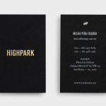
Highpark by Face
Highpark is a new residential project located in the middle of San Pedro Garza García and described by Face – the agency behind the development’s visual identity, print work and website – as ‘arguably one of Latin America’s most affluent municipalities’ and widely credited as an “architectural masterpiece”. Face go on to say that the “project needed to speak volumes about the...