Lettering
GUT by &Walsh
Guts aren’t exactly glamorous. And the connotations of the word ‘gut’ are multifarious: there’s the gory (‘blood and guts’); the Germanic ‘good’; the straightforwardly corporeal; or for those with an interest in newer psychological findings, it’s a wondrous ‘second brain’. Ad agency folk, however, have long taken the word ‘guts’ far outside of the bodily. For many of them, ‘guts’...
Fergus by Principal Studio
Organic food brands often land in the same visual territory as many vegan and eco-conscious counterparts – but when did the pursuit of consumer trust become so entwined with muted colour palettes, illustrated veg and rustic textures? There’s nothing inherently problematic with this combination of design elements, yet it has become a tired and overused formula for brands operating in...
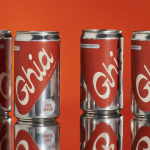
Ghia Non-Alcoholic Aperitif by Perron-Roettinger
In case you’ve missed it, low and no-alcohol drinks are a thing. With over 20% of adults in the UK claiming to be teetotal, abstinence is cool: Brewdog is now Punk AF (that’s ‘alcohol free’), Thomson & Scott’s Noughty is (fairly) nice, and Seedlip is sexy. This sobriety revolution is driven, in part, by the mindfully sceptical Gen Z, turned...
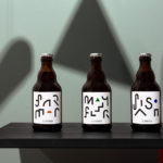
St. ERHARD by Bedow
With a desire to stand out, and in response to the extensive saturation of heritage-related visual cues throughout the German beer market, brewery St. ERHARD worked outside of the country with Swedish studio Bedow to develop a modern graphic identity for three of its brews. Farmer, Mayflower and Saison are premium beers, each of which are crafted, brewed and bottled by St. Erhard in...
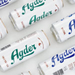
Agder Bryggeri by Frank
Agder Bryggeri is a well-regarded and historical name amongst breweries throughout Norway. It was first established in 1900 but was closed down in 1904 due to operational problems. Recently, the brewery has been resurrected as part of Norsk Bryggerier’s commitment to local beer brands, and is now sold throughout the Agder counties of southern Norway. As part of this resurrection...
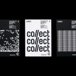
Collect by Spin
Collect is an international art fair that this year took place between the 2–6 of February at London’s Saatchi Gallery. Presented by the Crafts Council, Collect gave visitors the chance to see and buy museum-quality and contemporary ceramics, glass, jewellery, wood, metal and textiles created by established and emerging artists and makers represented by over thirty of the world’s best galleries. Collect’s...
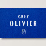
Chez Olivier by Swear Words
Chez Olivier is an authentic French bistro located in the centre of Greville St village, Melbourne, that intends to share its passion for French food, wine and culture with the community. It features an intimate European-style interior design of stained woods, classic furniture, photography and period advertising. It also has a unique bar of padlocks, inspired by Pont des Arts, engraved with messages of love...
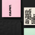
Culprit by Studio South
Culprit is a bar and restaurant located on Auckland’s Wyndham Street. It has a menu made from ingredients supplied by local New Zealand producers, growers and farmers, and is inspired founder’s Kyle Street & Jordan MacDonald’s travels across the United States and Europe. Culprit has a modern interior design in a converted loft space created by Kirsty Mitchell. This is characterised by large exposed beams and brick...

Roster Bar & Restaurant by Bond
Roster is a bar and restaurant on the corner of Pohjoisesplanadi and Unioninkatu in the Tori Quarters of Helsinki. It features an impressive interior made up of custom furniture with a vintage twist, raw and refined materials and hand-picked design objects. Although sophisticated in its design, Roster is a casual rather than formal dinning experience. The eclectic but cohesive style that proliferates interior, its high-quality food...

Sardine by Here Design
Sardine is a restaurant, located on London’s Micawber Street, with a simple menu of rustic, Southern French and Mediterranean-inspired dishes cooked over a wood fire. It features an interior design of bent wood chairs, open kitchen, steel and light wood table tops and a brand identity created by Here Design. This adds a touch of a mediterranean colour to interior through menus and tile detail, while also linking other assets such...
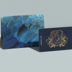
Earls.67 by Glasfurd & Walker
Earls is a family-owned premium but casual restaurant chain with 66 locations throughout Canada and the United States and a thirty year history. The hospitality sector has seen a lot of change in this time. It continues to be highly competitive and often demands innovation and adaptability to remain relevant. With this in mind, Earls commissioned Canadian graphic design studio Glasfurd & Walker and interior...
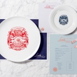
Little Italy by Here Design
Little Italy is a restaurant, gelateria and pizzeria located in the Jordanian capital of Amman. The restaurant features a distinctive, period and European-inspired interior of stained wood, glossy white tiles, concrete floor, vintage glass light shades, wood panelling and exposed I beams, brought together with a modern balance and lovely sense of form and contrast. This continues through to the restaurant’s brand identity, developed by London based Here Design, in...