The Best Logo Designs of 2018
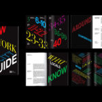
A’18 by Pentagram
AIA Conference on Architecture is an annual three-day event that explores what is new and now in architecture and design. In 2018 this took place between June 21st and 23rd at Manhattan’s Javits Center, a pioneering modernist space frame structure designed by architect James Ingo Freed. The event is made up of workshops, seminars and city tours across the five boroughs of New...
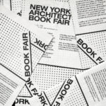
New York Architecture Book Fair by Pentagram
Storefront for Art and Architecture is an independent not-for-profit art and architecture organisation, located in New York’s Soho, dedicated to advancing architecture, art and design. To further this remit the organisation developed the New York Architecture Book Fair, an event and platform that brings together authors, designers, publishers, critics and readers to consider, through a programme of discussion, installation and pop-ups,...
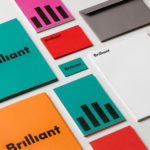
Brilliant by The Studio
Swedish employee engagement consultancy Netsurvey and Bright, experts in customer surveys, have been merged and rebranded as Brilliant by The Studio. This merger and rebranding intended to create a new platform capable of encapsulating the skills and corporate cultures of both companies and develop a visual expression that people from each could identify with and stand behind. In the same spirit as The Studio’s...
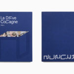
Nunchi by Bedow
Nunchi is an Italian startup and the vision of Cedric Naudon, a self-confessed gastronome. This follows his ambitious project to create an entirely new creative neighbourhood of restaurants, fashion boutiques and design stores in Le Marais, Paris. Nunchi intends to frame and connect all of Cedric Naudon’s gastronomic projects. The first of which is a reimagining of Edouard Nignon’s classic cookbook L’Heptameron des Gourmets,...
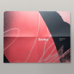
Everlea by Studio Brave
Everlea is a new property development described as a private sanctuary of townhouses located in the Melbourne suburb of Keysborough, an expanding community marked by its space and natural surroundings of native trees, shrubs, parkland and a landscaped network of safe pedestrianised streets. Developed by SB&G, working in collaboration with Bruce Henderson Architects, landscape architects Tract and Kathy Demos, Everlea “offers a pairing of design expertise guided by...
Schubertíada Vilabertran by Mucho
Schubertíada is an annual festival run by Associació Franz Schubert that celebrates the works of the 19th-century Austrian Romantic composer Franz Schubert. This takes place in the Spanish municipality of Vilabertran in July. The festival includes a programme of chamber concerts, lied recitals, instrumental solos and lectures. Schubert is known, not just for his compositions, but for his contribution to Lieder; German poetry...
246 Queen by Studio South
246 Queen has a long and storied history. Opened in 1964 on Auckland’s Queen Street, it heralded a new era of modern architectural vision, exclusive boutique-based experience and an urban post-war retail sophistication. The building played host to fashion shows, designer concessions, furniture showrooms and contemporary dining. However, the architectural ideas drawn up by the original architects Rigby Mullan (Alan...
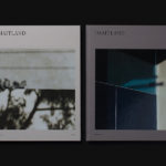
The Maitland by Studio Brave
The Maitland is a luxury 22 apartment residential property development from Gibson Developments located on Malvern Road in Glen Iris, a suburb of Melbourne, Australia. It is marked by an architectural, interior and landscape design language—created by Bruce Henderson (architecture), Charlotte Henderson (interiors) and Jack Merlo (landscape)—of colour, texture and form that connect it intimately to the neighbourhood and its leafy...
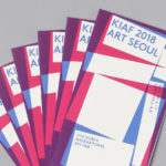
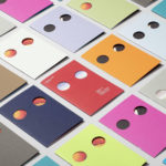
Korea International Art Fair 2018 by Studio fnt
Each year KIAF plays host to and brings to the Korea domestic market the artworks of international artists and galleries. This year, the 17th Korea International Art Fair took place between the 4–7 October in the city of Seoul. With a desire to become the pre-eminent art platform of South Korea, serve as a conduit between the Asian and international art...

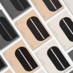
Rimowa by Commission
Rimowa is a Cologne-based manufacturer of luxury luggage. It has a significant history, beginning in 1898 as a travel and leather goods maker known for its innovative approach, and growing to become an international brand with a line of polycarbonate and aluminium products with a distincive ribbed relief. Commission worked with Chief Executive Alexandre Arnault and Chief Brand Officer Hector Muelas to create...
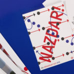
XVIth All Sokol Slet 2018 by Studio Najbrt
Slet is a mass gymnastics event and union of schools that has its roots in the latter half of 19th century Prague with the intention of providing physical, moral and intellectual training for the nation. Slet takes its name from the Czech word for flocking of birds. This can be understood in the sight of a stadium field filled with participants...
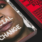
Innsbruck International, Biennial of the Arts by Studio Mut
Innsbruck International, Biennial of the Arts is a 16-day event set over 10 locations presenting the work of over 20 international artists who are invited to make use of Innsbruck’s historical and contemporary venues. Together, these works reach across the wide spectrum of the visual arts; from painting and sculpture, film and sound to performances and installations. Although events of this kind...