Cable Factory by Bond
Cable Factory (Kaapelitehdas) is one of Helsinki’s most famous buildings, originally designed by the Finnish industrial architect Wäinö Gustaf Palmqvist in 1939. For many decades it was the largest building in Finland with a footprint of 56,000 m², and it remains one of the most iconic. In 1991 the site was redeveloped to become the country’s biggest cultural centre, housing...
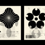
LogoArchive – Akogare 憧れ by Hugh Miller
LogoArchive returns with its fourth collaborative Extra Issue and first bi-lingual release, documenting the forms of Japanese logo design. Through the distinctive smaller format of the bound booklet LogoArchive seeks to surprise and delight with each new issue, introducing new collaborators to offer unexpected interpretations of the ubiquitous logo book. For this Extra Issue, Hugh Miller orchestrates graphic impact and...
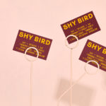
Shy Bird by Perky Bros
Shy Bird is a all-day café, rotisserie and bar in Cambridge, Massachusetts. Its core mission is to elevate chicken, and the experience of eating chicken into the realms of the exceptional through gastronomic know-how, a beautiful interior and a visual identity designed by American studio Perky Bros. Drawing their inspiration from the red junglefowl, the “original chicken” and descendant of the domestic chicken, and...
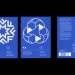
Mitka by Madcats Agency
The spray paint packaging on shelves in Ukraine is usually sad, and often amusing: ‘sad because someone made it… amusing because someone put it into production,’ Kyiv’s Madcats Agency admits. There’s a riot of colour, a sea of tasteless typography and a catalogue of dreadful names (Auto Email, Body 999 and Rector are among the competition). Mitka is different. The...
Leapling Films by F37
Leapling Films is a Manchester-based independent production company founded by ‘leap year baby Chris Lane’. For those that don’t know, this included myself until an hour ago, the word ‘Leapling’ is used to describe somebody who was born on the 29th February. Chris is a member of The Production Guild. His work has been seen by millions of people worldwide, and his credits as...
LogoArchive Issue 7
LogoArchive Issue 1 was conceived, designed and sent to print in a day. It was inspired by a panel discussion at Somerset House as part of the exhibition Print! Now on to its seventh numbered release (and the tenth in the series), LogoArchive continues to reconfigure itself with each new issue with the intention of surprising and delighting. This issue...
Vessel Floats by Order
In the Brooklyn neighbourhood of Greenpoint sits Vessel Floats, a new flotation and deprivation therapy spa that draws on the continuing interest in concepts such as mindful living and wellness. Through considered interior design and visual identity, the latter developed by New York-based studio Order, Vessel Floats intends to further develop and bring to modernity an experience that has been around...
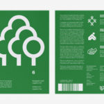
LogoArchive Issue 6
LogoArchive was conceived, designed and sent to print in a day. It was inspired by a panel discussion at Somerset House as part of the exhibition Print! Now on to its sixth numbered release, LogoArchive continues to reconfigure itself with each new issue with the intention of surprising and delighting, particularly at a moment of intentional difficulty. This issue, launched...
LogoArchive ExtraIssue – Past & Present
The distinctive smaller format of LogoArchive–a zine on mid-century symbols that channels the independent spirit of niche publishing–has created a space for experimentation and collaboration with those who also share a similar interest in symbols and corporate identity programmes of the past. BankerWessel is one such studio. Their brand identity work brings the spirit of mid-century form language into the...
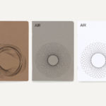
AIR Studios by Spin
AIR Studios was founded in 1965 by Beatles producer Sir George Martin. It is located in London’s Lyndhurst Hall, a former church with one of the largest recording rooms in the world and a live space capable of holding a full symphony orchestra. Since its opening, it has hosted a plethora of world-class talent. These have included Sir Paul McCartney, Adele, The...
MoMA by Order
The MoMA logotype, set in Franklin Gothic No. 2 and designed by Ivan Chermayeff, is an icon, and has been part of the New York urban landscape and international museum graphic vernacular since its creation in 1964. With evolving communicative needs and channels, the MoMA logotype was made a central graphic device as part of a new visual identity launched in...
LogoArchive ExtraIssue – Letters As Symbols
LogoArchive in print was conceived, designed and sent to print in a day. It was inspired by a panel discussion at Somerset House as part of the exhibition Print! Now on to its seventh release, LogoArchive continues to reconfigure itself with each new issue with the intention of surprising, graphically and materially, within the context of archival. The distinctive smaller...