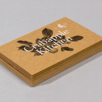
Crabapple Kitchen by Swear Words
Located on Hawthorn’s Glenferrie Road, Victoria, Crabapple Kitchen is a ‘high-end café/wine bar’ with an ever-changing menu of simple, rustic and seasonal Italian, French and Spanish cuisine created from local produce and served in a ‘homely and light-hearted environment’ – derived from the French and Italian countryside – made up of ‘beautiful fabrics, French pantries, hanging copper pots, comfy banquettes and...
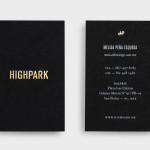
Highpark by Face
Highpark is a new residential project located in the middle of San Pedro Garza García and described by Face – the agency behind the development’s visual identity, print work and website – as ‘arguably one of Latin America’s most affluent municipalities’ and widely credited as an “architectural masterpiece”. Face go on to say that the “project needed to speak volumes about the...
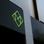
Metronet by Work In Progress
Metronet is an Oslo-based consultancy that provides strategic SEO, PPC, e-commerce, social media, web analytic, design and development services to a wide range of international clients. The consultancy’s visual identity, developed by Work In Progress, mixes the established technological conventions of simple geometric forms, fine line weights, grids and a mono-spaced typeface with abstract interior artwork and a retrospective undertone to convey digital networks,...
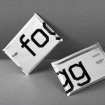
Fogg by Bunch & Kurppa Hosk
By purchasing overcapacity from international telecom networks, Fogg Mobile provides a fixed cost mobile data traffic service for people who want to avoid unexpected roaming bills when travelling abroad. Through the animate and evolving qualities of computer generated imagery and a combination of unbleached paper, stitching, flat coated colour and silver polypropylene, Fogg’s visual identity, created by Kurppa Hosk and developed by Bunch, delivers...

Newscope Films by Karoshi
Newscope Films is an independent, UK-based producer of feature films, television programmes and micro-budget movies for an international market. United by their mission to develop innovative, highly conceptual and original genre films, multi-disciplinary design agency Karoshi created a ‘progressive new identity solution which would capture this brand spirit whilst remaining accessible to a broad audience’....
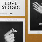
Sancy & Regent by OK-RM
Sancy & Regent is a UK-based online boutique retailer of limited edition jewellery created by young international designers. Their visual identity, developed by independent design studio OK-RM, combines classic type, proprietary quirk and subtle embellishment with tactile material choices and a hidden high quality print finish, to convey small-scale craft with consistent, curated quality....
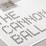
The Cannonball by Lo Siento
The Cannonball is a Spanish production studio that develops ‘creative and sophisticated audio-visual narratives’ within the fields of broadcast television, photography, social media, fashion films and motion graphics. Their visual identity, developed by Barcelona-based brand and graphic design agency Lo Siento working in collaboration with Dave Sedgwick, utilises a ball bearing, grid-based concept to give the associated force of the name...
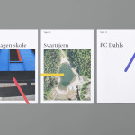
Tegn_3 by Neue
Tegn_3 is a Norwegian, multidisciplinary, architecture design studio that, through inclusive methods, process-oriented and competent project management, deliver holistic solutions that encompass the fields of architecture, planning and landscape, to large clients across Scandinavia. Their visual identity, developed by Neue, draws together the themes of technical knowledge, structure, connections, collaboration and creativity through neutral typography, a modular and expanding geometric...
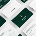
Guy Bauer by Anagrama
Guy Bauer is a Chicago-based video production company ‘committed to creating stories that elicit feelings’. The company’s new visual identity, based around a quill logo – conveying their story-telling philosophy – a stationery solution that references the film industry in its layout and a deep green color palette, designed to convey depth and reliability, was recently developed by independent design agency Anagrama....

Massproductions by Britton Britton
Massproductions is a Stockholm-based furniture company – established in 2009 by designers Chris Martin and Magnus Elebäck – that develops ”high quality, tactile furniture in a modernist spirit’. The firm’s visual identity, developed by creative branding and communication agency Britton Britton, neatly mixes a structural, typographical authority with craft textures and confidently appropriates an upholstered colour palette of the past....
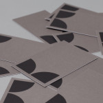
K2LD Architects by Studio Hi Ho
K2LD is a small Melbourne-based architecture and interior design firm with a project history that includes individual private homes, community precincts, multi-unit developments and large-scale commercial projects. The firm’s identity, an abstract, structural and modular amalgamation of initials (check the ideation animation here), uncoated materials and a monochromatic colour palette – developed by brand and communication studio Hi Ho – unapologetically embraces the established and reductionist cues of the industry....

The Tokenhouse by Designers Anonymous
The Tokenhouse is a gastropub – run by hospitality brand Fuller’s – located on London’s Moorgate road. Designers Anonymous – the agency behind the branding of Fuller’s King’s Cross pub venture The Parcel Yard and fair-trade coffee range Brewer St. – developed a visual identity for the venue that appropriates 17th century history, gives it a contemporary vector treatment, a creative but cohesive diversity...