
Privacy International by Paul Belford Ltd.
Privacy International is a UK based non-profit organisation established in 1990 to monitor the security intrusions of governments and business, increase the awareness of data protection concerns and establish ‘new forms of privacy advocacy’ at an international level. Made up of computer professionals, academics, lawyers, journalists and human rights campaigners the organisation has worked on initiatives across fifty countries and is...

Mal de Mar by Face
Mal de Mar is a San Pedro, MX based business and on-line journal where art, design, architecture, photography and travel combine. The journal’s new identity, developed by ‘supermodernist’ design agency Face, captures and binds the timeless pursuit of knowledge and experience through travel and culture with that of the modern technological world with a contemporary fusion of light, symmetrical and consistent line...
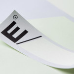
Etxe by Blok
“Etxe is a small, innovative industrial design studio based in Mexico City. Their philosophy is to design to the very essence of a product. There is no room for extraneous elements; they believe that the beauty and artfulness of a product lies in its purest functionality. The identity itself is thus a distillation of their unique approach.” – Blok...
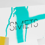
Smets by Coast
SMETS is a luxury department store located in the heart of Brussels (with two more locations across Luxembourg) with over 3.500 square metres of fashion, design, art, food and beauty. Following last December’s BP&O review of the SMETS identity, independent design agency Coast has recently published some further images outlining how this new visual identity has been executed across a wider variety of collaterals and touch-points....
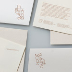
The Slanted Door by Manual
The Slanted Door is a family run, contemporary Vietnamese restaurant that fuses traditional recipes with locally sourced ingredients. Opened in 1995 and located on San Francisco’s Valencia Street The Slanted Door recently underwent a rebrand managed by design and visual communication studio Manual....
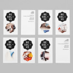
Resolve by Neue
Resolve is a Norweigen provider of a broad selection of cleaning and restoration services to both the commercial and private clients covering asbestos removal, fire and water damage mitigation and ventilation cleaning. Their new identity, designed by Oslo based Neue, rejects that hard industrial aesthetics of the sector in favour of a softer, people led proposition....
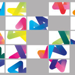
Architecture PLB by Sea
Architecture PLB is a design-led practice working across both the public and private sectors with offices in Winchester and London. Their new brand identity, designed by communications agency Sea, unites the three dimensional aspect of the architectural world and a sense of sculptural creativity with a gradated ‘A’ logomark and the utility and corporate neutrality of a well-spaced, light grey san serif...

Sellar by Campbell Hay
Sellar Development is a privately owned property investment, development and management business based in London and responsible for such high profile projects as The Shard and London Bridge Place. The company approached brand design agency Campbell Hay to develop an identity that would reflect their ongoing partnerships, collaborative process and involvement with the architectural world....
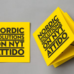
Attido by Bond
Attido, formerly Nordic Solutions, is a Finnish based consulting, development and optimisation company that focuses on the utilisation of information systems in business. Following expansion into the global market and a change in name the company approached independent design agency Bond to develop an identity that would characterise their “goal-driven and solution-centered attitude”....
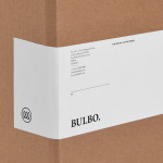
Bulbo by Anagrama
Bulbo is a San Pedro, (MX) based boutique lighting shop that specialises in high-end products and interior planning. The brand approached independent design agency Anagrama to develop a visual identity that would unite the company’s experience of light and space with the contemporary elegance of their products....
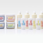
Cure Life Products by Mucho
Cure is a Californian based handcrafted body care company that formulates products to alleviate daily stresses and donates 20% of all purchases to global charities. The company’s branding and packaging was managed by multidisciplinary design studio Dowling Duncan, now Mucho, and based around a simple logo-type solution and a clean, bright typographical labeling system....
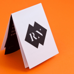
Roc Noir by 400
Roc Noir is a UK ’boutique’ retailer of high quality Ski equipment, that mixes knowledge, service and hand selected products for sport enthusiasts. Their identity, designed by London based brand and design consultancy 400, takes its cues from rock carved letter-forms and marries this with bold geometric forms to resolve and emphasise the personal service, quality and utilitarian nature of the brand....