
Multicourse by Bravo
Multicourse is a provider of F&B service training for catering staff developed by industry experts and operates across Singapore. Their identity, developed by independent design agency Bravo (also based in Singapore) translates the brand’s high quality service proposition and accessibility in a neat logo-type solution and a playfully contrasting, folded napkin logo-mark and collateral....
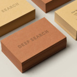
Deep Search by Bielke&Yang
Deep Search is a Norwegian shoe brand that devotes its time to the inquiry of nature, fundamental human activities and their practical impact on the aesthetic of shoes. Deep Search’s brand identity—which includes a logo, logotype, stationery and packaging solution created by Bielke&Yang—is a neat fine lined and geometric logo-type that sits over the tactile quality of the material choices...

Bricos by Anagrama
Bricos, originally named Mayoreo Electrico Monterry, is an electrical hardware store servicing the North East and Monterry regions of Mexico. As part of an expansion plan the company approached design agency Anagrama to create their new identity, packaging propositions and retail environments with the consistency expected from international customers....
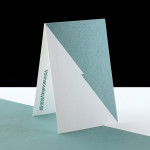
Voimaosakeyhtiö SF by Werklig
Voimaosakeyhtiö SF is the parent company to over 69 different manufacturing businesses in Finland and majority shareholder in the power company Fennovoima, a company that delivers energy to each of these businesses through a share-holder based co-operative scheme. Voimaosakeyhtiö SF’s new visual identity, stationary, website and brand guidelines, developed by Helsinki based design agency Werklig, resolve the cool Finnish environment, the theme of energy and...

Aker Brygge by Bleed
Aker Brygge is a waterside district at the heart of Oslo currently under redevelopment. As part of this, design agency Bleed worked alongside and collaboratively with property developers, architects, landscape architects and exterior lighting designers to bring together and brand this new vision due to be completed in 2015....

MCK Architects by There
MCK Architects is an award winning Sydney based architectural firm that specialises in high quality, high finish residential and commercial projects. Their new identity, developed by brand communication and environment agency There, blends the classic proportional and distinctive geometric aesthetic of MCK’s buildings with their collaborative work-style. The agency also created the accompanying printed collaterals, office signage and website....
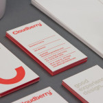
Cloudberry by Perky Bros
Cloudberry is a New York-based interactive design firm that specialises in simple and intuitive on-line experiences for both the financial and healthcare sectors. Brand design agency Perky Bros – commissioned to develop Cloudberry’s visual identity and website – created an abstract smile like logo-mark to resolve and express the simplicity of ideas, the positive impact these have on Cloudberry’s clients and...
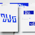
OVG by Studio Dumbar
OVG is a Dutch company that specialises in the development, redevelopment and restoration of buildings and land across Europe. Studio Dumbar created their brand identity around the changing nature of our landscapes to characterise the solid reliability and innovative approach of the company....
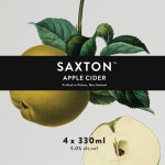
Saxton Cider by Supply
Saxton is a new range of ciders from New Zealand brewery McCashins developed for fresh food retailer Woolworth’s, Australia. The products identity and packaging, developed by Supply, utilises a classic 17th, 18th and 19th century botanical fruit print and engraving illustrative style to communicate a hand-crafted sensibility....
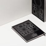
The Lollipop Shoppe by Studio Makgill
Established in 2007 The Lollipop Shoppe is a contemporary retailer designer furniture and accessories located in Brighton, UK. With its own range in development and another store set for London they challenged Studio Makgill to develop an identity that could reflect their growing ambitions, convey a straightforward business nature and unify the shop’s modern and classic product ranges....
Great British Chefs by Hat-trick
Great British Chefs is an application that gives its users access to videos, cooking tips and shopping lists from a range of customisable menus built from over 180 dishes created by twelve of Britain’s top chefs. The apps identity, designed by London based studio Hat-trick is a series of ‘C’ shaped logo-marks created from kitchen implements that resolve the ideas of...
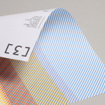
3angrymen by Build
3angrymen is a London based production and digital content company with a client list that includes the NSPCC, ChildLine, Barclaycard, Hovis, Palmolive and TKMaxx. Their new brand identity, designed by Build, draws out the fine colour bands of their previous logo to craft a new, contemporary and sophisticated scan line pattern. Paired with a monospace type choice and contemporary monograms Build’s...